Branch
Digital native graphic-design styles
Styles born on screens: interfaces, the web and generative systems. Stylogeny describes 41 of them. The earliest began in 1977, the latest in 2022. Of these, 31 are still in use.
The 41 styles
Oldest first. Each has its own page: its design choices, where it comes from, and real works.
Bitmap & Pixel GraphicsGraphics and lettering built from the square pixels of low-resolution screens (arcade and console sprites, home-computer displays and the first graphical user interfaces), where every dot was placed by hand within tight limits of memory, resolution and palette.
Demoscene Graphics (Cracktros, Demos & Text-Mode Art)The graphics of the demoscene, a mainly European community of coders, graphicians and musicians that grew from the intros software crackers added to pirated Commodore 64 and Amiga games in the mid-1980s.
Early Web VernacularThe amateur web of the mid-1990s to early 2000s, when millions of people hand-coded personal homepages on free hosts such as GeoCities with table layouts, browser-default fonts, tiled backgrounds, animated GIFs, MIDI soundtracks, hit counters and ‘under construction’ signs.
Emoji Pictographic LanguagePictographs typed as characters and set inline in running text.
Y2K FuturismThe optimistic, chrome-plated vision of the future that surrounded the turn of the millennium, spread by consumer electronics, music videos, games, fashion and dot-com branding.
Fantasy User Interface (FUI) & Sci-Fi HUDFantasy user interfaces are the screen graphics of films and series: computer screens, holograms and helmet HUDs made to be watched for a few seconds, not used.
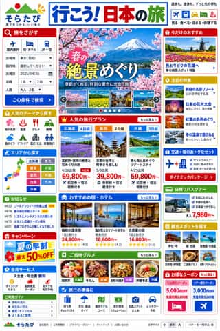
Japanese Dense Web DesignThe information-packed look of Japan's big portals, shops, airlines and ministries: three or more narrow columns of boxed modules, crowded with small Japanese text, blue links, tiny thumbnails, dated news lists and rotating ad banners, in bright colours on a white page.
Skeuomorphic UIInterface design that imitates physical materials and objects (stitched leather, linen, wooden shelves, brushed aluminium, felt, paper and glass) so that digital tools look and behave like their real-world counterparts.
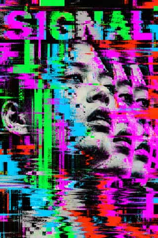
Glitch Art & Datamosh GraphicsAn art and design practice that makes digital failure the picture.
Korean Webtoon GraphicsThe full-colour, vertical-scroll comic that Korean web portals made standard in the 2000s and smartphone apps took worldwide.
- Internet Ugly & Meme VernacularA deliberately amateur image dialect of forums, imageboards and social feeds, named 'Internet Ugly' by Nick Douglas in 2014.
- Frutiger AeroThe glossy, optimistic look of consumer technology from the mid-2000s to the early 2010s, retrospectively named in 2017 by the Consumer Aesthetics Research Institute after Windows Vista's Aero interface and Adrian Frutiger's humanist sans.
- Danmaku Bullet-Comment OverlayThe bullet-comment layer of Japanese and Chinese video sites, begun on Niconico in December 2006 and taken up by AcFun and Bilibili in 2008–2009.
Synthwave / OutrunThe retro-futurist look of synthwave music: a 1980s revival that grew from mid-2000s French electro and online synth scenes, took its other name from Sega's arcade racer Out Run (1986) and reached the mainstream with Drive (2011).
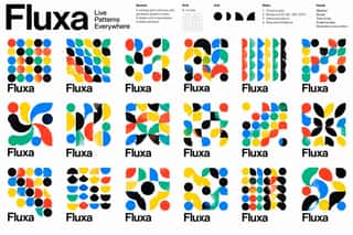
Generative & Dynamic IdentitiesIdentity systems designed as rules rather than fixed marks: logos and graphics generated by code, data or parameters so that they vary endlessly while staying recognisable.
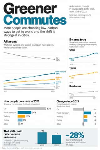
Newsroom Data Graphics & ScrollytellingThe house style of newspaper graphics desks since about 2009–2011 (the New York Times graphics desk, D3.js, the Guardian Datablog): conventional charts drawn from the data, on a white or pale paper ground with light grey gridlines and no axis titles, lines labelled directly in place of a legend where possible and short annotations saying what to look at.
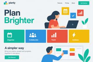
Flat DesignAn interface and illustration language that stripped screens of simulated materials, replacing bevels, gloss and textures with solid fields of colour, clean sans-serif type and reduced pictograms.
VaporwaveAn internet-born microgenre and visual aesthetic that remixes the debris of late-20th-century consumer culture (Windows 95 dialogs, classical busts, palm trees, mall interiors, Japanese text, early 3D renders) in pastel pinks and cyans.
DTC 'Blanding' / Millennial MinimalismThe friendly, frictionless minimalism of 2010s direct-to-consumer start-ups, built for the phone screen, the Instagram feed and the unboxing.
GOV.UK Design (GDS Style)The text-led design of GOV.UK, the UK government's single website, built by the Government Digital Service from 2012 and codified in the GOV.UK Design System (2018).
Low Poly IllustrationA digital illustration and game look in which subjects are built from a visible mesh of a few flat-shaded polygons, so that animals, faces, vehicles and landscapes read as hard-edged facets with no outline or texture.
- YouTube Thumbnail Style (the 'YouTube Face')The custom thumbnail of YouTube's creator economy: a 16:9 still made to be read at fingernail size in a feed of recommendations.
- 'Good Morning' Greeting Images (WhatsApp Forward Vernacular)The ready-made greeting pictures that millions of smartphone users, many of them older and new to the internet, forward to family, friends and groups each morning on WhatsApp, above all in India and Brazil.
Brutalist Web DesignA reaction against templated, conversion-optimised web design that exposes the raw materials of the browser: default system fonts, blue underlined links, visible borders, unstyled forms and plain document flow.
Material DesignGoogle's design system, launched in 2014, which reintroduced controlled depth to flat design through the metaphor of 'material': sheets of digital paper and ink that sit at defined elevations, cast consistent shadows and move with meaningful motion.
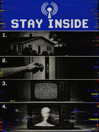
Analog Horror GraphicsA horror genre, mostly on YouTube, that tells its stories through imitation television and home-video graphics rather than actors: emergency-alert screens, station IDs, public-service, educational and instructional tapes, set between the 1960s and early 2000s.
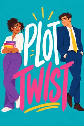
Illustrated Rom-Com Book Cover (Cartoon Couple Cover)The illustrated cover of the contemporary romantic comedy: a couple drawn as flat cartoon figures with simplified faces, from silhouettes and hidden faces to a few cartoon features, caught in one gesture that states the premise, on a single saturated ground of teal, pink, yellow or purple, under a hand-lettered title so large that the figures often lean on it.
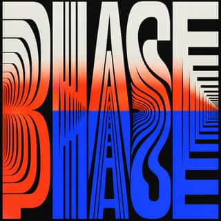
Kinetic Typography & Variable TypeTypography as the moving image: letterforms that stretch, squash, rotate and morph along variable-font axes, loop seamlessly and cut to the beat of music, used for identities, social-media posters and digital out-of-home screens.
- VTuber Avatar and Stream GraphicsThe graphic kit of virtual YouTubers, streamers who perform behind an animated anime-style character instead of their own face.
Corporate MemphisThe flat vector illustration style that became the default visual voice of big tech in the late 2010s: faceless, ethnically non-specific figures with elongated limbs and tiny heads, drawn in bright flat colour among blobs, leaves and confetti.
- Lo-fi Anime AestheticThe look of YouTube's 24/7 lo-fi hip hop streams.
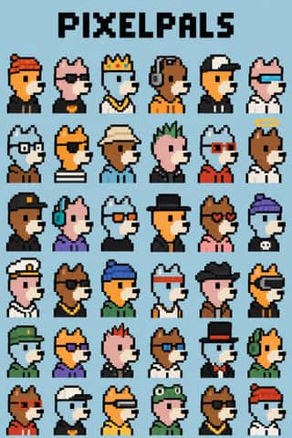
NFT Profile-Picture Collections (CryptoPunks to Bored Apes)Sets of thousands of avatar portraits that code assembles from one or two hundred hand-drawn traits, each sold as a token on a blockchain.
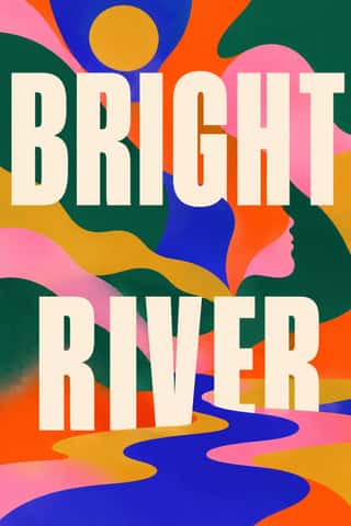
Book Blob (Abstract Colour-Blob Literary Fiction Cover)The default jacket of US literary fiction around 2019–2023: soft, overlapping blobs of saturated colour fill the cover edge to edge (cobalt, pink, orange-red, deep green, mustard).
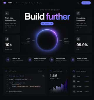
Dark Tech MinimalismThe dark, restrained aesthetic of developer tools and SaaS landing pages since about 2019: near-black grounds, grey type ramps, a neutral grotesque such as Inter, hairline borders, soft radial glows and bento grids of crisp product screenshots.
NeumorphismA short-lived interface trend in which controls are extruded from, or pressed into, a background of the same colour and modelled only by paired soft shadows.
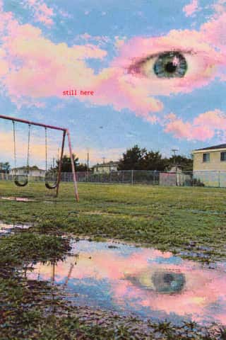
Weirdcore & DreamcoreAn internet aesthetic popularised on Reddit, TikTok and YouTube in the early 2020s, with dreamcore as its softer, pastel, cloud-filled sister.
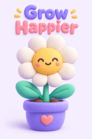
Claymorphism & Soft 3DA soft, toy-like 3D look from product design around 2020, given the name 'claymorphism' in a December 2021 article by Michał Malewicz.
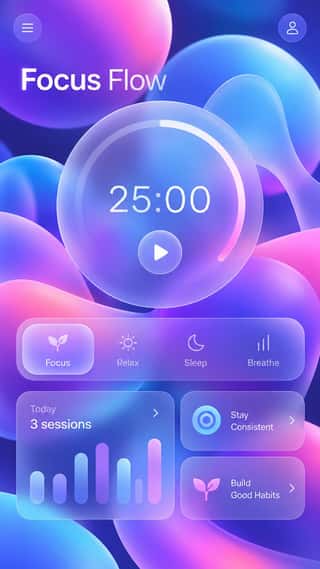
GlassmorphismAn interface style of translucent, frosted panels floating over vivid, blurred backgrounds, so that depth and hierarchy come from layered transparency.
Instagram Slideshow Activism (Social-Justice Infographics)The text-led explainer slideshows that filled Instagram after George Floyd's murder in May 2020.
- Neo-BrutalismA friendly, commercial descendant of web brutalism that keeps its blunt boxes but adds candy colour: thick black outlines, hard unblurred offset shadows, flat saturated fills and chunky sans-serif type on conventional, usable layouts.
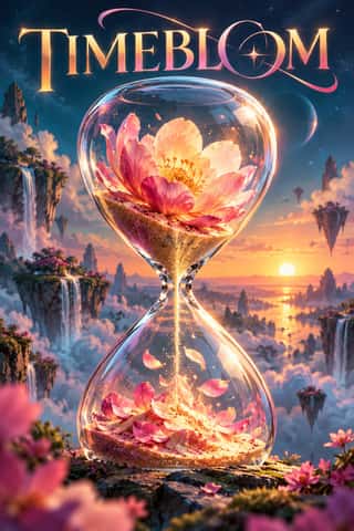
Generative-AI Image AestheticThe house look of pictures synthesised by text-to-image diffusion models since 2022.
The design choices they share
The choices these styles make more often than the 359 styles in the atlas as a whole, most telling first.
- Web & CSSin 38 of 41
- App & OS interfacein 26 of 41
- 3D renderin 24 of 41
- Motion & broadcastin 26 of 41
- Gradientsin 26 of 41
- Icons & pictogramsin 20 of 41
- Technological & futuristin 20 of 41
- Illusion of depthin 23 of 41