Branch
Rational modernism graphic-design styles
Grids, systems and objectivity: design as a neutral, universal method. Stylogeny describes 40 of them. The earliest began in 1908, the latest in 2016. Of these, 15 are still in use.
The 40 styles
Oldest first. Each has its own page: its design choices, where it comes from, and real works.
- London Transport DesignThe design programme Frank Pick built for London's Underground from 1908 and the London Passenger Transport Board (1933–40), continued by Harold Hutchison (1947–66).
Isotype Pictorial StatisticsA method of visual education developed by Otto Neurath, Marie Neurath (Reidemeister) and Gerd Arntz in Red Vienna from 1925, which turns statistics into rows of identical pictograms where a greater quantity is shown by more signs, never by bigger ones.
Scandinavian FunctionalismNordic functionalism (funkis) arrived in graphic form with Sigurd Lewerentz's posters and winged emblem for the 1930 Stockholm Exhibition.
Milanese Industrial Modernism (Olivetti, Pirelli, Studio Boggeri)The Milan-centred school that married Bauhaus- and Swiss-trained discipline with Italian painterly wit for enlightened industrial patrons such as Olivetti, Pirelli and La Rinascente.
- Nippon Kōbō & Tōhōsha Photo-Propaganda Magazines (NIPPON & FRONT)Luxury photo-propaganda magazines that imperial Japan sent abroad, 1934–45.
Penguin Paperback Design (Three Bands to the Marber Grid)The cover system of Penguin Books, London, from 1935 until Germano Facetti left in 1972.
UPA & Cartoon ModernThe modern cartoon of United Productions of America (UPA) and the 1950s films, commercials and books it inspired.
- Machine-Age Simplified Arabic TypeArabic redrawn for the machine rather than the reed pen.
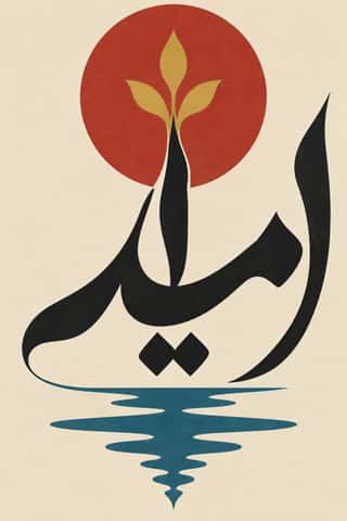
- Hurufiyya Calligraphic ModernismA pan-Arab and Iranian modern-art movement, begun by Madiha Omar in the late 1940s, that freed the letters of the Arabic script from text and used them as abstract visual units.
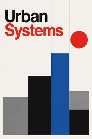
International Typographic StyleA post-war refinement of the New Typography in which the mathematical grid, objective photography and neo-grotesque sans-serifs were used to communicate with clarity and neutrality.
Japanese Postwar ModernismBuilding on the New Typography that Hiromu Hara and the Nippon Kobo circle had absorbed in the 1930s, Japan's postwar graphic designers fused the grid, sans-serif and objective photography of European modernism with indigenous traditions of family crests (kamon), asymmetry and charged emptiness (ma).
Brazilian Concrete DesignA São Paulo and Rio movement in which concrete art, concrete poetry and Brazil's first design offices shared one vocabulary: Max Bill's mathematically generated geometry, serial repetition and sans-serif type.
Finnish Bold Print (Marimekko Modernism)The printed-cotton modernism of Marimekko, founded in Helsinki in 1951 by Armi and Viljo Ratia out of Viljo's printing firm Printex.
Zagreb Modernist Graphics (EXAT 51 to Teatar &TD)Zagreb graphic design grown from the EXAT 51 manifesto (1951), which tied abstract art to visual communication.
HfG Ulm Systematic DesignThe Hochschule für Gestaltung Ulm (1953–1968) was founded as the successor to the Bauhaus.
Vicente Rojo & Mexican Editorial ModernismThe design of Mexico City's literary and cultural press, shaped from the 1950s by the Barcelona-born exile Vicente Rojo: México en la Cultura, the Revista de la Universidad, Plural, La Jornada and the covers of Ediciones Era.
Corporate Identity ModernismModernist reduction applied to corporate communication.
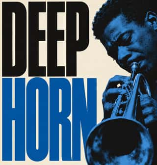
Blue Note Jazz Sleeve ModernismThe record-sleeve language of Blue Note Records, set by art director Reid Miles, who designed some 350 twelve-inch LP covers between about 1956 and 1967, often around Francis Wolff's session photographs.
Polish Cold War Neon (PRL Neonisation)The neon of People's Poland: after the 1956 thaw a state firm, Reklama, and a planned 'neonisation' set out to make war-ruined Warsaw a European capital of neon.
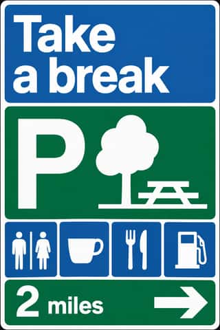
British Road Signage (Kinneir & Calvert)The national sign system Jock Kinneir and Margaret Calvert designed for Britain's motorways, first used on the Preston By-pass in 1958, and through the Worboys Committee for all roads from 1 January 1965.
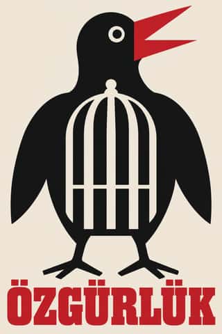
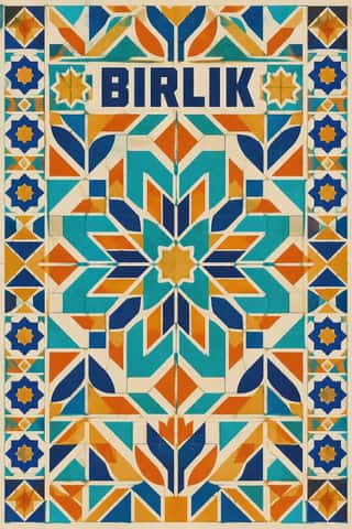
Turkish Modernist Poster & Graphic DesignThe posters of Istanbul's first generation of professional graphic designers for theatres, films, festivals and exhibitions.
- Bossa Nova Sleeve Modernism (César Villela and Elenco)The cover language of bossa nova, made in Rio by the self-taught designer César Villela, first at Odeon and then on the first sixteen LPs of Aloysio de Oliveira's label Elenco (from 1963), often around Francisco Pereira's photographs.
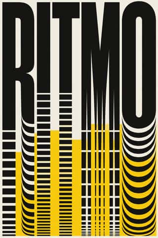
Di Tella Graphic Design (Instituto Torcuato Di Tella)The in-house graphics of Buenos Aires' Instituto Torcuato Di Tella, 1960–1970, led by Juan Carlos Distéfano with Juan Andralis, Rubén Fontana, Norberto Coppola and Carlos Soler.
Iranian Modernist Graphic DesignIranian graphic design came of age in the 1960s and 1970s.
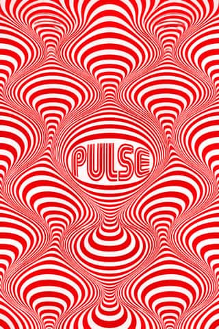
Op Art GraphicsA 1960s style that turned perceptual research into graphic effect: precisely drawn lines, checks, concentric rings and modular grids, usually black and white or complementaries of equal value, that seem to vibrate, swell or move.
Indian Institutional Modernism (NID)The design culture of independent India's public institutions, banks and broadcasters.
- Casablanca School Graphic ModernismA postcolonial modernism formed at the Casablanca fine-art school under Farid Belkahia, where Mohamed Melehi, Mohammed Chabâa and colleagues set Amazigh rugs and jewellery, painted ceilings and calligraphy beside a Bauhaus-style merging of art, craft and design.
Total Design & Dutch FunctionalismThe Dutch strand of systematic modernism took shape when Wim Crouwel, Benno Wissing, Friso Kramer and Paul and Dick Schwarz founded Total Design in Amsterdam in 1963 as the country's first multidisciplinary studio.
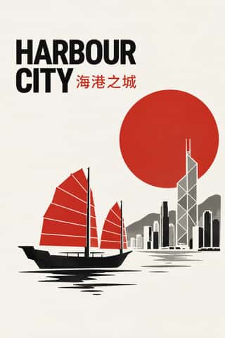
Hong Kong East–West Graphic ModernismThe studio design of Hong Kong from the 1960s, made for banks, developers, trade bodies, hotels and cultural events in a city that had to speak Chinese and English at once.
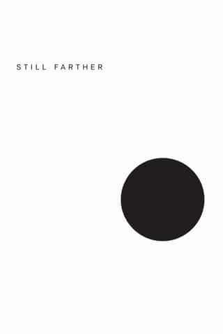
Minimalist Graphic DesignModernism reduced to its barest means, informed by 1960s Minimal art and Japanese emptiness: one image or line of type, vast white or neutral space, a monochrome or near-monochrome palette and meticulous typographic detail.
- Mexico 68 Olympic & Metro IdentityThe graphic programme of the 1968 Mexico City Olympics and the city's first Metro line.
Munich 1972 Olympic Design (Otl Aicher)The visual programme Otl Aicher's department made for the 1972 Munich Olympics, the 'cheerful Games' meant to show a democratic, modest West Germany.
Soviet Central Asian Ornamental ModernismThe monumental art of Soviet Central Asia after the 1966 Tashkent earthquake: a strand of Socialist Realism mixed with Islamic and national ornament.
ECM Sleeve Aesthetic (Munich)The cover language of the Munich label ECM, made since 1970 by Barbara Wojirsch, Dieter Rehm and later Sascha Kleis and Mayo Bucher with co-founder Manfred Eicher.
Roman-like Thai Typography (modern loopless Thai)A Thai type genre that drops the head loops of most Thai letters, so the script reads as an even sans like Helvetica.
Contemporary Arabic & Dual-Script Type DesignA twenty-first-century type culture that redraws Arabic as a family matched to a Latin companion in weight, proportion and contrast, so the two scripts can share a page, screen or sign as equals.
Neo-Swiss RevivalA contemporary revival of the International Typographic Style, fuelled by digital re-releases of neo-grotesques and by studios such as Experimental Jetset and Norm: modular grids, flush-left grotesque type, huge tightly set headlines and flat fields of black, white and one signal colour.
Slow-Living Editorial (the Kinfolk Look)The look of Kinfolk, the slow-living quarterly founded in Portland in 2011 and run from Copenhagen since 2015, and of the indie lifestyle titles and Instagram feeds that copied it.
Plain Tobacco PackagingA packaging language written into law to strip tobacco of persuasion.
- Front-of-Pack Warning Octagons (Latin American Food Warning Seals)A state warning system stacked on commercial food packs.
The design choices they share
The choices these styles make more often than the 359 styles in the atlas as a whole, most telling first.
- Rational & objectivein 30 of 40
- Generous white spacein 29 of 40
- Geometric primitivesin 30 of 40
- Offset printingin 34 of 40
- Non-representationalin 25 of 40
- Grotesque & neo-grotesquein 25 of 40
- Ornament-freein 22 of 40
- Modular gridin 21 of 40