Branch
Postmodern graphic-design styles
Irony, layering and deconstruction of modernist certainty. Stylogeny describes 25 of them. The earliest began in 1968, the latest in 2018. Of these, 16 are still in use.
The 25 styles
Oldest first. Each has its own page: its design choices, where it comes from, and real works.
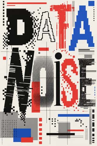
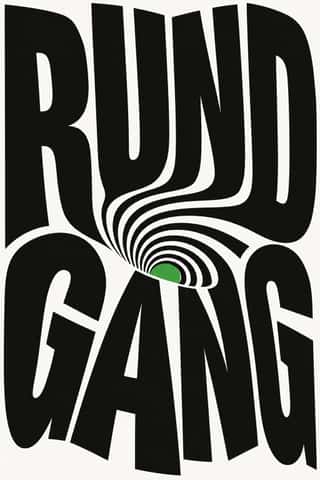
- Swiss Punk / New Wave TypographyA rebellion from inside the Swiss school: Wolfgang Weingart and his Basel students kept the grotesque and the grid but set them in motion with extreme letterspacing, stepped and angled lines, rules and bars, enlarged halftone screens and layered film montage.
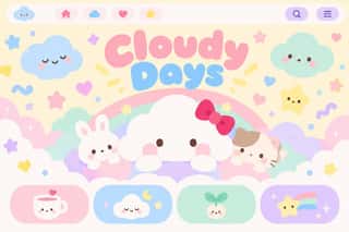
Kawaii DesignJapan's culture of cuteness, which grew from 1970s teenage rounded handwriting and shōjo fancy goods into a global design language through Sanrio, character merchandise and emoji.
Dutch Expressive Postmodernism (Studio Dumbar & Hard Werken)An anti-functionalist current in Dutch graphic design led by Studio Dumbar in The Hague (from 1977) and the Rotterdam collective Hard Werken (magazine from 1979, design office 1982–1994).
- Post-Punk Record Sleeve (Stiff, Factory, 4AD)The record sleeves that British art-school designers made after punk, for independent labels and some majors: Barney Bubbles at Stiff, Malcolm Garrett for Buzzcocks, Peter Saville at Factory and 23 Envelope at 4AD.
Cranbrook & Deconstructivist TypographyGraduate-school experimentation, centred on Katherine and Michael McCoy's Cranbrook design programme, that applied post-structuralist literary theory to the page.
NSK Retro-Avant-GardeThe retro-avant-garde of Neue Slowenische Kunst, founded in Ljubljana in 1984 by Laibach, IRWIN and the Scipion Nasice Sisters Theatre, with Novi kolektivizem as its design department.
Memphis DesignThe Milan collective founded by Ettore Sottsass, whose furniture, laminates and objects (first shown in September 1981) became a graphic language of their own.
Emigre & Early Digital TypeRudy VanderLans and Zuzana Licko's magazine and type foundry, launched in 1984 alongside the first Macintosh, turned the computer's low-resolution constraints into a new typographic idiom.
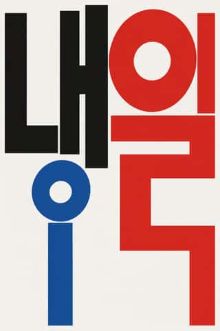
Out-of-Square Hangul TypographyA Korean typographic movement that frees Hangul from the equal square in which metal and photo type had always set each syllable.
Techno-Futurist GraphicsElectronic-music and video-game graphics of the late 1980s and 1990s that turned corporate modernism into a sci-fi consumer fantasy.
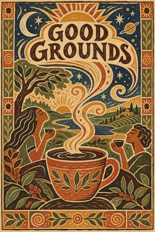
Global Village CoffeehouseThe faux-naive, earth-toned illustration style that late-1980s American designers set against Memphis, and that chain cafés, bookstores, packaging and clip art spread through the 1990s.
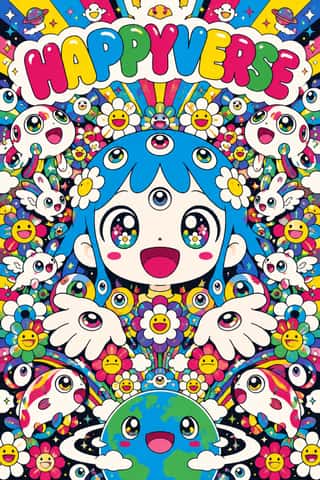
SuperflatThe flat, saturated, cartoon-crowded look that Takashi Murakami named in his exhibition and manifesto Superflat (Tokyo, 2000; US tour 2001).
- South African Vernacular Design (Ijusi)A post-apartheid design language launched in Durban in 1995 by Garth Walker's Orange Juice Design and its free, experimental magazine Ijusi (isiZulu for 'juice'), which asked 'What makes me South African, and what does that look like?'.
- Indian Pop-Kitsch Design (Desi Kitsch)Urban Indian gift and T-shirt design from the late 1990s into the 2010s that recasts the street and bazaar as ironic, affectionate icons: truck tails and 'Horn OK Please', auto-rickshaws, Ambassadors and Chetaks, cutting chai, old Bollywood stills and dialogues, Bhagat Singh in place of Che.
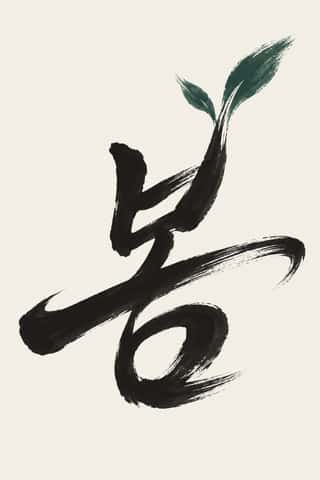
Korean Commercial Calligraphy (Kaelligeurapi)Brush-written Hangul made for commerce, not the scroll.
Yuru-chara (Japanese Local Mascot Design)Japan's local mascots: characters commissioned by prefectures, towns and tourism bodies to stand for a place, named yuru-kyara ('loose characters') by the illustrator Jun Miura around 2000.
Hauntology & Ghost Box DesignSleeves and print that rebuild a misremembered British past from the public graphics of roughly 1958–1978.
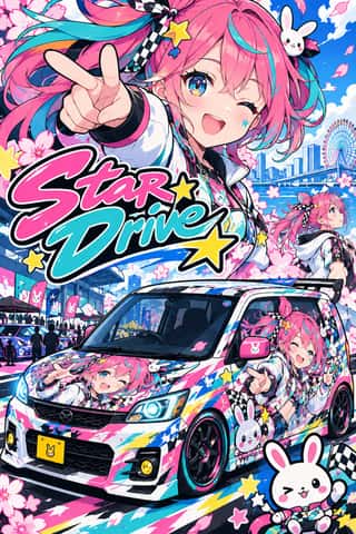
Itasha (Anime Character Car Graphics)Private cars, motorbikes and bicycles that Japanese fans of anime, manga and games cover with their favourite characters, named by the mid-2000s with the self-mocking word itasha, 'painful car'.
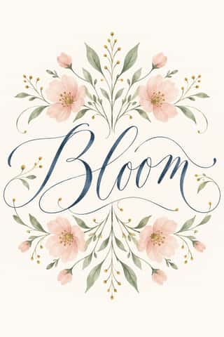
Modern Calligraphy and Brush LetteringThe loose pointed-pen and brush-pen script of wedding stationery and the 2010s craft boom.
- Seoul Independent Graphic Design (Small-Studio Scene)Graphic design by Seoul's small, self-run studios, which from about 2005 chose to stay small.
Hipster Artisanal RevivalThe trade-mark look of the 2007–2018 craft boom, which dressed new coffee roasters, breweries and stationers as nineteenth- and early-twentieth-century firms.
Lucerne Poster Scene (Neubad & Südpol Posters)Lucerne's poster culture for small non-commercial venues (Südpol, Neubad, Treibhaus) and the Weltformat festival.
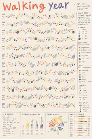
Data HumanismAn information-design approach that draws data rather than charting it, treating numbers as personal, approximate and human.
Newtro (Korean New-Retro)A South Korean branding trend, named 'Going New-tro' in Seoul National University's Trend Korea 2019 (October 2018), in which heritage firms reissue their own postwar to 1990s labels, trademarks and mascots, polished for young buyers.
Guochao (China-Chic National Trend)A Chinese branding and fashion trend, usually dated from Li-Ning's 'China Li-Ning' show at New York Fashion Week in February 2018, that redraws heritage motifs as finishes for sneakers, apparel, cosmetics and museum merchandise.
The design choices they share
The choices these styles make more often than the 359 styles in the atlas as a whole, most telling first.
- Offset printingin 24 of 25
- Found & vernacular imageryin 15 of 25
- Playful & wittyin 22 of 25
- Ironic & self-awarein 14 of 25
- Eclectic mixingin 14 of 25
- Desktop publishingin 8 of 25
- Experimental & distortedin 11 of 25
- Collage & layeringin 13 of 25