World region
Graphic-design styles from Western Europe
Styles that took shape in Western Europe, alone or together with other regions. Stylogeny describes 77 of them. The earliest began in c. 895, the latest in 2018. Of these, 34 are still in use.
The 77 styles
Oldest first. Each has its own page: its design choices, where it comes from, and real works.
- Hebrew MicrographyA Jewish scribal art in which lines of minute Hebrew script, usually the Masoretic notes that guard the biblical text, are written so that the line itself draws: interlaced frames and star rosettes on full carpet pages, and animals, knights, fish and grotesques in the margins.
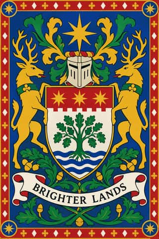
European HeraldryThe hereditary identifying devices of medieval Europe's knights and seals, codified into a rule-bound grammar still used by states, cities, churches, universities and families.
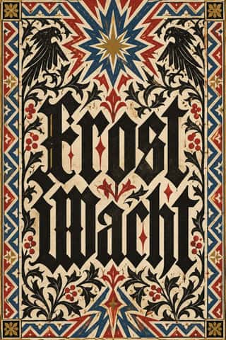
Gothic Blackletter & Fraktur TraditionThe broken scripts of the Latin West.
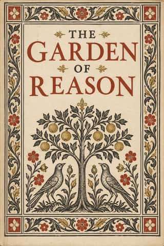
Renaissance Book TypographyThe printed book as shaped by humanist Italy and France: roman and italic types modelled on humanist handwriting, a single justified text block set in harmonious proportions within generous margins, and woodcut initials, borders and printer's devices as the only ornament.
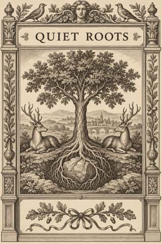
Emblem Book (Motto, Picture & Epigram)A European book genre in which, from Chrestien Wechel's Paris edition of 1534 on, every page or opening repeats one fixed unit: a short motto, an allegorical picture and an explanatory verse, which only together yield a moral, amorous or religious meaning.
Tarot de Marseille Woodcut CardsThe standard pattern of French tarot cards, descended from Milanese tarot and recut by card-makers in Paris, Lyon, Avignon, Dijon and Marseille from the 17th century.
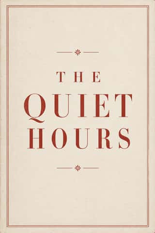
Neoclassical Book TypographyThe Enlightenment book stripped of Renaissance woodcut decoration.
Imagerie d'Épinal & European BilderbogenCheap single-sheet popular prints sold by pedlars across 19th-century Europe, led by the Pellerin imagerie at Épinal and the Neuruppin Bilderbogen.
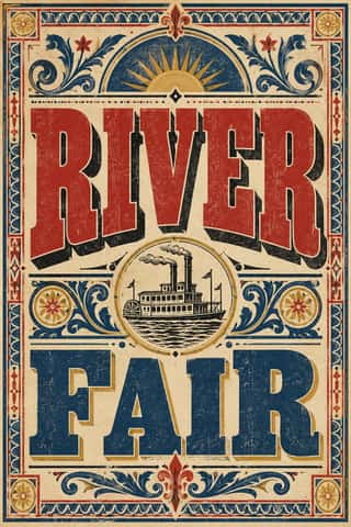
Victorian Letterpress & Wood TypeThe commercial jobbing print of the industrial century: posters, playbills, auction notices and ephemera built from a flood of new display types (fat faces, Egyptians, grotesques, Tuscans and condensed wood type).
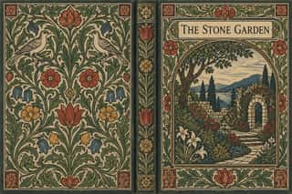
Arts & Crafts MovementA British-led reform movement that answered industrial shoddiness with honest handcraft, medieval models and the ideal of joy in labour.
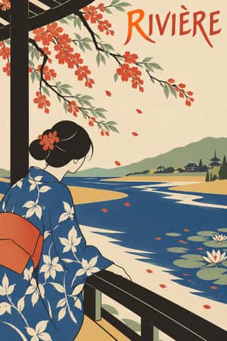
JaponismeThe Western absorption of Japanese woodblock prints, textiles and crafts after Japan reopened to trade in the 1850s.
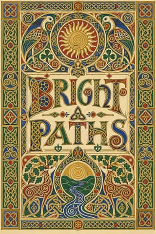
Celtic Revival Illumination & LetteringOrnament and lettering of the Celtic Revival in Ireland, Scotland and the Isle of Man, modelled on Insular gospel books such as Kells and on carved stone crosses.
Belle Époque Lithographic PosterThe large colour lithographic street poster that turned Paris into an open-air gallery, from Jules Chéret's first posters of 1866 to Leonetto Cappiello before the First World War.
- African Wax & Fancy PrintIndustrially printed cotton made for West and Central African markets, first by Dutch and British mills that imitated Javanese batik with resin resist, and later by African mills.
Art NouveauAn international 'new art' that sought a modern style free of historical revival, drawing its forms from plant growth and the female figure.
- Glasgow StyleGlasgow's distinctive answer to Art Nouveau, formed around Charles Rennie Mackintosh, Margaret and Frances Macdonald and Herbert MacNair at the Glasgow School of Art.
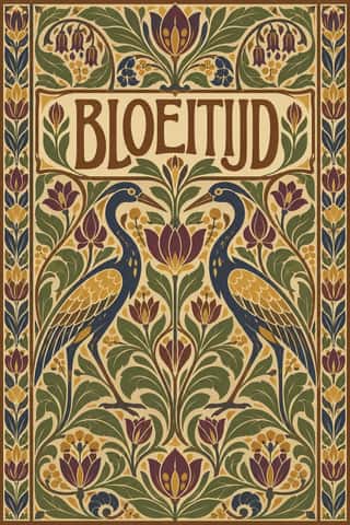
Nieuwe Kunst (Dutch Art Nouveau)The Dutch branch of Art Nouveau, seen mostly in book covers, vignettes and posters.
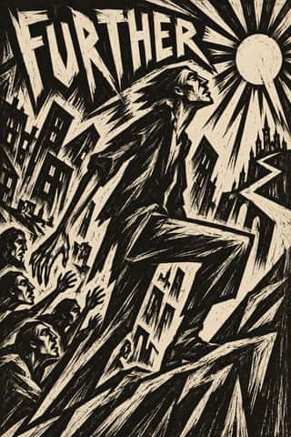
Expressionist Woodcut GraphicsThe graphic arm of German Expressionism, from Die Brücke in Dresden (1905) to the Berlin journals Der Sturm and Die Aktion and Frans Masereel's woodcut novels.
Cubist Pictorial SpaceThe pictorial revolution of Picasso and Braque that shattered single-point perspective into overlapping, faceted planes seen from several viewpoints at once.
- London Transport DesignThe design programme Frank Pick built for London's Underground from 1908 and the London Passenger Transport Board (1933–40), continued by Harold Hutchison (1947–66).
Art DecoThe glamorous modern style named after the 1925 Paris Exposition des Arts Décoratifs, which disciplined ornament into geometry: sunbursts, chevrons, stepped forms and sleek stylised figures rendered in lacquer-smooth colour with metallic accents.
- Vorticism & BLAST TypographyLondon's short-lived rival to Futurism, launched by Wyndham Lewis with BLAST (dated 20 June 1914; War Number, July 1915).
- DadaBorn in wartime Zurich at the Cabaret Voltaire in 1916 and spreading to Berlin, Hanover, Cologne and Paris, Dada used chance, absurdity and provocation against the culture that had produced the war.
De StijlA Dutch movement formed around Theo van Doesburg's journal De Stijl and Piet Mondrian's Neoplasticism, which sought universal harmony through the most elementary means: horizontal and vertical lines, rectangles, the three primaries and black, white and grey.
Wendingen & Amsterdam School TypographyThe graphic language of Wendingen (1918–1932), monthly of the Amsterdam architects' society Architectura et Amicitia, and its editor H.
Die Neue TypographieThe programme that turned avant-garde experiment into a functional typographic method, named by Moholy-Nagy in 1923 and codified in Jan Tschichold's 'elementare typographie' (1925) and Die neue Typographie (1928).
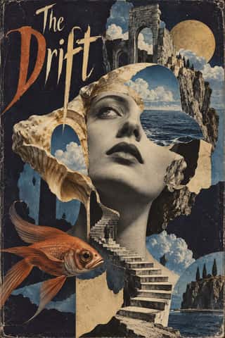
Surrealist GraphicsLaunched by André Breton's 1924 manifesto, Surrealism sought the marvellous in dreams, chance and the unconscious.
Isotype Pictorial StatisticsA method of visual education developed by Otto Neurath, Marie Neurath (Reidemeister) and Gerd Arntz in Red Vienna from 1925, which turns statistics into rows of identical pictograms where a greater quantity is shown by more signs, never by bigger ones.
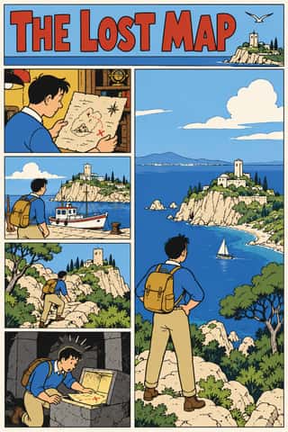
Ligne Claire (Franco-Belgian Clear Line)The comic drawing style of Hergé's Tintin and the Brussels school, named 'klare lijn' by Joost Swarte in 1977.
Penguin Paperback Design (Three Bands to the Marber Grid)The cover system of Penguin Books, London, from 1935 until Germano Facetti left in 1972.
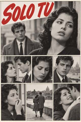
Fotoromanzo (Italian Photo-Romance)The photo-romance of the Italian women's weeklies: a melodrama told in staged photographs, first printed by Il mio sogno and Bolero Film in May 1947 and copied from France to Brazil.
French Post-War Visual-Gag Poster (Savignac, Villemot, Morvan)The humorous street poster of post-war Paris, which took off in 1949 when Raymond Savignac and Bernard Villemot showed their rejected projects together and Savignac's Monsavon cow, its udder filling a bar of soap, went up on the walls.
Corporate Identity ModernismModernist reduction applied to corporate communication.
Pop Art GraphicsPop turned the commercial imagery of post-war consumer culture (comics, packaging, celebrity photographs and advertising) into both its subject and its method.
Situationist Détournement GraphicsGraphics of the Letterist and Situationist Internationals (1956–1972), built on détournement: taking existing words and pictures (comic strips, advertisements, news photographs, city maps, classic texts) and turning them against their source.
British Road Signage (Kinneir & Calvert)The national sign system Jock Kinneir and Margaret Calvert designed for Britain's motorways, first used on the Preston By-pass in 1958, and through the Worboys Committee for all roads from 1 January 1965.
Fluxus Graphics (Maciunas)The house graphics George Maciunas made from 1962 until his death in 1978 for Fluxus, a network of artists who staged events and sold cheap multiples.
Total Design & Dutch FunctionalismThe Dutch strand of systematic modernism took shape when Wim Crouwel, Benno Wissing, Friso Kramer and Paul and Dick Schwarz founded Total Design in Amsterdam in 1963 as the country's first multidisciplinary studio.
Psychedelic PosterThe concert-poster language of the 1960s counterculture, born in San Francisco's Fillmore and Avalon ballrooms and echoed in London's underground press.
- Atelier Populaire (May '68 Screenprint Poster)The posters of the Atelier populaire, set up when students, teachers and artists occupied the École des Beaux-Arts in Paris on 14 May 1968, until police cleared the school on 27 June.
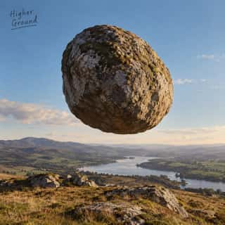
Hipgnosis Photographic Concept SleeveThe sleeves the London studio Hipgnosis made for Pink Floyd, Led Zeppelin, Genesis, Peter Gabriel, 10cc and others from 1968 to 1983.
- Ultras Graphics (Curva Banners and Tifo)The graphic language of Italy's organised football supporters, the ultras, from the late 1960s, and of the groups that copied them across Europe, North Africa and beyond.
Underground ComixSelf-published, adults-only comic books from the San Francisco counterculture, made outside the Comics Code on the newsstand comic's format.
- Grapus (French Militant Graphic Collective)The posters and identities of Grapus, a Paris collective founded in 1970 by Communist Party members who had met in the 1968 poster workshops.
- Roots Reggae Sleeve Art & Rasta IconographyThe record sleeves of roots reggae, from Catch a Fire (1973) until dancehall took over in the 1980s.
Métal hurlant Science-Fiction Comics (Mœbius, Druillet & Les Humanoïdes Associés)The adult science-fiction comics of Métal hurlant, the Paris magazine founded in 1974 by Mœbius, Philippe Druillet, Jean-Pierre Dionnet and Bernard Farkas.
- Punk & DIY ZineThe graphic voice of punk rock in fanzines, record sleeves and gig flyers: images and words cut from newspapers, typed or scrawled, pasted down and run off on a photocopier.
Dutch Expressive Postmodernism (Studio Dumbar & Hard Werken)An anti-functionalist current in Dutch graphic design led by Studio Dumbar in The Hague (from 1977) and the Rotterdam collective Hard Werken (magazine from 1979, design office 1982–1994).
- Post-Punk Record Sleeve (Stiff, Factory, 4AD)The record sleeves that British art-school designers made after punk, for independent labels and some majors: Barney Bubbles at Stiff, Malcolm Garrett for Buzzcocks, Peter Saville at Factory and 23 Envelope at 4AD.
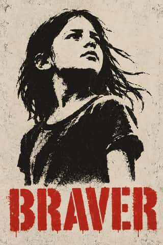
Stencil Street ArtPictures cut rather than drawn: a photograph is reduced to two or three flat tones, cut into card and sprayed onto a wall, usually uninvited, so one hard-edged figure appears in the street, in black with at most one accent colour.
Demoscene Graphics (Cracktros, Demos & Text-Mode Art)The graphics of the demoscene, a mainly European community of coders, graphicians and musicians that grew from the intros software crackers added to pirated Commodore 64 and Amiga games in the mid-1980s.
Techno-Futurist GraphicsElectronic-music and video-game graphics of the late 1980s and 1990s that turned corporate modernism into a sci-fi consumer fantasy.
Rave & Acid House GraphicsThe pocket-sized promotional art of acid house, rave and early techno, handed out in record shops and car parks to advertise all-night parties.
Grunge TypographyThe 1990s magazine and music-industry style in which type was layered, eroded, overlapped and cropped until legibility became negotiable.
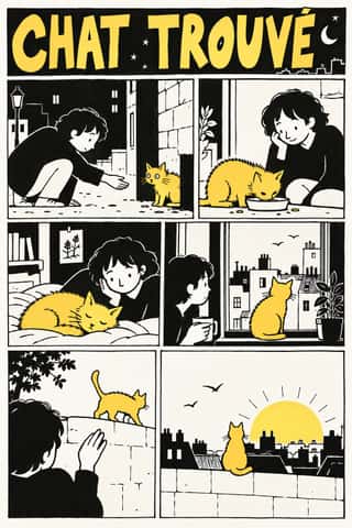
L'Association and French Alternative ComicsThe black-and-white auteur comics of L'Association, the Paris publisher founded by seven cartoonists in 1990, and the 1990s small-press scene it led.
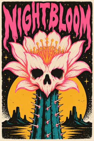
Screenprinted Gig & Alt-Movie PosterHand-pulled, numbered screenprints that revived the rock poster in Austin from 1991, led by Frank Kozik, and spread via Flatstock fairs and, from 2004, Mondo to 'alternative' film posters, for collectors as much as the show.
Hype Streetwear Graphics (Box Logo to Quotation Marks)The logo-led graphics of streetwear since the 1990s: one wordmark or emblem on a plain T-shirt, hoodie or object is the product.
Fantasy User Interface (FUI) & Sci-Fi HUDFantasy user interfaces are the screen graphics of films and series: computer screens, holograms and helmet HUDs made to be watched for a few seconds, not used.
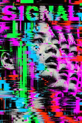
Glitch Art & Datamosh GraphicsAn art and design practice that makes digital failure the picture.
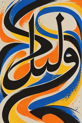
Arabic CalligraffitiArabic letters sprayed, rolled and brushed at the scale of buildings.
Contemporary Arabic & Dual-Script Type DesignA twenty-first-century type culture that redraws Arabic as a family matched to a Latin companion in weight, proportion and contrast, so the two scripts can share a page, screen or sign as equals.
Hauntology & Ghost Box DesignSleeves and print that rebuild a misremembered British past from the public graphics of roughly 1958–1978.
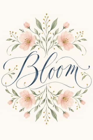
Modern Calligraphy and Brush LetteringThe loose pointed-pen and brush-pen script of wedding stationery and the 2010s craft boom.
Neo-Swiss RevivalA contemporary revival of the International Typographic Style, fuelled by digital re-releases of neo-grotesques and by studios such as Experimental Jetset and Norm: modular grids, flush-left grotesque type, huge tightly set headlines and flat fields of black, white and one signal colour.
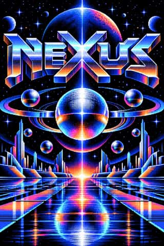
Synthwave / OutrunThe retro-futurist look of synthwave music: a 1980s revival that grew from mid-2000s French electro and online synth scenes, took its other name from Sega's arcade racer Out Run (1986) and reached the mainstream with Drive (2011).
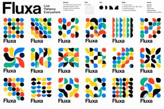
Generative & Dynamic IdentitiesIdentity systems designed as rules rather than fixed marks: logos and graphics generated by code, data or parameters so that they vary endlessly while staying recognisable.
Natural Wine Label ArtThe labels of the natural (low-intervention) wine scene, which grew from Beaujolais into a worldwide network of small growers, bars and importers.
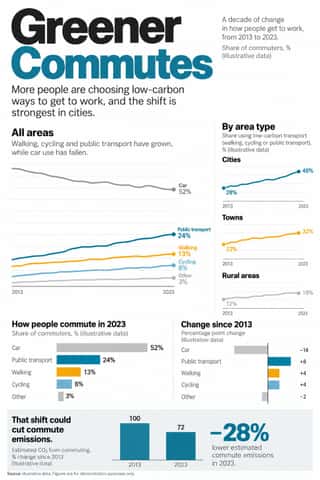
Newsroom Data Graphics & ScrollytellingThe house style of newspaper graphics desks since about 2009–2011 (the New York Times graphics desk, D3.js, the Guardian Datablog): conventional charts drawn from the data, on a white or pale paper ground with light grey gridlines and no axis titles, lines labelled directly in place of a legend where possible and short annotations saying what to look at.
GOV.UK Design (GDS Style)The text-led design of GOV.UK, the UK government's single website, built by the Government Digital Service from 2012 and codified in the GOV.UK Design System (2018).
Plain Tobacco PackagingA packaging language written into law to strip tobacco of persuasion.
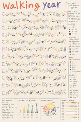
Data HumanismAn information-design approach that draws data rather than charting it, treating numbers as personal, approximate and human.
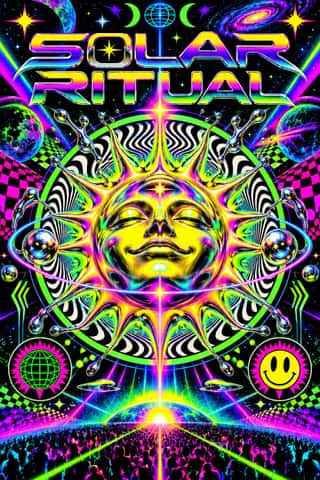
Acid Graphics / New UglyA late-2010s club and poster style that updates 1990s rave graphics with modern 3D tools: liquid-chrome and melting lettering, neo-tribal spikes, wireframes, op-art patterns and acid-green palettes on black, mixed with blackletter and stretched grotesques.
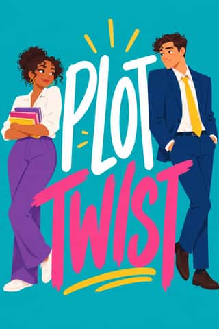
Illustrated Rom-Com Book Cover (Cartoon Couple Cover)The illustrated cover of the contemporary romantic comedy: a couple drawn as flat cartoon figures with simplified faces, from silhouettes and hidden faces to a few cartoon features, caught in one gesture that states the premise, on a single saturated ground of teal, pink, yellow or purple, under a hand-lettered title so large that the figures often lean on it.
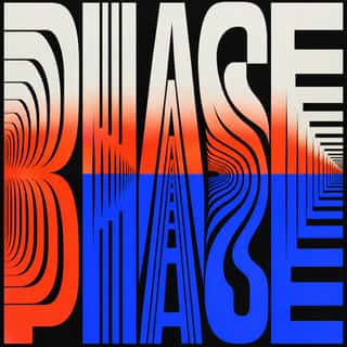
Kinetic Typography & Variable TypeTypography as the moving image: letterforms that stretch, squash, rotate and morph along variable-font axes, loop seamlessly and cut to the beat of music, used for identities, social-media posters and digital out-of-home screens.
- Lo-fi Anime AestheticThe look of YouTube's 24/7 lo-fi hip hop streams.
Extinction Rebellion GraphicsThe visual identity of Extinction Rebellion, the climate movement founded in Stroud in 2018, built by its volunteer Art Group as a free kit anyone may print.
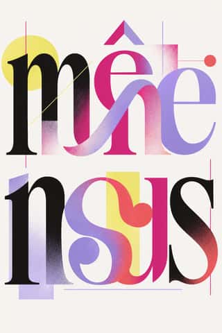
Post-Binary Typography (Bye Bye Binary and Inclusive French Type)A Franco-Belgian type practice that redesigns written French for gender inclusion inside the word.
The design choices they share
The choices these styles make more often than the 359 styles in the atlas as a whole, most telling first.
- Rules & barsin 31 of 77
- Letterpressin 23 of 77
- Modular gridin 27 of 77
- Ornament-freein 28 of 77
- Rectilinearin 34 of 77
- Ironic & self-awarein 27 of 77
- Rational & objectivein 23 of 77
- All capsin 44 of 77