The 29 styles
Oldest first. Each has its own page: its design choices, where it comes from, and real works.
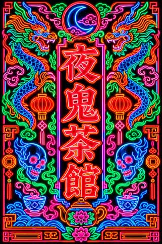
Hong Kong Neon & Beiwei Shop-Sign LetteringThe night-time signscape of Hong Kong's Kowloon streets.
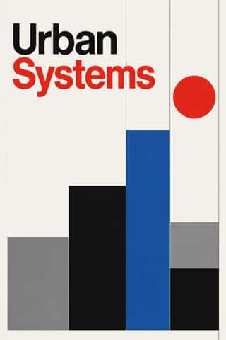
International Typographic StyleA post-war refinement of the New Typography in which the mathematical grid, objective photography and neo-grotesque sans-serifs were used to communicate with clarity and neutrality.
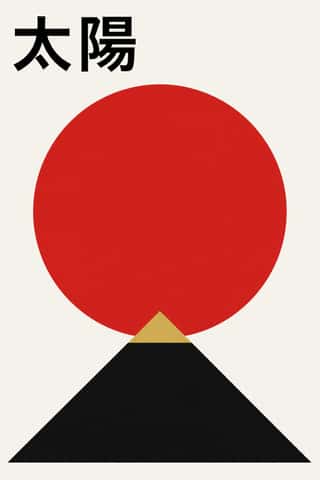
Japanese Postwar ModernismBuilding on the New Typography that Hiromu Hara and the Nippon Kobo circle had absorbed in the 1930s, Japan's postwar graphic designers fused the grid, sans-serif and objective photography of European modernism with indigenous traditions of family crests (kamon), asymmetry and charged emptiness (ma).
Polish Poster SchoolA painterly, metaphorical poster culture that flourished in communist Poland, chiefly for film, theatre, opera and circus.
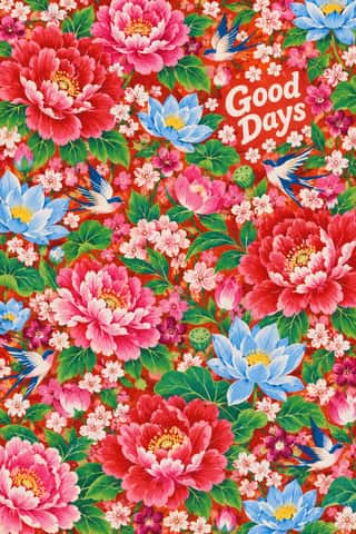
Taiwan Floral Cloth (Huabu)Cheap printed cotton covered edge to edge in large, full-blown peonies with lotuses, phoenixes, dragons, mandarin ducks, small florets and auspicious emblems on saturated vermilion, bright pink or sky-blue grounds.
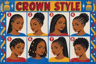
West African Barbershop & Hair Salon SignsHand-painted boards advertising barbershops and braiding salons across West and Central Africa, made by self-taught, often anonymous sign painters since the mid-20th century.
Brazilian Concrete DesignA São Paulo and Rio movement in which concrete art, concrete poetry and Brazil's first design offices shared one vocabulary: Max Bill's mathematically generated geometry, serial repetition and sans-serif type.
Drum Magazine & Sophiatown PhotojournalismThe picture magazine of Black urban Africa in the 1950s.
Finnish Bold Print (Marimekko Modernism)The printed-cotton modernism of Marimekko, founded in Helsinki in 1951 by Armi and Viljo Ratia out of Viljo's printing firm Printex.
Zagreb Modernist Graphics (EXAT 51 to Teatar &TD)Zagreb graphic design grown from the EXAT 51 manifesto (1951), which tied abstract art to visual communication.
Cairo–Beirut Arab Modernist Book & Periodical DesignThe illustrated book, magazine and children's-book culture that ran from Cairo's post-1952 publishing houses to the Arab nationalist and leftist presses of Beirut.
HfG Ulm Systematic DesignThe Hochschule für Gestaltung Ulm (1953–1968) was founded as the successor to the Bauhaus.
Vicente Rojo & Mexican Editorial ModernismThe design of Mexico City's literary and cultural press, shaped from the 1950s by the Barcelona-born exile Vicente Rojo: México en la Cultura, the Revista de la Universidad, Plural, La Jornada and the covers of Ediciones Era.
West German Conceptual Film & Culture Poster (Hillmann and Rambow)The art-film and culture poster Hans Hillmann developed from 1953 for the West German distributors Neue Filmkunst and Atlas Film, which his Kassel student Gunter Rambow took with Gerhard Lienemeyer into staged photo posters for theatre, publishers and protest.
Push Pin StyleThe eclectic illustrative style of New York's Push Pin Studios, founded by Seymour Chwast, Milton Glaser and Edward Sorel.
Zagreb School of Animated FilmThe modernist animation of Zagreb Film's Studio for Animated Film, grown from reduced-animation advertisements of 1954-1955 and named the 'Zagreb school' by Georges Sadoul and André Martin after Cannes 1958.
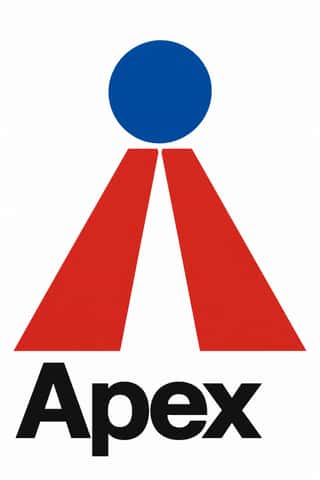
Corporate Identity ModernismModernist reduction applied to corporate communication.
Pop Art GraphicsPop turned the commercial imagery of post-war consumer culture (comics, packaging, celebrity photographs and advertising) into both its subject and its method.
Arab Children's Comic Magazines (Samir to Majid)Arabic children's comics weeklies, from Dar al-Hilal's Samir in Cairo (1956) to Abu Dhabi's Majid (1979), mixing translated Western strips with house characters by Egyptian, Lebanese, Armenian and European artists.
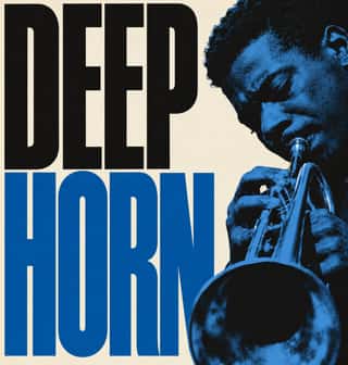
Blue Note Jazz Sleeve ModernismThe record-sleeve language of Blue Note Records, set by art director Reid Miles, who designed some 350 twelve-inch LP covers between about 1956 and 1967, often around Francis Wolff's session photographs.
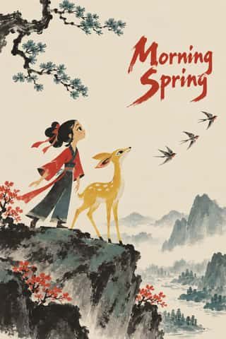
Chinese National-Style Animation (Shanghai Animation Film Studio)The 'national style' of the Shanghai Animation Film Studio, which turned from Disney and Soviet models to Chinese media: Peking-opera masks and movement, paper-cut and folded-paper figures, mural and New Year print colour and, from 1960, ink-wash painting set in motion after Qi Baishi and Li Keran.
Polish Cold War Neon (PRL Neonisation)The neon of People's Poland: after the 1956 thaw a state firm, Reklama, and a planned 'neonisation' set out to make war-ruined Warsaw a European capital of neon.
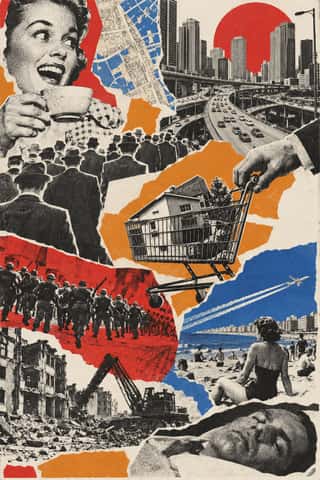
Situationist Détournement GraphicsGraphics of the Letterist and Situationist Internationals (1956–1972), built on détournement: taking existing words and pictures (comic strips, advertisements, news photographs, city maps, classic texts) and turning them against their source.
Thaw Modernism (Soviet and Czechoslovak)The light, stylised modernism that replaced Socialist Realist illusionism and Stalinist pomp in Soviet and Czechoslovak graphic and applied design, from the 1956 Secret Speech, the 1957 Moscow youth festival and Expo 58 to the crushing of the Prague Spring in 1968 (a political cut-off; the manner ran on into the 1970s).
- Dazibao (Big-Character Posters)Handwritten wall posters in large brush characters that turned the walls of Mao-era China into a public forum for criticism, denunciation and, at the Democracy Wall, dissent.
Kinngait (Cape Dorset) Inuit PrintmakingPrints from the Inuit co-operative studio at Kinngait (Cape Dorset), Nunavut, with a catalogued collection every year since 1959.
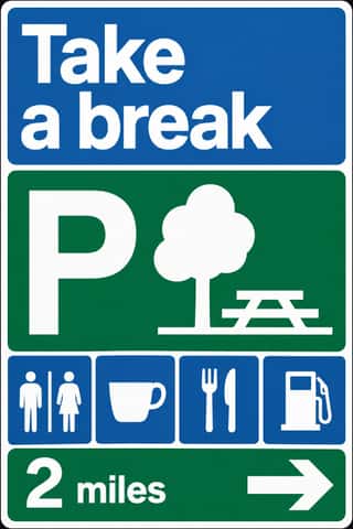
British Road Signage (Kinneir & Calvert)The national sign system Jock Kinneir and Margaret Calvert designed for Britain's motorways, first used on the Preston By-pass in 1958, and through the Worboys Committee for all roads from 1 January 1965.
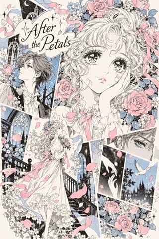
Shōjo Manga (Japanese Girls' Comics)The look of Japan's girls' comics (strictly a readership, not a style), which Takahashi Macoto fixed in 1958 from the lyrical illustration (jojōga) of Nakahara Jun'ichi and the Year 24 Group remade in the 1970s.
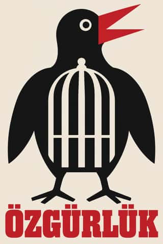
Turkish Modernist Poster & Graphic DesignThe posters of Istanbul's first generation of professional graphic designers for theatres, films, festivals and exhibitions.
The design choices they share
The choices these styles make more often than the 359 styles in the atlas as a whole, most telling first.
- Dynamic asymmetryin 16 of 29
- Generous white spacein 16 of 29
- Warm & approachablein 16 of 29
- Playful & wittyin 22 of 29
- Limited spot coloursin 23 of 29
- Offset printingin 19 of 29
- Ornament-freein 12 of 29
- Isolated objectin 21 of 29