Ornament · Motif
Rules & bars
Thick bars, lines and dots as structural accents.
A design choice in Stylogeny’s vocabulary, under ornament: how much decoration, and of what kind?
- styles make it
- 94
- as a defining choice
- 13
- as a usual one
- 50
- now and then
- 31
- avoid it
- 1
Styles defined by it 13
For these styles it is one of the choices that make the style.
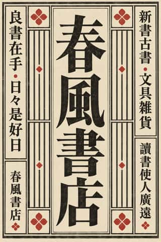
Song–Ming Woodblock Book Typography (Songti / Mincho)The page and letter of the East Asian book.
De StijlA Dutch movement formed around Theo van Doesburg's journal De Stijl and Piet Mondrian's Neoplasticism, which sought universal harmony through the most elementary means: horizontal and vertical lines, rectangles, the three primaries and black, white and grey.
- Russian ConstructivismConstructivism rejected art for art's sake in favour of the artist-engineer building useful things for the new Soviet society.
Wendingen & Amsterdam School TypographyThe graphic language of Wendingen (1918–1932), monthly of the Amsterdam architects' society Architectura et Amicitia, and its editor H.
- BauhausThe German school founded by Walter Gropius in 1919 moved from Expressionist craft ideals to a programme of 'art and technology' after 1923, when Moholy-Nagy, Herbert Bayer and Joost Schmidt made its printing and advertising workshops a laboratory for functional communication.
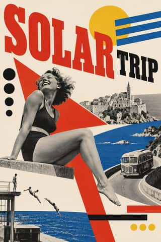
Czech Poetist Book Design (Devětsil)The book and magazine design of the Czech Devětsil circle, where Karel Teige and his colleagues turned constructivist tools (asymmetry, sans and slab capitals, heavy bars, photomontage) toward Poetism's lyrical celebration of travel, cinema, jazz and the circus.
- MavoTokyo's anarchist avant-garde, founded in July 1923 by Murayama Tomoyoshi, back from a year in Berlin, with four former Futurists, and its magazine MAVO (seven issues, July 1924 to August 1925).
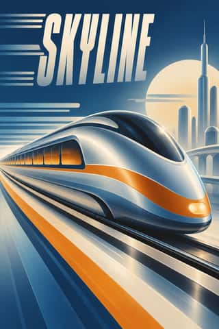
Streamline ModerneThe late, chiefly American phase of Art Deco, in which aerodynamic science became a visual language for a Depression-era culture hungry for progress.
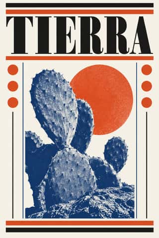
Vicente Rojo & Mexican Editorial ModernismThe design of Mexico City's literary and cultural press, shaped from the 1950s by the Barcelona-born exile Vicente Rojo: México en la Cultura, the Revista de la Universidad, Plural, La Jornada and the covers of Ediciones Era.
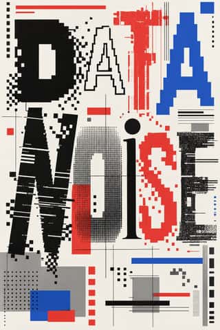
- Swiss Punk / New Wave TypographyA rebellion from inside the Swiss school: Wolfgang Weingart and his Basel students kept the grotesque and the grid but set them in motion with extreme letterspacing, stepped and angled lines, rules and bars, enlarged halftone screens and layered film montage.
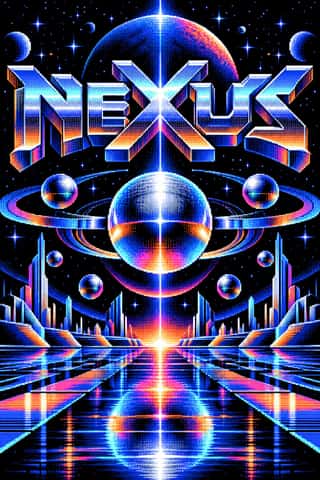
Demoscene Graphics (Cracktros, Demos & Text-Mode Art)The graphics of the demoscene, a mainly European community of coders, graphicians and musicians that grew from the intros software crackers added to pirated Commodore 64 and Amiga games in the mid-1980s.
Fantasy User Interface (FUI) & Sci-Fi HUDFantasy user interfaces are the screen graphics of films and series: computer screens, holograms and helmet HUDs made to be watched for a few seconds, not used.
GOV.UK Design (GDS Style)The text-led design of GOV.UK, the UK government's single website, built by the Government Digital Service from 2012 and codified in the GOV.UK Design System (2018).
Styles that often use it 50
A characteristic choice: usual in these styles, though not essential.
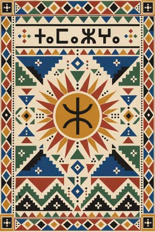
Amazigh Sign System & TifinaghThe visual language shared by Amazigh communities from the Rif, Atlas and Kabylie to the Aurès and the Tuareg Sahara.
- Ancient Egyptian Hieroglyphic & Register CompositionThe visual system of pharaonic Egypt, in which writing is made of pictures and pictures are ruled like writing.
Mixteca-Puebla Codex PaintingThe painted screenfold books of Postclassic southern and central Mexico (not the Maya codices): long strips of gesso-coated deerskin, folded like a screen and painted on both sides.
Persian Miniature (Ilkhanid, Timurid and Safavid Book Painting)The court book painting of Iran and Timurid Herat, formed in Mongol Tabriz from Islamic, Byzantine and Chinese models: from Rashid al-Din's Jamiʿ al-tawarikh (1314) and the Great Mongol Shahnama to Behzad's Herat and the Shahnama of Shah Tahmasp, ending in the album pages of Safavid Isfahan.
- Persian Nastaʿlīq Calligraphy (Qiṭʿa, Chalipa and Siyāh-mashq)The 'hanging' script of Persian poetry and an art of the single sheet.
- Sápmi Graphic Identity (Duodji & Gákti Colour Code)Duodji is Sámi handicraft: hard work in wood, horn and bone, soft work in skin and cloth; drums painted with alder-bark figures survive from the 17th and 18th centuries.
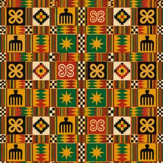
Adinkra & Kente Symbol SystemsThe Akan textile languages of Ghana.
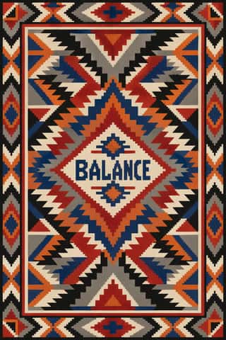
Diné (Navajo) Weaving DesignThe tapestry-woven design tradition of Diné (Navajo) weavers, recorded in Spanish sources from the early 18th century.
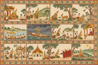
Burmese Parabaik Painting (Konbaung Folding Books)Painted Burmese folding books of the Konbaung court and its monasteries.
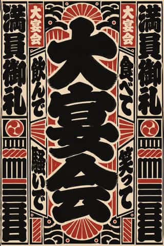
Edo-moji Commercial Lettering (Kanteiryū, Yose-moji, Sumō-ji)The fat, ink-heavy brush hands that Edo's professional sign and bill writers made for the city's entertainments: Kanteiryū for kabuki signboards and playbills from 1779, yose-moji for rakugo halls, sumō-ji for sumo ranking sheets, and squarish kago-moji for votive name slips.
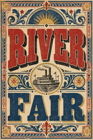
Victorian Letterpress & Wood TypeThe commercial jobbing print of the industrial century: posters, playbills, auction notices and ephemera built from a flood of new display types (fat faces, Egyptians, grotesques, Tuscans and condensed wood type).
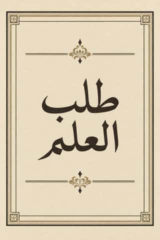
Bulaq (Amiriyya) Naskh Book PrintingThe page of the Arabic printed book as Egypt's state press at Bulaq shaped it from 1822: justified blocks of black Naskh type on pale paper, often boxed in a ruled frame, with an ornamental headpiece on the opening page, headings set larger or in a second script such as Nastaʿlīq, and almost no pictures.
- Urdu Katib LithographyFor about a century and a half Urdu chose lithography over movable type, because metal type could not reproduce the sloping, stacked ligatures of Nastaʿlīq.
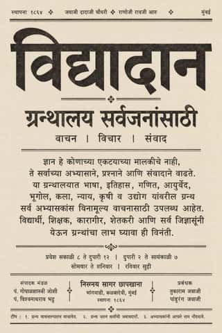
Nirnaya Sagar Devanagari Typography (Bombay Metal Type)Devanagari as Javaji Dadaji's Bombay type foundry (1864) and Nirnaya Sagar Press (1869) cut and printed it: upright metal type with a strong headline, cut with the punch-cutter Ranoji Aru, and enough conjunct and 'Akhand' sorts to set Sanskrit, Vedic accents and Marathi whole.
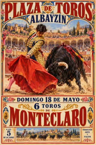
Spanish Bullfight Poster (Cartel Taurino)The Spanish bullfight poster in its illustrated form, from Marcelino de Unceta's lithographs (from 1879) to the Valencian house of Ortega, which supplied rings across Spain.
- Glasgow StyleGlasgow's distinctive answer to Art Nouveau, formed around Charles Rennie Mackintosh, Margaret and Frances Macdonald and Herbert MacNair at the Glasgow School of Art.
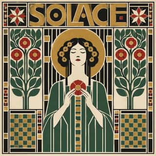
Vienna SecessionThe Viennese break with academic art led by Gustav Klimt, Koloman Moser, Josef Hoffmann and Alfred Roller, which pulled Art Nouveau toward the square, the grid and the flat plane.
- London Transport DesignThe design programme Frank Pick built for London's Underground from 1908 and the London Passenger Transport Board (1933–40), continued by Harold Hutchison (1947–66).
Art DecoThe glamorous modern style named after the 1925 Paris Exposition des Arts Décoratifs, which disciplined ornament into geometry: sunbursts, chevrons, stepped forms and sleek stylised figures rendered in lacquer-smooth colour with metallic accents.
- Vorticism & BLAST TypographyLondon's short-lived rival to Futurism, launched by Wyndham Lewis with BLAST (dated 20 June 1914; War Number, July 1915).
- DadaBorn in wartime Zurich at the Cabaret Voltaire in 1916 and spreading to Berlin, Hanover, Cologne and Paris, Dada used chance, absurdity and provocation against the culture that had produced the war.
- Estridentismo (Stridentist) GraphicsMexico's first avant-garde (1921-27), launched when Manuel Maples Arce pasted his manifesto Actual No. 1 on Mexico City walls.
- Brazilian Modernismo Graphics (Klaxon and the Semana de 22)The print side of São Paulo's Modernismo (1922-29), set in jobbing print shops.
Die Neue TypographieThe programme that turned avant-garde experiment into a functional typographic method, named by Moholy-Nagy in 1923 and codified in Jan Tschichold's 'elementare typographie' (1925) and Die neue Typographie (1928).
Republican Chinese Book Cover Design (Lu Xun & Tao Yuanqing)The covers of China's New Literature.
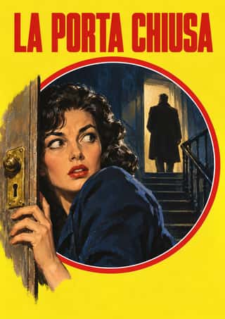
Giallo Mondadori Covers (I Libri Gialli)The cover system of Mondadori's crime series, Milan, from I Libri Gialli of 1929 to Il Giallo Mondadori today.
Penguin Paperback Design (Three Bands to the Marber Grid)The cover system of Penguin Books, London, from 1935 until Germano Facetti left in 1972.
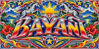
Jeepney ArtThe decoration of the Philippine jeepney, the shared taxi built from surplus US Army jeeps after 1945 and later from locally fabricated stainless-steel bodies by firms such as Sarao and Francisco Motors.
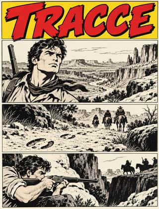
Bonelli Fumetto (Italian Popular Adventure Comics)The house format of Milan's Bonelli publishing house and its imitators (Tex, Zagor, Dylan Dog, Nathan Never): monthly newsstand paperbacks of 16 x 21 cm with about a hundred black-and-white pages, each a long episode of a serial hero.
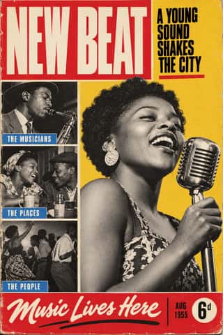
Drum Magazine & Sophiatown PhotojournalismThe picture magazine of Black urban Africa in the 1950s.
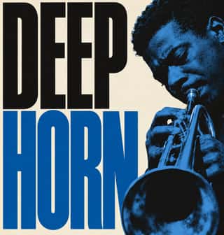
Blue Note Jazz Sleeve ModernismThe record-sleeve language of Blue Note Records, set by art director Reid Miles, who designed some 350 twelve-inch LP covers between about 1956 and 1967, often around Francis Wolff's session photographs.
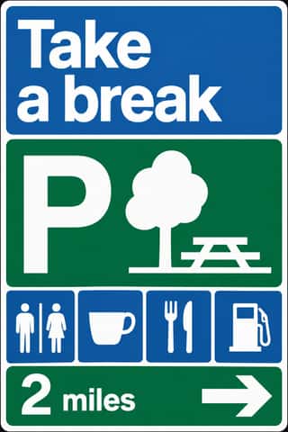
British Road Signage (Kinneir & Calvert)The national sign system Jock Kinneir and Margaret Calvert designed for Britain's motorways, first used on the Preston By-pass in 1958, and through the Worboys Committee for all roads from 1 January 1965.
Fluxus Graphics (Maciunas)The house graphics George Maciunas made from 1962 until his death in 1978 for Fluxus, a network of artists who staged events and sold cheap multiples.
- Roots Reggae Sleeve Art & Rasta IconographyThe record sleeves of roots reggae, from Catch a Fire (1973) until dancehall took over in the 1980s.
Dutch Expressive Postmodernism (Studio Dumbar & Hard Werken)An anti-functionalist current in Dutch graphic design led by Studio Dumbar in The Hague (from 1977) and the Rotterdam collective Hard Werken (magazine from 1979, design office 1982–1994).
Cranbrook & Deconstructivist TypographyGraduate-school experimentation, centred on Katherine and Michael McCoy's Cranbrook design programme, that applied post-structuralist literary theory to the page.
Emigre & Early Digital TypeRudy VanderLans and Zuzana Licko's magazine and type foundry, launched in 1984 alongside the first Macintosh, turned the computer's low-resolution constraints into a new typographic idiom.
Techno-Futurist GraphicsElectronic-music and video-game graphics of the late 1980s and 1990s that turned corporate modernism into a sci-fi consumer fantasy.
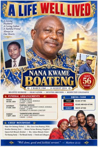
Ghanaian Funeral Poster & BannerThe printed death announcements of southern Ghana, also found elsewhere in West Africa: colour posters, mostly A2, pasted on walls, trees, poles and vehicles, and by the mid-2010s large PVC banners hung at the family house.
- Nigerian Pentecostal Crusade Poster & BillboardThe roadside adverts of Nigeria's Pentecostal and independent churches: billboards, banners and posters on poles, walls and bridges announcing crusades, revivals, conventions and night vigils.
Hype Streetwear Graphics (Box Logo to Quotation Marks)The logo-led graphics of streetwear since the 1990s: one wordmark or emblem on a plain T-shirt, hoodie or object is the product.
Early Web VernacularThe amateur web of the mid-1990s to early 2000s, when millions of people hand-coded personal homepages on free hosts such as GeoCities with table layouts, browser-default fonts, tiled backgrounds, animated GIFs, MIDI soundtracks, hit counters and ‘under construction’ signs.
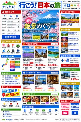
Japanese Dense Web DesignThe information-packed look of Japan's big portals, shops, airlines and ministries: three or more narrow columns of boxed modules, crowded with small Japanese text, blue links, tiny thumbnails, dated news lists and rotating ad banners, in bright colours on a white page.
Hauntology & Ghost Box DesignSleeves and print that rebuild a misremembered British past from the public graphics of roughly 1958–1978.
Neo-Swiss RevivalA contemporary revival of the International Typographic Style, fuelled by digital re-releases of neo-grotesques and by studios such as Experimental Jetset and Norm: modular grids, flush-left grotesque type, huge tightly set headlines and flat fields of black, white and one signal colour.
Synthwave / OutrunThe retro-futurist look of synthwave music: a 1980s revival that grew from mid-2000s French electro and online synth scenes, took its other name from Sega's arcade racer Out Run (1986) and reached the mainstream with Drive (2011).
Hipster Artisanal RevivalThe trade-mark look of the 2007–2018 craft boom, which dressed new coffee roasters, breweries and stationers as nineteenth- and early-twentieth-century firms.
Brutalist Web DesignA reaction against templated, conversion-optimised web design that exposes the raw materials of the browser: default system fonts, blue underlined links, visible borders, unstyled forms and plain document flow.
Extinction Rebellion GraphicsThe visual identity of Extinction Rebellion, the climate movement founded in Stroud in 2018, built by its volunteer Art Group as a free kit anyone may print.
- Neo-BrutalismA friendly, commercial descendant of web brutalism that keeps its blunt boxes but adds candy colour: thick black outlines, hard unblurred offset shadows, flat saturated fills and chunky sans-serif type on conventional, usable layouts.
Styles that use it now and then 31
An occasional choice in these styles.
- Neoclassical Book Typography1757–1830
- Imagerie d'Épinal & European Bilderbogen1796–1939
- Fileteado Porteño1890–present
- Simplicissimus Satirical Style (Munich)1896–1944
- Bògòlanfini Mud Cloth1900–present
- Italian Futurism1909–1944
- Leningrad Avant-Garde Picture Book1922–1936
- WPA Silkscreen Posters1935–1943
- Machine-Age Simplified Arabic Type1947–present
- Onitsha Market Pamphlets1947–1980
- International Typographic Style1950–1975
- HfG Ulm Systematic Design1953–1968
- Polish Cold War Neon (PRL Neonisation)1956–1981
- Di Tella Graphic Design (Instituto Torcuato Di Tella)1960–1970
- Total Design & Dutch Functionalism1963–1990
- Munich 1972 Olympic Design (Otl Aicher)1966–1972
- Black Panther Party Graphics1967–1980
- Turkish Weekly Humour Magazines (Gırgır to Uykusuz)1972–2025
- Lebanese Civil War Party Poster1975–1990
- Post-Punk Record Sleeve (Stiff, Factory, 4AD)1977–1990
- Memphis Design1981–1988
- ACT UP & Gran Fury AIDS Activist Graphics1987–1995
- Grunge Typography1990–2000
- L'Association and French Alternative Comics1990–present
- Nollywood Video Jacket & Film Poster1992–present
- Contemporary Chinese Book Design ('Most Beautiful Books of China')2003–present
- Newsroom Data Graphics & Scrollytelling2009–present
- Plain Tobacco Packaging2012–present
- Analog Horror Graphics2015–present
- Newtro (Korean New-Retro)2017–present
- Dark Tech Minimalism2019–present
It often goes with
Choices that the styles making it make more often than the atlas as a whole.
- Rectilinearin 59 of 94
- Grotesque & neo-grotesquein 46 of 94
- Typography onlyin 48 of 94
- Letterpressin 32 of 94
- Layered informationin 48 of 94
- Straight photographyin 40 of 94
Styles that avoid it
Styles that deliberately leave it out.