Rational modernism · 1951–1960 · Western Europe
Festival of Britain 'Contemporary' Pattern (Lucienne Day and the Festival Pattern Group)
Also known as Contemporary style, Festival style, 1950s British Contemporary textiles, Festival Pattern Group
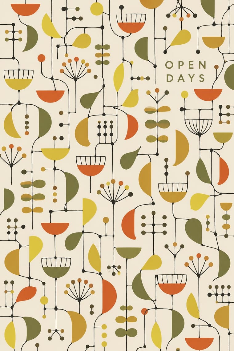
The post-war British pattern language launched at the 1951 Festival of Britain. Lucienne Day's 'Calyx' for Heal's replaced the revived Victorian floral with spindly lines linking small cup and seedpod shapes, after Klee, Miró and Calder, while the Festival Pattern Group turned X-ray crystal-structure diagrams into wallpapers, dress fabrics and furnishings. Screen-printed in a few flat inks on olive, ochre or white grounds, it set the light 'Contemporary' look of British homes through the 1950s; in the 1960s Day turned to brighter colours and simpler forms.
Make something in this style Get advice in this style Mix it with another style
01
How it works
- Draw the motif as wiry, spindly line that links small flat shapes, cups, dots and seedheads, rather than as a filled silhouette.
- Abstract the plant until stalk, calyx and seedhead read as marks, not as a botanical drawing.
- Scatter the motifs evenly in an all-over repeat with plenty of ground showing between them.
- Print in three or four flat screen inks, with black line and one bright accent on an olive, ochre, brown or white ground.
- Take ornament from science as well as nature: let a crystal-structure diagram or ball-and-stick lattice become the repeat.
- Keep the tone light and playful, a child-like sketch rather than a heavy period ornament.
London, 1951: the Festival of Britain, where Lucienne Day's 'Calyx' was shown in Robin Day's room in the Homes and Gardens Pavilion and printed by Heal's, and where the Council of Industrial Design's Festival Pattern Group furnished the Regatta Restaurant with patterns drawn from crystal-structure diagrams. Mark Hartland Thomas formed the group, bringing its manufacturers together in 1949, after a talk by Dorothy Hodgkin to the Society of Industrial Artists, taking up crystallographer Helen Megaw's 1946 suggestion that crystal-structure diagrams suit textile design
02
Its design choices
From Stylogeny’s vocabulary of design choices: defining choices make the style, characteristic ones are usual, occasional ones turn up now and then.
- Layout & composition
- Space & hierarchy
- Colour
- Form & shape
- Surface & texture
- Ornament
- Imagery
- Medium & production
- Tone & intent
- Avoids
- Naturalistic depiction, Ornament-free, Gradients, Illusion of depth, Straight photography, Gloss & highlights, Horror vacui, Fluorescent & neon
Palette
-
#6b6b3a -
#e6cf3e -
#d4532a -
#1b1a17 -
#f1ece0 -
#c18f32
Typefaces
-
Festival display lettering used alongside the patterns (posters, catalogues, signs), not in the repeats
Festival Titling (Philip Boydell, 1951), condensed three-dimensional sans-serif capitals commissioned for the Festival of Britain's exhibition display
-
Festival display lettering used alongside the patterns, not in the repeats
bold sloping slab-serif lettering on the Royal Festival Hall and South Bank buildings, developed under a typography panel including Nicolete Gray, Charles Hasler and Gordon Cullen, partly after early 19th-century faces
-
The only lettering that belongs to the pattern itself
the designer's facsimile signature printed along the selvedge (e.g. 'Lucienne Day' on 'Provence', John Line & Sons, 1951)
Known for
-
Lucienne Day, 'Calyx'
1951, furnishing fabric hand screen-printed on linen by Heal's Wholesale & Export in lemon yellow, orangey-red and black on an olive ground (Wikipedia); shown at the Festival of Britain, Gold Medal at the Milan Triennale 1951; the design in watercolour, gouache and collage is V&A O85223
-
Lucienne Day for Heal's, 'Graphica' (1953), screen-printed cotton, black lines on an ochre ground; with 'Spectators', 'Linear' and 'Ticker Tape' awarded the Gran Premio at the Tenth Milan Triennale, 1954 (V&A O110353)
-
Lucienne Day, 'Dandelion Clocks' (1953), 'Herb Antony' (1956) and 'Sequoia' (1959), furnishing fabrics for Heal's
-
Lucienne Day, 'Provence' wallpaper, hand screen print for John Line & Sons, 1951, lettered on the selvedge with her facsimile signature
V&A O228597
-
S. M. Slade for British Celanese, 'Afwillite 8.45', screen-printed spun rayon dress fabric, 1951, from Helen Megaw's crystallography model; shown in the Regatta Restaurant (Festival Pattern Group; V&A O69642)
-
William J. Odell for John Line & Sons, wallpaper based on the crystal structure of afwillite, colour screenprint, white and yellow on a brown ground, 1951 (Festival Pattern Group; V&A O75789)
03
Make something in this style
Say what you need, and Stylogeny’s image studio draws it from Festival of Britain 'Contemporary' Pattern (Lucienne Day and the Festival Pattern Group)’s design choices and checks it against them. It takes about a minute, and you get a link to share.
04
Where it comes from, and what it’s close to
Before it
The style it grew out of, and the styles it borrowed from.
After it
The styles that grew out of it.
No later style in the atlas grew out of it yet.
Alike in its design choices
Styles that make many of the same choices, related or not, besides those above.
-
-
-
-
-
-
05
Often taken for
Festival of Britain 'Contemporary' Pattern has no real works recorded yet, so these are its nearest styles by its choices alone, with the choices that tell them apart.
-
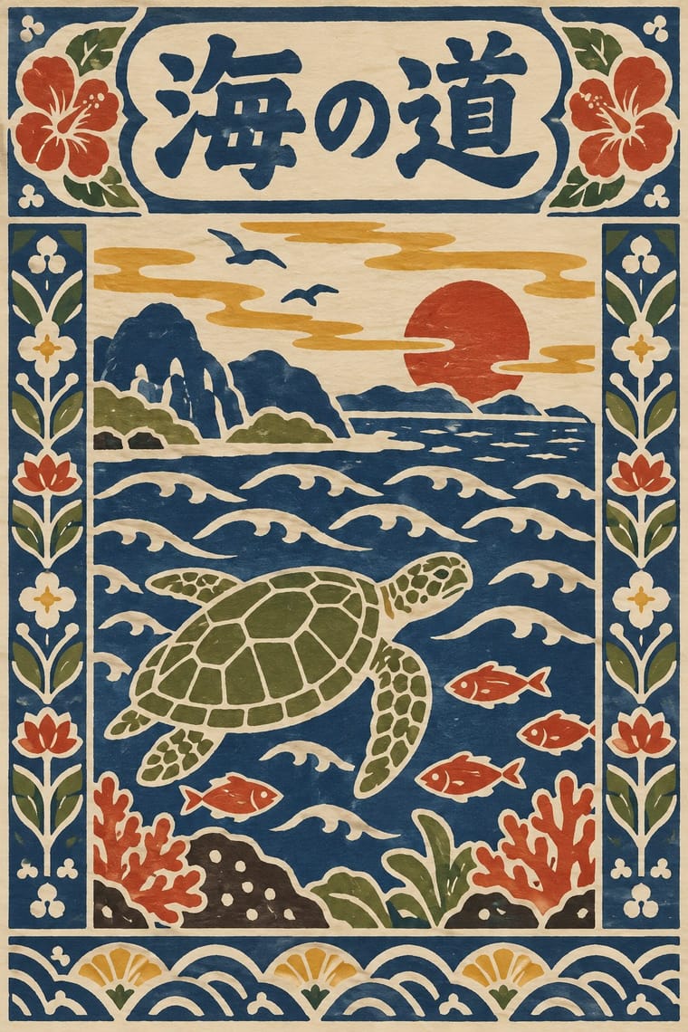
Finnish Bold Print (Marimekko Modernism)
Finnish Bold Print is one of Festival of Britain 'Contemporary' Pattern’s nearest styles by choices; no real work of either fits the other better.
Choices that tell Festival of Britain 'Contemporary' Pattern and Finnish Bold Print apart Choice Festival of Britain 'Contemporary' Pattern Finnish Bold Print Line illustration defining — Analogous harmony — characteristic Earth & mineral characteristic — Monochrome — characteristic Squiggles & confetti characteristic — No shared descent in the atlas: they reached these choices separately.
-
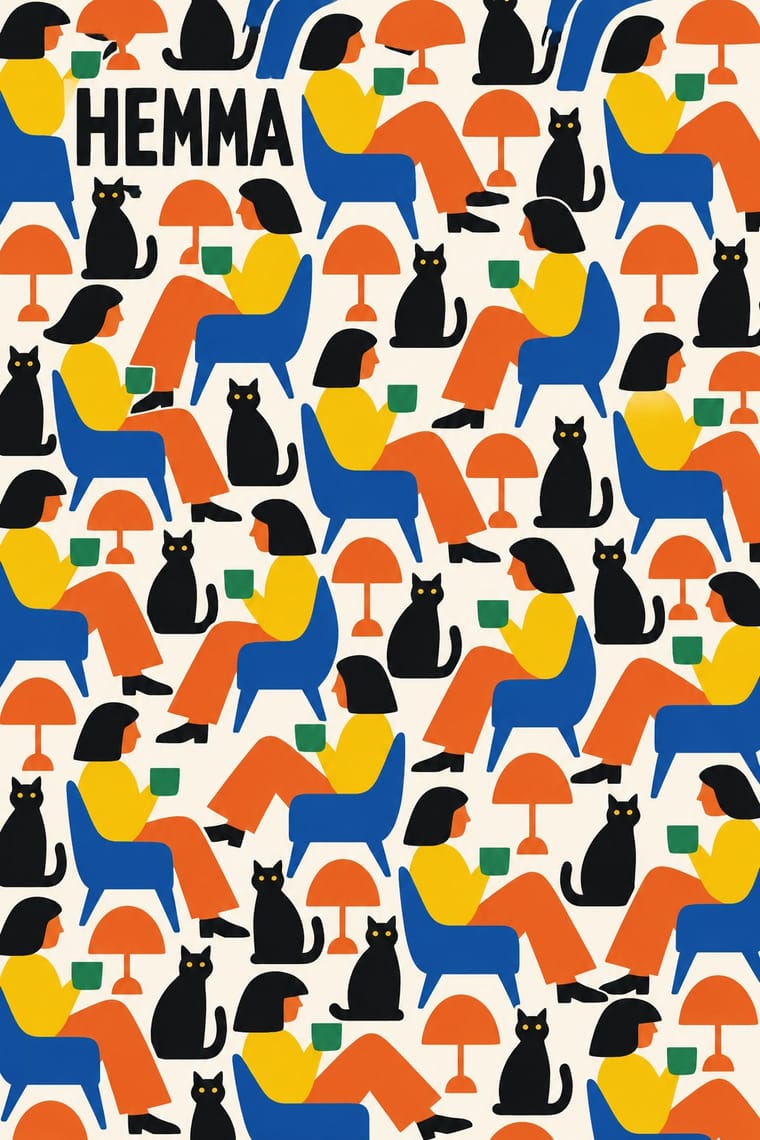
minä perhonen (Hand-Drawn Textile Graphics, Akira Minagawa)
minä perhonen is one of Festival of Britain 'Contemporary' Pattern’s nearest styles by choices; no real work of either fits the other better.
Choices that tell Festival of Britain 'Contemporary' Pattern and minä perhonen apart Choice Festival of Britain 'Contemporary' Pattern minä perhonen Non-representational defining — Stylised figuration occasional defining Line illustration defining occasional Analogous harmony — characteristic Geometric primitives characteristic — No shared descent in the atlas: they reached these choices separately.
-
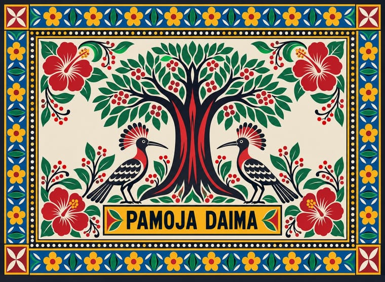
Serizawa Katazome and Mingei Stencil-Dye Graphics
Serizawa Katazome and Mingei Stencil-Dye Graphics is one of Festival of Britain 'Contemporary' Pattern’s nearest styles by choices; no real work of either fits the other better.
Choices that tell Festival of Britain 'Contemporary' Pattern and Serizawa Katazome and Mingei Stencil-Dye Graphics apart Choice Festival of Britain 'Contemporary' Pattern Serizawa Katazome and Mingei Stencil-Dye Graphics Non-representational defining — Framed panels — defining Painterly brushwork occasional avoids Stylised figuration occasional defining Line illustration defining occasional No shared descent in the atlas: they reached these choices separately.
-
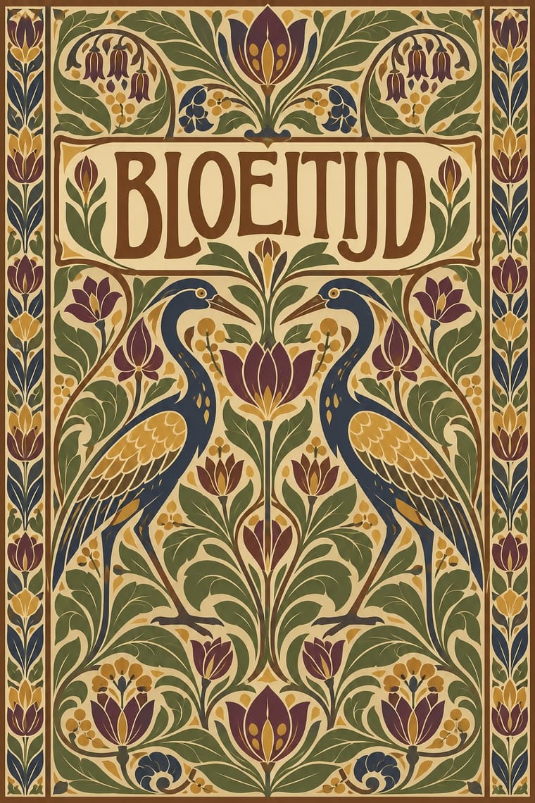
10-gruppen (Tiogruppen) Printed Textiles
10-gruppen Printed Textiles is one of Festival of Britain 'Contemporary' Pattern’s nearest styles by choices; no real work of either fits the other better.
Choices that tell Festival of Britain 'Contemporary' Pattern and 10-gruppen Printed Textiles apart Choice Festival of Britain 'Contemporary' Pattern 10-gruppen Printed Textiles Floral & vegetal characteristic avoids Stylised figuration occasional defining Biomorphic curves defining — Full polychrome — characteristic Painterly brushwork occasional avoids No shared descent in the atlas: they reached these choices separately.
— means the choice isn’t among the style’s recorded choices. Critics recorded each work’s choices with the styles’ descriptions in view, so this shows whether the descriptions hold together, not proof that they are right.
06
Combine it with
Styles Festival of Britain 'Contemporary' Pattern (Lucienne Day and the Festival Pattern Group) pairs well with or plays against, from the research. Each is worked out as a combination: which style gives the type, the colours and the forms.
- UPA & Cartoon Modern Pairs well · Both draw a spindly, child-like modern line in flat colour; put a UPA figure in front of a Contemporary repeat for a full 1950s scene.
- Finnish Bold Print (Marimekko Modernism) Contrasts · Same decade, same screen-printed furnishing cloth, but Marimekko fills one huge silhouette where Day scatters small shapes on thin lines; compare to see what scale does to a repeat.
- Thaw Modernism (Soviet and Czechoslovak) Pairs well · Thaw graphics share the light utopian line and flat pastel shapes; its stylised figures and stars give the repeat a narrative accent.
- Googie & Atomic Age Contrasts · Both are atomic-age optimism, but Googie shouts from roadside signs in neon and boomerangs while this stays a quiet domestic pattern in earth tones.
- Surrealist Graphics Pairs well · Borrow a Miró-like biomorphic blob or floating sign to push a Contemporary repeat further toward painting.
- NK Textilkammare Geometric Print (Astrid Sampe, Signerad Textil) Pairs well · The British contemporary prints of the same years share screen-printed, all-over repeats in limited flat colour; borrow their spindly drawn line for a lighter variant of a ruled NK stripe.
07
Sources
- Victoria and Albert Museum, Lucienne Day, design for 'Calyx', 1951: https://collections.vam.ac.uk/item/O85223/
- Victoria and Albert Museum, Lucienne Day, 'Graphica' furnishing fabric, Heal & Son, 1953: https://collections.vam.ac.uk/item/O110353/
- Victoria and Albert Museum, Lucienne Day, 'Provence' wallpaper, John Line & Sons, 1951: https://collections.vam.ac.uk/item/O228597/
- Victoria and Albert Museum, S. M. Slade, 'Afwillite 8.45' dress fabric, British Celanese, 1951: https://collections.vam.ac.uk/item/O69642/
- Victoria and Albert Museum, William J. Odell, afwillite wallpaper, John Line & Sons, 1951: https://collections.vam.ac.uk/item/O75789/
- Wikipedia, Lucienne Day: https://en.wikipedia.org/wiki/Lucienne_Day
- Wikipedia, Festival of Britain: https://en.wikipedia.org/wiki/Festival_of_Britain
- Robin and Lucienne Day Foundation, Lucienne Day in the 1950s: https://robinandluciennedayfoundation.org/lives-and-designs/1950s/lucienne-day-br-1950s
- Lesley Jackson, From Atoms to Patterns: Crystal Structure Designs from the 1951 Festival of Britain (Richard Dennis, 2008), cited by the V&A
How Stylogeny researches and checks a style: where the facts come from.