Style combination · Pairs well
Festival of Britain 'Contemporary' Pattern × Surrealist Graphics
Borrow a Miró-like biomorphic blob or floating sign to push a Contemporary repeat further toward painting.
Mix them and make something Festival of Britain 'Contemporary' Pattern Surrealist Graphics
01
What each style brings
Each part of the design comes from the style with the stronger say in it, and each style gives at least two.
Festival of Britain 'Contemporary' Pattern (Lucienne Day and the Festival Pattern Group) Surrealist Graphics
- Type from Surrealist Graphics
- Colour from Festival of Britain 'Contemporary' Pattern
- Form from Festival of Britain 'Contemporary' Pattern
- Composition from Festival of Britain 'Contemporary' Pattern
- Surface from Surrealist Graphics
-
02
The type
Open fonts standing in for each style’s own type, which is often hand-drawn or commercial.
Display · Surrealist Graphics
Yay!
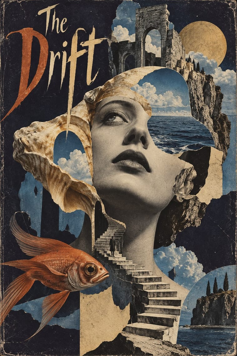
Gloock; Surrealist Graphics used Artists' hand-lettered mastheads and Didone and Victorian display faces lifted from 19th-century catalogues
Text · Festival of Britain 'Contemporary' Pattern
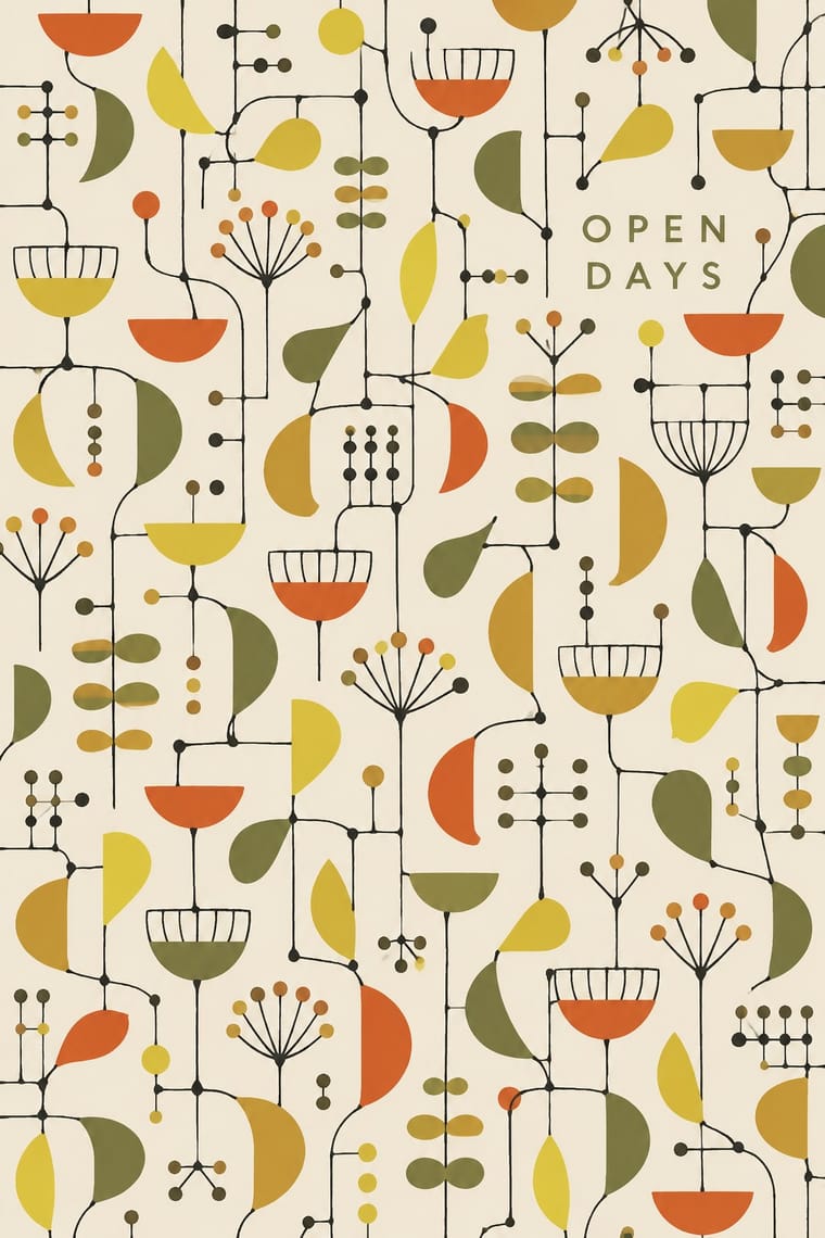
The post-war British pattern language launched at the 1951 Festival of Britain. Lucienne Day's 'Calyx' for Heal's replaced the revived Victorian floral with spindly lines linking small cup and seedpod shapes, after Klee, Miró and Calder, while the Festival Pattern Group turned X-ray crystal-structure diagrams into wallpapers, dress fabrics and furnishings. Screen-printed in a few flat inks on olive, ochre or white grounds, it set the light 'Contemporary' look of British homes through the 1950s; in the 1960s Day turned to brighter colours and simpler forms.
Jost; Festival of Britain 'Contemporary' Pattern used Festival display lettering used alongside the patterns (posters, catalogues, signs), not in the repeats and Festival display lettering used alongside the patterns, not in the repeats
03
The colours
The ground and leading colours come from Festival of Britain 'Contemporary' Pattern, with a counter-accent from Surrealist Graphics. The ink reads on the ground at 4.5:1 or more.
Festival of Britain 'Contemporary' Pattern (Lucienne Day and the Festival Pattern Group) Surrealist Graphics
-
#f1ece0ground · 36% -
#1b1a17ink · 14% -
#d4532aaccent · 18% -
#a24a2aaccent · 14% -
#e6cf3eaccent · 10% -
#d8b77aaccent · 8%
As CSS
:root {
  --ground: #f1ece0;
  --ink: #1b1a17;
  --accent-1: #d4532a;
  --accent-2: #a24a2a;
  --accent-3: #e6cf3e;
  --accent-4: #d8b77a;
  --font-display: "Gloock", serif;
  --font-text: "Jost", sans-serif;
}
04
The two styles
05
More combinations
With Festival of Britain 'Contemporary' Pattern
- UPA & Cartoon Modern Pairs well · Both draw a spindly, child-like modern line in flat colour; put a UPA figure in front of a Contemporary repeat for a full 1950s scene.
- Finnish Bold Print (Marimekko Modernism) Contrasts · Same decade, same screen-printed furnishing cloth, but Marimekko fills one huge silhouette where Day scatters small shapes on thin lines; compare to see what scale does to a repeat.
- Thaw Modernism (Soviet and Czechoslovak) Pairs well · Thaw graphics share the light utopian line and flat pastel shapes; its stylised figures and stars give the repeat a narrative accent.
- Googie & Atomic Age Contrasts · Both are atomic-age optimism, but Googie shouts from roadside signs in neon and boomerangs while this stays a quiet domestic pattern in earth tones.
- NK Textilkammare Geometric Print (Astrid Sampe, Signerad Textil) Pairs well · The British contemporary prints of the same years share screen-printed, all-over repeats in limited flat colour; borrow their spindly drawn line for a lighter variant of a ruled NK stripe.
With Surrealist Graphics
- Corporate Identity Modernism Contrasts · Place a single dream image inside a strict corporate grid; the calm system heightens the strangeness.
- Isotype Pictorial Statistics Contrasts · Isotype's one-symbol-one-meaning is the antithesis of Surrealist ambiguity; decide whether the viewer should decode or be disturbed.
- Psychedelic Poster Pairs well · Psychedelic posters revived Surrealist dream imagery; combine them for hallucinatory figurative work with melting forms.
- Polish Poster School Pairs well · Polish poster artists fused Surrealist metaphor with painterly lettering; borrow the method for cultural posters built on one uncanny image.
- Post-Punk Record Sleeve (Stiff, Factory, 4AD) Pairs well · Vaughan Oliver drew on Dalí and Surrealism; add an uncanny juxtaposition to a blurred, textured 23 Envelope photograph for a dream-like sleeve.
- Brodovitch Editorial Design (Harper's Bazaar) Pairs well · Take its isolated body parts, torn edges and dreamlike juxtaposition, but apply them to the photographic spread.
- AIZ Political Photomontage (Heartfield) Pairs well · Surrealist photography also makes the impossible look photographed; take its dream logic when a brief needs strangeness, and add the AIZ headline and caption when that strangeness has to land a political point.
- Emblem Book (Motto, Picture & Epigram) Pairs well · Both find meaning in the gap between a picture and the words beside it; pair a framed, uncanny object with a terse motto above and a short verse below for an editorial series that asks to be decoded.