Space & hierarchy · Density
Measured density
Moderate, even density with clear breathing room.
A design choice in Stylogeny’s vocabulary, under space & hierarchy: how is attention distributed?
- styles make it
- 76
- as a defining choice
- 2
- as a usual one
- 60
- now and then
- 14
- avoid it
- 1
Styles defined by it 2
For these styles it is one of the choices that make the style.
- German Book Art Movement (Buchkunstbewegung)The German reform of the book, from the magazine Pan (1895) to the private presses that ended around 1933.
Contemporary Arabic & Dual-Script Type DesignA twenty-first-century type culture that redraws Arabic as a family matched to a Latin companion in weight, proportion and contrast, so the two scripts can share a page, screen or sign as equals.
Styles that often use it 60
A characteristic choice: usual in these styles, though not essential.
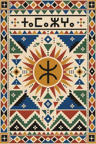
Amazigh Sign System & TifinaghThe visual language shared by Amazigh communities from the Rif, Atlas and Kabylie to the Aurès and the Tuareg Sahara.
- Ethiopian Ge'ez Manuscript & Haräg IlluminationThe manuscript art of the Ethiopian and Eritrean Orthodox Tewahedo Church, written in the Ge'ez syllabary on parchment from the Garima Gospels (radiocarbon-dated to roughly the 4th–7th centuries) to the present.
- Maghrebi Script (Maghribi Calligraphy of al-Andalus and North Africa)The family of Arabic scripts of al-Andalus and North Africa, descended from early Kufic bookhands.
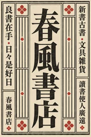
Song–Ming Woodblock Book Typography (Songti / Mincho)The page and letter of the East Asian book.
- Persian Nastaʿlīq Calligraphy (Qiṭʿa, Chalipa and Siyāh-mashq)The 'hanging' script of Persian poetry and an art of the single sheet.
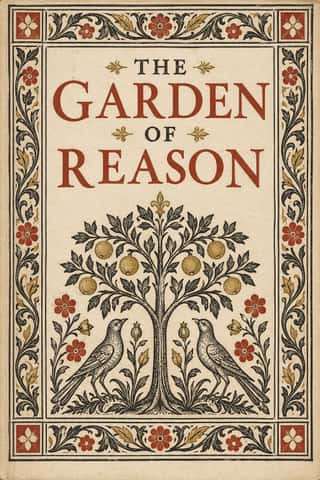
Renaissance Book TypographyThe printed book as shaped by humanist Italy and France: roman and italic types modelled on humanist handwriting, a single justified text block set in harmonious proportions within generous margins, and woodcut initials, borders and printer's devices as the only ornament.
Emblem Book (Motto, Picture & Epigram)A European book genre in which, from Chrestien Wechel's Paris edition of 1534 on, every page or opening repeats one fixed unit: a short motto, an allegorical picture and an explanatory verse, which only together yield a moral, amorous or religious meaning.
- Đông Hồ & Hàng Trống Folk PrintsVietnam's two classic folk-print schools, bought for Tết. Đông Hồ families press each colour from its own carved block onto giấy điệp, dó paper brushed with ground scallop shell whose streaked, faintly sparkling surface serves as the white, and print the black line last.
- Sápmi Graphic Identity (Duodji & Gákti Colour Code)Duodji is Sámi handicraft: hard work in wood, horn and bone, soft work in skin and cloth; drums painted with alder-bark figures survive from the 17th and 18th centuries.
Tarot de Marseille Woodcut CardsThe standard pattern of French tarot cards, descended from Milanese tarot and recut by card-makers in Paris, Lyon, Avignon, Dijon and Marseille from the 17th century.
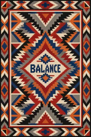
Diné (Navajo) Weaving DesignThe tapestry-woven design tradition of Diné (Navajo) weavers, recorded in Spanish sources from the early 18th century.
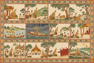
Burmese Parabaik Painting (Konbaung Folding Books)Painted Burmese folding books of the Konbaung court and its monasteries.
Neoclassical Book TypographyThe Enlightenment book stripped of Renaissance woodcut decoration.
Imagerie d'Épinal & European BilderbogenCheap single-sheet popular prints sold by pedlars across 19th-century Europe, led by the Pellerin imagerie at Épinal and the Neuruppin Bilderbogen.
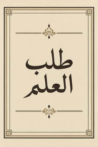
Bulaq (Amiriyya) Naskh Book PrintingThe page of the Arabic printed book as Egypt's state press at Bulaq shaped it from 1822: justified blocks of black Naskh type on pale paper, often boxed in a ruled frame, with an ornamental headpiece on the opening page, headings set larger or in a second script such as Nastaʿlīq, and almost no pictures.
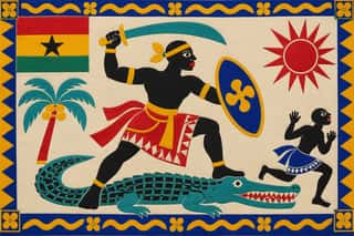
Fante Asafo Flags (Frankaa)The company flags (frankaa) of the Fante asafo, the old warrior companies of Ghana's central coast, widely adopted from the mid-nineteenth century.
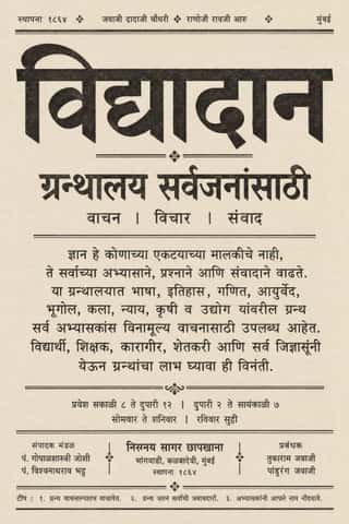
Nirnaya Sagar Devanagari Typography (Bombay Metal Type)Devanagari as Javaji Dadaji's Bombay type foundry (1864) and Nirnaya Sagar Press (1869) cut and printed it: upright metal type with a strong headline, cut with the punch-cutter Ranoji Aru, and enough conjunct and 'Akhand' sorts to set Sanskrit, Vedic accents and Marathi whole.
- Norwegian and Finnish National Romantic Graphics (Munthe & Karelianism)The flat, decorative branch of Norway's and Finland's national romanticism, which turned Viking carving, the sagas, the Kalevala and old peasant weaving into modern ornament.
Simplicissimus Satirical Style (Munich)The house style of the Munich satirical weekly Simplicissimus, set by Th.
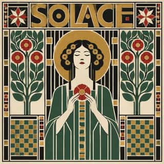
Vienna SecessionThe Viennese break with academic art led by Gustav Klimt, Koloman Moser, Josef Hoffmann and Alfred Roller, which pulled Art Nouveau toward the square, the grid and the flat plane.
Mir iskusstva Book ArtThe graphic idiom of the St Petersburg World of Art circle (journal 1898–1904, exhibitions until Paris 1927) and the book artists around it.
- London Transport DesignThe design programme Frank Pick built for London's Underground from 1908 and the London Passenger Transport Board (1933–40), continued by Harold Hutchison (1947–66).
- Taishō Roman & Lyrical IllustrationThe lyrical illustration (jojōga) of late-Meiji to early-Shōwa Japan, led by Takehisa Yumeji: willowy, large-eyed women in kimono drawn with an Art Nouveau contour, set among camellias and kimono patterns and lettered by hand.
De StijlA Dutch movement formed around Theo van Doesburg's journal De Stijl and Piet Mondrian's Neoplasticism, which sought universal harmony through the most elementary means: horizontal and vertical lines, rectangles, the three primaries and black, white and grey.
Wendingen & Amsterdam School TypographyThe graphic language of Wendingen (1918–1932), monthly of the Amsterdam architects' society Architectura et Amicitia, and its editor H.
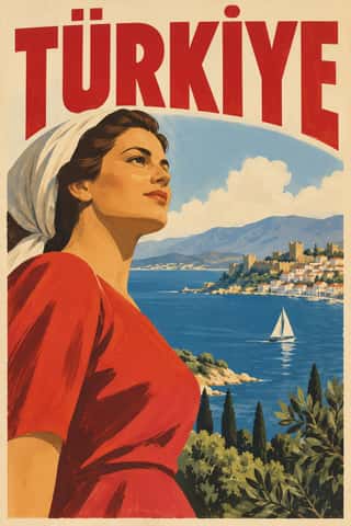
Early Turkish Republican Graphic DesignThe pictorial poster, label and ticket art of the young Turkish Republic, led by İhap Hulusi Görey after his Munich training in Ludwig Hohlwein's orbit, with Münif Fehim Özarman and, after 1943, Kenan Temizan.
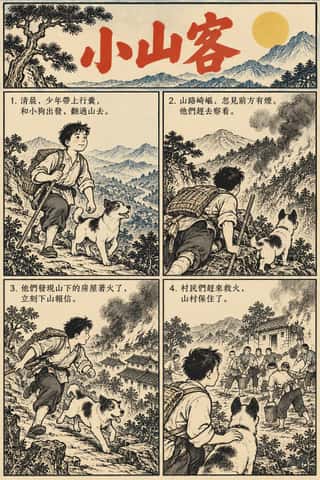
Lianhuanhua Picture-Story BooksPalm-sized Chinese picture books, about three by five inches, that tell a novel, opera, film or revolutionary story in hundreds of single framed drawings, one to a page, each with a short caption.
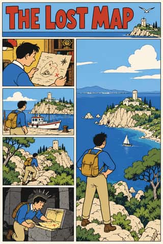
Ligne Claire (Franco-Belgian Clear Line)The comic drawing style of Hergé's Tintin and the Brussels school, named 'klare lijn' by Joost Swarte in 1977.
Scandinavian FunctionalismNordic functionalism (funkis) arrived in graphic form with Sigurd Lewerentz's posters and winged emblem for the 1930 Stockholm Exhibition.
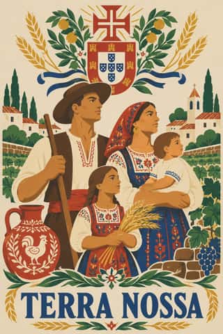
Estado Novo Folk Modernism (SPN)The official image of Salazar's Estado Novo, shaped by António Ferro's Secretariado de Propaganda Nacional (SPN, 1933; SNI from 1944).
Penguin Paperback Design (Three Bands to the Marber Grid)The cover system of Penguin Books, London, from 1935 until Germano Facetti left in 1972.
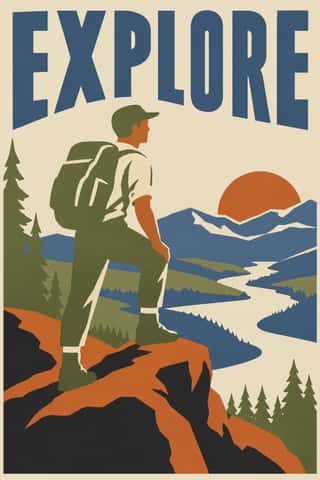
WPA Silkscreen PostersPosters made by the Federal Art Project of the Works Progress Administration to promote health campaigns, education, theatre, travel and the national parks during the Depression.
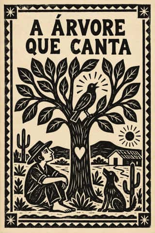
Literatura de Cordel WoodcutThe cover art of Brazil's literatura de cordel, pocket chapbooks of verse whose single picture is a small woodcut cut in soft umburana wood and printed in black above a plain letterpress title.
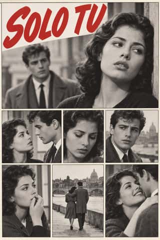
Fotoromanzo (Italian Photo-Romance)The photo-romance of the Italian women's weeklies: a melodrama told in staged photographs, first printed by Il mio sogno and Bolero Film in May 1947 and copied from France to Brazil.
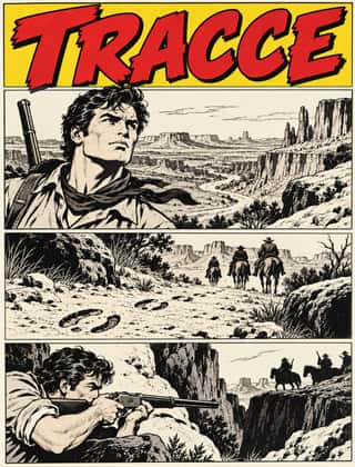
Bonelli Fumetto (Italian Popular Adventure Comics)The house format of Milan's Bonelli publishing house and its imitators (Tex, Zagor, Dylan Dog, Nathan Never): monthly newsstand paperbacks of 16 x 21 cm with about a hundred black-and-white pages, each a long episode of a serial hero.
Finnish Bold Print (Marimekko Modernism)The printed-cotton modernism of Marimekko, founded in Helsinki in 1951 by Armi and Viljo Ratia out of Viljo's printing firm Printex.
HfG Ulm Systematic DesignThe Hochschule für Gestaltung Ulm (1953–1968) was founded as the successor to the Bauhaus.
Push Pin StyleThe eclectic illustrative style of New York's Push Pin Studios, founded by Seymour Chwast, Milton Glaser and Edward Sorel.
Arab Children's Comic Magazines (Samir to Majid)Arabic children's comics weeklies, from Dar al-Hilal's Samir in Cairo (1956) to Abu Dhabi's Majid (1979), mixing translated Western strips with house characters by Egyptian, Lebanese, Armenian and European artists.
- Casablanca School Graphic ModernismA postcolonial modernism formed at the Casablanca fine-art school under Farid Belkahia, where Mohamed Melehi, Mohammed Chabâa and colleagues set Amazigh rugs and jewellery, painted ceilings and calligraphy beside a Bauhaus-style merging of art, craft and design.
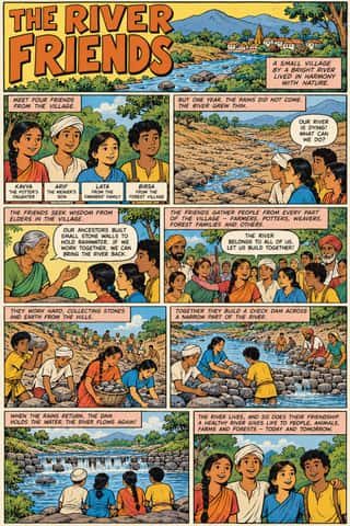
Amar Chitra Katha ComicsThe Bombay comic-book series that from 1967 retold Hindu myth and epic, Buddhist and Jain tales, saints, folk legends, the jests of the court wits Birbal and Tenali Raman, and Indian history for children, in English and Indian languages, with well over 500 titles by the early 1990s.
- Roots Reggae Sleeve Art & Rasta IconographyThe record sleeves of roots reggae, from Catch a Fire (1973) until dancehall took over in the 1980s.
- Madinah Mushaf (King Fahd Complex Qur'an Page)One fixed page for the Qur'an across much of the Muslim world: Uthman Taha's fully vowelled Naskh in fifteen justified lines, written so that every page ends at the end of a verse (the late Ottoman âyet-berkenar layout), inside a floral frame, with sura titles in framed cartouches and verse numbers in small round medallions.
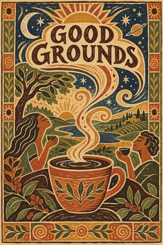
Global Village CoffeehouseThe faux-naive, earth-toned illustration style that late-1980s American designers set against Memphis, and that chain cafés, bookstores, packaging and clip art spread through the 1990s.
L'Association and French Alternative ComicsThe black-and-white auteur comics of L'Association, the Paris publisher founded by seven cartoonists in 1990, and the 1990s small-press scene it led.
Skeuomorphic UIInterface design that imitates physical materials and objects (stitched leather, linen, wooden shelves, brushed aluminium, felt, paper and glass) so that digital tools look and behave like their real-world counterparts.
- Frutiger AeroThe glossy, optimistic look of consumer technology from the mid-2000s to the early 2010s, retrospectively named in 2017 by the Consumer Aesthetics Research Institute after Windows Vista's Aero interface and Adrian Frutiger's humanist sans.
Hipster Artisanal RevivalThe trade-mark look of the 2007–2018 craft boom, which dressed new coffee roasters, breweries and stationers as nineteenth- and early-twentieth-century firms.
Risograph & Indie Print CultureA contemporary culture of zines, art books, posters and prints made on Japanese Risograph stencil duplicators, whose soy-based spot inks (fluorescent pink, yellow, blue, teal) are laid down one drum at a time.
Newsroom Data Graphics & ScrollytellingThe house style of newspaper graphics desks since about 2009–2011 (the New York Times graphics desk, D3.js, the Guardian Datablog): conventional charts drawn from the data, on a white or pale paper ground with light grey gridlines and no axis titles, lines labelled directly in place of a legend where possible and short annotations saying what to look at.
Flat DesignAn interface and illustration language that stripped screens of simulated materials, replacing bevels, gloss and textures with solid fields of colour, clean sans-serif type and reduced pictograms.
DTC 'Blanding' / Millennial MinimalismThe friendly, frictionless minimalism of 2010s direct-to-consumer start-ups, built for the phone screen, the Instagram feed and the unboxing.
GOV.UK Design (GDS Style)The text-led design of GOV.UK, the UK government's single website, built by the Government Digital Service from 2012 and codified in the GOV.UK Design System (2018).
Material DesignGoogle's design system, launched in 2014, which reintroduced controlled depth to flat design through the metaphor of 'material': sheets of digital paper and ink that sit at defined elevations, cast consistent shadows and move with meaningful motion.
- Lo-fi Anime AestheticThe look of YouTube's 24/7 lo-fi hip hop streams.
Newtro (Korean New-Retro)A South Korean branding trend, named 'Going New-tro' in Seoul National University's Trend Korea 2019 (October 2018), in which heritage firms reissue their own postwar to 1990s labels, trademarks and mascots, polished for young buyers.
Post-Binary Typography (Bye Bye Binary and Inclusive French Type)A Franco-Belgian type practice that redesigns written French for gender inclusion inside the word.
GlassmorphismAn interface style of translucent, frosted panels floating over vivid, blurred backgrounds, so that depth and hierarchy come from layered transparency.
Instagram Slideshow Activism (Social-Justice Infographics)The text-led explainer slideshows that filled Instagram after George Floyd's murder in May 2020.
- Neo-BrutalismA friendly, commercial descendant of web brutalism that keeps its blunt boxes but adds candy colour: thick black outlines, hard unblurred offset shadows, flat saturated fills and chunky sans-serif type on conventional, usable layouts.
Styles that use it now and then 14
An occasional choice in these styles.
- Chinese Calligraphy & Seal Carving (Shufa & Zhuanke)c. 0–present
- Lotería Card Imagery (Mexican Lotería)1887–present
- Glasgow Style1890–1914
- Senegalese Sufi Devotional Imagery (Souwère Glass Painting and Amadou Bamba Portraits)1900–present
- Arnhem Land Bark Painting & Rarrk1912–present
- Amazonian Boat Lettering (Abridores de Letras)1925–present
- Cairo–Beirut Arab Modernist Book & Periodical Design1952–1990
- Vicente Rojo & Mexican Editorial Modernism1953–1990
- Roman-like Thai Typography (modern loopless Thai)1973–present
- Lebanese Civil War Party Poster1975–1990
- Bitmap & Pixel Graphics1977–1995
- City Pop Illustration1979–present
- Natural Wine Label Art2007–present
- Corporate Memphis2017–present
It often goes with
Choices that the styles making it make more often than the atlas as a whole.
- Warm & approachablein 40 of 76
- Light groundin 64 of 76
- Restrained accentsin 48 of 76
- Framed panelsin 52 of 76
- Borders & framesin 41 of 76
- Authoritative & institutionalin 35 of 76