Style combination · Contrasts
Festival of Britain 'Contemporary' Pattern × Googie
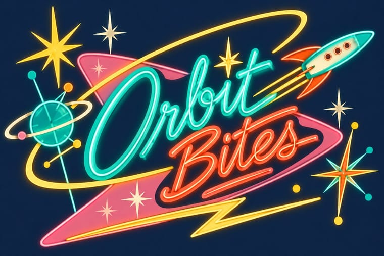
Both are atomic-age optimism, but Googie shouts from roadside signs in neon and boomerangs while this stays a quiet domestic pattern in earth tones.
Mix them and make something Festival of Britain 'Contemporary' Pattern Googie
01
What each style brings
Each part of the design comes from the style with the stronger say in it, and each style gives at least two.
Festival of Britain 'Contemporary' Pattern (Lucienne Day and the Festival Pattern Group) Googie & Atomic Age
- Type from Googie
- Colour from Festival of Britain 'Contemporary' Pattern
- Form from Googie
- Composition from Festival of Britain 'Contemporary' Pattern
- Surface from Festival of Britain 'Contemporary' Pattern
02
The type
Open fonts standing in for each style’s own type, which is often hand-drawn or commercial.
Text · Festival of Britain 'Contemporary' Pattern
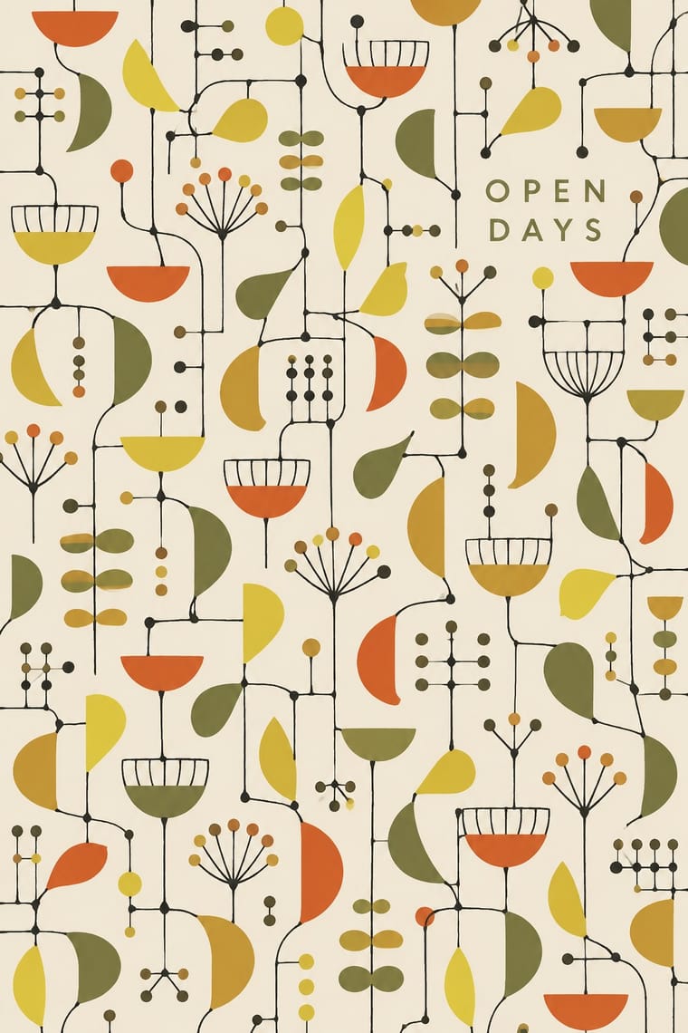
The post-war British pattern language launched at the 1951 Festival of Britain. Lucienne Day's 'Calyx' for Heal's replaced the revived Victorian floral with spindly lines linking small cup and seedpod shapes, after Klee, Miró and Calder, while the Festival Pattern Group turned X-ray crystal-structure diagrams into wallpapers, dress fabrics and furnishings. Screen-printed in a few flat inks on olive, ochre or white grounds, it set the light 'Contemporary' look of British homes through the 1950s; in the 1960s Day turned to brighter colours and simpler forms.
Jost; Festival of Britain 'Contemporary' Pattern used Festival display lettering used alongside the patterns (posters, catalogues, signs), not in the repeats and Festival display lettering used alongside the patterns, not in the repeats
03
The colours
The ground and leading colours come from Festival of Britain 'Contemporary' Pattern, with a counter-accent from Googie. The ink reads on the ground at 4.5:1 or more.
Festival of Britain 'Contemporary' Pattern (Lucienne Day and the Festival Pattern Group) Googie & Atomic Age
-
#f1ece0ground · 36% -
#1b1a17ink · 14% -
#d4532aaccent · 18% -
#e6cf3eaccent · 14% -
#c18f32accent · 10% -
#6b6b3aaccent · 8%
As CSS
:root {
  --ground: #f1ece0;
  --ink: #1b1a17;
  --accent-1: #d4532a;
  --accent-2: #e6cf3e;
  --accent-3: #c18f32;
  --accent-4: #6b6b3a;
  --font-display: "Yellowtail", cursive;
  --font-text: "Jost", sans-serif;
}
04
The two styles
05
More combinations
With Festival of Britain 'Contemporary' Pattern
- UPA & Cartoon Modern Pairs well · Both draw a spindly, child-like modern line in flat colour; put a UPA figure in front of a Contemporary repeat for a full 1950s scene.
- Finnish Bold Print (Marimekko Modernism) Contrasts · Same decade, same screen-printed furnishing cloth, but Marimekko fills one huge silhouette where Day scatters small shapes on thin lines; compare to see what scale does to a repeat.
- Thaw Modernism (Soviet and Czechoslovak) Pairs well · Thaw graphics share the light utopian line and flat pastel shapes; its stylised figures and stars give the repeat a narrative accent.
- Surrealist Graphics Pairs well · Borrow a Miró-like biomorphic blob or floating sign to push a Contemporary repeat further toward painting.
- NK Textilkammare Geometric Print (Astrid Sampe, Signerad Textil) Pairs well · The British contemporary prints of the same years share screen-printed, all-over repeats in limited flat colour; borrow their spindly drawn line for a lighter variant of a ruled NK stripe.
With Googie
- Y2K Futurism Pairs well · Both sell a glossy future; add Googie starbursts and orbit lines to Y2K chrome for retro-futurism that spans both millennia.
- HfG Ulm Systematic Design Contrasts · Ulm's anti-styling functionalism is its sober opposite; use the contrast to calibrate how much showmanship a brand can bear.
- Hand-Painted Signage & Vernacular Lettering Pairs well · Pair Googie forms with sign-painter scripts and shaded lettering for convincing diner, motel and bowling-alley signage.
- Memphis Design Pairs well · Memphis revived its boomerangs and squiggles; mix the two for a playful atomic-meets-postmodern pattern system.
- City Pop Illustration Pairs well · Googie's motels, diners and boomerang roadside signs are the American architecture these painters idealised; borrow its signage and script for the fascias in a city pop street scene.
- Polish Cold War Neon (PRL Neonisation) Contrasts · Googie sold motels and coffee shops to passing drivers with starbursts, boomerangs and swept-back sign panels; the Polish signs answered to state planners rather than to passing trade and kept to a script name and a line figure on a modernist block. Borrow googie's bounce when a Polish-style sign feels too polite.
- Art Deco Pairs well · Googie's atomic starbursts extend Deco's celestial ornament; mix them for retro hospitality and signage.
- Streamline Moderne Pairs well · Googie is Streamline's post-war heir; combine their curves and speed lines for retro diner, travel or automotive branding.