Rational modernism · 1995–present · East Asia, Northern Europe
minä perhonen (Hand-Drawn Textile Graphics, Akira Minagawa)
Also known as minä perhonen, mina perhonen, minä (1995–2003), Tambourine pattern
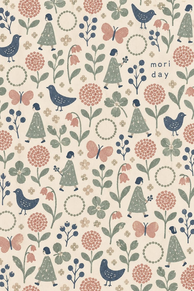
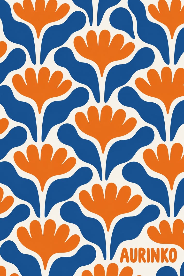
A Tokyo label's textile graphics in which small hand-drawn birds, butterflies, forests and rings are repeated in loose, quiet rows, often embroidered so the stitching stays visible. It takes up the Nordic everyday ideal of Finnish bold print but reverses its scale: small embroidered hand marks, delicate and densely repeated, against one huge flat screen-printed motif in strong colour. The lineage from Finnish bold print is loose; the craft is Japanese and hand-made.
Make something in this style Get advice in this style Mix it with another style
01
How it works
- Start every motif as a hand drawing and keep its wobble instead of tidying it into geometry.
- Repeat small figures such as birds, butterflies, flowers and rings across the whole cloth in loose rows.
- Render pattern in embroidery or fine print so the hand and stitching show.
- Limit colour to one or two muted tones on a soft ground.
- Keep presentation calm, with plain wool or cotton grounds.
Tokyo: the label minä (1995–2003) was renamed minä perhonen ('I, butterfly' in Finnish) in 2003, making clothing and interiors from textile designs drawn by Akira Minagawa and in-house designer Keiko Tanaka, under the concept of "special ordinary clothing"; the embroidered tambourine motif was first released in 2000.
02
Its design choices
From Stylogeny’s vocabulary of design choices: defining choices make the style, characteristic ones are usual, occasional ones turn up now and then.
- Layout & composition
- Space & hierarchy
- Colour
- Form & shape
- Surface & texture
- Medium & production
- Avoids
- Fluorescent & neon, Gradients, Gloss & highlights, Illusion of depth, Straight photography, Optical pattern, Ironic & self-aware, Agitational & persuasive, Rectilinear
Palette
-
#f1ece2 -
#d9cfc0 -
#9aa7a0 -
#c98f86 -
#3f4a5a
Typefaces
-
Lowercase sans-serif wordmark
minä perhonen
-
No signature typeface; the pattern, not the type, carries the style
Known for
-
Akira Minagawa, 'tambourine' embroidered ring pattern
first released 2000; Kvadrat Tambourine on Nanna Ditzel's Hallingdal, 2006
-
Exhibition 'minä perhonen / minagawa akira TSUZUKU', Museum of Contemporary Art Tokyo, 16 Nov 2019 – 16 Feb 2020
in-house designer Keiko Tanaka credited
-
minä perhonen / minagawa akira
Tsuzuku (Seigensha, 2020)
03
Make something in this style
Say what you need, and Stylogeny’s image studio draws it from minä perhonen (Hand-Drawn Textile Graphics, Akira Minagawa)’s design choices and checks it against them. It takes about a minute, and you get a link to share.
04
Where it comes from, and what it’s close to
Before it
The style it grew out of, and the styles it borrowed from.
After it
The styles that grew out of it.
No later style in the atlas grew out of it yet.
Alike in its design choices
Styles that make many of the same choices, related or not, besides those above.
-
-
-
-
-
-
05
Often taken for
minä perhonen has no real works recorded yet, so these are its nearest styles by its choices alone, with the choices that tell them apart.
-
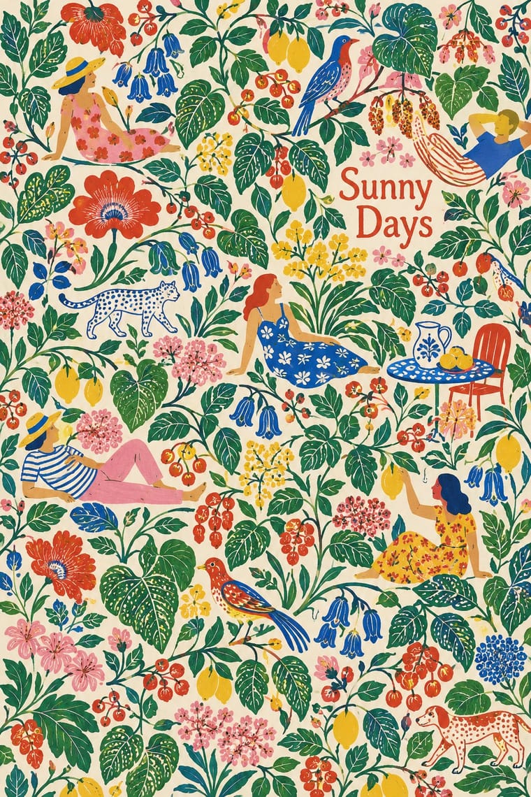
Finnish Bold Print (Marimekko Modernism)
Finnish Bold Print is one of minä perhonen’s nearest styles by choices; no real work of either fits the other better.
Choices that tell minä perhonen and Finnish Bold Print apart Choice minä perhonen Finnish Bold Print Stylised figuration defining occasional Rectilinear avoids characteristic Calm & contemplative defining — Monochrome — characteristic Non-representational — characteristic minä perhonen descends from Finnish Bold Print: a shared line, so the likeness is inherited.
-
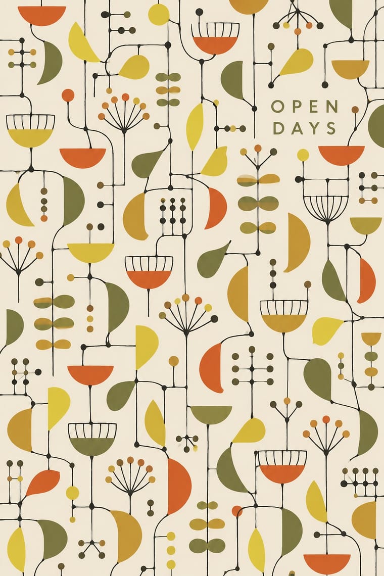
Festival of Britain 'Contemporary' Pattern (Lucienne Day and the Festival Pattern Group)
Festival of Britain 'Contemporary' Pattern is one of minä perhonen’s nearest styles by choices; no real work of either fits the other better.
Choices that tell minä perhonen and Festival of Britain 'Contemporary' Pattern apart Choice minä perhonen Festival of Britain 'Contemporary' Pattern Stylised figuration defining occasional Non-representational — defining Analogous harmony characteristic — Line illustration occasional defining Calm & contemplative defining — No shared descent in the atlas: they reached these choices separately.
-
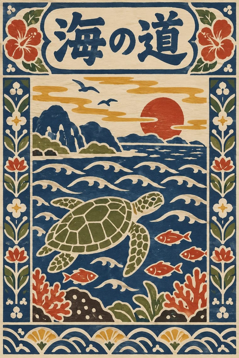
Serizawa Katazome and Mingei Stencil-Dye Graphics
Serizawa Katazome and Mingei Stencil-Dye Graphics is one of minä perhonen’s nearest styles by choices; no real work of either fits the other better.
Choices that tell minä perhonen and Serizawa Katazome and Mingei Stencil-Dye Graphics apart Choice minä perhonen Serizawa Katazome and Mingei Stencil-Dye Graphics Analogous harmony characteristic — Framed panels — defining Pen, brush & ink defining occasional Hand-lettering — defining Earth & mineral occasional defining minä perhonen borrowed from Serizawa Katazome and Mingei Stencil-Dye Graphics, but neither descends from the other.
-
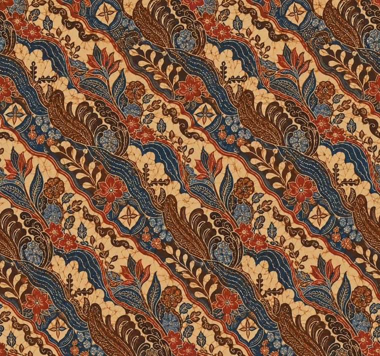
Batik Pattern Tradition
Batik Pattern Tradition is one of minä perhonen’s nearest styles by choices; no real work of either fits the other better.
Choices that tell minä perhonen and Batik Pattern Tradition apart Choice minä perhonen Batik Pattern Tradition Limited spot colours defining — Abundant decoration — defining Generous white space occasional avoids Horror vacui — defining Stylised figuration defining occasional No shared descent in the atlas: they reached these choices separately.
— means the choice isn’t among the style’s recorded choices. Critics recorded each work’s choices with the styles’ descriptions in view, so this shows whether the descriptions hold together, not proof that they are right.
06
Combine it with
Styles minä perhonen (Hand-Drawn Textile Graphics, Akira Minagawa) pairs well with or plays against, from the research. Each is worked out as a combination: which style gives the type, the colours and the forms.
- Japanese Postwar Modernism Pairs well · Both come from Japan and favour restrained, craft-minded everyday design, though the soft wobbling hand is minä perhonen's own.
- Muji No-Brand Design (Mujirushi Ryohin) Pairs well · Plain everyday goods give the quiet ground that lets small hand-drawn pattern read.
- Scandinavian Functionalism Pairs well · Calm upholstery and interiors carry embroidered pattern without noise.
- DTC 'Blanding' / Millennial Minimalism Contrasts · Generic anonymous softness against a distinct, personally drawn and densely repeated mark.
07
Sources
- http://www.mot-art-museum.jp/en/exhibitions/minagawa-akira-tsuzuku/
- https://www.stylepark.com/en/kvadrat/tambourine-hallingdal
- https://en.seigensha.com/books/978-4-86152-764-7/
- https://www.wallpaper.com/fashion/mina-perhonen-exhibition-tokyo
How Stylogeny researches and checks a style: where the facts come from.