Style combination · Pairs well
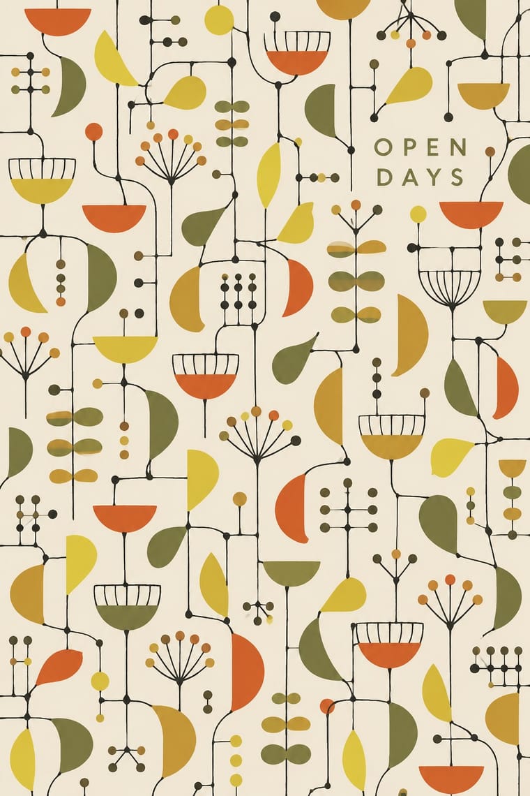
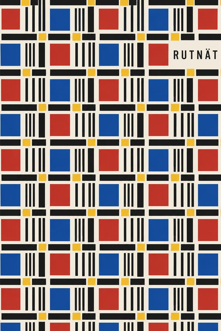
Festival of Britain 'Contemporary' Pattern × NK Textilkammare Geometric Print
The British contemporary prints of the same years share screen-printed, all-over repeats in limited flat colour; borrow their spindly drawn line for a lighter variant of a ruled NK stripe.
Mix them and make something Festival of Britain 'Contemporary' Pattern NK Textilkammare Geometric Print
01
What each style brings
Each part of the design comes from the style with the stronger say in it, and each style gives at least two.
Festival of Britain 'Contemporary' Pattern (Lucienne Day and the Festival Pattern Group) NK Textilkammare Geometric Print (Astrid Sampe, Signerad Textil)
- Type from Festival of Britain 'Contemporary' Pattern
-
- Colour from NK Textilkammare Geometric Print
- Form from NK Textilkammare Geometric Print
- Composition from Festival of Britain 'Contemporary' Pattern
- Surface from Festival of Britain 'Contemporary' Pattern
02
The type
Open fonts standing in for each style’s own type, which is often hand-drawn or commercial.
Display · Festival of Britain 'Contemporary' Pattern
Index
Londrina Solid; Festival of Britain 'Contemporary' Pattern used Festival display lettering used alongside the patterns (posters, catalogues, signs), not in the repeats and Festival display lettering used alongside the patterns, not in the repeats
Text · NK Textilkammare Geometric Print
The reduced, geometric household textiles of NK's textile department in Stockholm under Astrid Sampe: small ruled units, stripes, checks, arrows and thin outlines repeated evenly, mostly on screen-printed linen and cotton, some on woven linen, in black and white with a few flat accents of red, blue or yellow. Sampe's late-1940s fabrics followed Mondrian; the 1954 Signerad Textil collection put artists' names, Aalto's among them, on industrially printed cloth. Quiet, rational cloth with no focal point and no type in the repeat.
Jost; NK Textilkammare Geometric Print used No lettering in the repeat and The printed selvedge mark naming maker, pattern and designer in capitals, such as 'TEXTILKAMMARE MADE IN SWEDEN "14/6" ALVAR AALTO DESIGN' on Aalto's 14/6 (MFA Boston 2012.847)
03
The colours
The ground and leading colours come from NK Textilkammare Geometric Print, with a counter-accent from Festival of Britain 'Contemporary' Pattern. The ink reads on the ground at 4.5:1 or more.
Festival of Britain 'Contemporary' Pattern (Lucienne Day and the Festival Pattern Group) NK Textilkammare Geometric Print (Astrid Sampe, Signerad Textil)
-
#f2eee4ground · 36% -
#161616ink · 14% -
#e5b51faccent · 18% -
#d4532aaccent · 14% -
#1f4f9aaccent · 10% -
#8f8b82accent · 8%
As CSS
:root {
  --ground: #f2eee4;
  --ink: #161616;
  --accent-1: #e5b51f;
  --accent-2: #d4532a;
  --accent-3: #1f4f9a;
  --accent-4: #8f8b82;
  --font-display: "Londrina Solid", cursive;
  --font-text: "Jost", sans-serif;
}
04
The two styles
05
More combinations
With Festival of Britain 'Contemporary' Pattern
- UPA & Cartoon Modern Pairs well · Both draw a spindly, child-like modern line in flat colour; put a UPA figure in front of a Contemporary repeat for a full 1950s scene.
- Finnish Bold Print (Marimekko Modernism) Contrasts · Same decade, same screen-printed furnishing cloth, but Marimekko fills one huge silhouette where Day scatters small shapes on thin lines; compare to see what scale does to a repeat.
- Thaw Modernism (Soviet and Czechoslovak) Pairs well · Thaw graphics share the light utopian line and flat pastel shapes; its stylised figures and stars give the repeat a narrative accent.
- Googie & Atomic Age Contrasts · Both are atomic-age optimism, but Googie shouts from roadside signs in neon and boomerangs while this stays a quiet domestic pattern in earth tones.
- Surrealist Graphics Pairs well · Borrow a Miró-like biomorphic blob or floating sign to push a Contemporary repeat further toward painting.
With NK Textilkammare Geometric Print
- Scandinavian Functionalism Pairs well · The parent language: a calm functionalist layout of type and white space with one band of NK-style striped cloth as its only ornament.
- Finnish Bold Print (Marimekko Modernism) Contrasts · Marimekko enlarges one hand-cut or brushed motif to a huge repeat with a deliberately wobbly edge; NK's geometric strand keeps small, ruled units on a black-and-white base. Set one against the other to show scale against restraint.
- Josef Frank and Svenskt Tenn Botanical Prints Contrasts · The other Stockholm house of printed linen in the same decades: Frank fills the cloth with many-coloured invented plants, NK's geometric prints with a few lines in black, white and one accent.
- De Stijl Pairs well · Sampe's late-1940s fabrics followed Mondrian: take De Stijl's black lines and primary accents and turn them into an even, directionless repeat.