Digital native · 2010–2017 · Global / networked, North America
Metro (Microsoft Design Language)
Also known as Metro UI, Modern UI, Windows Phone 7 design
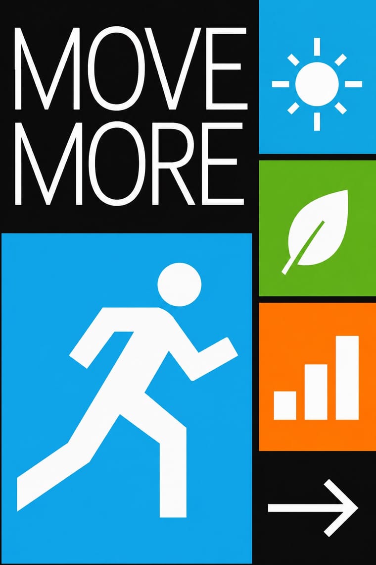
An interface language from Microsoft that put typography ahead of chrome: large light sans-serif headings, flat rectangular Live Tiles, lateral panoramic scrolling and bold single accent colours on dark or white grounds. It borrowed from Swiss graphic design and public transport signage, and gave way to Fluent Design from 2017.
Make something in this style Get advice in this style Mix it with another style
01
How it works
- Put content before chrome: let type and data replace buttons, frames and bezels.
- Build screens from flat rectangular tiles on a strict grid with generous gutters.
- Set oversized, light-weight Segoe headings flush left and cut off at the screen edge to invite panning.
- Choose one saturated accent colour per theme and apply it to flat fields on a dark or white ground.
- Reduce icons to simple monoline glyphs and let motion confirm every touch and transition.
- Use small all-caps labels for section and app titles.
Microsoft, Redmond, USA: unveiled as the Windows Phone 7 Series interface in February 2010, with earlier traces in Windows Media Center and the Zune software; the name Metro was dropped in 2012 for Microsoft design language after a reported trademark concern
02
Its design choices
From Stylogeny’s vocabulary of design choices: defining choices make the style, characteristic ones are usual, occasional ones turn up now and then.
- Layout & composition
- Space & hierarchy
- Typography
- Colour
- Surface & texture
- Ornament
- Imagery
- Medium & production
- Tone & intent
- Avoids
- Skeuomorphic material, Gloss & highlights, Frosted glass, Illusion of depth, Rounded & pill, Abundant decoration, Borders & frames, Gradients, Ornamented display
Palette
-
#ffffff -
#000000 -
#1ba1e2 -
#d80073 -
#60a917 -
#fa6800
Typefaces
-
Segoe UI
-
Segoe WP
-
Zegoe UI
Known for
-
Windows Phone 7
unveiled February 2010, released October 2010
-
Zune software and Zune HD
-
Xbox 360 dashboard update and Xbox One interface
-
Windows 8 Start screen
2012
-
Outlook.com
2012
03
Make something in this style
Say what you need, and Stylogeny’s image studio draws it from Metro (Microsoft Design Language)’s design choices and checks it against them. It takes about a minute, and you get a link to share.
04
Where it comes from, and what it’s close to
Before it
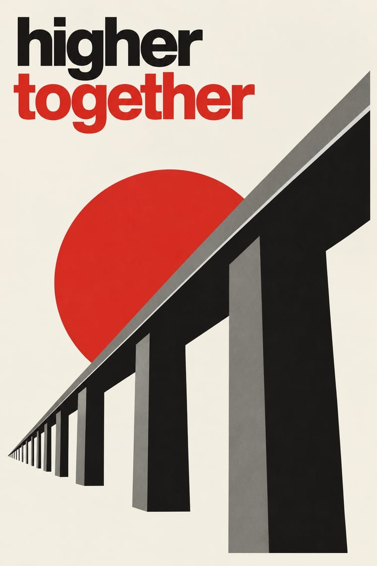
The style it grew out of, and the styles it borrowed from.


After it
The styles that grew out of it.
No later style in the atlas grew out of it yet.
Alike in its design choices
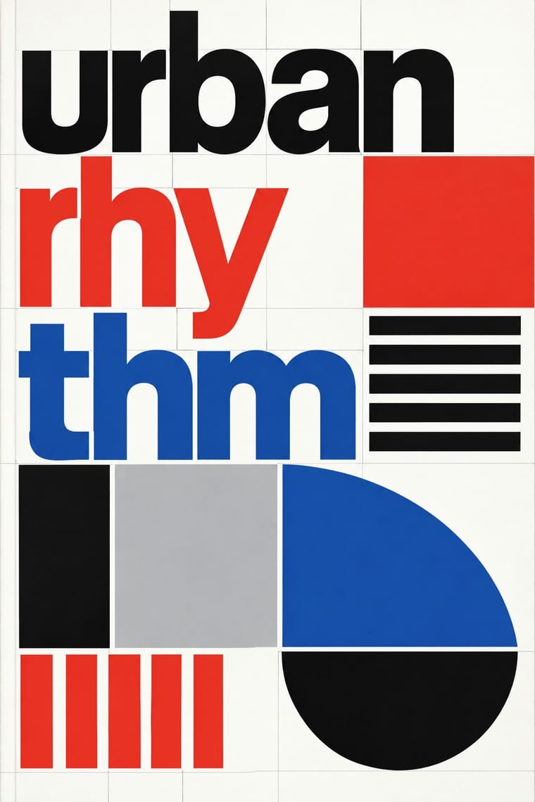
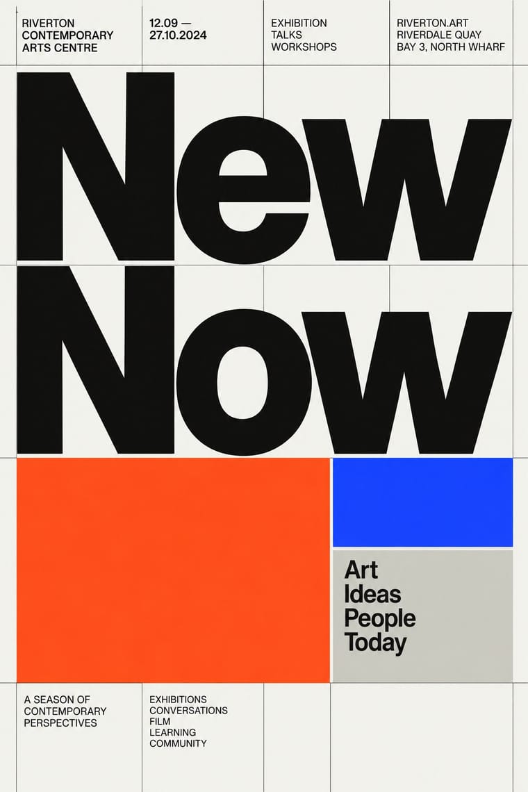
Styles that make many of the same choices, related or not, besides those above.
05
Often taken for
Metro has no real works recorded yet, so these are its nearest styles by its choices alone, with the choices that tell them apart.
-
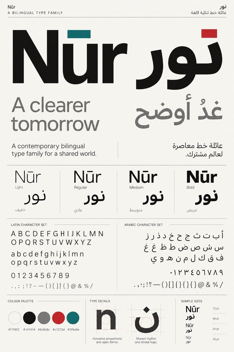
Contemporary Arabic & Dual-Script Type Design
1 of Contemporary Arabic & Dual-Script Type Design’s 5 real works fits Metro’s choices slightly better than its own: Frutiger Arabic, type specimen.
Choices that tell Metro and Contemporary Arabic apart Choice Metro Contemporary Arabic Extreme scale contrast defining — Measured density — defining Flush left, ragged right defining — Monochrome — characteristic Dark ground characteristic — Both descend from International Typographic Style in the family tree.
-
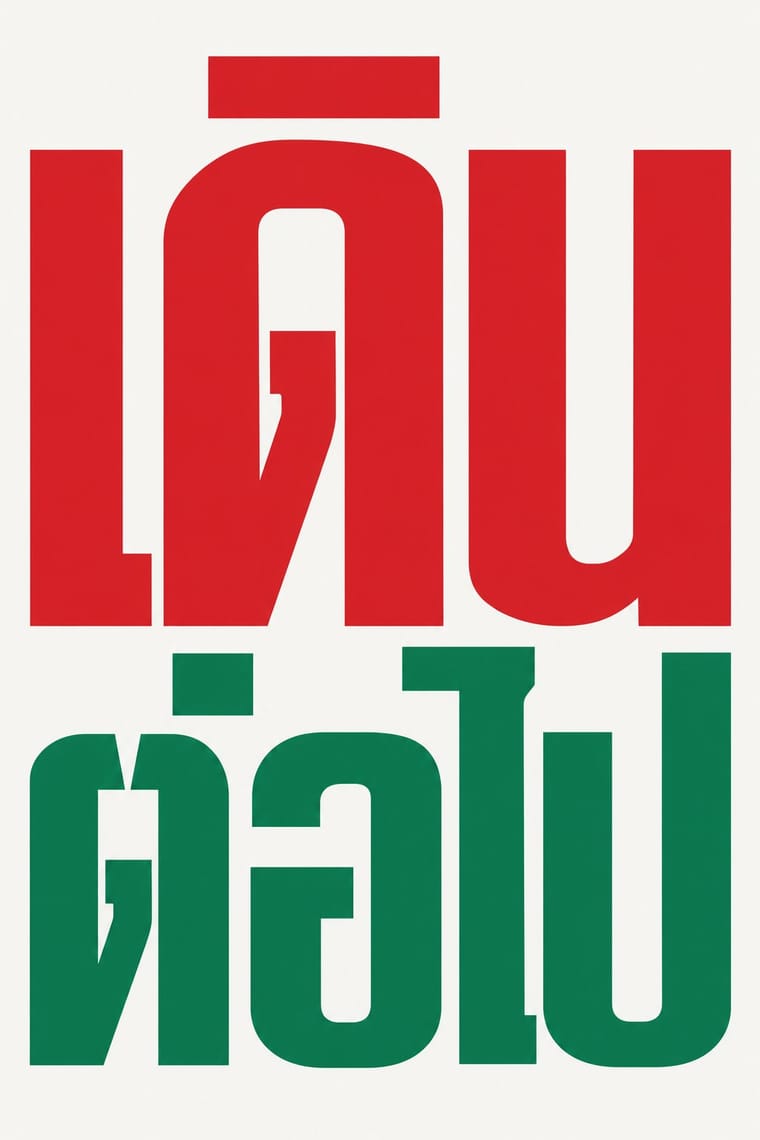
Total Design & Dutch Functionalism
Total Design & Dutch Functionalism is one of Metro’s nearest styles by choices; no real work of either fits the other better.
Choices that tell Metro and Total Design apart Choice Metro Total Design Humanist sans defining — Grotesque & neo-grotesque — defining Pictogram characteristic — Geometric primitives — characteristic Icons & pictograms characteristic — Both descend from International Typographic Style in the family tree.
-
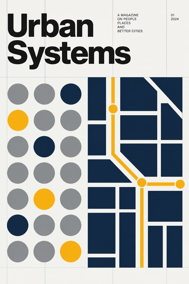
Flat Design
Flat Design is one of Metro’s nearest styles by choices; no real work of either fits the other better.
Choices that tell Metro and Flat Design apart Choice Metro Flat Design Extreme scale contrast defining — Rounded & pill avoids occasional Limited spot colours defining occasional Geometric primitives — characteristic Dark ground characteristic — Metro descends from Flat Design: a shared line, so the likeness is inherited.
-
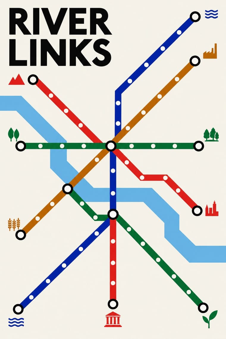
Neo-Swiss Revival
Neo-Swiss Revival is one of Metro’s nearest styles by choices; no real work of either fits the other better.
Choices that tell Metro and Neo-Swiss Revival apart Choice Metro Neo-Swiss Revival Humanist sans defining — Grotesque & neo-grotesque — defining Dark ground characteristic — Monochrome — characteristic Pictogram characteristic — Both descend from International Typographic Style in the family tree.
— means the choice isn’t among the style’s recorded choices. Critics recorded each work’s choices with the styles’ descriptions in view, so this shows whether the descriptions hold together, not proof that they are right.
06
Combine it with
Styles Metro (Microsoft Design Language) pairs well with or plays against, from the research. Each is worked out as a combination: which style gives the type, the colours and the forms.
- International Typographic Style Pairs well · Take back the Swiss grid and flush-left discipline to keep tile layouts rational.
- Skeuomorphic UI Contrasts · The opposite answer to the same era: material realism against pure typographic flatness.
- Glassmorphism Contrasts · Translucent depth against opaque flat colour blocks; use blur sparingly to soften an overly stark tile wall.
- Material Design Contrasts · Layered paper and shadow against Metro's single flat plane; mix elevation into tiles only to signal interaction.
07
Sources
- https://en.wikipedia.org/wiki/Metro_(design_language)
- https://en.wikipedia.org/wiki/Windows_Phone_7
- https://en.wikipedia.org/wiki/Fluent_Design_System
How Stylogeny researches and checks a style: where the facts come from.