Digital native · 2010–present · North America, Latin America & Caribbean, Global / networked
Witch House Graphics (Symbol Names and Haunted Web Imagery)
Also known as Witch house visual aesthetic, Witch-house typography
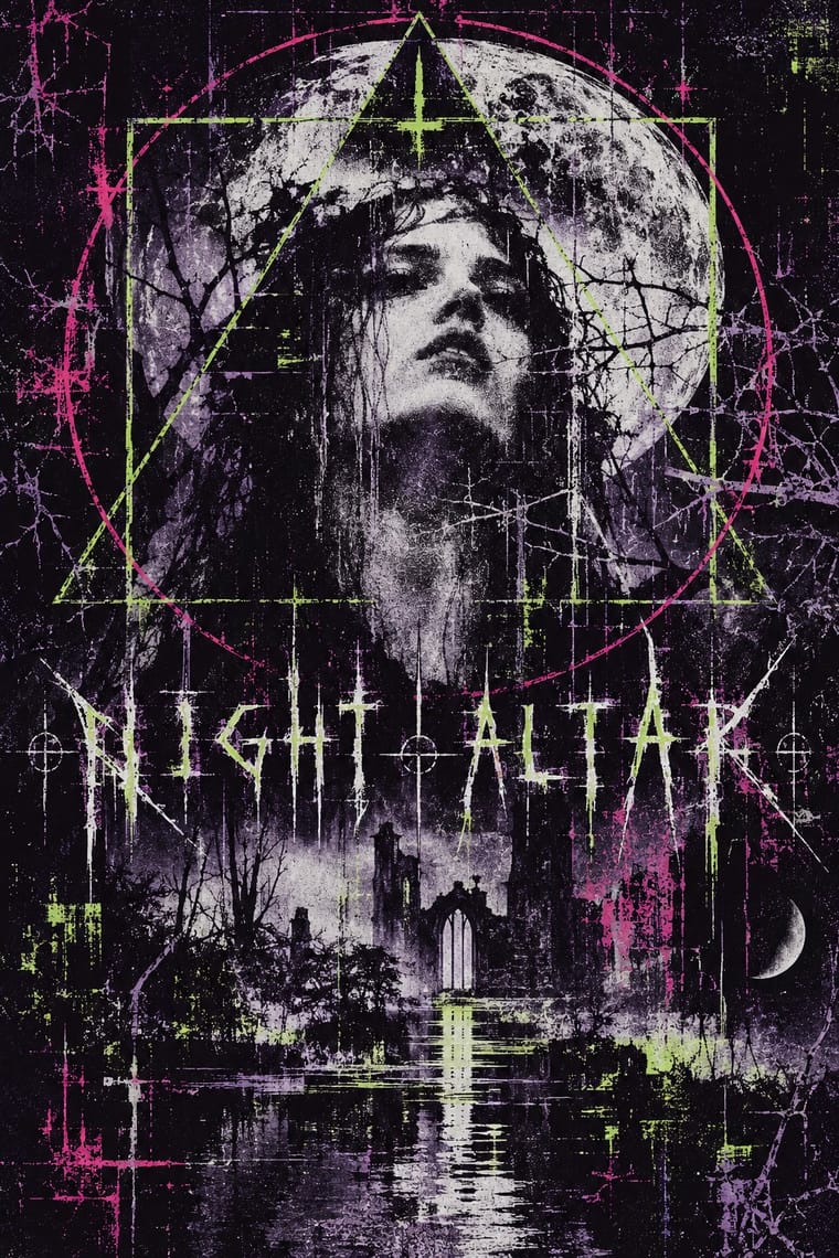
A web-native music-graphics language documented around witch house in 2010. Its core identities turn names into triangles, crosses and mirrored glyphs alongside altered photographs and video. Related covers pair separate signs with conventional capitals; these illustrate the surrounding image language, not symbol substitution. Dark monochrome and lurid colour both occur. Judge the graphic choices, not the musical genre alone.
Make something in this style Get advice in this style Mix it with another style
Use it with care
These are musicians' authored identities, not a reusable alphabet of anonymous occult decoration. Credit the artists and obtain permission for their marks, photographs and footage; online circulation does not make those works openly licensed. The folk-symbols trait records coded and sometimes religious-looking signs, not evidence of the makers' beliefs or a licence to copy a community's sacred designs. Research any specific sign before using it. Symbol-only names can obstruct search, pronunciation and assistive access: supply a readable equivalent rather than reproducing that obstruction in navigation or essential information. The available evidence is strongest for the early-2010s visual cluster; later witch-house releases must be judged visually, not admitted by genre alone.
01
How it works
- For a symbol-name identity, compose the display name from typed symbols, substitutions or mirrored characters so that the word also reads as a small visual mark; retain a plain-text name alongside it wherever people need to search, pronounce or access it.
- Treat the cover, artist page and moving image as one atmosphere: carry the same glyphs and estranged photographic material between them rather than letting a musical genre tag substitute for a visual identity.
- Alter a photograph or video frame through blur, grain, tinting, channel displacement or crude layering; keep enough of the original scene visible for its ordinary subject to become unsettling.
- Place one sign or figure over the picture, or assemble a deliberately excessive collage of found images; use simple geometric signs rather than assuming that every identity needs a symmetrical, thorn-grown alphabet.
- Use darkness and restricted colour when the image calls for them, but allow acidic green, violet and magenta interference; do not turn the scene's varied covers into an obligatory black-and-white formula.
- Make display lettering feel coded and ritualised, whether through substituted glyphs, spaced capitals or an occasional gothic title; avoid importing a complete corporate grid or a functional interface aesthetic.
Networked electronic-music blogs, artist pages and videos, publicly documented in 2010; early participants include Rhode Island's Λ, New York's White Ring and Mexico City's RITUALZ. The starting year marks contemporary documentation, not a claim to the first use of the imagery.
02
Its design choices
From Stylogeny’s vocabulary of design choices: defining choices make the style, characteristic ones are usual, occasional ones turn up now and then.
- Layout & composition
- Space & hierarchy
- Typography
- Colour
- Form & shape
- Surface & texture
- Imagery
- Medium & production
- Tone & intent
- Avoids
- Modular grid, Cards & bento tiles, Rounded sans, Chrome & 3D render, Frosted glass, Flat vector illustration, Rational & objective, Authoritative & institutional
Palette
-
#0d0b12 -
#dedfe0 -
#49385f -
#9ed33b -
#d7388a
Typefaces
-
Typed symbol-name lettering
triangles, daggers, numerals and mirrored characters substituted for or assembled beside letters, as in GL▲SS †33†H and ℑ⊇◊⊆ℜ; no single font family is established by the sources
-
Widely tracked, plain sans-serif capitals, as on the inspected White Ring Black Earth That Made Me cover; this is a lettering treatment, not a verified typeface identification
-
Gothic display lettering paired with symbol glyphs, as in the Send Me an Angel (Zombie Rave Mix) still reproduced in August 2010; the exact face is unconfirmed
Known for
-
Λ (pronounced arc), Rhode Island artist
symbol-name identity explained in Sian Rowe's interview of 11 August 2010; the artist explicitly favoured the visual choice over searchability
-
ℑ⊇◊⊆ℜ, associated with Mater Suspiria Cult in Rowe's 11 August 2010 report
mirrored symbol-name explained by its bearer; the accompanying Send Me an Angel (Zombie Rave Mix) still overlays white glyphs and gothic lettering on a softened, darkened live-action scene
-
GL▲SS †33†H
triangle, dagger and numeral substitutions in the identity documented by Rowe in August 2010; included for the verified name treatment, not an uninspected album cover
-
Complementary cover example, not evidence of substituted-symbol lettering
RITUALZ, GHETTO ASS WITCH (artist Bandcamp release dated 28 February 2011): the displayed cover combines cross-and-double-cross signs, thin sans-serif capitals, a cut-out photographic figure, diagrammatic overlays and clashing green and magenta. The current cover display was inspected; the page does not independently establish that this exact image has remained unchanged since 2011
-
Complementary cover example, not evidence of substituted-symbol lettering or found-photo provenance
White Ring, Black Earth That Made Me (artist Bandcamp edition dated 21 November 2011): the displayed cover pairs widely spaced white capitals with a blurred woodland photograph, a hanging sheet bearing a branching sign, and green-violet channel fringes. This is the dated edition on the artist's page, not a claim that the EP first appeared in 2011
03
Make something in this style
Say what you need, and Stylogeny’s image studio draws it from Witch House Graphics (Symbol Names and Haunted Web Imagery)’s design choices and checks it against them. It takes about a minute, and you get a link to share.
04
Where it comes from, and what it’s close to
Before it
The style it grew out of, and the styles it borrowed from.
Nothing earlier is recorded: in the atlas it is a starting point.
After it
The styles that grew out of it.
No later style in the atlas grew out of it yet.
Alike in its design choices
Styles that make many of the same choices, related or not, besides those above.
05
Often taken for
Witch House Graphics has no real works recorded yet, so these are its nearest styles by its choices alone, with the choices that tell them apart.
-
Weirdcore & Dreamcore
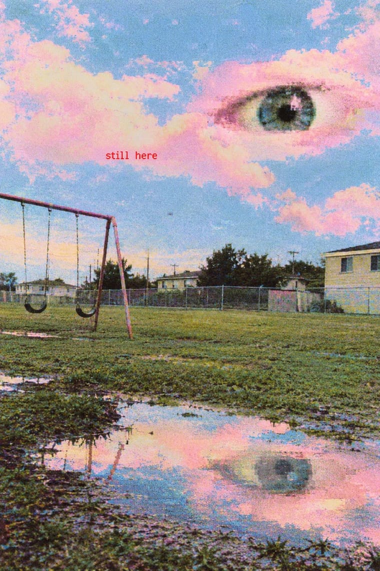
Weirdcore & Dreamcore is one of Witch House Graphics’s nearest styles by choices; no real work of either fits the other better.
Choices that tell Witch House Graphics and Weirdcore apart Choice Witch House Graphics Weirdcore Geometric primitives defining — Pastel — characteristic Experimental & distorted defining occasional Distortion & exaggeration — characteristic Folk & sacred symbols characteristic — No shared descent in the atlas: they reached these choices separately.
-
Glitch Art & Datamosh Graphics
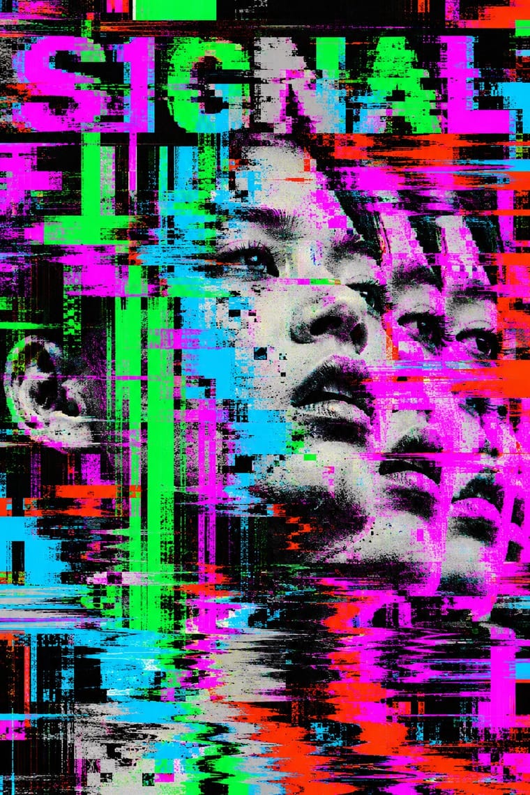
Glitch Art & Datamosh Graphics is one of Witch House Graphics’s nearest styles by choices; no real work of either fits the other better.
Choices that tell Witch House Graphics and Glitch Art apart Choice Witch House Graphics Glitch Art Geometric primitives defining — Complementary clash — characteristic Monochrome characteristic — Non-representational — characteristic Naturalistic depiction characteristic — No shared descent in the atlas: they reached these choices separately.
-
Vaporwave
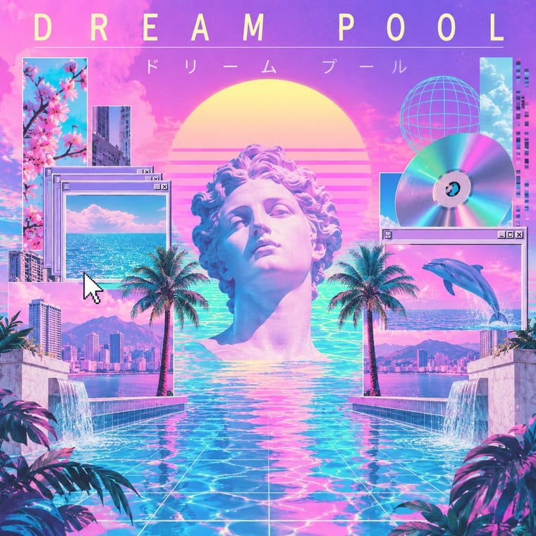
Vaporwave is one of Witch House Graphics’s nearest styles by choices; no real work of either fits the other better.
Choices that tell Witch House Graphics and Vaporwave apart Choice Witch House Graphics Vaporwave Experimental & distorted defining — Chrome & 3D render avoids characteristic Treated photography defining occasional Pastel — defining Monochrome characteristic — No shared descent in the atlas: they reached these choices separately.
-
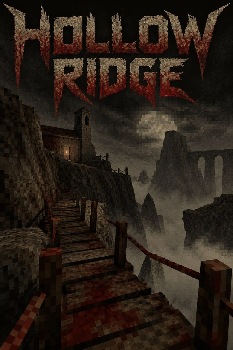
PS1 / Lo-Fi 3D Revival (PSX Aesthetic)
PS1 / Lo-Fi 3D Revival is one of Witch House Graphics’s nearest styles by choices; no real work of either fits the other better.
Choices that tell Witch House Graphics and PS1 apart Choice Witch House Graphics PS1 Experimental & distorted defining — Earth & mineral — defining Fluorescent & neon occasional avoids 3D render — defining Geometric primitives defining occasional No shared descent in the atlas: they reached these choices separately.
— means the choice isn’t among the style’s recorded choices. Critics recorded each work’s choices with the styles’ descriptions in view, so this shows whether the descriptions hold together, not proof that they are right.
06
Combine it with
Styles Witch House Graphics (Symbol Names and Haunted Web Imagery) pairs well with or plays against, from the research. Each is worked out as a combination: which style gives the type, the colours and the forms.
- Glitch Art & Datamosh Graphics Pairs well · Use channel displacement or compression damage to estrange a recognisable scene, but retain the symbol-name as the identity; the image need not become an abstract demonstration of file failure.
- Hauntology & Ghost Box Design Contrasts · Choose between Ghost Box's fictitious institutional series and this scene's coded artist identity: trade the ruled paperback title band for a glyph-name and a distressed photographic field.
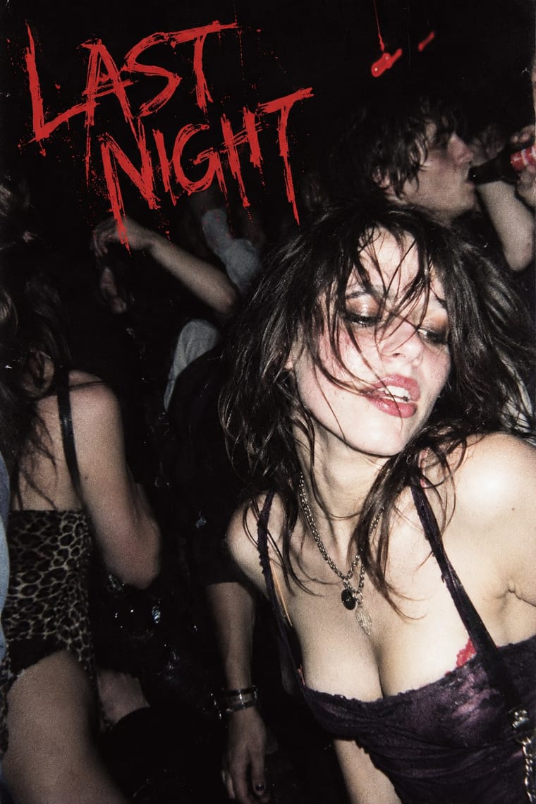
- Weirdcore & Dreamcore Contrasts · Both can estrange a low-quality photograph; use a coded artist name and geometric sign for witch-house identity, rather than weirdcore's anonymous place and short viewer-addressing caption. A haunted photograph alone is not enough.
- Black Metal Graphics Contrasts · Both can place an obscure mark over a bleak picture; distinguish typed, substituted glyphs and treated web imagery from a hand-drawn mirrored thorn alphabet. A thorn-logo cover does not become this style merely because its music is witch house.
- Vaporwave Contrasts · Both can rework found media in conspicuous digital colour; keep the symbol-name and unsettling scene if the brief wants witch house rather than a collage of consumer nostalgia.
07
Sources
- Sian Rowe, 'Meet the bands whose /\/ /\ /\/\ € $ are made out of $¥ /\/\ ß 0 \ $', The Guardian, 11 August 2010: interviews with Λ and ℑ⊇◊⊆ℜ, GL▲SS †33†H name, GIF-heavy artist sites, and the illustrated Send Me an Angel still. Text and still inspected. https://www.theguardian.com/music/musicblog/2010/aug/11/bands-names-symbols
- Tom Ewing, 'Got any witch house? Why I'm on the genre-mongers' side', The Guardian, 19 August 2010: contemporary account treating typography, night photography and altered found video as an integrated aesthetic rather than incidental packaging. https://www.theguardian.com/music/2010/aug/19/witch-house-musical-genres
- RITUALZ, GHETTO ASS WITCH, artist Bandcamp: release date 28 February 2011 and Mexico City artist location; displayed cover inspected directly. Its colour and collage are counterevidence to a compulsory monochrome genome. Present cover version is not independently dated. https://ritualz.bandcamp.com/album/ghetto-ass-witch
- White Ring, Black Earth That Made Me, artist Bandcamp: edition date 21 November 2011; accompanying artist text identifies New York, witch house and Rocket Girl distribution. Displayed cover inspected directly for spaced capitals, photographed sign, blur and chromatic fringes. https://whitering.bandcamp.com/album/black-earth-that-made-me
- Untitled Burial, official website, inspected during this research: current self-description centres witch house and dark electronic music. This supports continued scene activity, not a claim that every current cover retains the early visual cluster. https://www.untitledburial.com/
- Research scope: no direct graphic-design descent from a single atlas style was established, so parent is null and influences is empty. Palette is an interpretive working selection, not sampled archival ink specifications. The current Bandcamp cover displays supplement, rather than replace, the dated 2010 text and video-still evidence. Found-video use is documented, but the cover images do not establish found-photo provenance; the geometric-sign weight describes the symbol-led cluster, not every release in the musical genre. No inspected production record establishes offset printing.
- Wikipedia, 'Weirdcore', Characteristics section, checked for the comparative affinity only: low-quality edited photography, empty familiar places and short unsettling viewer-addressing captions. The contrast is a visual boundary, not a claim of historical descent. https://en.wikipedia.org/wiki/Weirdcore
How Stylogeny researches and checks a style: where the facts come from.