Layout & composition · Grid systems
Column grid
Vertical columns structure text and image; vertical placement is free.
A design choice in Stylogeny’s vocabulary, under layout & composition: how is the picture plane organised?
- styles make it
- 51
- as a defining choice
- 9
- as a usual one
- 20
- now and then
- 22
- avoid it
- 2
Styles defined by it 9
For these styles it is one of the choices that make the style.
- Ancient Egyptian Hieroglyphic & Register CompositionThe visual system of pharaonic Egypt, in which writing is made of pictures and pictures are ruled like writing.
- Ethiopian Ge'ez Manuscript & Haräg IlluminationThe manuscript art of the Ethiopian and Eritrean Orthodox Tewahedo Church, written in the Ge'ez syllabary on parchment from the Garima Gospels (radiocarbon-dated to roughly the 4th–7th centuries) to the present.
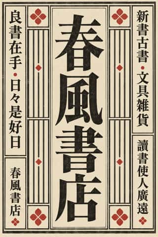
Song–Ming Woodblock Book Typography (Songti / Mincho)The page and letter of the East Asian book.
- Urdu Katib LithographyFor about a century and a half Urdu chose lithography over movable type, because metal type could not reproduce the sloping, stacked ligatures of Nastaʿlīq.
- Machine-Age Simplified Arabic TypeArabic redrawn for the machine rather than the reed pen.
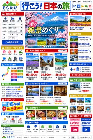
Japanese Dense Web DesignThe information-packed look of Japan's big portals, shops, airlines and ministries: three or more narrow columns of boxed modules, crowded with small Japanese text, blue links, tiny thumbnails, dated news lists and rotating ad banners, in bright colours on a white page.
Korean Webtoon GraphicsThe full-colour, vertical-scroll comic that Korean web portals made standard in the 2000s and smartphone apps took worldwide.
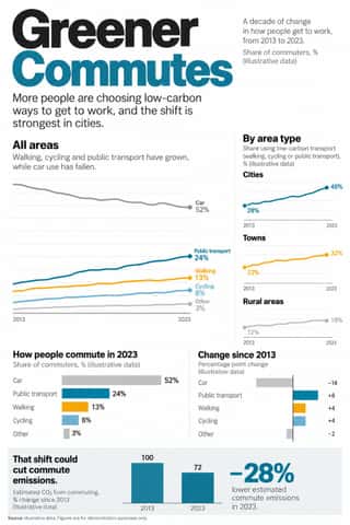
Newsroom Data Graphics & ScrollytellingThe house style of newspaper graphics desks since about 2009–2011 (the New York Times graphics desk, D3.js, the Guardian Datablog): conventional charts drawn from the data, on a white or pale paper ground with light grey gridlines and no axis titles, lines labelled directly in place of a legend where possible and short annotations saying what to look at.
GOV.UK Design (GDS Style)The text-led design of GOV.UK, the UK government's single website, built by the Government Digital Service from 2012 and codified in the GOV.UK Design System (2018).
Styles that often use it 20
A characteristic choice: usual in these styles, though not essential.
Chinese Calligraphy & Seal Carving (Shufa & Zhuanke)The written art of China and the root of East Asian lettering.
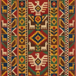
Andean Woven Graphic SystemsThe graphic systems of Andean cloth, the region's most prestigious medium, in which every motif is built on the warp-and-weft grid.
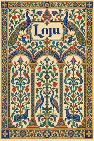
Armenian Manuscript IlluminationThe illuminated books of the Armenian Church, from the Gospel of Queen Mlke (c. 862) and the Etchmiadzin Gospels (989) to the last manuscripts around 1800.
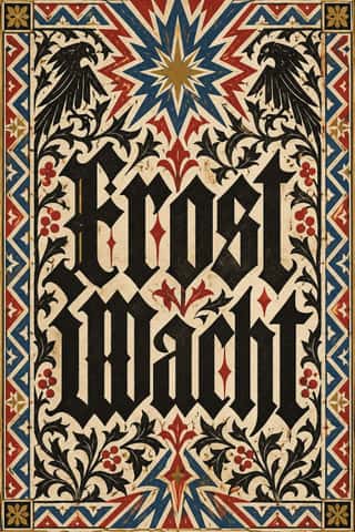
Gothic Blackletter & Fraktur TraditionThe broken scripts of the Latin West.
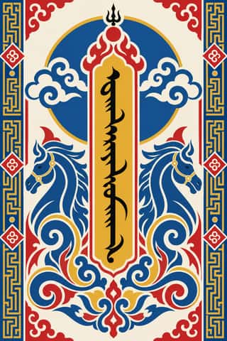
Mongol Bichig Calligraphy & Ugalz OrnamentMongolia's classical script and the auspicious ornament that frames it on state, Buddhist and household objects.
Persian Miniature (Ilkhanid, Timurid and Safavid Book Painting)The court book painting of Iran and Timurid Herat, formed in Mongol Tabriz from Islamic, Byzantine and Chinese models: from Rashid al-Din's Jamiʿ al-tawarikh (1314) and the Great Mongol Shahnama to Behzad's Herat and the Shahnama of Shah Tahmasp, ending in the album pages of Safavid Isfahan.
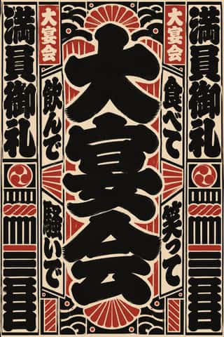
Edo-moji Commercial Lettering (Kanteiryū, Yose-moji, Sumō-ji)The fat, ink-heavy brush hands that Edo's professional sign and bill writers made for the city's entertainments: Kanteiryū for kabuki signboards and playbills from 1779, yose-moji for rakugo halls, sumō-ji for sumo ranking sheets, and squarish kago-moji for votive name slips.
- Persian Popular Narrative (Lithographs & Coffeehouse Painting)Iran's popular picture-stories in two media.
Scandinavian FunctionalismNordic functionalism (funkis) arrived in graphic form with Sigurd Lewerentz's posters and winged emblem for the 1930 Stockholm Exhibition.
International Typographic StyleA post-war refinement of the New Typography in which the mathematical grid, objective photography and neo-grotesque sans-serifs were used to communicate with clarity and neutrality.
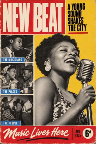
Drum Magazine & Sophiatown PhotojournalismThe picture magazine of Black urban Africa in the 1950s.
HfG Ulm Systematic DesignThe Hochschule für Gestaltung Ulm (1953–1968) was founded as the successor to the Bauhaus.
Vicente Rojo & Mexican Editorial ModernismThe design of Mexico City's literary and cultural press, shaped from the 1950s by the Barcelona-born exile Vicente Rojo: México en la Cultura, the Revista de la Universidad, Plural, La Jornada and the covers of Ediciones Era.
Corporate Identity ModernismModernist reduction applied to corporate communication.
- Dazibao (Big-Character Posters)Handwritten wall posters in large brush characters that turned the walls of Mao-era China into a public forum for criticism, denunciation and, at the Democracy Wall, dissent.
Munich 1972 Olympic Design (Otl Aicher)The visual programme Otl Aicher's department made for the 1972 Munich Olympics, the 'cheerful Games' meant to show a democratic, modest West Germany.
- Contemporary Chinese Book Design ('Most Beautiful Books of China')Chinese book design since 2003, when Shanghai founded the yearly 'Most Beautiful Books of China' award, whose winners go on to Leipzig.
Contemporary Arabic & Dual-Script Type DesignA twenty-first-century type culture that redraws Arabic as a family matched to a Latin companion in weight, proportion and contrast, so the two scripts can share a page, screen or sign as equals.
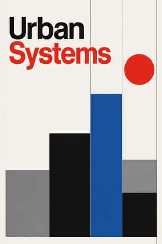
Neo-Swiss RevivalA contemporary revival of the International Typographic Style, fuelled by digital re-releases of neo-grotesques and by studios such as Experimental Jetset and Norm: modular grids, flush-left grotesque type, huge tightly set headlines and flat fields of black, white and one signal colour.
Material DesignGoogle's design system, launched in 2014, which reintroduced controlled depth to flat design through the metaphor of 'material': sheets of digital paper and ink that sit at defined elevations, cast consistent shadows and move with meaningful motion.
Styles that use it now and then 22
An occasional choice in these styles.
- Hebrew Micrographyc. 895–present
- Renaissance Book Typographyc. 1460–1600
- Bulaq (Amiriyya) Naskh Book Printing1822–1956
- Spanish Bullfight Poster (Cartel Taurino)1879–present
- Mexican Popular Graphics (Posada)1880–1917
- Die Neue Typographie1923–1940
- Isotype Pictorial Statistics1925–1971
- American Mid-Century Modernism1940–1970
- Di Tella Graphic Design (Instituto Torcuato Di Tella)1960–1970
- Fluxus Graphics (Maciunas)1962–1978
- Phototype Expressive Typography (Lubalin & U&lc)1962–1985
- Total Design & Dutch Functionalism1963–1990
- Black Panther Party Graphics1967–1980
- Roman-like Thai Typography (modern loopless Thai)1973–present
- Solidarność & Polish Underground Graphics1980–1989
- Emigre & Early Digital Type1984–1998
- ACT UP & Gran Fury AIDS Activist Graphics1987–1995
- Ghanaian Funeral Poster & Banner1990–present
- Early Web Vernacular1994–2004
- Seoul Independent Graphic Design (Small-Studio Scene)2005–present
- Slow-Living Editorial (the Kinfolk Look)2011–present
- Post-Binary Typography (Bye Bye Binary and Inclusive French Type)2018–present
It often goes with
Choices that the styles making it make more often than the atlas as a whole.
- Layered informationin 37 of 51
- Rectilinearin 32 of 51
- Rational & objectivein 25 of 51
- Light groundin 48 of 51
- Typography onlyin 31 of 51
- Rules & barsin 27 of 51
Styles that avoid it
Styles that deliberately leave it out.