Rational modernism · 1954–1995 · Northern Europe
Finnish Symbol Poster (the 'Finnish School', 1954–1995)
Also known as Finnish school (label coined abroad for the 1960s–70s generation: Kyösti Varis, Jukka Veistola, Pekka Kuronen, Erkki Ruuhinen, Heikki Ahtiainen; Erik Bruun and Martti Mykkänen are its forerunners), Pilot-group (its 1980s strand: Tapani Aartomaa, Pekka Loiri, Kari Piippo), Finnish modernist poster, Suomalainen julistetaide (Finnish poster art)
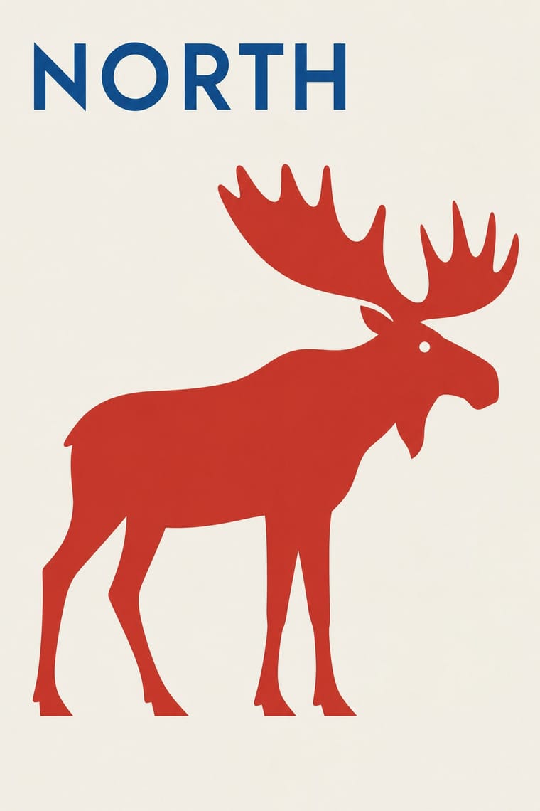
Finnish poster and symbol design, 1950s to 1990s, in which one reduced picture, often an animal, an object or a visual pun, carries the whole message on an empty ground. Varis aimed for posters with no text; his were called sign-like and visually reduced. Dry humour (Bruun's tongue-in-cheek Finnair salmon, 1958) sits beside a love of Finnish nature. Unlike its parent it also campaigns: the social posters of the 1960s–70s, Varis's Your Lifemeter (1970), Piippo's Ruanda (1994). The same makers drew national logos; Mykkänen's book covers are a typographic side strand.
Make something in this style Get advice in this style Mix it with another style
01
How it works
- Let one reduced, sign-like picture carry the whole message, and drop the text if the picture can make the association alone.
- Find the symbol in a sideways idea: a fish for a flight to Lapland, a burnt cigarette marked like a gauge for smoking, an animal or object standing for a client or a cause.
- Set the symbol alone on a large quiet ground in a few colours, with no ornament or frame.
- Keep the wit dry and let it serve the message, whether the subject is soft drinks or a social campaign.
- Draw the poster image so it can also work as a logo, stamp or cover: one economical sign across every size.
Helsinki advertising agencies and design studios: Erik Bruun's own studio (founded 1953), the agency SEK where Kyösti Varis was artistic director 1959–1967, and graduates of the Taideteollinen keskuskoulu (Central School of Applied Arts), some of whom, like Martti Mykkänen, studied further in Switzerland. Bruun and Mykkänen belong to the generation before; abroad the new generation of the 1960s and 1970s (Varis, Jukka Veistola, Pekka Kuronen, Erkki Ruuhinen, Heikki Ahtiainen) was called the 'Finnish school'. In the 1980s the Pilot-group (Tapani Aartomaa, Pekka Loiri, Kari Piippo) carried it on, and the Lahti Poster Museum, founded in 1975, collected and showed it.
02
Its design choices
From Stylogeny’s vocabulary of design choices: defining choices make the style, characteristic ones are usual, occasional ones turn up now and then.
- Layout & composition
- Space & hierarchy
- Typography
- Colour
- Form & shape
- Surface & texture
- Imagery
- Medium & production
- Tone & intent
- Avoids
- Horror vacui, Layered information, Abundant decoration, Collage & layering, Photomontage, Eclectic mixing, Ornamented display, Gradients, Skeuomorphic material, Gloss & highlights, Distortion & exaggeration
Palette
-
#f3efe6 -
#151515 -
#d22f27 -
#1f4f9a -
#ee8a1d
Typefaces
-
No type at all
the wordless poster in which the picture alone makes the association (Kyösti Varis's stated aim)
-
Slab-serif capitals in Bruun's The Salmon Flight (1958)
'DESTINATION' and 'NORTH' in white italic, 'FINLAND' large, upright and ochre at the foot, with his hand-written signature
-
One line of bold, tightly set neo-grotesque lower case for 'Your Lifemeter' (Varis, 1970), with hand-written numerals on the image itself
-
Bold geometric-sans capitals, widely letterspaced, in one line at the head and foot of Piippo's Lahti Poster Museum 1975–1990
1990
-
Title letters arranged into a pattern on the cover, as in Martti Mykkänen's Odysseus
Tammi, Keltainen kirjasto, 1964
Known for
-
Erik Bruun, 'The Salmon Flight' (1958), Finnair poster for the Lapland flight
salmon laid over a white aircraft on a dark, swept ground, 'Destination North Finland' below
-
Erik Bruun, Hartwall Jaffa poster
1959; Malva describes his iconic soft-drink poster of a 'temptingly bubbling lemonade bottle'
-
Erik Bruun, Merikotka (white-tailed eagle, 1962), and the nature conservation poster of a smiling seal
Malva
-
Erik Bruun, Saimaa ringed seal logo of the Finnish Association for Nature Conservation (1974); reverse sides of the 1986 markka banknotes
-
Martti Mykkänen, pared-down cover of Väinö Linna's Tuntematon sotilas (1954), one of about 450 covers by him
-
Martti Mykkänen, cover of James Joyce's Odysseus (Tammi, Keltainen kirjasto, 1964), the title letters arranged into a pattern; layout of the magazine Look at Finland (1964–1992)
-
Kyösti Varis, 'Your Lifemeter' (1970)
a burnt-down cigarette shown close and life-like on black, its paper marked with a hand-drawn scale 40–50–60; logos for Finnair, Alko and the Nordic Council
-
Kari Piippo, poster 'Lahti Poster Museum 1975–1990' (1990), a black razor blade with a filmstrip edge on white, and self-published campaign posters such as Ruanda (1994)
03
Make something in this style
Say what you need, and Stylogeny’s image studio draws it from Finnish Symbol Poster (the 'Finnish School', 1954–1995)’s design choices and checks it against them. It takes about a minute, and you get a link to share.
04
Where it comes from, and what it’s close to
Before it
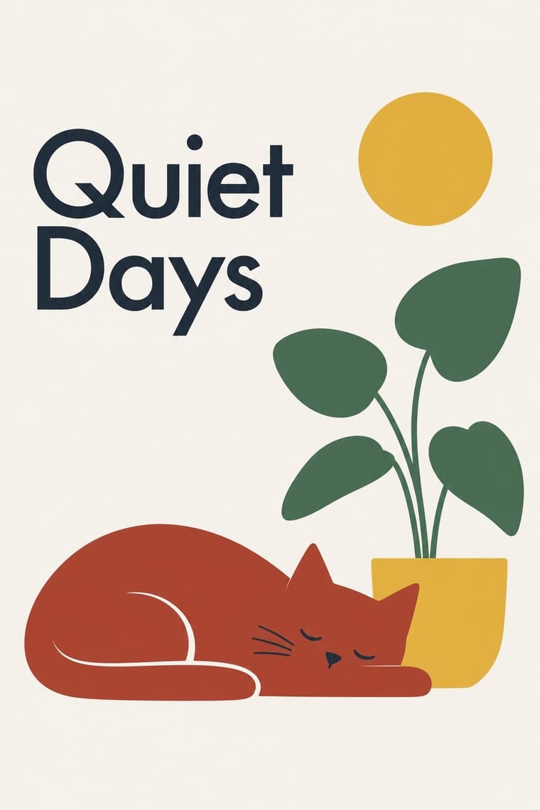
The style it grew out of, and the styles it borrowed from.

After it
The styles that grew out of it.
No later style in the atlas grew out of it yet.
Alike in its design choices
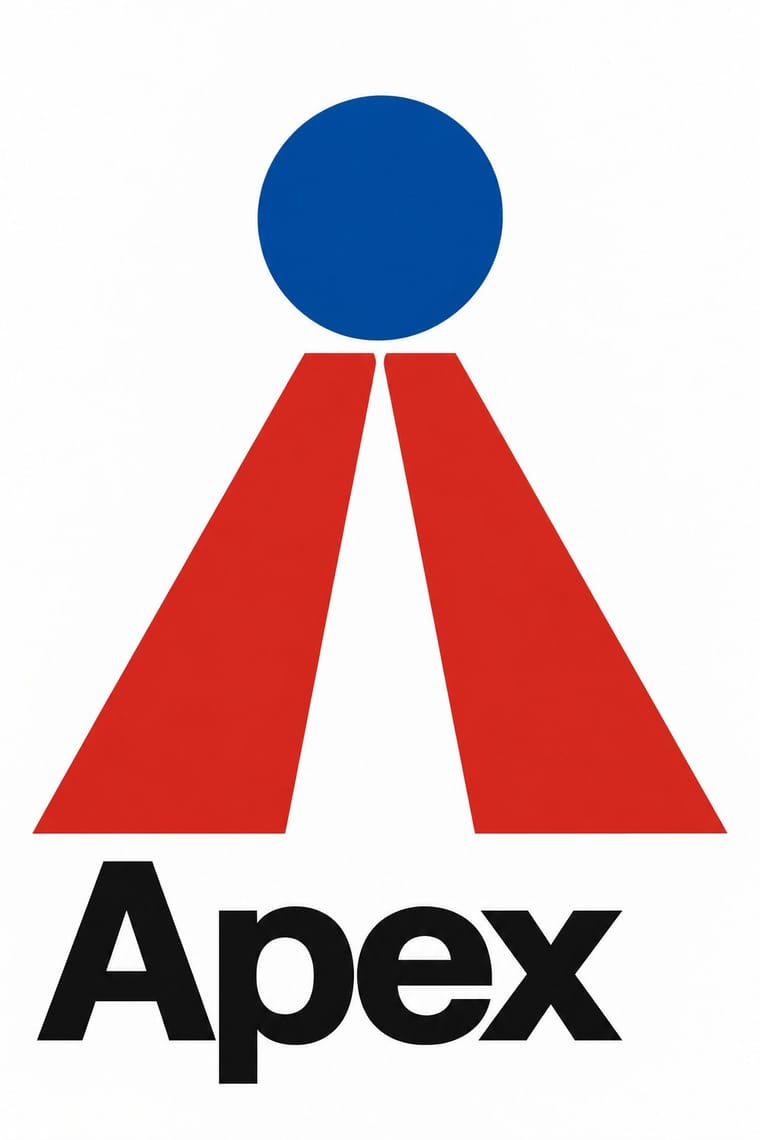
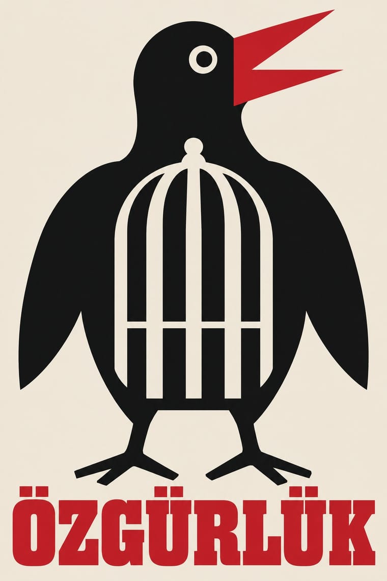
Styles that make many of the same choices, related or not, besides those above.
05
Often taken for
Finnish Symbol Poster has no real works recorded yet, so these are its nearest styles by its choices alone, with the choices that tell them apart.
-
Japanese Postwar Modernism
1 of Japanese Postwar Modernism’s 4 real works fits Finnish Symbol Poster’s choices slightly better than its own: On Children's Day.
Choices that tell Finnish Symbol Poster and Japanese Postwar Modernism apart Choice Finnish Symbol Poster Japanese Postwar Modernism Ornament-free defining — Geometric primitives occasional defining Flat vector illustration characteristic — Non-representational — characteristic Playful & witty defining — Both descend from Bauhaus in the family tree.
-
Scandinavian Functionalism
1 of Scandinavian Functionalism’s 4 real works fits Finnish Symbol Poster’s choices better than its own: DSB (Danish State Railways).
Choices that tell Finnish Symbol Poster and Scandinavian Functionalism apart Choice Finnish Symbol Poster Scandinavian Functionalism Ornament-free defining — Analogous harmony — characteristic Single focal point defining — Rounded & pill — characteristic Dark ground characteristic — Finnish Symbol Poster descends from Scandinavian Functionalism: a shared line, so the likeness is inherited.
-
Corporate Identity Modernism
Corporate Identity Modernism is one of Finnish Symbol Poster’s nearest styles by choices; no real work of either fits the other better.
Choices that tell Finnish Symbol Poster and Corporate Identity Modernism apart Choice Finnish Symbol Poster Corporate Identity Modernism Stylised figuration defining — Geometric primitives occasional defining Dark ground characteristic — Grotesque & neo-grotesque occasional defining Flat vector illustration characteristic — Both descend from Bauhaus in the family tree.
-
Turkish Modernist Poster & Graphic Design
Turkish Modernist Poster & Graphic Design is one of Finnish Symbol Poster’s nearest styles by choices; no real work of either fits the other better.
Choices that tell Finnish Symbol Poster and Turkish Modernist Poster apart Choice Finnish Symbol Poster Turkish Modernist Poster Ornament-free defining — Distortion & exaggeration avoids occasional Pictogram characteristic — Photomontage avoids occasional Complementary clash — characteristic No shared descent in the atlas: they reached these choices separately.
— means the choice isn’t among the style’s recorded choices. Critics recorded each work’s choices with the styles’ descriptions in view, so this shows whether the descriptions hold together, not proof that they are right.
06
Combine it with
Styles Finnish Symbol Poster (the 'Finnish School', 1954–1995) pairs well with or plays against, from the research. Each is worked out as a combination: which style gives the type, the colours and the forms.
- Finnish Bold Print (Marimekko Modernism) Pairs well · The same Finnish flat colour and enlarged motif, one as a single sign on paper, the other as a repeat on cloth: pair a symbol poster with a printed-textile ground.
- Japanese Postwar Modernism Pairs well · Both reduce a poster to one emblem on empty ground; add the Japanese abstraction and calm to the Finnish animal and pun for a cooler sign.
- Polish Poster School Contrasts · Another wit-driven postwar poster school, but painterly, hand-lettered and distorted against the Finnish flat, near-wordless symbol.
- Basel Object Poster (Swiss Sachplakat) Contrasts · Kamekura compared Varis's humour to Leupin's, but the Basel poster paints the object in glossy relief where the Finnish one flattens it into a sign.
- Corporate Identity Modernism Pairs well · The same makers drew national logos (Finnair, Alko, the Nordic Council); combine the poster sign with a corporate identity programme.
07
Sources
- Ho Chi Minh City Museum of Fine Arts, '100 years – 100 posters – An introduction to Finnish poster art' (2013): https://hcmc-museum.edu.vn/en/luu-tru/2924
- Wikipedia (fi), Erik Bruun: https://fi.wikipedia.org/wiki/Erik_Bruun
- Wikipedia (en), Erik Bruun: https://en.wikipedia.org/wiki/Erik_Bruun
- Malva museum, 'Erik Bruun, Naturally' exhibition (2022–2023): https://malvamuseo.fi/en/exhibitions/erik-bruun-naturally
- Come to Finland, 'The Salmon Flight' by Erik Bruun: https://cometofinland.fi/artwork/the-salmon-flight-by-erik-bruun/
- Wikipedia (fi), Kyösti Varis: https://fi.wikipedia.org/wiki/Kyösti_Varis
- AGI, Kyösti Varis: https://a-g-i.org/user/kyostivaris/
- Wikipedia (fi), Martti Mykkänen: https://fi.wikipedia.org/wiki/Martti_Mykkänen
- Wikipedia (fi), Kari Piippo: https://fi.wikipedia.org/wiki/Kari_Piippo
- AGI, Kari Piippo: https://a-g-i.org/user/karipiippo
- AGI, Kari Piippo, Lahti Poster Museum 1975–1990 (1990): https://a-g-i.org/design/lahti-poster-museum-1975-1990
- AGI, Kyösti Varis, Your Lifemeter (1970): https://a-g-i.org/design/your-lifemeter
How Stylogeny researches and checks a style: where the facts come from.