Style combination · Contrasts
Finnish Symbol Poster × Polish Poster School
Another wit-driven postwar poster school, but painterly, hand-lettered and distorted against the Finnish flat, near-wordless symbol.
Mix them and make something Finnish Symbol Poster Polish Poster School
01
What each style brings
Each part of the design comes from the style with the stronger say in it, and each style gives at least two.
Finnish Symbol Poster (the 'Finnish School', 1954–1995) Polish Poster School
- Type from Polish Poster School
- Colour from Finnish Symbol Poster
- Form from Finnish Symbol Poster
- Composition from Finnish Symbol Poster
- Surface from Polish Poster School
02
The type
Open fonts standing in for each style’s own type, which is often hand-drawn or commercial.
Display · Polish Poster School
Yay!
Londrina Solid; Polish Poster School used Henryk Tomaszewski's casual handwritten capitals and Brush- and crayon-drawn title lettering
Text · Finnish Symbol Poster
Finnish poster and symbol design, 1950s to 1990s, in which one reduced picture, often an animal, an object or a visual pun, carries the whole message on an empty ground. Varis aimed for posters with no text; his were called sign-like and visually reduced. Dry humour (Bruun's tongue-in-cheek Finnair salmon, 1958) sits beside a love of Finnish nature. Unlike its parent it also campaigns: the social posters of the 1960s–70s, Varis's Your Lifemeter (1970), Piippo's Ruanda (1994). The same makers drew national logos; Mykkänen's book covers are a typographic side strand.
Inter; Finnish Symbol Poster used No type at all and Slab-serif capitals in Bruun's The Salmon Flight (1958)
03
The colours
The ground and leading colours come from Finnish Symbol Poster, with a counter-accent from Polish Poster School. The ink reads on the ground at 4.5:1 or more.
Finnish Symbol Poster (the 'Finnish School', 1954–1995) Polish Poster School
-
#f3efe6ground · 36% -
#151515ink · 14% -
#ee8a1daccent · 18% -
#d4352baccent · 14% -
#1f4f9aaccent · 10% -
#7b4b2aaccent · 8%
As CSS
:root {
  --ground: #f3efe6;
  --ink: #151515;
  --accent-1: #ee8a1d;
  --accent-2: #d4352b;
  --accent-3: #1f4f9a;
  --accent-4: #7b4b2a;
  --font-display: "Londrina Solid", cursive;
  --font-text: "Inter", sans-serif;
}
04
The two styles
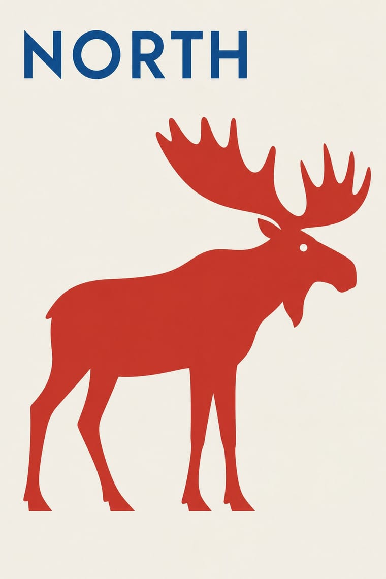
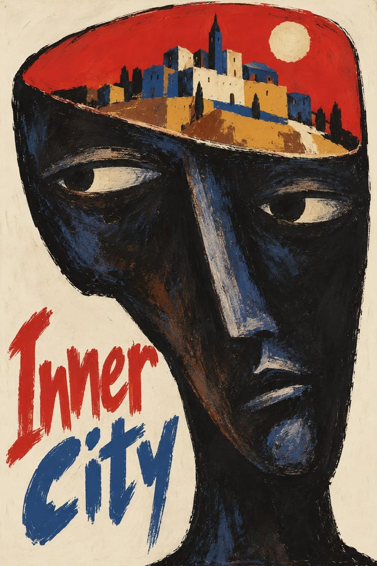
05
More combinations
With Finnish Symbol Poster
- Finnish Bold Print (Marimekko Modernism) Pairs well · The same Finnish flat colour and enlarged motif, one as a single sign on paper, the other as a repeat on cloth: pair a symbol poster with a printed-textile ground.
- Japanese Postwar Modernism Pairs well · Both reduce a poster to one emblem on empty ground; add the Japanese abstraction and calm to the Finnish animal and pun for a cooler sign.
- Basel Object Poster (Swiss Sachplakat) Contrasts · Kamekura compared Varis's humour to Leupin's, but the Basel poster paints the object in glossy relief where the Finnish one flattens it into a sign.
- Corporate Identity Modernism Pairs well · The same makers drew national logos (Finnair, Alko, the Nordic Council); combine the poster sign with a corporate identity programme.
With Polish Poster School
- International Typographic Style Contrasts · Painterly ambiguity versus objective grid and photography; borrow one hand-painted image to warm a Swiss-style cultural series.
- Socialist Realist Propaganda Poster Contrasts · The school defined itself against official heroic realism; use the pairing to show metaphor outperforming literal propaganda.
- Iranian Modernist Graphic Design Pairs well · Iranian designers absorbed the Polish metaphor poster; combine one surreal image with calligraphic lettering for cultural posters.
- Push Pin Style Pairs well · Both prize the illustrator-designer's hand and wit; pair Polish metaphor with Push Pin lettering for theatrical, idea-led posters.
- Polish Cold War Neon (PRL Neonisation) Pairs well · Some of the same artists drew posters and neons; take the poster's single witty idea and hand-drawn title and translate it into one line of light for a night version of a campaign.
- Polish Information Picture Book (Dwie Siostry) Contrasts · The poster designer and teacher Henryk Tomaszewski is credited with a role in the revival, but the poster school puts one painted, metaphorical image on a poster, while the picture books refuse paint and fill a spread with a hundred small labelled facts. Choose between a single idea that provokes and a dense page that informs.
- Turkish Modernist Poster & Graphic Design Contrasts · The same conceptual-poster network: Turkish designers showed at the Warsaw Poster Biennale from 1966 and Ertel's posters entered the Wilanów archive in 1968. The Polish school paints, collages and distorts its single idea; the Turkish posters cut it into flat shapes in two or three clean inks. Choose Warsaw for unease, Istanbul for a crisp visual pun.
- West German Conceptual Film & Culture Poster (Hillmann and Rambow) Contrasts · Its contemporary in art-film posters: the Polish school paints the metaphor and letters the title by hand in loose brushwork; take the Kassel route when the same single idea should come from a cropped photograph or a hard silhouette with set grotesque type.