Style combination · Pairs well
Corporate Identity Modernism × Finnish Symbol Poster
The same makers drew national logos (Finnair, Alko, the Nordic Council); combine the poster sign with a corporate identity programme.
Mix them and make something Corporate Identity Modernism Finnish Symbol Poster
01
What each style brings
Each part of the design comes from the style with the stronger say in it, and each style gives at least two.
Corporate Identity Modernism Finnish Symbol Poster (the 'Finnish School', 1954–1995)
- Type from Corporate Identity Modernism
- Colour from Finnish Symbol Poster
- Form from Finnish Symbol Poster
- Composition from Corporate Identity Modernism
- Surface from Corporate Identity Modernism
02
The type
Open fonts standing in for each style’s own type, which is often hand-drawn or commercial.
Text · Finnish Symbol Poster
Finnish poster and symbol design, 1950s to 1990s, in which one reduced picture, often an animal, an object or a visual pun, carries the whole message on an empty ground. Varis aimed for posters with no text; his were called sign-like and visually reduced. Dry humour (Bruun's tongue-in-cheek Finnair salmon, 1958) sits beside a love of Finnish nature. Unlike its parent it also campaigns: the social posters of the 1960s–70s, Varis's Your Lifemeter (1970), Piippo's Ruanda (1994). The same makers drew national logos; Mykkänen's book covers are a typographic side strand.
Inter; Finnish Symbol Poster used No type at all and Slab-serif capitals in Bruun's The Salmon Flight (1958)
03
The colours
The ground and leading colours come from Finnish Symbol Poster, with a counter-accent from Corporate Identity Modernism. The ink reads on the ground at 4.5:1 or more.
Corporate Identity Modernism Finnish Symbol Poster (the 'Finnish School', 1954–1995)
-
#f3efe6ground · 36% -
#151515ink · 14% -
#ee8a1daccent · 18% -
#d7261eaccent · 14% -
#0a4fa0accent · 10% -
#a4a9adaccent · 8%
As CSS
:root {
  --ground: #f3efe6;
  --ink: #151515;
  --accent-1: #ee8a1d;
  --accent-2: #d7261e;
  --accent-3: #0a4fa0;
  --accent-4: #a4a9ad;
  --font-display: "Inter Tight", sans-serif;
  --font-text: "Inter", sans-serif;
}
04
The two styles
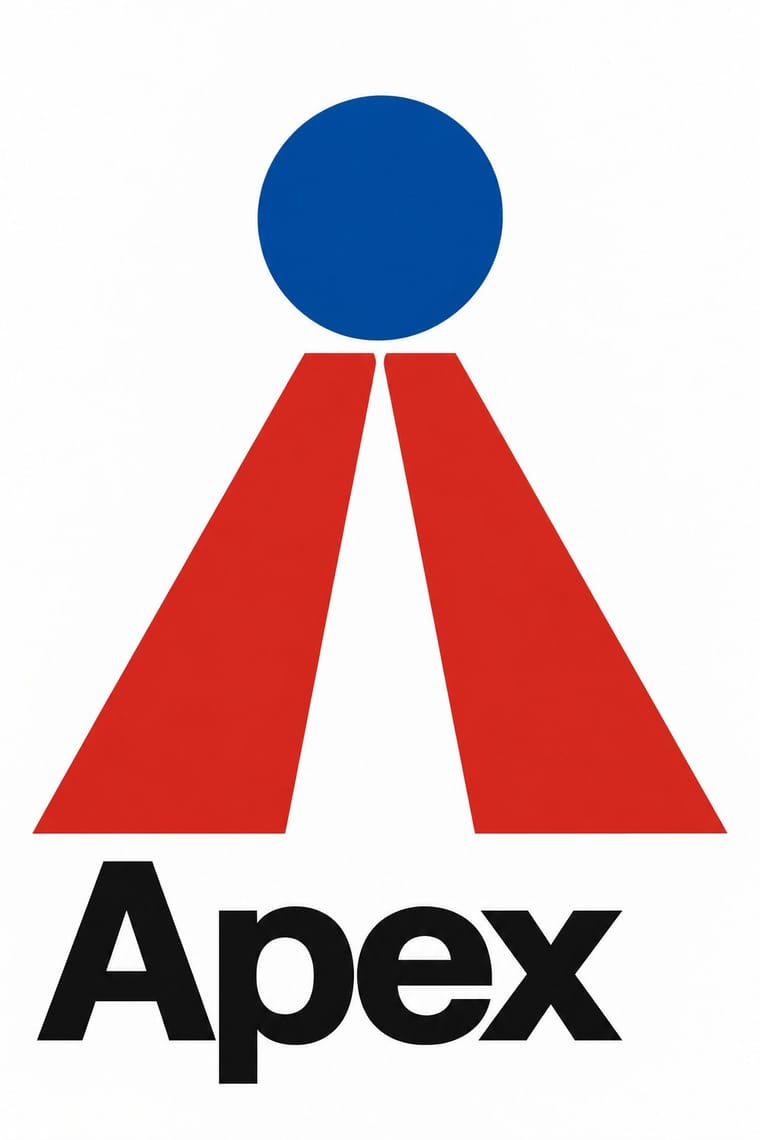
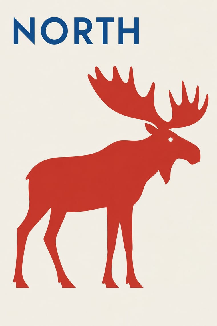
05
More combinations
With Corporate Identity Modernism
- Corporate Memphis Contrasts · Its successor trades abstract authority for rubbery friendliness; compare the two to decide how institutional or human a brand should feel.
- Generative & Dynamic Identities Pairs well · Keep the manual's mark, colour and grid as constants and let generative rules vary one parameter, so the system still reads as one company.
- Flat Design Pairs well · Flat UI inherits these reductive marks; reuse their clear-space and colour-code discipline when scaling icons across screens.
- Punk & DIY Zine Contrasts · Punk's ransom-note lettering is the anti-manual; one torn, xeroxed element against a corporate grid reads instantly as critique.
- Plakatstil / Sachplakat Pairs well · Its brand-name-plus-object formula prefigures logo-led identity; pair it with a modernist grid for confident product campaigns.
- Risograph & Indie Print Culture Contrasts · Exact Pantone-matched corporate colour is the opposite of riso's drifting inks; use the contrast to signal independence.
- Contemporary Arabic & Dual-Script Type Design Pairs well · Roll a matched Arabic–Latin family through a standards manual so both scripts carry the identity with equal authority.
- Milanese Industrial Modernism (Olivetti, Pirelli, Studio Boggeri) Contrasts · American corporate identity policed one mark through a manual, while Milan let artists vary the language; compare the two when deciding how strict a brand system should be.
With Finnish Symbol Poster
- Finnish Bold Print (Marimekko Modernism) Pairs well · The same Finnish flat colour and enlarged motif, one as a single sign on paper, the other as a repeat on cloth: pair a symbol poster with a printed-textile ground.
- Japanese Postwar Modernism Pairs well · Both reduce a poster to one emblem on empty ground; add the Japanese abstraction and calm to the Finnish animal and pun for a cooler sign.
- Polish Poster School Contrasts · Another wit-driven postwar poster school, but painterly, hand-lettered and distorted against the Finnish flat, near-wordless symbol.
- Basel Object Poster (Swiss Sachplakat) Contrasts · Kamekura compared Varis's humour to Leupin's, but the Basel poster paints the object in glossy relief where the Finnish one flattens it into a sign.