Digital native · 2018–present · Global / networked, North America, Western Europe
Cottagecore
Also known as Cottage core, Cottagecore aesthetic
An internet-born pastoral aesthetic of cottage gardens, wildflowers, baking and slow rural life, circulated as mood boards, stickers, packaging, book covers and game art. Its link to Arts and Crafts is one of shared ideals (craft, rural simplicity, folk styles as a counter to industrial production), not a direct visual descent. It has been criticised for romanticising rural life and ignoring rural poverty, and for evoking conservative gender roles, Eurocentrism and heteronormativity.
Make something in this style Get advice in this style Mix it with another style
01
How it works
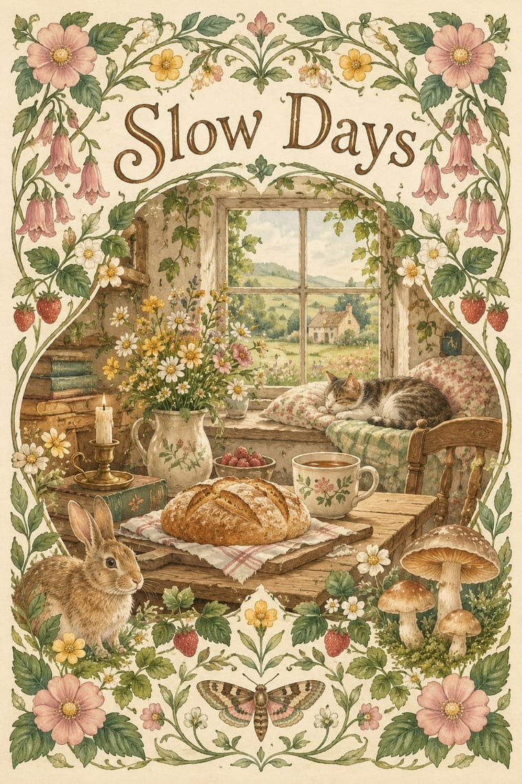
- Draw on the countryside: put wildflowers, mushrooms, bread, animals and cottage interiors at the centre of the image.
- Keep the palette muted and earthy, with sage, cream, dusty rose and butter yellow lit by soft, warm light.
- Render images as gentle watercolour, gouache or soft-focus photography rather than crisp vector or hard photography.
- Wrap text and objects in floral borders, wreaths and repeated botanical pattern.
- Set type in warm serifs, hand lettering or occasional script that feels handwritten, never corporate.
- Evoke an unhurried, idealised past with a tone of calm and nostalgia.
Tumblr, 2018; spread to Pinterest and TikTok, with a sharp rise in spring 2020 during pandemic lockdowns
02
Its design choices
From Stylogeny’s vocabulary of design choices: defining choices make the style, characteristic ones are usual, occasional ones turn up now and then.
- Layout & composition
- Space & hierarchy
- Typography
- Colour
- Form & shape
- Surface & texture
- Imagery
- Medium & production
- Tone & intent
- Avoids
- Ornament-free, Grotesque & neo-grotesque, Fluorescent & neon, Dark ground, Gloss & highlights, Modular grid, Agitational & persuasive
Palette
-
#f4ecd8 -
#a9b79a -
#d9a5a0 -
#e8c872 -
#7b5e4b -
#4f6b4a
Typefaces
-
Italicised roman title lettering, described on Wikipedia as reminiscent of a Chronicles of Narnia scrawl
Folklore cover
-
Warm serifs and hand lettering
indicative, not tied to a named typeface or a design-press source
Known for
-
Taylor Swift, Folklore
2020; artwork made in collaboration with photographer Beth Garrabrant; grayscale woodland photographs and italic roman title lettering; cited by W magazine as cottagecore
-
The Sims 4
Cottage Living expansion pack (July 2021; linked to cottagecore on Wikipedia's Cottagecore page)
-
Tumblr, Pinterest and TikTok mood boards
a 150% rise in cottagecore posts on Tumblr, March to May 2020, reported by Sourcing Journal
-
Animal Crossing
New Horizons (2020), compared with cottagecore in New York Times coverage; cultural context only, its cartoon look differs from the botanical principles
03
Make something in this style
Say what you need, and Stylogeny’s image studio draws it from Cottagecore’s design choices and checks it against them. It takes about a minute, and you get a link to share.
04
Where it comes from, and what it’s close to
Before it
The style it grew out of, and the styles it borrowed from.
After it
The styles that grew out of it.
No later style in the atlas grew out of it yet.
Alike in its design choices
Styles that make many of the same choices, related or not, besides those above.
-
-
-
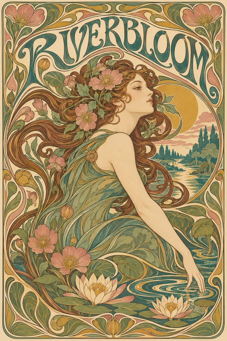
-
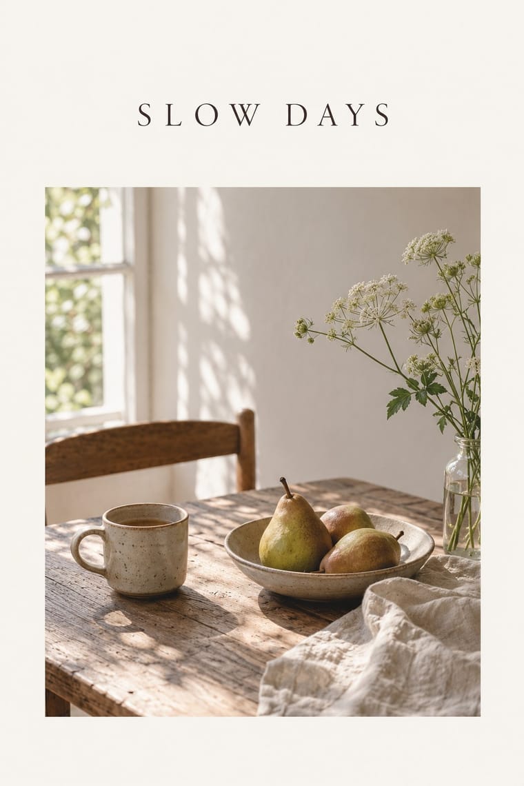
-
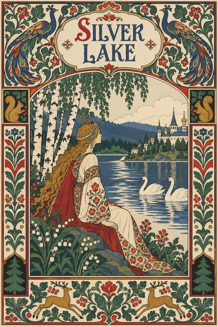
-
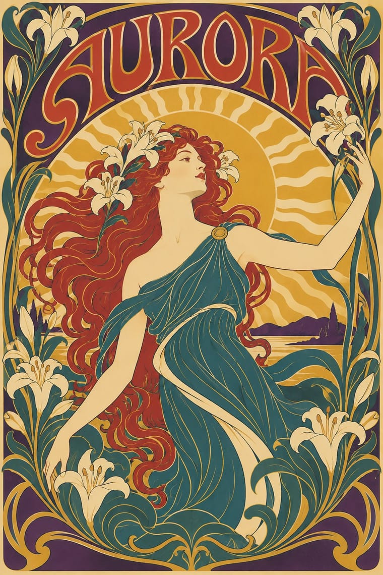
05
Often taken for
Cottagecore has no real works recorded yet, so these are its nearest styles by its choices alone, with the choices that tell them apart.
-
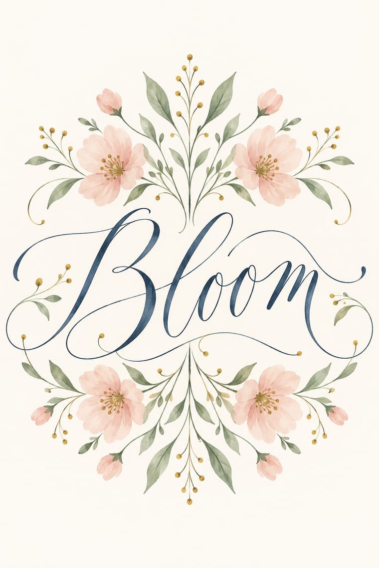
Modern Calligraphy and Brush Lettering
Modern Calligraphy and Brush Lettering is one of Cottagecore’s nearest styles by choices; no real work of either fits the other better.
Choices that tell Cottagecore and Modern Calligraphy and Brush Lettering apart Choice Cottagecore Modern Calligraphy and Brush Lettering Analogous harmony characteristic — Brush & pen calligraphy — defining Earth & mineral characteristic — Dark ground avoids occasional Naturalistic depiction characteristic — No shared descent in the atlas: they reached these choices separately.
-
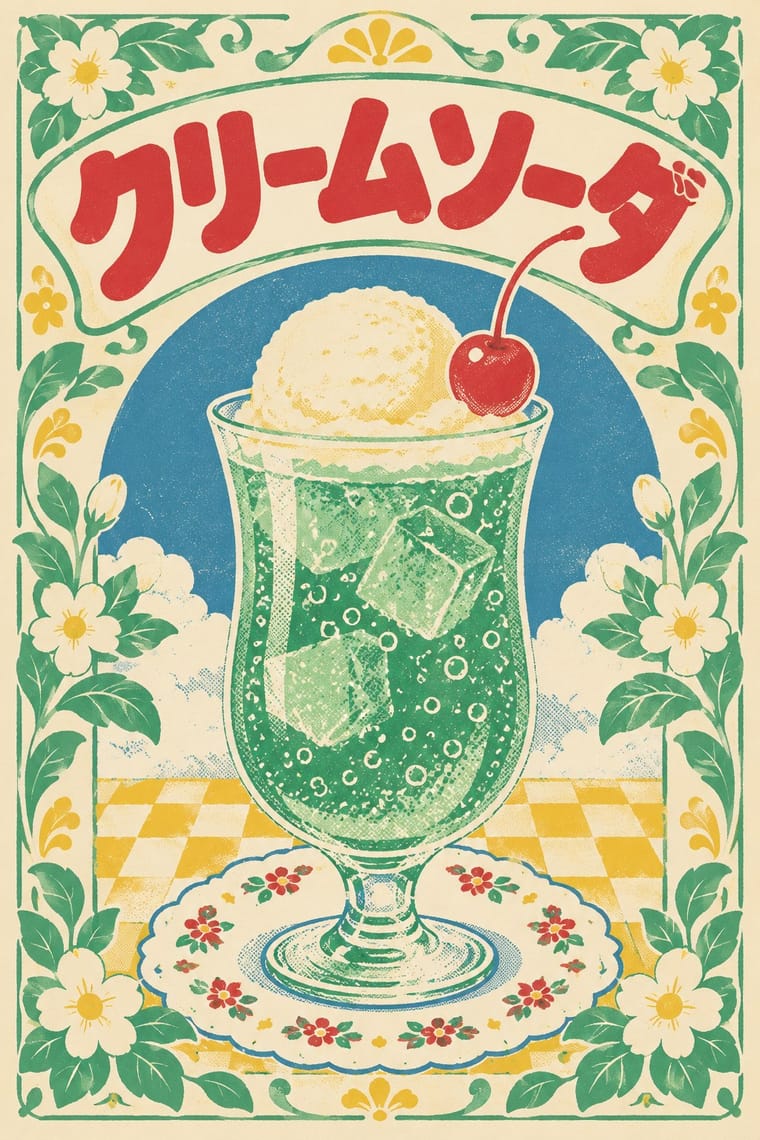
Showa and Heisei Retro Revival (Japanese Packaging and Kissaten Graphics)
Showa and Heisei Retro Revival is one of Cottagecore’s nearest styles by choices; no real work of either fits the other better.
Choices that tell Cottagecore and Showa and Heisei Retro Revival apart Choice Cottagecore Showa and Heisei Retro Revival Biomorphic curves defining — Flat fields — defining Analogous harmony characteristic — Limited spot colours — defining Earth & mineral characteristic — No shared descent in the atlas: they reached these choices separately.
-
Art Nouveau
Art Nouveau is one of Cottagecore’s nearest styles by choices; no real work of either fits the other better.
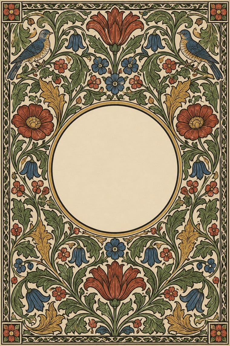
Choices that tell Cottagecore and Art Nouveau apart Choice Cottagecore Art Nouveau Earth & mineral characteristic — Whiplash line — defining Light ground characteristic — Abundant decoration occasional defining Rounded & pill characteristic — Both descend from Arts & Crafts Movement in the family tree.
-
Slow-Living Editorial (the Kinfolk Look)
Slow-Living Editorial is one of Cottagecore’s nearest styles by choices; no real work of either fits the other better.
Choices that tell Cottagecore and Slow-Living Editorial apart Choice Cottagecore Slow-Living Editorial Biomorphic curves defining — Ornament-free avoids characteristic Floral & vegetal defining — Isolated object — characteristic Abundant decoration occasional avoids No shared descent in the atlas: they reached these choices separately.
— means the choice isn’t among the style’s recorded choices. Critics recorded each work’s choices with the styles’ descriptions in view, so this shows whether the descriptions hold together, not proof that they are right.
06
Combine it with
Styles Cottagecore pairs well with or plays against, from the research. Each is worked out as a combination: which style gives the type, the colours and the forms.
- Hipster Artisanal Revival Contrasts · Shares handmade, small-batch values, but swap its black-and-white urban badges for soft colour and florals to get cottagecore.
- Solarpunk Pairs well · Add solarpunk's hopeful green futures to cottagecore's gardens for an eco-pastoral look.
- Art Nouveau Pairs well · Use its whiplash floral borders for a more ornate, romantic variant.
- Lo-fi Anime Aesthetic Pairs well · Both are calm, cosy, soft-lit internet moods; combine a lofi window scene with a cottage garden.
- Slow-Living Editorial (the Kinfolk Look) Contrasts · Shares soft natural light and slow living, but is minimal and photographic where cottagecore is floral and illustrated.
- Dark Academia Contrasts · Also a nostalgic digital moodboard, but rural, light and floral where this is urban, dark and scholarly.
07
Sources
- Wikipedia, Cottagecore (https://en.wikipedia.org/wiki/Cottagecore), for origin, 2020 rise, Arts and Crafts ideals and the critiques
- Isabel Slone, New York Times, 10 March 2020 (https://www.nytimes.com/2020/03/10/style/cottagecore.html), as cited on Wikipedia
- Rebecca Jennings, Vox, 7 July 2020 (https://www.vox.com/the-goods/2020/7/7/21315213/cottagecore-tiktok-dark-academia), for the conservative values and gender roles critique, as cited on Wikipedia
- Angela Velasquez, Sourcing Journal, 10 June 2020 (https://sourcingjournal.com/denim/denim-trends/gen-z-fashion-cottagecore-sustainability-edited-elfin-fairies-gigi-hadid-215061/), for the Tumblr 150% figure, as cited on Wikipedia
- Wikipedia, Folklore (Taylor Swift album), for the grayscale cover, italic roman title and Garrabrant collaboration
How Stylogeny researches and checks a style: where the facts come from.