Pictorial & machine age · 1890–1914 · Southern Europe
Italian Liberty Poster (Ricordi and the Stile Liberty Affiche)
Also known as Stile Liberty poster, Stile floreale poster, Ricordi lithographic workshop posters
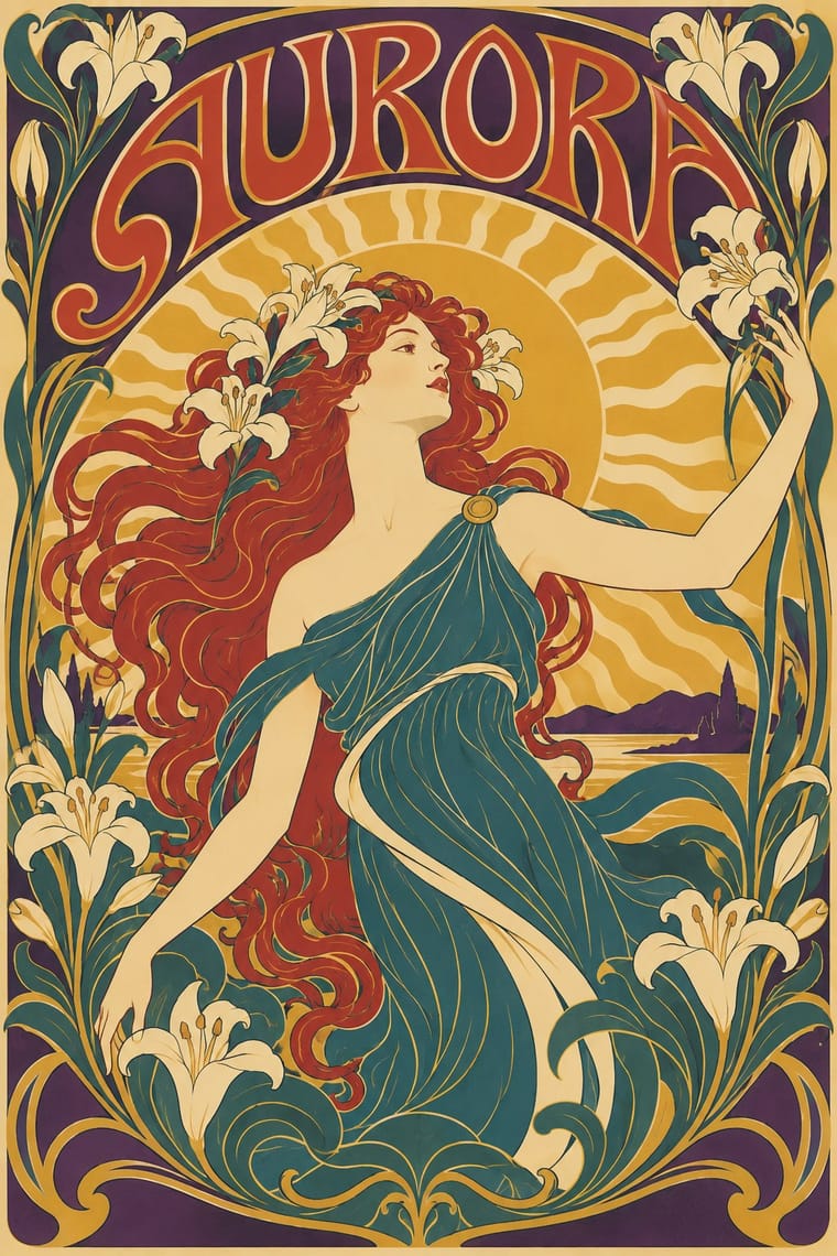
The Italian form of the Art Nouveau poster, produced largely in Milan around the Ricordi lithographic workshop for opera, department stores, liqueurs and expositions. A single monumental woman or stage figure, drawn in flat colour inside sinuous outlines and framed by floral borders, carries the sale. It differs from general Art Nouveau in being a poster form: one monumental figure, theatrical and commercial subjects (opera, department stores, liqueurs), and flat lithographic colour built to sell. Some later work, such as Dudovich's Mele posters, simplifies the figure.
Make something in this style Get advice in this style Mix it with another style
01
How it works
- Place one large allegorical or theatrical figure at the centre and let it carry the whole message.
- Draw the figure in flat lithographic colour fields bounded by flowing, whiplash outlines.
- Frame the image with floral borders, garlands or a panel edge that holds the composition like a stage.
- Letter the title and brand by hand, integrated into the picture and shaped to its curves.
- Keep the mood theatrical and glamorous, selling opera, fashion or liqueur as spectacle.
- In some later work, flatten and simplify the figure into bolder silhouettes.
Milan and Turin, Italy, with the Ricordi workshop in Milan as its centre; other Stile Liberty poster work came from Turin and Livorno. Giulio Ricordi, who ran the Casa Ricordi music publishing firm from 1888 to 1912, moved it into poster printing, with artists and lithographers such as Leopoldo Metlicovitz (technical director from 1892), Adolfo Hohenstein and Marcello Dudovich.
02
Its design choices
From Stylogeny’s vocabulary of design choices: defining choices make the style, characteristic ones are usual, occasional ones turn up now and then.
- Layout & composition
- Space & hierarchy
- Typography
- Colour
- Form & shape
- Surface & texture
- Medium & production
- Tone & intent
- Avoids
- Modular grid, Rectilinear, Grotesque & neo-grotesque, Ornament-free, Straight photography, Monochrome, Rational & objective
Palette
-
#f1e4c3 -
#b8382f -
#2f5d62 -
#d9a441 -
#3b2a4a
Typefaces
-
Hand-drawn Liberty display lettering integrated into the image
-
Art Nouveau decorative display capitals
Italian lithographic houses
-
Hand-drawn script for opera titles and brand names
Known for
-
Leopoldo Metlicovitz, opera posters for Ricordi
Tosca, 1900; Madama Butterfly, 1904
-
Leopoldo Metlicovitz, poster for the 1906 Milan Universal Exhibition
-
Marcello Dudovich, posters for the Mele department store, Naples
-
Adolfo Hohenstein, Madama Butterfly poster for Ricordi
-
Giovanni Maria Mataloni, gas lamp poster
1896; Stile Liberty, not Ricordi
-
Giuseppe Boano, Teatro Regio poster
1898; Stile Liberty, not Ricordi
-
Leonardo Bistolfi, poster for the 1902 Turin Exposition
Stile Liberty, not Ricordi
-
Leonetto Cappiello, baths of Livorno poster
1901; Stile Liberty, not Ricordi
03
Make something in this style
Say what you need, and Stylogeny’s image studio draws it from Italian Liberty Poster (Ricordi and the Stile Liberty Affiche)’s design choices and checks it against them. It takes about a minute, and you get a link to share.
04
Where it comes from, and what it’s close to
Before it
The style it grew out of, and the styles it borrowed from.
After it
The styles that grew out of it.
No later style in the atlas grew out of it yet.
Alike in its design choices
Styles that make many of the same choices, related or not, besides those above.
05
Often taken for
Italian Liberty Poster has no real works recorded yet, so these are its nearest styles by its choices alone, with the choices that tell them apart.
-
Push Pin Style
2 of Push Pin Style’s 4 real works fit Italian Liberty Poster’s choices better than their own: Dylan and Mahalia Jackson.
Choices that tell Italian Liberty Poster and Push Pin Style apart Choice Italian Liberty Poster Push Pin Style Floral & vegetal defining occasional Line illustration occasional defining Biomorphic curves characteristic — Limited spot colours — characteristic Lithography defining — No shared descent in the atlas: they reached these choices separately.
-
Art Deco
1 of Art Deco’s 5 real works fits Italian Liberty Poster’s choices slightly better than its own: La danseuse aux jets d'eau, plate 61 from Gazette du Bon…
Choices that tell Italian Liberty Poster and Art Deco apart Choice Italian Liberty Poster Art Deco Whiplash line characteristic avoids Angular & zigzag — defining Floral & vegetal defining — Geometric sans — defining Hand-lettering defining — Both descend from Art Nouveau in the family tree.
-
Art Nouveau
Art Nouveau is one of Italian Liberty Poster’s nearest styles by choices; no real work of either fits the other better.
Choices that tell Italian Liberty Poster and Art Nouveau apart Choice Italian Liberty Poster Art Nouveau Full polychrome characteristic — Organic flow occasional defining Isolated object characteristic — Abundant decoration occasional defining Measured density characteristic — Italian Liberty Poster descends from Art Nouveau: a shared line, so the likeness is inherited.
-
Bezalel School
Bezalel School is one of Italian Liberty Poster’s nearest styles by choices; no real work of either fits the other better.
Choices that tell Italian Liberty Poster and Bezalel School apart Choice Italian Liberty Poster Bezalel School Isolated object characteristic — Folk & sacred symbols — defining Measured density characteristic — Jewel & metallic occasional defining All caps characteristic — Both descend from Art Nouveau in the family tree.
— means the choice isn’t among the style’s recorded choices. Critics recorded each work’s choices with the styles’ descriptions in view, so this shows whether the descriptions hold together, not proof that they are right.
06
Combine it with
Styles Italian Liberty Poster (Ricordi and the Stile Liberty Affiche) pairs well with or plays against, from the research. Each is worked out as a combination: which style gives the type, the colours and the forms.
- International Typographic Style Contrasts · A grid-bound, ornament-free neutral layout against a floral, figure-led theatrical one.
- Art Deco Pairs well · A later style (after 1914) toward which the whiplash curves could be flattened into stepped, symmetrical glamour for a luxury-goods poster.
- Belle Époque Lithographic Poster Pairs well · Take the French poster's single-figure punch but add Ricordi's framed, theatrical symmetry and floral borders.
- Italian Futurism Pairs well · A later movement that Liberty poster simplification only anticipates: harder geometry and dynamic silhouettes, kept here within lithographic colour.
07
Sources
- https://en.wikipedia.org/wiki/Stile_Liberty
- https://en.wikipedia.org/wiki/Casa_Ricordi
- https://en.wikipedia.org/wiki/Leopoldo_Metlicovitz
- https://en.wikipedia.org/wiki/Marcello_Dudovich
- https://en.wikipedia.org/wiki/Adolfo_Hohenstein
How Stylogeny researches and checks a style: where the facts come from.