Style combination · Pairs well
Cottagecore × Solarpunk
Add solarpunk's hopeful green futures to cottagecore's gardens for an eco-pastoral look.
01
What each style brings
Each part of the design comes from the style with the stronger say in it, and each style gives at least two.
Cottagecore Solarpunk
- Type from Solarpunk
- Colour from Cottagecore
- Form from Cottagecore
- Composition from Solarpunk
- Surface from Cottagecore
02
The type
Open fonts standing in for each style’s own type, which is often hand-drawn or commercial.
Display · Solarpunk
Rose
Federant, standing in for Swash, Art Nouveau-flavoured upper- and lowercase display lettering, as in Solarpunk Magazine's orange masthead (Issue #14, 2024)
Text · Cottagecore
An internet-born pastoral aesthetic of cottage gardens, wildflowers, baking and slow rural life, circulated as mood boards, stickers, packaging, book covers and game art. Its link to Arts and Crafts is one of shared ideals (craft, rural simplicity, folk styles as a counter to industrial production), not a direct visual descent. It has been criticised for romanticising rural life and ignoring rural poverty, and for evoking conservative gender roles, Eurocentrism and heteronormativity.
EB Garamond; Cottagecore used Italicised roman title lettering, described on Wikipedia as reminiscent of a Chronicles of Narnia scrawl and Warm serifs and hand lettering
03
The colours
The ground and leading colours come from Cottagecore, with a counter-accent from Solarpunk. The ink reads on the ground at 4.5:1 or more.
Cottagecore Solarpunk
-
#f4ecd8ground · 36% -
#4f6b4aink · 14% -
#e8c872accent · 18% -
#e8b445accent · 14% -
#d9a5a0accent · 10% -
#b8652faccent · 8%
As CSS
:root {
  --ground: #f4ecd8;
  --ink: #4f6b4a;
  --accent-1: #e8c872;
  --accent-2: #e8b445;
  --accent-3: #d9a5a0;
  --accent-4: #b8652f;
  --font-display: "Federant", sans-serif;
  --font-text: "EB Garamond", serif;
}
Use it with care
Solarpunk: Draw original worlds rather than pastiches of Studio Ghibli films or of living illustrators such as Likhain, Fei Fei Ruan or Stephen Lillie, and do not prompt an image model with their names. Do not use the look to greenwash: Adam Flynn calls luxury condos with a green roof that price out existing communities 'fake Solarpunk urbanism', so show shared, affordable infrastructure and ordinary people. When a scene borrows architecture, dress or symbols from a specific culture (Afrofuturist, Indigenous or other), keep their meanings and credit their makers.
04
The two styles
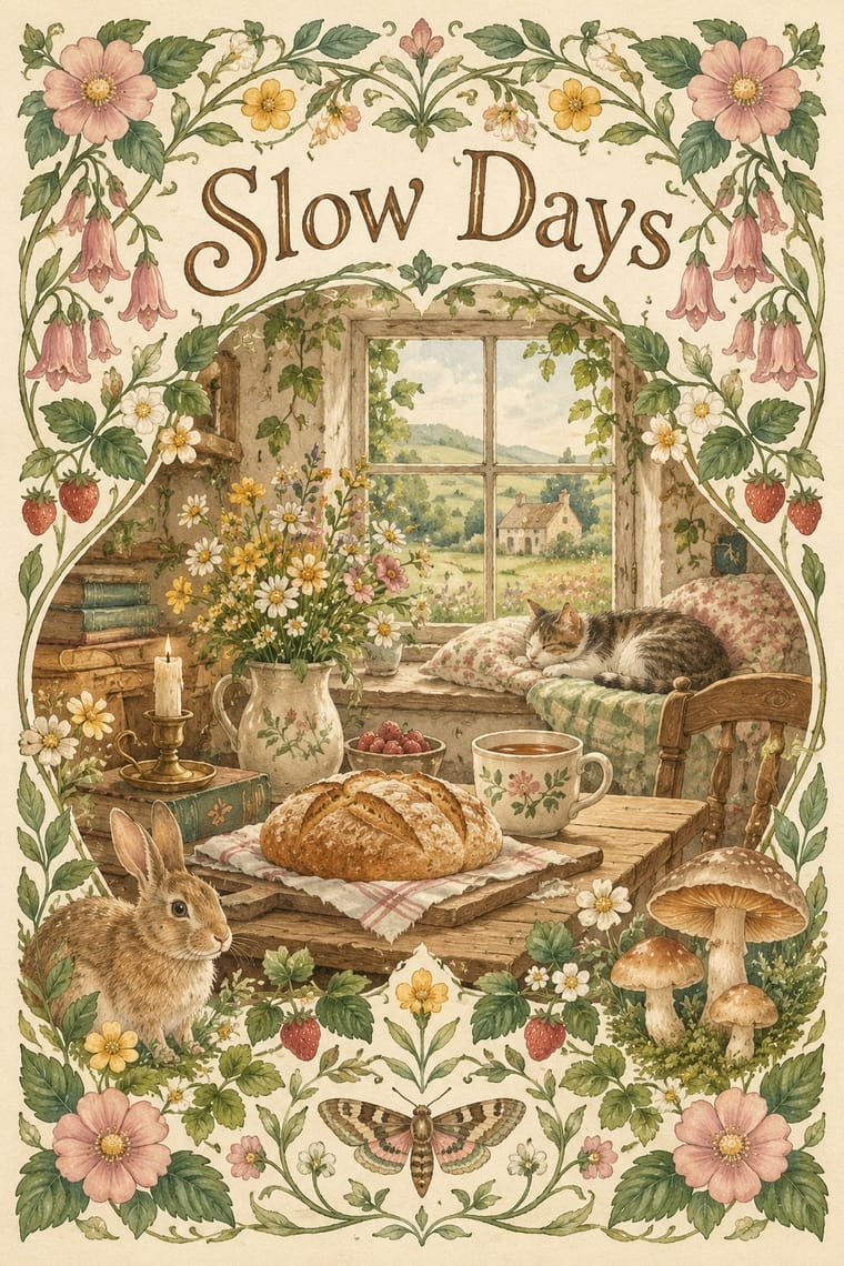
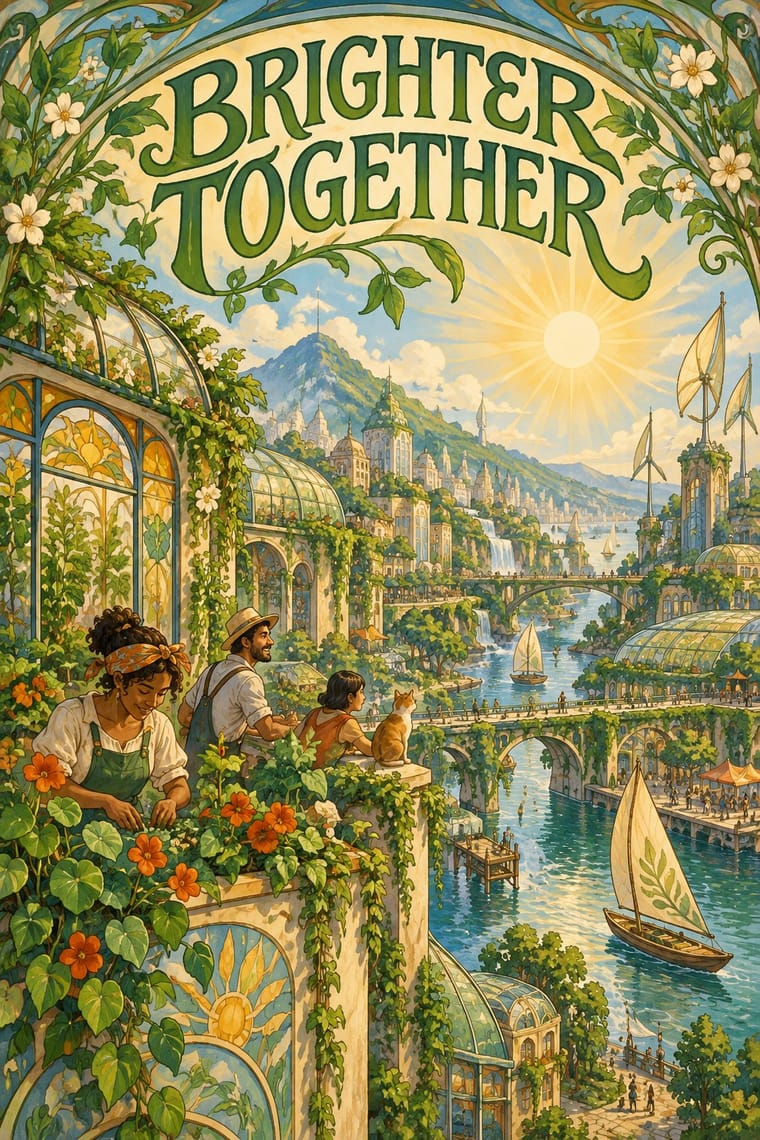
05
More combinations
With Cottagecore
- Hipster Artisanal Revival Contrasts · Shares handmade, small-batch values, but swap its black-and-white urban badges for soft colour and florals to get cottagecore.
- Art Nouveau Pairs well · Use its whiplash floral borders for a more ornate, romantic variant.
- Lo-fi Anime Aesthetic Pairs well · Both are calm, cosy, soft-lit internet moods; combine a lofi window scene with a cottage garden.
- Slow-Living Editorial (the Kinfolk Look) Contrasts · Shares soft natural light and slow living, but is minimal and photographic where cottagecore is floral and illustrated.
- Dark Academia Contrasts · Also a nostalgic digital moodboard, but rural, light and floral where this is urban, dark and scholarly.
With Solarpunk
- Afrofuturist Design Pairs well · Wakanda is claimed by both: Afrofuturism brings ancestral glyphs, regal figures and cosmic dark grounds, solarpunk daylight, gardens and ordinary communities; join them with the symbols' meanings intact and Black artists credited.
- Frutiger Aero Contrasts · Both pair green nature with optimistic technology, but Aero renders it as glossy stock photography, bubbles and glass for a product; choose solarpunk for painted, handmade, lived-in places and shared infrastructure.
- Extinction Rebellion Graphics Contrasts · Both answer the climate crisis: XR shouts alarm in woodcut and flat spot colour; solarpunk paints the hopeful world after it. Pair them for campaigns that move from warning to vision.
- Synthwave / Outrun Contrasts · Synthwave's retro future is neon, chrome and night on an empty grid; solarpunk is daylit, green and crowded with people. Put them side by side to stage a fossil-fuelled nostalgia against a renewable future.
- Art Nouveau Pairs well · Olivia Louise built the look on 'updated Art Nouveau': borrow arched frames, whiplash vines and Mucha-style lettering for the veneer, but keep the painted vista and future infrastructure so it reads as a world to come rather than a period revival.
- Lo-fi Anime Aesthetic Pairs well · Both draw on Miyazaki and Ghibli-style painted backgrounds; lofi turns inward to one quiet room at dusk, solarpunk outward to a shared, sunlit city.
- Arts & Crafts Movement Pairs well · Both prize the artisan over the factory; wrap a solarpunk scene in a Morris-style foliage border or woodcut initial for zines, seed packets and printed manifestos.
- Biobrand (Organic Biotech CGI) Contrasts · Both pair nature with technology, but solarpunk paints a communal daylit landscape; the biobrand isolates one rendered organism as a product. Switch to solarpunk when the story is a shared future rather than a single item.