Style combination · Pairs well
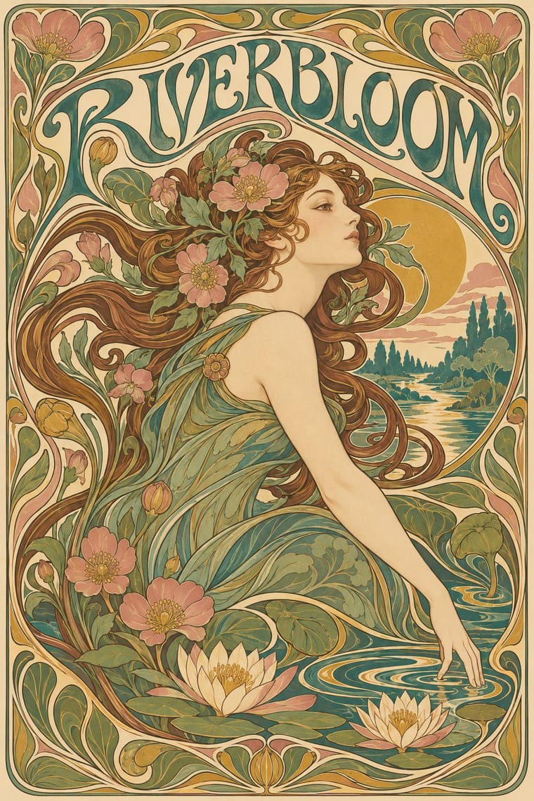
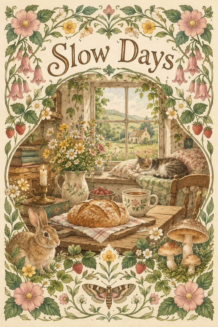
Art Nouveau × Cottagecore
Use its whiplash floral borders for a more ornate, romantic variant.
01
What each style brings
Each part of the design comes from the style with the stronger say in it, and each style gives at least two.
Art Nouveau Cottagecore
- Type from Art Nouveau
- Colour from Cottagecore
- Form from Art Nouveau
- Composition from Art Nouveau
- Surface from Cottagecore
02
The type
Open fonts standing in for each style’s own type, which is often hand-drawn or commercial.
Text · Cottagecore
An internet-born pastoral aesthetic of cottage gardens, wildflowers, baking and slow rural life, circulated as mood boards, stickers, packaging, book covers and game art. Its link to Arts and Crafts is one of shared ideals (craft, rural simplicity, folk styles as a counter to industrial production), not a direct visual descent. It has been criticised for romanticising rural life and ignoring rural poverty, and for evoking conservative gender roles, Eurocentrism and heteronormativity.
EB Garamond; Cottagecore used Italicised roman title lettering, described on Wikipedia as reminiscent of a Chronicles of Narnia scrawl and Warm serifs and hand lettering
03
The colours
The ground and leading colours come from Cottagecore, with a counter-accent from Art Nouveau. The ink reads on the ground at 4.5:1 or more.
Art Nouveau Cottagecore
-
#f4ecd8ground · 36% -
#4f6b4aink · 14% -
#e8c872accent · 18% -
#c9a24baccent · 14% -
#d9a5a0accent · 10% -
#3f7a75accent · 8%
As CSS
:root {
  --ground: #f4ecd8;
  --ink: #4f6b4a;
  --accent-1: #e8c872;
  --accent-2: #c9a24b;
  --accent-3: #d9a5a0;
  --accent-4: #3f7a75;
  --font-display: "Federant", sans-serif;
  --font-text: "EB Garamond", serif;
}
04
The two styles
05
More combinations
With Art Nouveau
- Fileteado Porteño Pairs well · Fileteado's acanthus scrolls share the whiplash; combine them for ornate, hand-made lettering frames.
- International Typographic Style Contrasts · Ornamental curves against an orthogonal grid make a strong deliberate tension; let one botanical flourish break a cold grid.
- Psychedelic Poster Pairs well · San Francisco poster artists lifted Mucha's figures and whiplash wholesale; push the curves into saturated, vibrating colour for a 1960s-flavoured revival.
- Russian Constructivism Contrasts · Organic sensuality versus machine-age diagonals: use the opposition to stage nature against industry.
- Vienna Secession Contrasts · Set French whiplash against the Viennese square to show the turn from organic to geometric ornament within one decorative idiom.
- Skønvirke (Danish Art Nouveau, Bindesbøll) Contrasts · Shares the hand-lettering and abundance but swaps the whiplash line and the female figure for blunt abstract masses; set side by side they show the heavy Danish variant.
- Expressionist Woodcut Graphics Contrasts · The parent's smooth whiplash and floral harmony is exactly what the gouge splinters; use one against the other to stage order breaking down.
- Beggarstaffs Poster (Nicholson & Pryde) Contrasts · Its curving floral line is the opposite of cut masses; set side by side to show how much a poster can drop.
With Cottagecore
- Hipster Artisanal Revival Contrasts · Shares handmade, small-batch values, but swap its black-and-white urban badges for soft colour and florals to get cottagecore.
- Solarpunk Pairs well · Add solarpunk's hopeful green futures to cottagecore's gardens for an eco-pastoral look.
- Lo-fi Anime Aesthetic Pairs well · Both are calm, cosy, soft-lit internet moods; combine a lofi window scene with a cottage garden.
- Slow-Living Editorial (the Kinfolk Look) Contrasts · Shares soft natural light and slow living, but is minimal and photographic where cottagecore is floral and illustrated.
- Dark Academia Contrasts · Also a nostalgic digital moodboard, but rural, light and floral where this is urban, dark and scholarly.