Style combination · Contrasts
Cottagecore × Dark Academia
Also a nostalgic digital moodboard, but rural, light and floral where this is urban, dark and scholarly.
01
What each style brings
Each part of the design comes from the style with the stronger say in it, and each style gives at least two.
Cottagecore Dark Academia
- Type from Dark Academia
- Colour from Dark Academia
-
Cottagecore avoids dark ground: this is where the two pull against each other, which is the point of the contrast.
- Form from Cottagecore
-
Dark Academia avoids floral & vegetal: this is where the two pull against each other, which is the point of the contrast.
- Composition from Dark Academia
- Surface from Cottagecore
02
The type
Open fonts standing in for each style’s own type, which is often hand-drawn or commercial.
Text · Cottagecore
An internet-born pastoral aesthetic of cottage gardens, wildflowers, baking and slow rural life, circulated as mood boards, stickers, packaging, book covers and game art. Its link to Arts and Crafts is one of shared ideals (craft, rural simplicity, folk styles as a counter to industrial production), not a direct visual descent. It has been criticised for romanticising rural life and ignoring rural poverty, and for evoking conservative gender roles, Eurocentrism and heteronormativity.
EB Garamond; Cottagecore used Italicised roman title lettering, described on Wikipedia as reminiscent of a Chronicles of Narnia scrawl and Warm serifs and hand lettering
03
The colours
The ground and leading colours come from Dark Academia, with a counter-accent from Cottagecore. The ink reads on the ground at 4.5:1 or more.
Cottagecore Dark Academia
-
#16110eground · 36% -
#e8dcc4ink · 14% -
#c9b79caccent · 18% -
#e8c872accent · 14% -
#1c2a45accent · 10% -
#7b5e4baccent · 8%
As CSS
:root {
  --ground: #16110e;
  --ink: #e8dcc4;
  --accent-1: #c9b79c;
  --accent-2: #e8c872;
  --accent-3: #1c2a45;
  --accent-4: #7b5e4b;
  --font-display: "Cormorant Garamond", serif;
  --font-text: "EB Garamond", serif;
}
04
The two styles
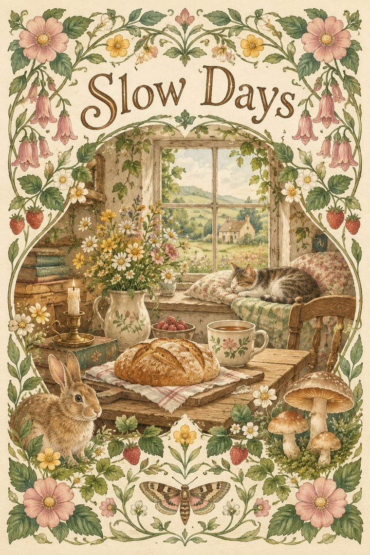
05
More combinations
With Cottagecore
- Hipster Artisanal Revival Contrasts · Shares handmade, small-batch values, but swap its black-and-white urban badges for soft colour and florals to get cottagecore.
- Solarpunk Pairs well · Add solarpunk's hopeful green futures to cottagecore's gardens for an eco-pastoral look.
- Art Nouveau Pairs well · Use its whiplash floral borders for a more ornate, romantic variant.
- Lo-fi Anime Aesthetic Pairs well · Both are calm, cosy, soft-lit internet moods; combine a lofi window scene with a cottage garden.
- Slow-Living Editorial (the Kinfolk Look) Contrasts · Shares soft natural light and slow living, but is minimal and photographic where cottagecore is floral and illustrated.
With Dark Academia
- Hauntology & Ghost Box Design Contrasts · Both turn institutional nostalgia uncanny, but Ghost Box uses grotesque type, halftone and flat fields where this is serif, photographic and dense.
- Slow-Living Editorial (the Kinfolk Look) Contrasts · Shares muted earth tones and humanist serifs, but airy and light where this is dim and dense.