Counterculture · 1979–1986 · Western Europe
2 Tone Graphics
Also known as 2 Tone, Two Tone sleeve design, Walt Jabsco look, Coventry ska graphics
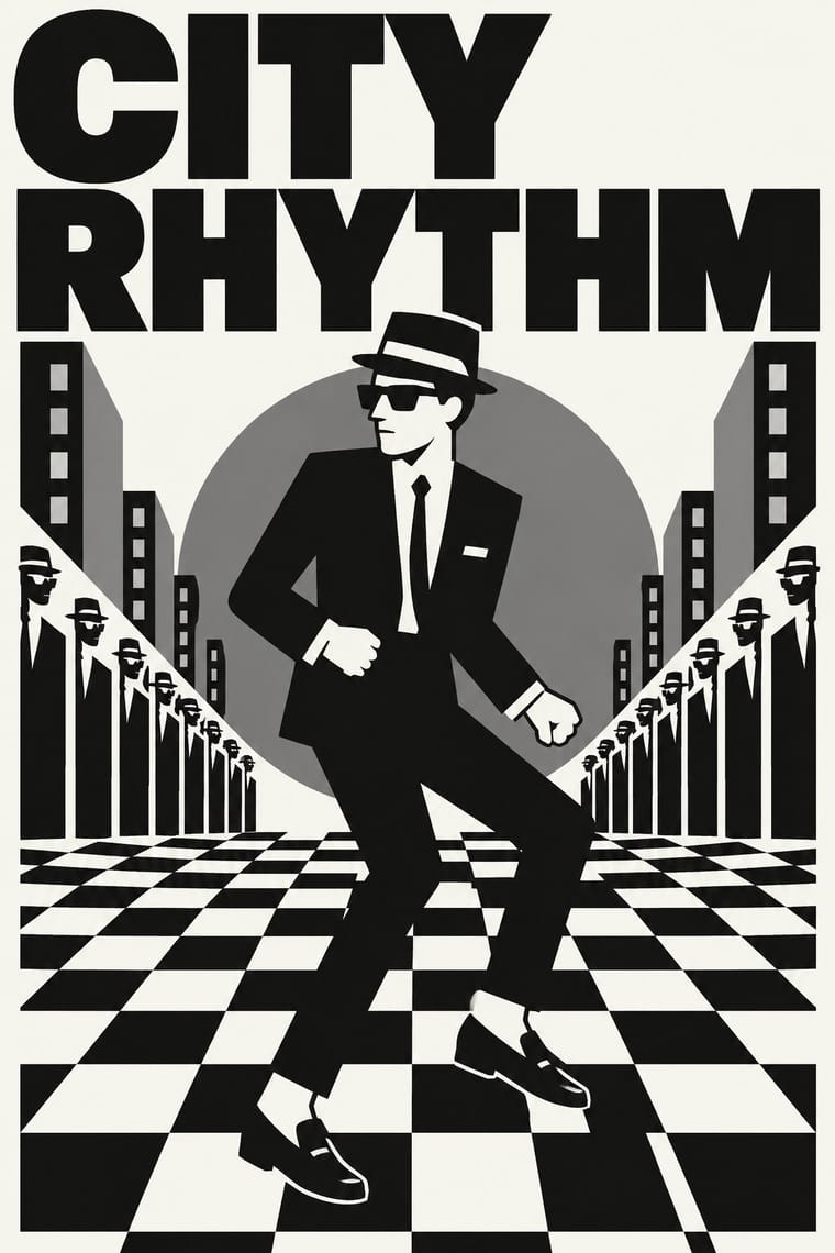
The visual identity of 2 Tone Records: a black-and-white checkerboard, taken by Jerry Dammers from an old mod pop-art motif, and a cartoon mascot, Walt Jabsco, a rude boy in suit and pork-pie hat based on a photograph of the Jamaican singer Peter Tosh. Devised by Dammers with Horace Panter, and worked up into artwork by John 'Teflon' Sims and David Storey, it turned punk-era DIY into a controlled, repeatable system and revived the dress of 1960s Jamaican ska and mod. It descends from op art through the check; the DIY spirit of punk is an influence, not the parent.
Make something in this style Get advice in this style Mix it with another style
01
How it works
- Reduce every release to a high-contrast black and white.
- Repeat one mascot and one checkerboard on every sleeve and label so the series reads as a brand.
- Draw the figure as a flat, simplified silhouette in suit, hat and loafers.
- Use the checkerboard as border, ground and trim to make a pattern into an emblem.
- Borrow the dress and attitude of 1960s ska and mod, and set it with bold, plain lettering.
Coventry, England: 2 Tone Records, founded in 1979 by Jerry Dammers of the Specials with Chrysalis backing
02
Its design choices
From Stylogeny’s vocabulary of design choices: defining choices make the style, characteristic ones are usual, occasional ones turn up now and then.
- Layout & composition
- Space & hierarchy
- Typography
- Colour
- Form & shape
- Surface & texture
- Imagery
- Medium & production
- Tone & intent
- Avoids
- Collage & layering, Horror vacui, Photocopy & distress, Photocopy & zine, Eclectic mixing, Experimental & distorted, Fluorescent & neon, Abundant decoration, Floral & vegetal
Palette
-
#111111 -
#f5f5f0 -
#7a7a7a -
#d9d9d4
Typefaces
-
Helvetica Inserat
2 Tone logotype
-
Bold grotesque sans capitals
Known for
-
Walt Jabsco logo
2 Tone Records, 1979
-
2 Tone logotype
large '2' above 'Tone' in Helvetica Inserat (Horace Panter)
-
TT1/TT2 split single
The Special AKA 'Gangsters' and The Selecter (1979)
-
The Specials, 'A Message to You Rudy'
CHS TT5
03
Make something in this style
Say what you need, and Stylogeny’s image studio draws it from 2 Tone Graphics’s design choices and checks it against them. It takes about a minute, and you get a link to share.
04
Where it comes from, and what it’s close to
Before it
The style it grew out of, and the styles it borrowed from.
After it
The styles that grew out of it.
No later style in the atlas grew out of it yet.
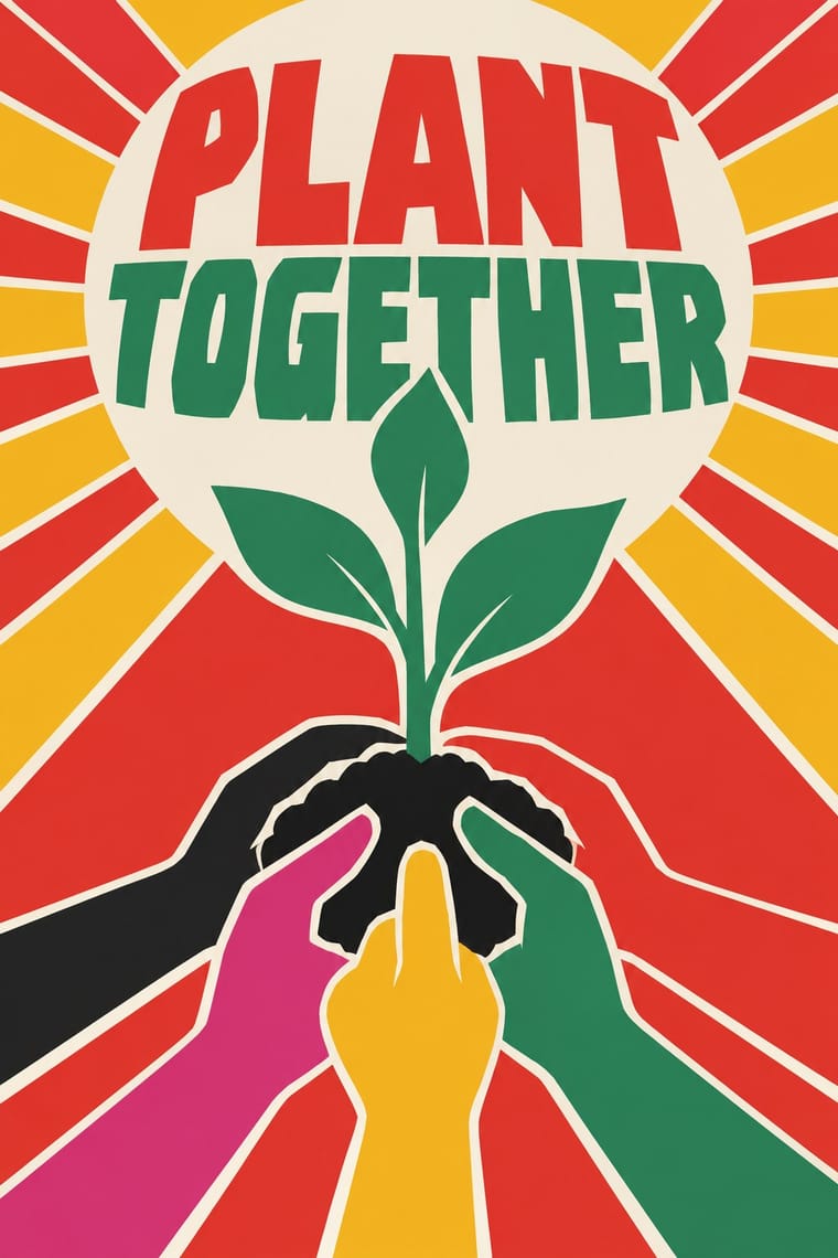
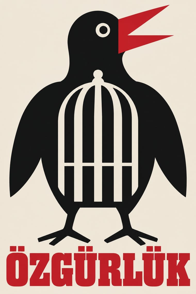
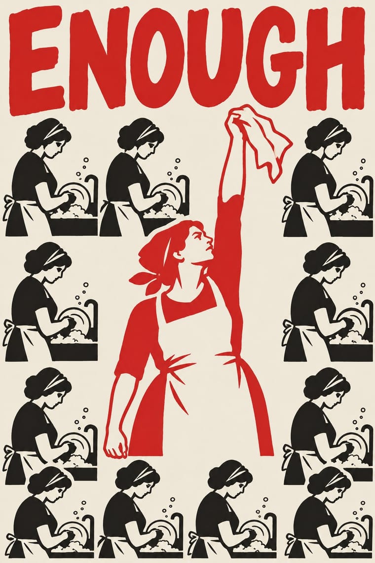
Alike in its design choices
Styles that make many of the same choices, related or not, besides those above.
-
-
-
-
-
-
05
Often taken for
2 Tone Graphics has no real works recorded yet, so these are its nearest styles by its choices alone, with the choices that tell them apart.
-
Op Art Graphics
1 of Op Art Graphics’s 5 real works fits 2 Tone Graphics’s choices better than its own: Poster for an exhibition of work by François Morellet at…
Choices that tell 2 Tone Graphics and Op Art Graphics apart Choice 2 Tone Graphics Op Art Graphics Stylised figuration defining — All-over field — defining Single focal point defining — Illusion of depth — defining Straight photography occasional avoids 2 Tone Graphics descends from Op Art Graphics: a shared line, so the likeness is inherited.
-
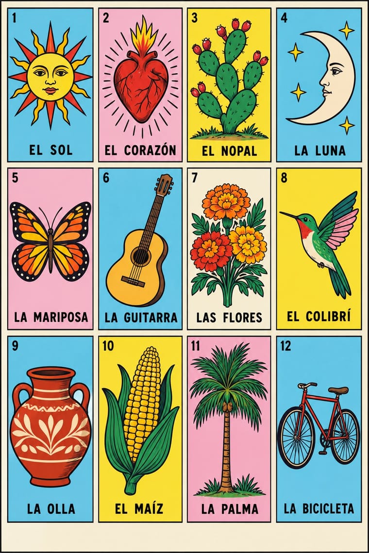
Lotería Card Imagery (Mexican Lotería)
Lotería Card Imagery is one of 2 Tone Graphics’s nearest styles by choices; no real work of either fits the other better.
Choices that tell 2 Tone Graphics and Lotería Card Imagery apart Choice 2 Tone Graphics Lotería Card Imagery Monochrome defining — Full polychrome — defining Optical pattern defining — Modular grid — defining Geometric tessellation defining — No shared descent in the atlas: they reached these choices separately.
-
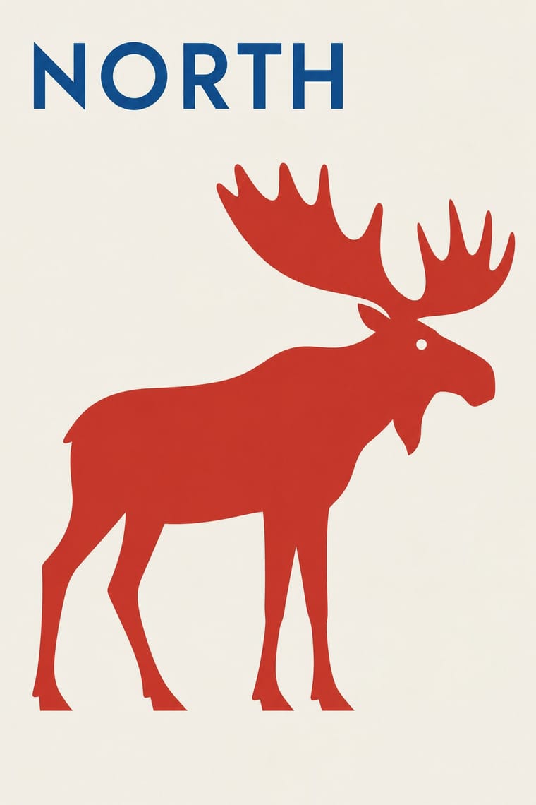
Finnish Symbol Poster (the 'Finnish School', 1954–1995)
Finnish Symbol Poster is one of 2 Tone Graphics’s nearest styles by choices; no real work of either fits the other better.
Choices that tell 2 Tone Graphics and Finnish Symbol Poster apart Choice 2 Tone Graphics Finnish Symbol Poster Monochrome defining — Ornament-free — defining Optical pattern defining — Generous white space — defining Geometric tessellation defining — Both descend from Bauhaus in the family tree.
-
Cuban Revolutionary Poster (OSPAAAL & ICAIC)
Cuban Revolutionary Poster is one of 2 Tone Graphics’s nearest styles by choices; no real work of either fits the other better.
Choices that tell 2 Tone Graphics and Cuban Revolutionary Poster apart Choice 2 Tone Graphics Cuban Revolutionary Poster Monochrome defining — Complementary clash — characteristic Geometric tessellation defining — Full polychrome — characteristic Straight photography occasional avoids No shared descent in the atlas: they reached these choices separately.
— means the choice isn’t among the style’s recorded choices. Critics recorded each work’s choices with the styles’ descriptions in view, so this shows whether the descriptions hold together, not proof that they are right.
06
Combine it with
Styles 2 Tone Graphics pairs well with or plays against, from the research. Each is worked out as a combination: which style gives the type, the colours and the forms.
- Post-Punk Record Sleeve (Stiff, Factory, 4AD) Contrasts · Shares restraint and a single focal point, but swaps abstraction for a cartoon mascot.
- Punk & DIY Zine Contrasts · Keep the DIY, in-house spirit but swap cut-and-paste chaos for one controlled, repeatable mark.
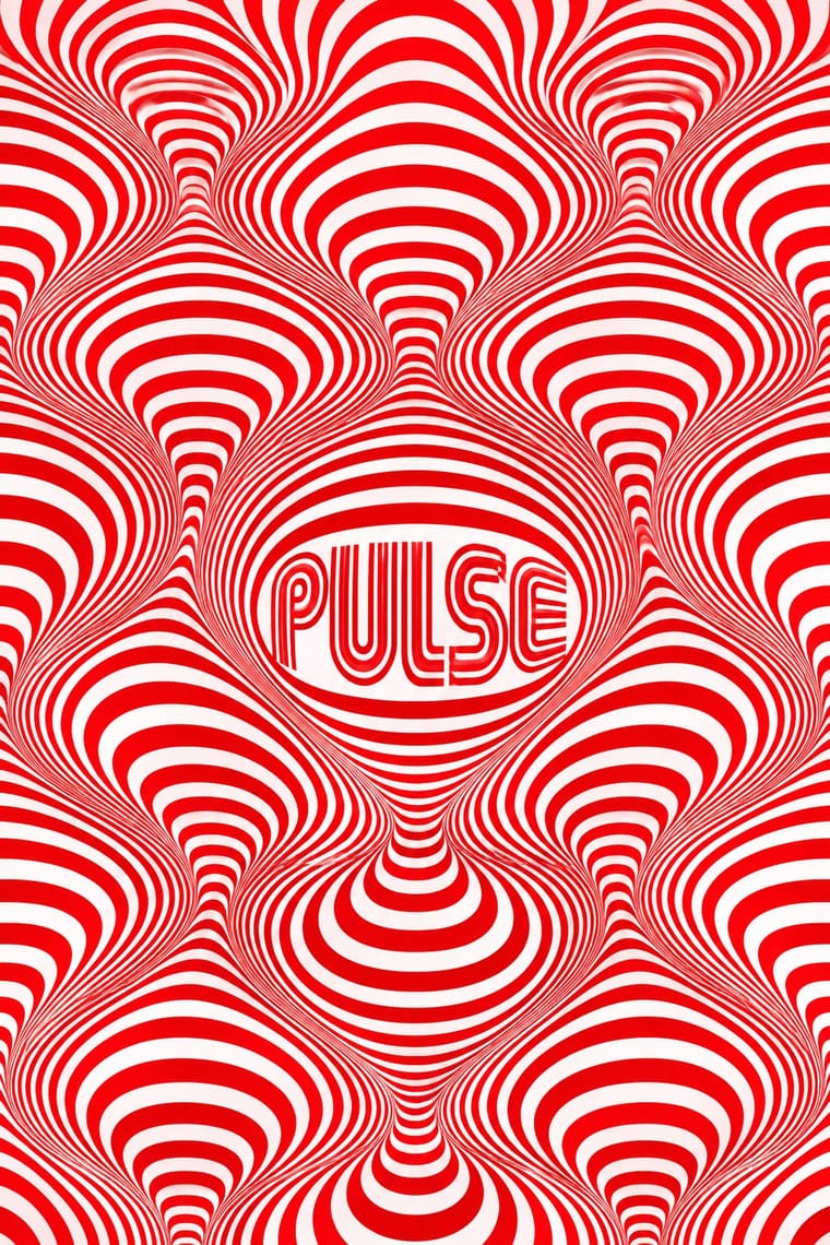
- Op Art Graphics Pairs well · Let the checkerboard carry optical energy as border and ground around a flat figure.
07
Sources
- https://en.wikipedia.org/wiki/2_Tone_Records
- https://en.wikipedia.org/wiki/Walt_Jabsco
- https://www.creativereview.co.uk/2-tone-records/
How Stylogeny researches and checks a style: where the facts come from.