Style combination · Contrasts
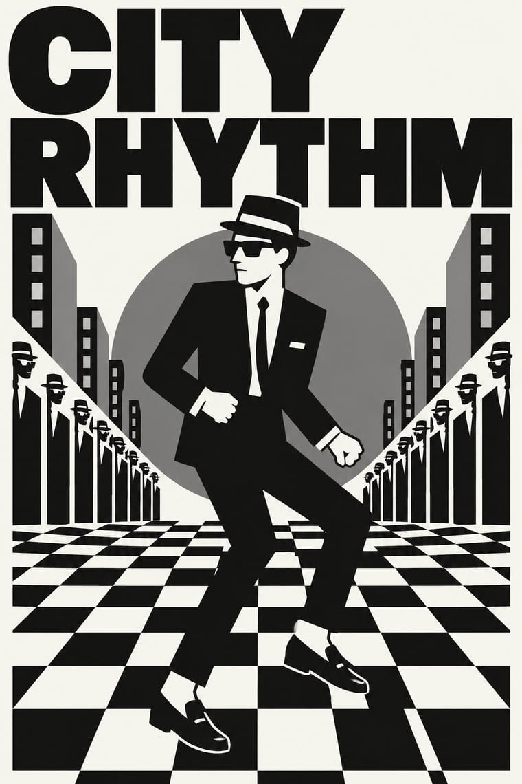
Post-Punk Record Sleeve × 2 Tone Graphics
Shares restraint and a single focal point, but swaps abstraction for a cartoon mascot.
Mix them and make something Post-Punk Record Sleeve 2 Tone Graphics
01
What each style brings
Each part of the design comes from the style with the stronger say in it, and each style gives at least two.
Post-Punk Record Sleeve (Stiff, Factory, 4AD) 2 Tone Graphics
- Type from Post-Punk Record Sleeve
- Colour from 2 Tone Graphics
- Form from 2 Tone Graphics
- Composition from Post-Punk Record Sleeve
- Surface from Post-Punk Record Sleeve
02
The type
Open fonts standing in for each style’s own type, which is often hand-drawn or commercial.
Display · Post-Punk Record Sleeve
Again
Syne; Post-Punk Record Sleeve used Peter Saville's colour-coded alphabet, one coloured block per letter, decoded by a wheel on the back of Power, Corruption & Lies (1983) and used for the title of Blue Monday and Small, ordered sans-serif capitals in the manner of Jan Tschichold's New Typography, which Saville took as his model from the 1978 Factory poster onwards
Text · 2 Tone Graphics
The visual identity of 2 Tone Records: a black-and-white checkerboard, taken by Jerry Dammers from an old mod pop-art motif, and a cartoon mascot, Walt Jabsco, a rude boy in suit and pork-pie hat based on a photograph of the Jamaican singer Peter Tosh. Devised by Dammers with Horace Panter, and worked up into artwork by John 'Teflon' Sims and David Storey, it turned punk-era DIY into a controlled, repeatable system and revived the dress of 1960s Jamaican ska and mod. It descends from op art through the check; the DIY spirit of punk is an influence, not the parent.
Inter; 2 Tone Graphics used Helvetica Inserat and Bold grotesque sans capitals
03
The colours
The ground and leading colours come from 2 Tone Graphics, with a counter-accent from Post-Punk Record Sleeve. The ink reads on the ground at 4.5:1 or more.
Post-Punk Record Sleeve (Stiff, Factory, 4AD) 2 Tone Graphics
-
#f5f5f0ground · 36% -
#111111ink · 14% -
#d9d9d4accent · 18% -
#f2c230accent · 14% -
#7a7a7aaccent · 10% -
#b8963eaccent · 8%
As CSS
:root {
  --ground: #f5f5f0;
  --ink: #111111;
  --accent-1: #d9d9d4;
  --accent-2: #f2c230;
  --accent-3: #7a7a7a;
  --accent-4: #b8963e;
  --font-display: "Syne", sans-serif;
  --font-text: "Inter", sans-serif;
}
Use it with care
Post-Punk Record Sleeve (Stiff, Factory, 4AD): The sleeves are in copyright, and several of their quoted images have their own authors, such as Harold Craft's pulsar plot and Bernard Pierre Wolff's photograph of the Appiani tomb: make a new quotation from a public-domain or licensed source rather than copying a Factory, Stiff or 4AD cover or its colour code.
04
The two styles
05
More combinations
With Post-Punk Record Sleeve
- Surrealist Graphics Pairs well · Vaughan Oliver drew on Dalí and Surrealism; add an uncanny juxtaposition to a blurred, textured 23 Envelope photograph for a dream-like sleeve.
- Die Neue Typographie Pairs well · Saville's model: borrow Tschichold's asymmetric placement and small sans-serif capitals, then replace his photographs with one quoted image to get a cool, ordered sleeve.
- Swiss Punk / New Wave Typography Contrasts · Both took modernism apart in the same years: Weingart's Basel school layered type and broke the grid, while post-punk sleeves quoted one borrowed image and withheld the type; choose between layering and withholding.
- Afrobeat Sleeve Art Contrasts · Lemi Ghariokwu's sleeves fill every inch to state the record's argument, while post-punk sleeves leave the name off and say nothing; use the pair to decide how much a cover should explain.
- Minimalist Graphic Design Pairs well · Both let one image or word stand on an empty field; minimalism keeps it calm and neutral, post-punk adds a borrowed image, a code and a darker mood.
- Punk & DIY Zine Contrasts · Same scene, opposite means: punk pasted ransom-note collage onto photocopies, post-punk withheld text and printed one quoted image offset on special stock; choose between shouting and withholding.
- Hipgnosis Photographic Concept Sleeve Contrasts · The generation that made it look dated: post-punk designers quoted one found image and coded or shrank the type, where Hipgnosis paid for elaborate location shoots and darkroom work. Choose between quoting a picture and staging one.
- British Style Press (The Face, i-D and Arena) Contrasts · Same years and city: Saville kept type sparse or left it off and quoted one image on a single square. Brody's own Fetish and Cabaret Voltaire sleeves belong to that genre; this entry is the editorial system he built alongside them, with oversized drawn headlines across a whole magazine.