Craft & organic · 1890–1920 · Northern Europe
Skønvirke (Danish Art Nouveau, Bindesbøll)
Also known as Skønvirke, Skønvirkestil, Danish Art Nouveau, Bindesbøll style
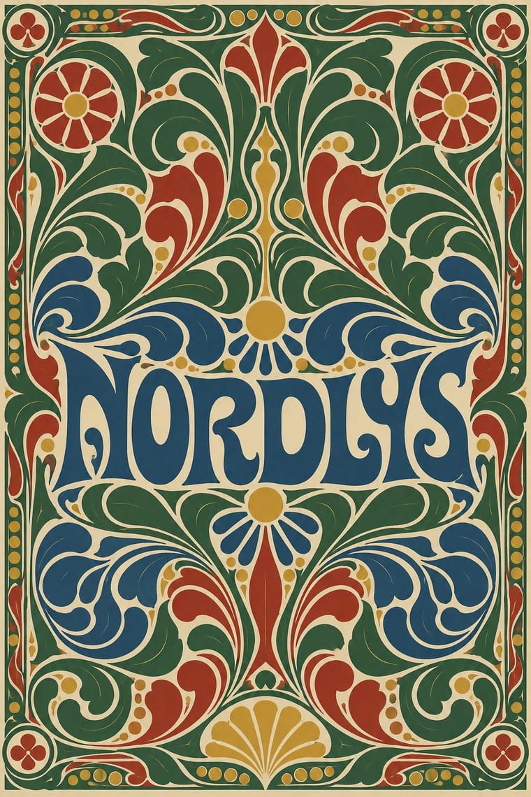
The Danish answer to Art Nouveau, around 1890–1920, seen in print above all in Thorvald Bindesbøll's work: heavy, roughly drawn hand lettering locked into dense ornament of swelling tendrils, cloud and wave forms. Labels, logos, covers and vignettes are framed and centred, in black with one or two flat colours. Bindesbøll kept his ornament abstract; the wider movement added stylised wild flowers, insects and sea life. Both trade Art Nouveau's thin whiplash line and female figures for blunt, swelling masses. The 1904 Carlsberg label is still in use in adapted form.
Make something in this style Get advice in this style Mix it with another style
01
How it works
- Draw the name by hand in blunt, weighty letters and make them part of the ornament, not a caption set apart from it.
- Fill the field around a centred name with scrolls that swell into leaf, cloud or wave masses, leaving little empty ground.
- Let abstract, swelling ornament carry the design; when plants or animals appear (hop vine, Danish wild flowers, insects, sea life), stylise them into the same heavy mass, with swelling, blunt scrolls rather than Art Nouveau's thin whiplash.
- Frame the whole design in a border built from small ornament units that can be repeated and recombined.
- Print in black plus one or two flat colours, with one colour such as green clearly in charge.
- Make the mark sturdy enough to serve as a label, monogram or club badge for decades.
Copenhagen. The Danish style that ran parallel to Jugendstil and Art Nouveau, a blend of them and Arts and Crafts with Nordic national romanticism, traceable to about 1890; it was named at a 1907 exhibition at the Kunstindustrimuseet (now Designmuseum Danmark), and the magazine Skønvirke followed in 1914. Its motifs came from Danish flora and fauna, wild flowers, insects and sea life, and from medieval church murals and Nordic interlace (ormeslyng, vikingeslyng). Its graphic side rests above all on the architect-designer Thorvald Bindesbøll (1846–1908), called the spiritual father of the skønvirke era, who turned from architecture to ceramics, bindings, labels, logos and book ornament and kept his own ornament abstract.
02
Its design choices
From Stylogeny’s vocabulary of design choices: defining choices make the style, characteristic ones are usual, occasional ones turn up now and then.
- Layout & composition
- Space & hierarchy
- Typography
- Colour
- Form & shape
- Surface & texture
- Ornament
- Medium & production
- Tone & intent
- Avoids
- Naturalistic depiction, Ornament-free, Generous white space, Pastel, Gradients, Grotesque & neo-grotesque, Straight photography
Palette
-
#efe7d3 -
#1b1a17 -
#2f6b3a -
#a8322a -
#d4a32c -
#2c4f80
Typefaces
-
Thorvald Bindesbøll's hand-drawn label lettering, the 'roughly sketched letters' of the Carlsberg Pilsner label (1904), which Carlsberg has carried over in adapted form to other beers
-
The Carlsberg wordmark (Bindesbøll, 1904), hand-drawn and still in use
-
Bindesbøll's monograms, trademarks (bomærker), ex libris and letterheads (brevhoveder) for friends and firms, lettered by hand into their ornament (Den Store Danske)
-
Small book stamps (bogstempler) that Bindesbøll drew to be combined freely into borders and patterns in other books
Den Store Danske
Known for
-
Thorvald Bindesbøll, Carlsberg Pilsner label, 1904, still in use in adapted form; a printed example on a Carlsberg bottle is in the V&A
C.61B-1989
-
Thorvald Bindesbøll, the Carlsberg logo (1904) and the logos of Kjøbenhavns Boldklub and Dansk Boldspil-Union (dated 1900 by Den Store Danske); the DBU badge is still in use
-
Thorvald Bindesbøll, vignettes and decorative frames for Troldtøj (1889–1890), around drawings by Joakim Skovgaard and August Jerndorff
-
Thorvald Bindesbøll, cover for Thomas Laub's collection of hymn melodies
1896
-
Thorvald Bindesbøll, cover vignette drawings later used for Kunstmuseets Aarsskrift (from 1914), dated 1890–1899 by SMK
KKS1974-252
-
Thorvald Bindesbøll, sheet of ten studies for ornament, pen and black ink, 1895
SMK, KKS1965-132
-
Thorvald Bindesbøll, friezes, vignettes and binding stamps for books for the Copenhagen bookbinders Petersen & Petersen, from the 1880s
-
Thorvald Bindesbøll, calfskin cover with flower and leaf motifs for Harald Weitemeyer, Le Danemark
1899
03
Make something in this style
Say what you need, and Stylogeny’s image studio draws it from Skønvirke (Danish Art Nouveau, Bindesbøll)’s design choices and checks it against them. It takes about a minute, and you get a link to share.
04
Where it comes from, and what it’s close to
Before it
The style it grew out of, and the styles it borrowed from.
After it
The styles that grew out of it.
No later style in the atlas grew out of it yet.
Alike in its design choices
Styles that make many of the same choices, related or not, besides those above.
05
Often taken for
Skønvirke has no real works recorded yet, so these are its nearest styles by its choices alone, with the choices that tell them apart.
-
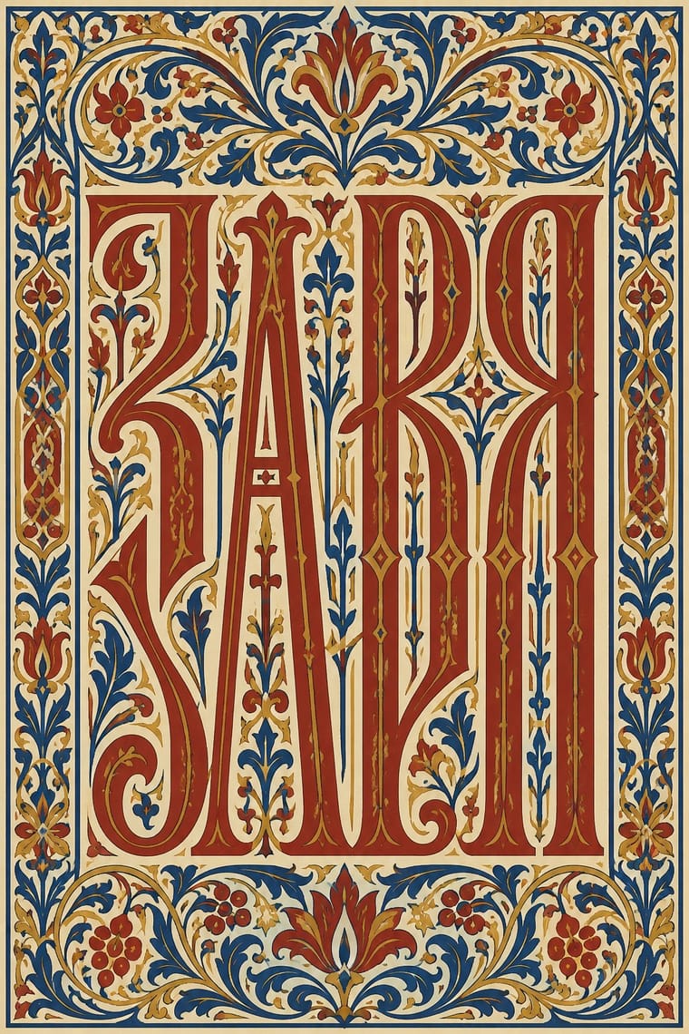
Vyaz (Ornamental Slavonic Lettering)
Vyaz is one of Skønvirke’s nearest styles by choices; no real work of either fits the other better.
Choices that tell Skønvirke and Vyaz apart Choice Skønvirke Vyaz Emblems & badges characteristic — Brush & pen calligraphy — defining Single focal point characteristic — Condensed display — defining Lithography characteristic — No shared descent in the atlas: they reached these choices separately.
-
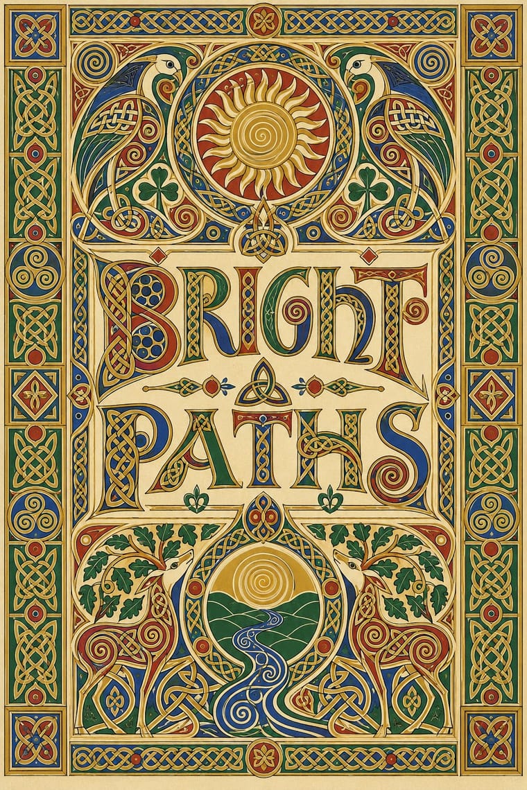
Celtic Revival Illumination & Lettering
Celtic Revival Illumination & Lettering is one of Skønvirke’s nearest styles by choices; no real work of either fits the other better.
Choices that tell Skønvirke and Celtic Revival Illumination apart Choice Skønvirke Celtic Revival Illumination Limited spot colours defining — Geometric tessellation — defining Biomorphic curves defining occasional Jewel & metallic — characteristic Typography only characteristic — Both descend from Arts & Crafts Movement in the family tree.
-
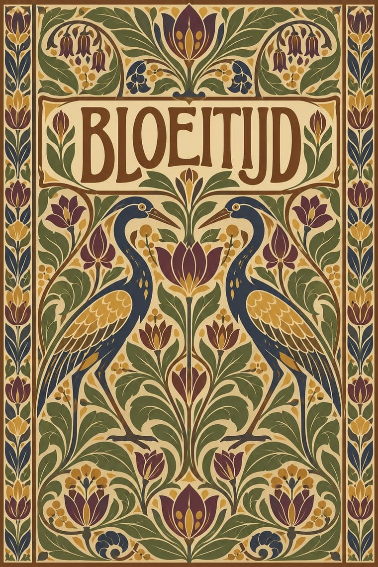
Nieuwe Kunst (Dutch Art Nouveau)
Nieuwe Kunst is one of Skønvirke’s nearest styles by choices; no real work of either fits the other better.
Choices that tell Skønvirke and Nieuwe Kunst apart Choice Skønvirke Nieuwe Kunst Limited spot colours defining occasional Earth & mineral occasional defining Non-representational defining occasional Analogous harmony — characteristic Monochrome characteristic — Both descend from Arts & Crafts Movement in the family tree.
-
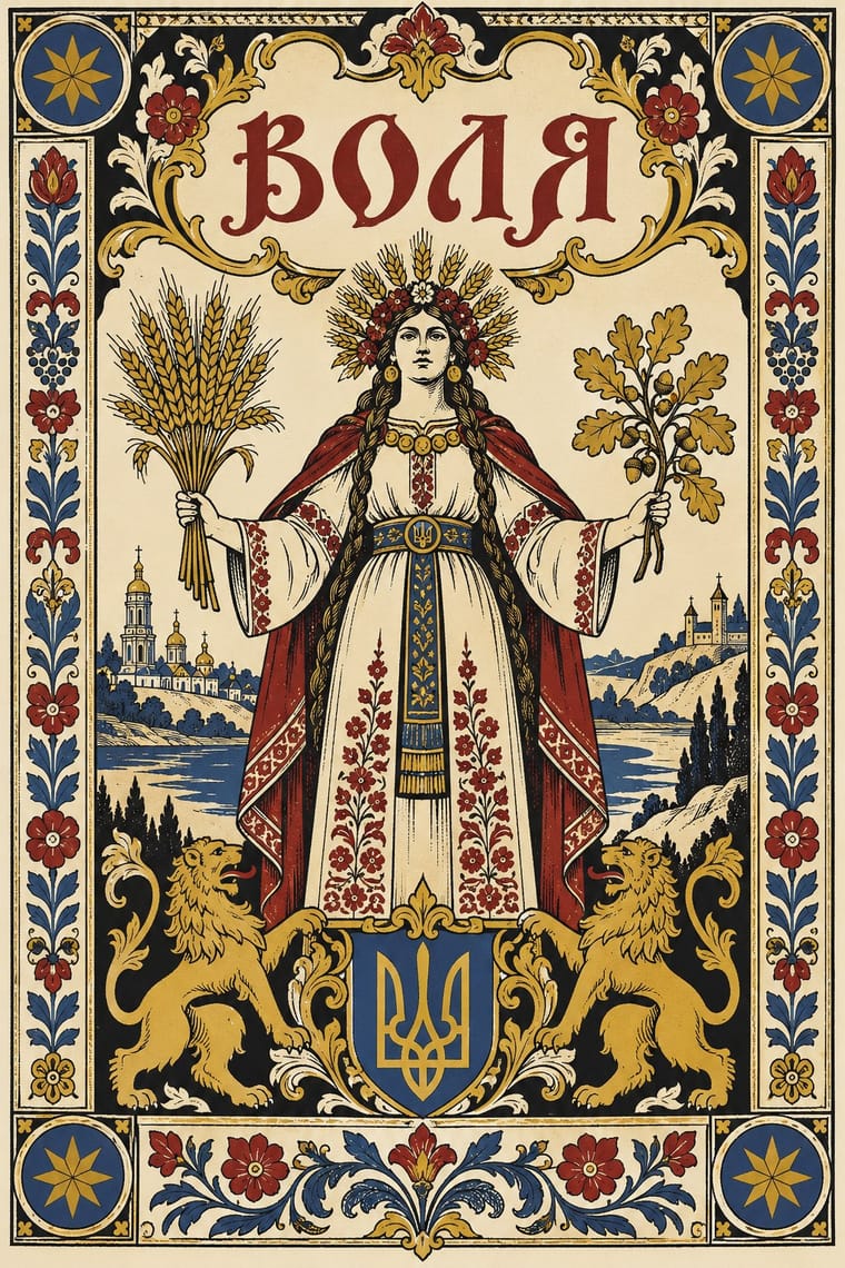
Narbut School (Ukrainian Baroque Revival Graphics)
Narbut School is one of Skønvirke’s nearest styles by choices; no real work of either fits the other better.
Choices that tell Skønvirke and Narbut School apart Choice Skønvirke Narbut School Non-representational defining — Line illustration — defining Horror vacui defining — Folk & sacred symbols — characteristic Biomorphic curves defining occasional Both descend from Arts & Crafts Movement in the family tree.
— means the choice isn’t among the style’s recorded choices. Critics recorded each work’s choices with the styles’ descriptions in view, so this shows whether the descriptions hold together, not proof that they are right.
06
Combine it with
Styles Skønvirke (Danish Art Nouveau, Bindesbøll) pairs well with or plays against, from the research. Each is worked out as a combination: which style gives the type, the colours and the forms.
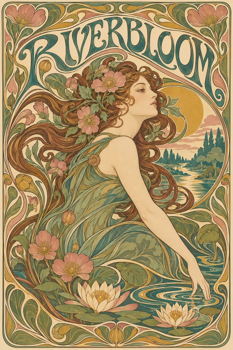
- Art Nouveau Contrasts · Shares the hand-lettering and abundance but swaps the whiplash line and the female figure for blunt abstract masses; set side by side they show the heavy Danish variant.
- Norwegian and Finnish National Romantic Graphics (Munthe & Karelianism) Contrasts · The neighbouring Nordic revival tells sagas with dragons and figures; Bindesbøll's strand of Skønvirke keeps ornament abstract, so borrow its interlace and flora but leave the saga figures out.
- Finnish Bold Print (Marimekko Modernism) Pairs well · Both enlarge abstract organic shapes; open up a dense Bindesbøll frame into a flat repeat for a lighter, modern Nordic take.
- Arts & Crafts Movement Pairs well · Its parent's framed, bordered book page carries Bindesbøll's heavier, abstract ornament well.
07
Sources
- Den Store Danske (lex.dk), 'Thorvald Bindesbøll' (Carlsberg label in adapted form; monograms, bomærker, ex libris, brevhoveder; bogstempler; Laub cover 1896; Le Danemark 1899): https://lex.dk/Thorvald_Bindesbøll
- Den Store Danske (lex.dk), 'skønvirke': https://lex.dk/skønvirke
- Victoria and Albert Museum, Beer bottle for Carlsberg Pilsner with paper label designed by Thorvald Bindesbøll, C.61B-1989: https://collections.vam.ac.uk/item/O9529
- SMK, Statens Museum for Kunst, Thorvald Bindesbøll, Omslagsvignetter til Kunstmuseets Aarskrift, KKS1974-252: https://open.smk.dk/artwork/image/KKS1974-252
- SMK, Thorvald Bindesbøll, Blad med ti studier til forskellig ornamentik (1895), KKS1965-132: https://open.smk.dk/artwork/image/KKS1965-132
- Danish Wikipedia, 'Thorvald Bindesbøll' (Petersen & Petersen friezes and vignettes; 'skønvirketidens åndelige fader'): https://da.wikipedia.org/wiki/Thorvald_Bindesbøll
- Danish Wikipedia, 'Skønvirke' (blend with nationalromantik; wild flowers, insects, sea life; Rørdam, Danmarks Tilblivelse, 1898): https://da.wikipedia.org/wiki/Skønvirke
- Den Store Danske (lex.dk), 'Anker Kyster' (Bindesbøll's spine and edges for the Troldtøj binding, 1889–90): https://lex.dk/Anker_Kyster
How Stylogeny researches and checks a style: where the facts come from.