Style combination · Pairs well
Arts × Skønvirke
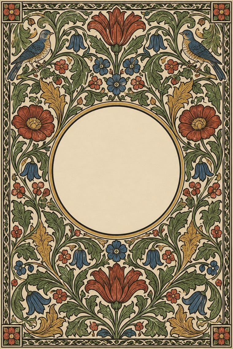
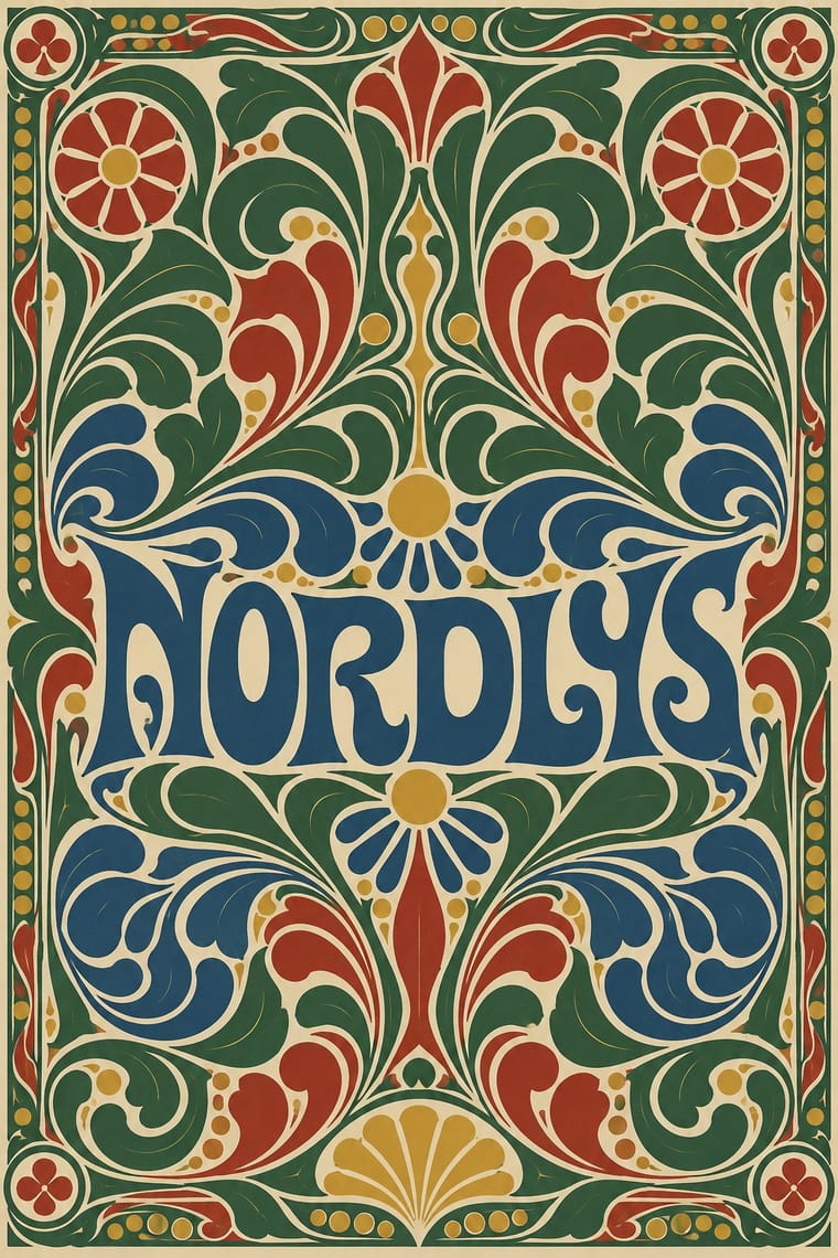
Its parent's framed, bordered book page carries Bindesbøll's heavier, abstract ornament well.
01
What each style brings
Each part of the design comes from the style with the stronger say in it, and each style gives at least two.
Arts & Crafts Movement Skønvirke (Danish Art Nouveau, Bindesbøll)
- Type from Arts
- Colour from Skønvirke
- Form from Arts
- Composition from Skønvirke
- Surface from Arts
02
The type
Open fonts standing in for each style’s own type, which is often hand-drawn or commercial.
Text · Skønvirke
The Danish answer to Art Nouveau, around 1890–1920, seen in print above all in Thorvald Bindesbøll's work: heavy, roughly drawn hand lettering locked into dense ornament of swelling tendrils, cloud and wave forms. Labels, logos, covers and vignettes are framed and centred, in black with one or two flat colours. Bindesbøll kept his ornament abstract; the wider movement added stylised wild flowers, insects and sea life. Both trade Art Nouveau's thin whiplash line and female figures for blunt, swelling masses. The 1904 Carlsberg label is still in use in adapted form.
Libre Caslon Text; Skønvirke used Thorvald Bindesbøll's hand-drawn label lettering, the 'roughly sketched letters' of the Carlsberg Pilsner label (1904), which Carlsberg has carried over in adapted form to other beers and The Carlsberg wordmark (Bindesbøll, 1904), hand-drawn and still in use
03
The colours
The ground and leading colours come from Skønvirke, with a counter-accent from Arts. The ink reads on the ground at 4.5:1 or more.
Arts & Crafts Movement Skønvirke (Danish Art Nouveau, Bindesbøll)
-
#efe7d3ground · 36% -
#1b1a17ink · 14% -
#d4a32caccent · 18% -
#a33224accent · 14% -
#2c4f80accent · 10% -
#2f6b3aaccent · 8%
As CSS
:root {
  --ground: #efe7d3;
  --ink: #1b1a17;
  --accent-1: #d4a32c;
  --accent-2: #a33224;
  --accent-3: #2c4f80;
  --accent-4: #2f6b3a;
  --font-display: "EB Garamond", serif;
  --font-text: "Libre Caslon Text", serif;
}
04
The two styles
05
More combinations
With Arts
- Flat Design Contrasts · Borrow one engraved border or initial to give a flat interface a crafted, editorial moment against its vector minimalism.
- Scandinavian Functionalism Pairs well · Keep the craft ethic and natural palette but reduce Morris's foliage to a single repeating motif for warmth without clutter.
- Risograph & Indie Print Culture Pairs well · Frame a two-ink riso print with a Morris-style vine border to give indie publishing an heirloom, hand-made gravity.
- Die Neue Typographie Contrasts · Tschichold's asymmetric, unornamented page was built against this centred, bordered book; set them side by side to argue tradition versus machine age.
- Gothic Blackletter & Fraktur Tradition Pairs well · Morris's Kelmscott Press revived gothic type (Troy and Chaucer) inside dense woodcut borders; join the broken letter to foliate frames and handmade paper for a medieval, hand-made book.
- Renaissance Book Typography Pairs well · Morris's Kelmscott Press revived Jenson's roman; pair a Renaissance text block with dense Arts & Crafts borders for a private-press feel.
- Josef Frank and Svenskt Tenn Botanical Prints Pairs well · The parent tradition: both fill a repeat with plants on linen, but Morris is symmetrical, earthy and dense with dark grounds, Frank is looser, brighter and mostly light. Pair a Morris-style framed book page with Frank-style endpapers.
- Italian Futurism Contrasts · Arts & Crafts handwork is everything Futurism wanted to burn; juxtapose them to stage machine against hand.
With Skønvirke
- Art Nouveau Contrasts · Shares the hand-lettering and abundance but swaps the whiplash line and the female figure for blunt abstract masses; set side by side they show the heavy Danish variant.
- Norwegian and Finnish National Romantic Graphics (Munthe & Karelianism) Contrasts · The neighbouring Nordic revival tells sagas with dragons and figures; Bindesbøll's strand of Skønvirke keeps ornament abstract, so borrow its interlace and flora but leave the saga figures out.
- Finnish Bold Print (Marimekko Modernism) Pairs well · Both enlarge abstract organic shapes; open up a dense Bindesbøll frame into a flat repeat for a lighter, modern Nordic take.