Style combination · Contrasts
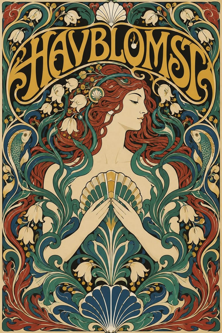
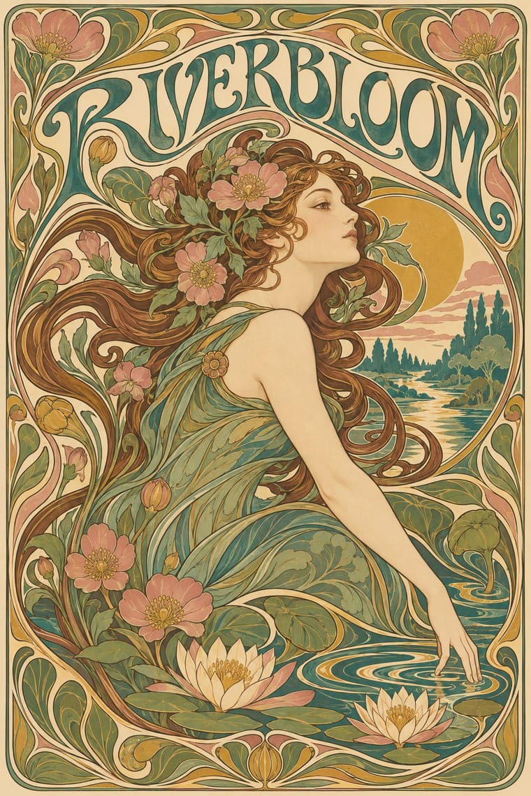
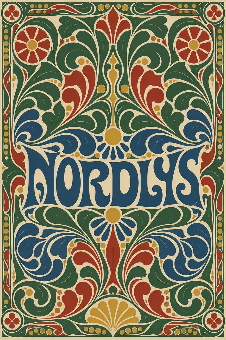
Art Nouveau × Skønvirke
Shares the hand-lettering and abundance but swaps the whiplash line and the female figure for blunt abstract masses; set side by side they show the heavy Danish variant.
01
What each style brings
Each part of the design comes from the style with the stronger say in it, and each style gives at least two.
Art Nouveau Skønvirke (Danish Art Nouveau, Bindesbøll)
- Type from Art Nouveau
- Colour from Skønvirke
- Form from Art Nouveau
- Composition from Skønvirke
- Surface from Skønvirke
02
The type
Open fonts standing in for each style’s own type, which is often hand-drawn or commercial.
Text · Skønvirke
The Danish answer to Art Nouveau, around 1890–1920, seen in print above all in Thorvald Bindesbøll's work: heavy, roughly drawn hand lettering locked into dense ornament of swelling tendrils, cloud and wave forms. Labels, logos, covers and vignettes are framed and centred, in black with one or two flat colours. Bindesbøll kept his ornament abstract; the wider movement added stylised wild flowers, insects and sea life. Both trade Art Nouveau's thin whiplash line and female figures for blunt, swelling masses. The 1904 Carlsberg label is still in use in adapted form.
Libre Caslon Text; Skønvirke used Thorvald Bindesbøll's hand-drawn label lettering, the 'roughly sketched letters' of the Carlsberg Pilsner label (1904), which Carlsberg has carried over in adapted form to other beers and The Carlsberg wordmark (Bindesbøll, 1904), hand-drawn and still in use
03
The colours
The ground and leading colours come from Skønvirke, with a counter-accent from Art Nouveau. The ink reads on the ground at 4.5:1 or more.
Art Nouveau Skønvirke (Danish Art Nouveau, Bindesbøll)
-
#efe7d3ground · 36% -
#1b1a17ink · 14% -
#d4a32caccent · 18% -
#a8322aaccent · 14% -
#3f7a75accent · 10% -
#2c4f80accent · 8%
As CSS
:root {
  --ground: #efe7d3;
  --ink: #1b1a17;
  --accent-1: #d4a32c;
  --accent-2: #a8322a;
  --accent-3: #3f7a75;
  --accent-4: #2c4f80;
  --font-display: "Federant", sans-serif;
  --font-text: "Libre Caslon Text", serif;
}
04
The two styles
05
More combinations
With Art Nouveau
- Fileteado Porteño Pairs well · Fileteado's acanthus scrolls share the whiplash; combine them for ornate, hand-made lettering frames.
- International Typographic Style Contrasts · Ornamental curves against an orthogonal grid make a strong deliberate tension; let one botanical flourish break a cold grid.
- Psychedelic Poster Pairs well · San Francisco poster artists lifted Mucha's figures and whiplash wholesale; push the curves into saturated, vibrating colour for a 1960s-flavoured revival.
- Russian Constructivism Contrasts · Organic sensuality versus machine-age diagonals: use the opposition to stage nature against industry.
- Vienna Secession Contrasts · Set French whiplash against the Viennese square to show the turn from organic to geometric ornament within one decorative idiom.
- Expressionist Woodcut Graphics Contrasts · The parent's smooth whiplash and floral harmony is exactly what the gouge splinters; use one against the other to stage order breaking down.
- Beggarstaffs Poster (Nicholson & Pryde) Contrasts · Its curving floral line is the opposite of cut masses; set side by side to show how much a poster can drop.
- Simplicissimus Satirical Style (Munich) Contrasts · The parent: Heine took over the Jugendstil idiom, but where Art Nouveau spends the whiplash line on flowers and idealised women, Simplicissimus spends it on a grotesque type and a caption. Choose it when the curve should mock rather than adorn.
With Skønvirke
- Norwegian and Finnish National Romantic Graphics (Munthe & Karelianism) Contrasts · The neighbouring Nordic revival tells sagas with dragons and figures; Bindesbøll's strand of Skønvirke keeps ornament abstract, so borrow its interlace and flora but leave the saga figures out.
- Finnish Bold Print (Marimekko Modernism) Pairs well · Both enlarge abstract organic shapes; open up a dense Bindesbøll frame into a flat repeat for a lighter, modern Nordic take.
- Arts & Crafts Movement Pairs well · Its parent's framed, bordered book page carries Bindesbøll's heavier, abstract ornament well.