Layout & composition · Grid systems
Classical text block
A single centred or justified block descended from book typography.
A design choice in Stylogeny’s vocabulary, under layout & composition: how is the picture plane organised?
- styles make it
- 33
- as a defining choice
- 10
- as a usual one
- 11
- now and then
- 12
- avoid it
- 13
Styles defined by it 10
For these styles it is one of the choices that make the style.
- Maghrebi Script (Maghribi Calligraphy of al-Andalus and North Africa)The family of Arabic scripts of al-Andalus and North Africa, descended from early Kufic bookhands.
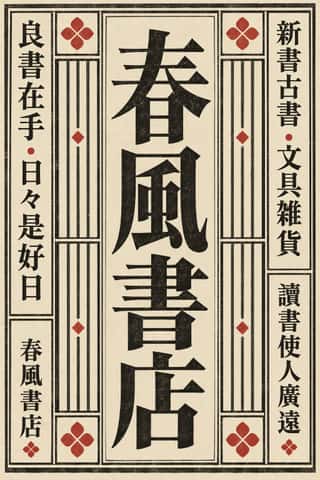
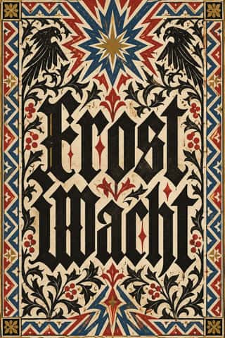
- Tibetan Woodblock Print Culture (Pecha & Prayer Flags)Tibetan Buddhist and Bön woodblock printing, from the first printed Kangyur (1410, cut in China) and the 15th-century presses of Gungthang to the great printing houses of Narthang, Derge and Lhasa.
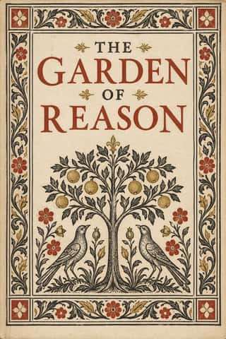
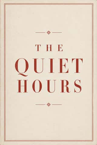
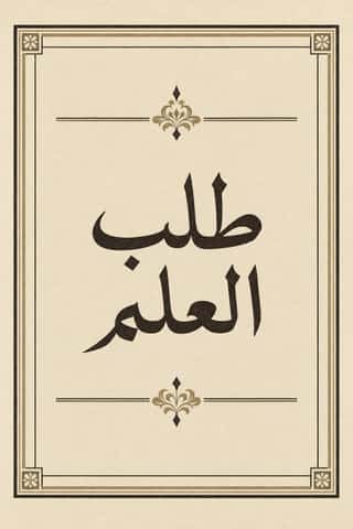
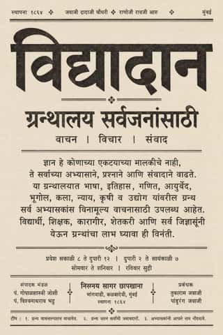
- German Book Art Movement (Buchkunstbewegung)The German reform of the book, from the magazine Pan (1895) to the private presses that ended around 1933.
- Madinah Mushaf (King Fahd Complex Qur'an Page)One fixed page for the Qur'an across much of the Muslim world: Uthman Taha's fully vowelled Naskh in fifteen justified lines, written so that every page ends at the end of a verse (the late Ottoman âyet-berkenar layout), inside a floral frame, with sura titles in framed cartouches and verse numbers in small round medallions.


Styles that often use it 11
A characteristic choice: usual in these styles, though not essential.

- Ottoman Tughra & Dîvânî Chancery CalligraphyThe Ottoman sultan's calligraphic monogram and the chancery hand written beneath it.
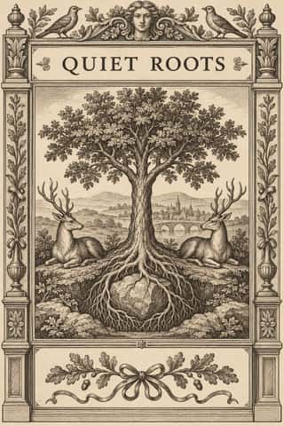
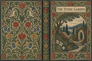
- Norwegian and Finnish National Romantic Graphics (Munthe & Karelianism)The flat, decorative branch of Norway's and Finland's national romanticism, which turned Viking carving, the sagas, the Kalevala and old peasant weaving into modern ornament.

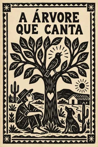
- Onitsha Market PamphletsCheap, stapled pamphlets of romance, advice, drama and political biography, written by students, clerks, journalists and traders and printed by jobbing letterpress shops around Onitsha Main Market in eastern Nigeria from the late 1940s.
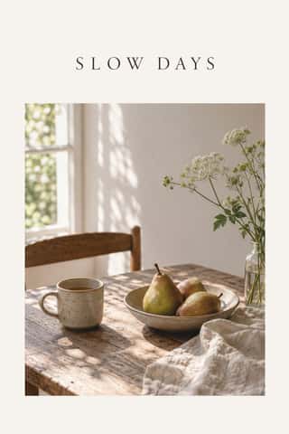

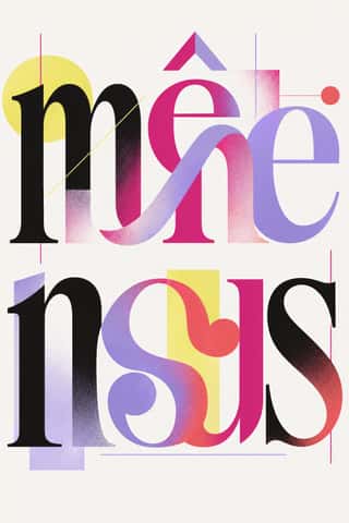


Styles that use it now and then 12
An occasional choice in these styles.
- Ethiopian Ge'ez Manuscript & Haräg Illuminationc. 500–present
- Imagerie d'Épinal & European Bilderbogen1796–1939
- Urdu Katib Lithography1837–present
- Celtic Revival Illumination & Lettering1861–1951
- Santiniketan & Bengal School Graphics1905–1954
- Wendingen & Amsterdam School Typography1918–1932
- Brazilian Modernismo Graphics (Klaxon and the Semana de 22)1922–1929
- Lianhuanhua Picture-Story Books1925–1990
- Machine-Age Simplified Arabic Type1947–present
- Minimalist Graphic Design1965–present
- Contemporary Chinese Book Design ('Most Beautiful Books of China')2003–present
- Modern Calligraphy and Brush Lettering2005–present
It often goes with
Choices that the styles making it make more often than the atlas as a whole.
- Paper & letterpress bitein 28 of 33
- Letterpressin 20 of 33
- Monochromein 29 of 33
- Authoritative & institutionalin 23 of 33
- Borders & framesin 25 of 33
- Brush & pen calligraphyin 19 of 33
Styles that avoid it
Styles that deliberately leave it out.
- Italian Futurism1909–1944
- Dada1916–1924
- Czech Poetist Book Design (Devětsil)1922–1938
- Die Neue Typographie1923–1940
- Psychedelic Poster1965–1973
- Swiss Punk / New Wave Typography1968–1990
- Graffiti & Hip-Hop Graphics1972–present
- Dutch Expressive Postmodernism (Studio Dumbar & Hard Werken)1977–1994
- Cranbrook & Deconstructivist Typography1980–1998
- Grunge Typography1990–2000
- Lucerne Poster Scene (Neubad & Südpol Posters)2007–present
- Acid Graphics / New Ugly2016–present
- Kinetic Typography & Variable Type2016–present