Pictorial & machine age · 1896–1957 · North America
Pulp Magazine Cover
Also known as Pulp cover art, Pulp fiction magazine covers, Pulp illustration
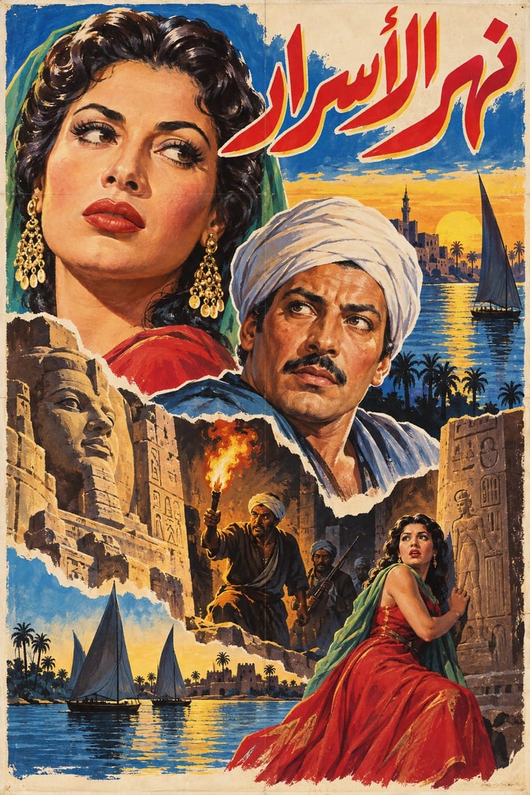
The painted colour covers of American pulp fiction magazines, printed on slicker cover stock around cheap wood-pulp interiors (period 1896 to 1957, the year the American News Company was liquidated, a date sometimes taken as the end of the pulp era). An original painting, reproduced by offset, shows one lurid scene of peril, a heroic figure, a threatened woman and a villain or monster, under a huge masthead, and the cover alone had to sell the issue on the newsstand.
Make something in this style Get advice in this style Mix it with another style
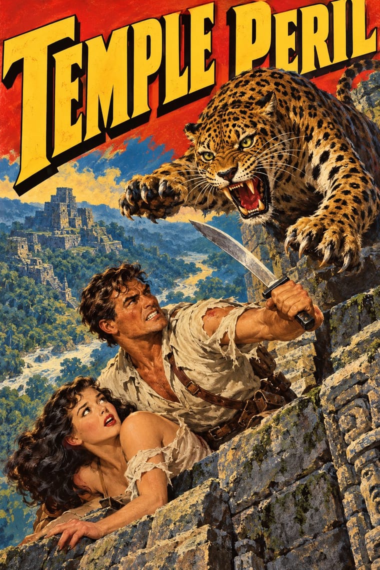
Use it with care
Pulp covers sold peril through sexualised and violent imagery: the 'damsel in distress' was often half-dressed or bound, and Margaret Brundage's Weird Tales covers (1933-38) showed nude or semi-nude women, with whipping scenes noted as controversial, until a new decency standard was imposed on newsstand pulps in 1938. Spicy Detective and the other 'spicy' pulps made this their selling point. Pulp fiction of the 1930s also carried many Yellow Peril villains loosely based on Fu Manchu, so cover villains often rest on racial caricature, and exoticising colonial stereotypes were common too. Do not copy these conventions as neutral decoration: if the style is used, keep the drama but drop the gendered violence and ethnic stereotypes, or treat them knowingly and critically.
01
How it works
- Paint one scene of peak action and make it the single point of entry.
- Stack a huge, shaded masthead across the top and let the painting run behind it.
- Stage hero, victim and threat in a diagonal clash of bodies and weapons.
- Use saturated reds, yellows and blues against deep shadow to catch the eye across a newsstand.
- Code the genre by cover: crime, western, science fiction or horror, each with its own props, and promise more than the story delivers.
United States: Frank Munsey's Argosy (1896, regarded as the first pulp) and Street & Smith's The Popular Magazine (1903, credited with introducing colour covers to pulp publishing)
02
Its design choices
From Stylogeny’s vocabulary of design choices: defining choices make the style, characteristic ones are usual, occasional ones turn up now and then.
- Layout & composition
- Space & hierarchy
- Typography
- Colour
- Surface & texture
- Ornament
- Imagery
- Medium & production
- Avoids
- Generous white space, Ornament-free, Grotesque & neo-grotesque, Typography only, Comic & cartoon, Non-representational, Calm & contemplative, Rational & objective
Palette
-
#c8281e -
#f2c230 -
#1d4a8a -
#14110f -
#e9d9b0
Typefaces
-
Hand-lettered shaded mastheads
-
Slab and Egyptian display faces
-
Condensed gothic display caps
Known for
-
Argosy (Frank Munsey)
the first pulp, 1896; its early covers were not the later painted scenes
-
The Popular Magazine (Street & Smith, 1903)
early colour covers, with covers by N. C. Wyeth
-
Black Mask and The Spider
Popular Publications
-
Weird Tales
-
Amazing Stories
Hugo Gernsback
-
Spicy Detective (Culture Publications), one of the 'spicy' or 'girlie' pulps
-
Frank R. Paul, Norman Saunders, Margaret Brundage, H. J. Ward and Rudolph Belarski
cover artists named in the Wikipedia article on pulp magazines
03
Make something in this style
Say what you need, and Stylogeny’s image studio draws it from Pulp Magazine Cover’s design choices and checks it against them. It takes about a minute, and you get a link to share.
04
Where it comes from, and what it’s close to
Before it
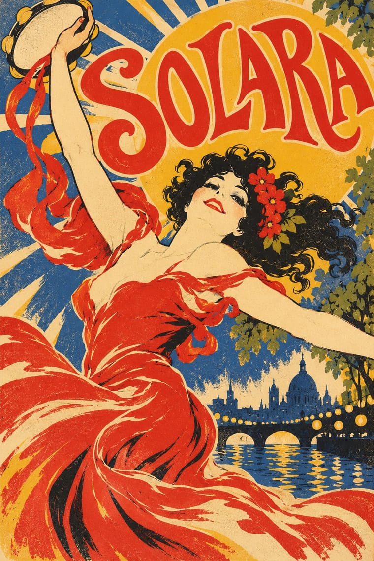
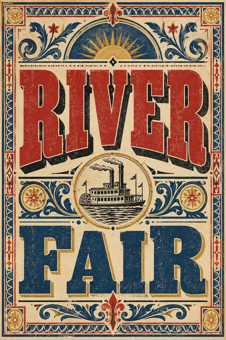
The style it grew out of, and the styles it borrowed from.
After it
The styles that grew out of it.
No later style in the atlas grew out of it yet.
Alike in its design choices
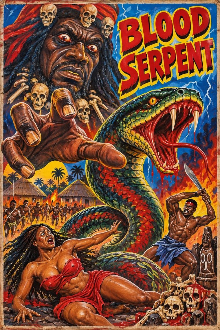
Styles that make many of the same choices, related or not, besides those above.
05
Often taken for
Pulp Magazine Cover has no real works recorded yet, so these are its nearest styles by its choices alone, with the choices that tell them apart.
-
Ghanaian Movie Poster
Ghanaian Movie Poster is one of Pulp Magazine Cover’s nearest styles by choices; no real work of either fits the other better.
Choices that tell Pulp Magazine Cover and Ghanaian Movie Poster apart Choice Pulp Magazine Cover Ghanaian Movie Poster Full bleed defining occasional Comic & cartoon avoids occasional Primary triad characteristic — Distortion & exaggeration occasional defining Dynamic asymmetry characteristic — No shared descent in the atlas: they reached these choices separately.
-
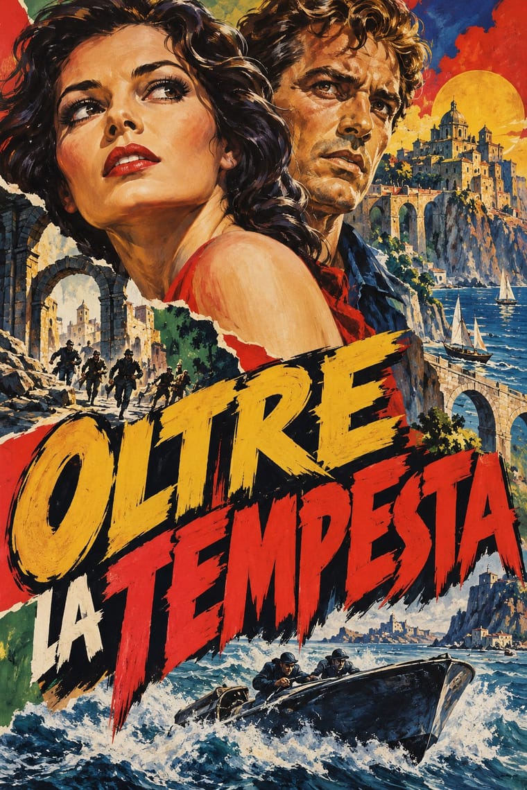
Italian Painted Film Poster (Rome Studios)
Italian Painted Film Poster is one of Pulp Magazine Cover’s nearest styles by choices; no real work of either fits the other better.
Choices that tell Pulp Magazine Cover and Italian Painted Film Poster apart Choice Pulp Magazine Cover Italian Painted Film Poster Single focal point defining — Ornament-free avoids characteristic Primary triad characteristic — Collage & layering — defining Dynamic asymmetry characteristic — No shared descent in the atlas: they reached these choices separately.
-
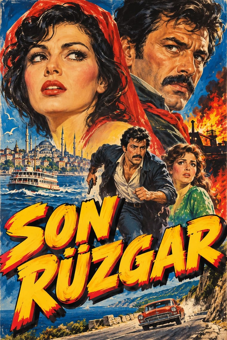
Yeşilçam Film Poster (Turkish Hand-Painted Afiş)
Yeşilçam Film Poster is one of Pulp Magazine Cover’s nearest styles by choices; no real work of either fits the other better.
Choices that tell Pulp Magazine Cover and Yeşilçam Film Poster apart Choice Pulp Magazine Cover Yeşilçam Film Poster Single focal point defining — Collage & layering — defining Complementary clash characteristic — Layered information — characteristic Primary triad characteristic — No shared descent in the atlas: they reached these choices separately.
-
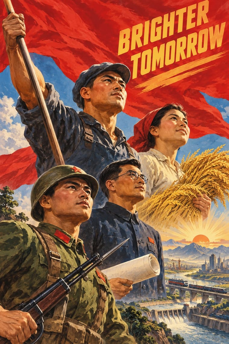
Socialist Realist Propaganda Poster
Socialist Realist Propaganda Poster is one of Pulp Magazine Cover’s nearest styles by choices; no real work of either fits the other better.
Choices that tell Pulp Magazine Cover and Socialist Realist Propaganda Poster apart Choice Pulp Magazine Cover Socialist Realist Propaganda Poster Complementary clash characteristic — Grotesque & neo-grotesque avoids occasional Primary triad characteristic — Gradients — characteristic Dynamic asymmetry characteristic — No shared descent in the atlas: they reached these choices separately.
— means the choice isn’t among the style’s recorded choices. Critics recorded each work’s choices with the styles’ descriptions in view, so this shows whether the descriptions hold together, not proof that they are right.
06
Combine it with
Styles Pulp Magazine Cover pairs well with or plays against, from the research. Each is worked out as a combination: which style gives the type, the colours and the forms.
- Penguin Paperback Design (Three Bands to the Marber Grid) Pairs well · The paperback cover is the later successor on the newsstand and bookstall; it trades the shouting masthead and painted peril for a restrained, systematic cover.
- American Four-Colour Comic Book (Golden to Bronze Age) Pairs well · Both are newsstand sensationalism; add panels, balloons and Ben-Day dots to turn a single painted scene into a comic.
- Ghanaian Movie Poster Contrasts · A painted-sensational neighbour: the pulp painting is an original reproduced by offset under a printed masthead, while the Ghanaian poster is painted directly on the final surface.
- Victorian Letterpress & Wood Type Pairs well · Slab and shaded display faces from jobbing printing give the masthead its loud, crowded voice.
07