Style combination · Pairs well
Pulp Magazine Cover × Victorian Letterpress
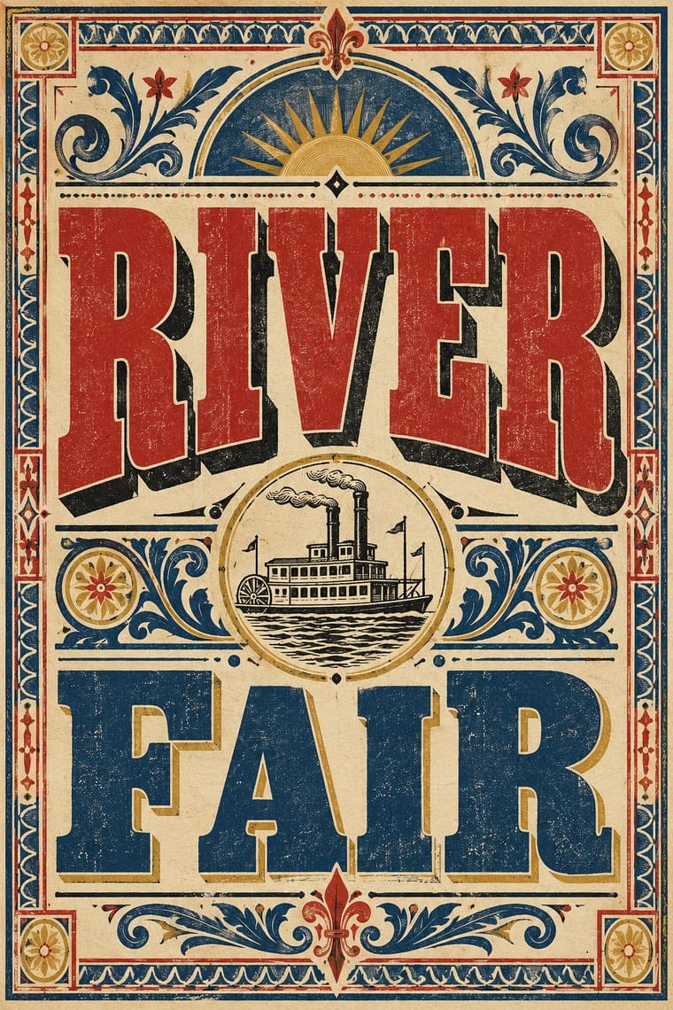
Slab and shaded display faces from jobbing printing give the masthead its loud, crowded voice.
Mix them and make something Pulp Magazine Cover Victorian Letterpress
01
What each style brings
Each part of the design comes from the style with the stronger say in it, and each style gives at least two.
Pulp Magazine Cover Victorian Letterpress & Wood Type
- Type from Victorian Letterpress
- Colour from Victorian Letterpress
- Form from Pulp Magazine Cover
- Composition from Pulp Magazine Cover
- Surface from Victorian Letterpress
02
The type
Open fonts standing in for each style’s own type, which is often hand-drawn or commercial.
Display · Victorian Letterpress
Rise
Abril Fatface, standing in for Fat face romans (Thorne, Figgins)
Text · Pulp Magazine Cover
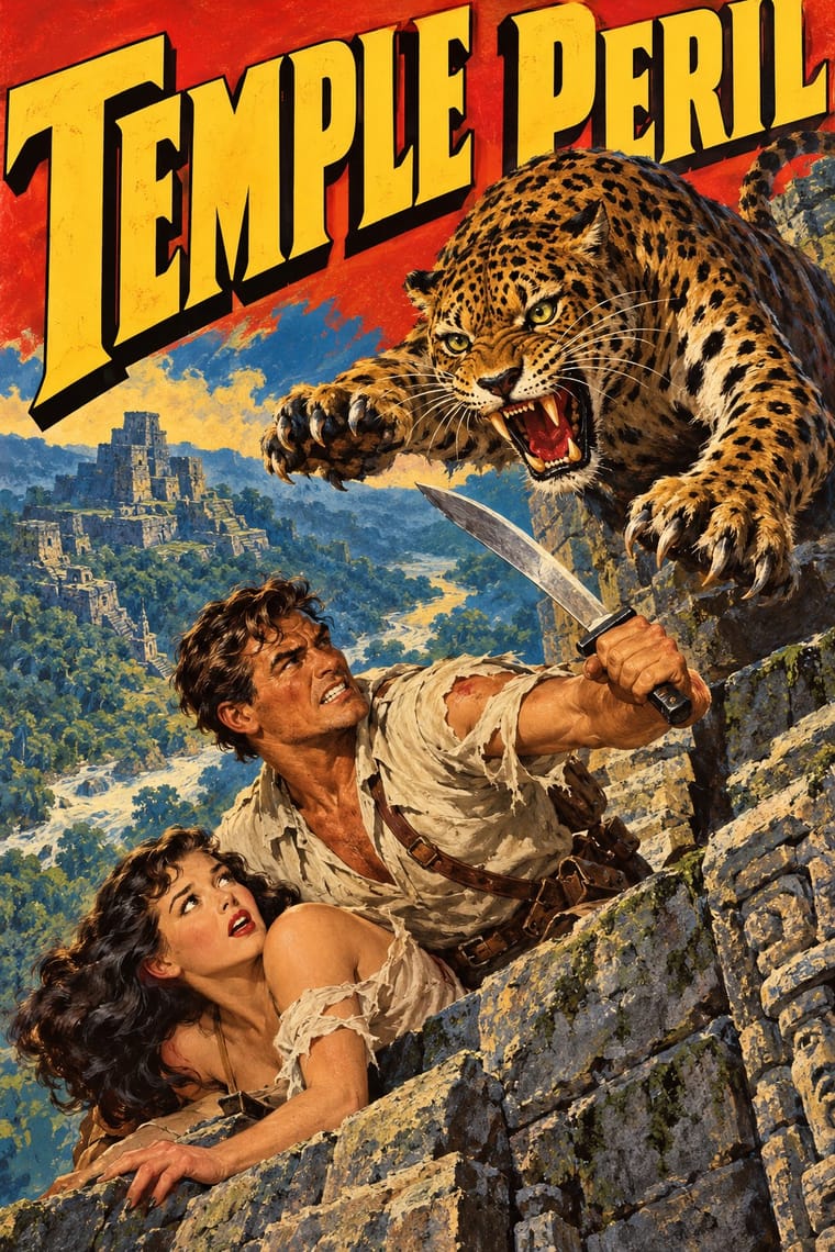
The painted colour covers of American pulp fiction magazines, printed on slicker cover stock around cheap wood-pulp interiors (period 1896 to 1957, the year the American News Company was liquidated, a date sometimes taken as the end of the pulp era). An original painting, reproduced by offset, shows one lurid scene of peril, a heroic figure, a threatened woman and a villain or monster, under a huge masthead, and the cover alone had to sell the issue on the newsstand.
Archivo; Pulp Magazine Cover used Hand-lettered shaded mastheads and Slab and Egyptian display faces
03
The colours
The ground and leading colours come from Victorian Letterpress, with a counter-accent from Pulp Magazine Cover. The ink reads on the ground at 4.5:1 or more.
Pulp Magazine Cover Victorian Letterpress & Wood Type
-
#efe4c9ground · 36% -
#1b1a17ink · 14% -
#b3322baccent · 18% -
#f2c230accent · 14% -
#d9b45aaccent · 10% -
#24477daccent · 8%
As CSS
:root {
  --ground: #efe4c9;
  --ink: #1b1a17;
  --accent-1: #b3322b;
  --accent-2: #f2c230;
  --accent-3: #d9b45a;
  --accent-4: #24477d;
  --font-display: "Abril Fatface", serif;
  --font-text: "Archivo", sans-serif;
}
Use it with care
Pulp Magazine Cover: Pulp covers sold peril through sexualised and violent imagery: the 'damsel in distress' was often half-dressed or bound, and Margaret Brundage's Weird Tales covers (1933-38) showed nude or semi-nude women, with whipping scenes noted as controversial, until a new decency standard was imposed on newsstand pulps in 1938. Spicy Detective and the other 'spicy' pulps made this their selling point. Pulp fiction of the 1930s also carried many Yellow Peril villains loosely based on Fu Manchu, so cover villains often rest on racial caricature, and exoticising colonial stereotypes were common too. Do not copy these conventions as neutral decoration: if the style is used, keep the drama but drop the gendered violence and ethnic stereotypes, or treat them knowingly and critically.
04
The two styles
05
More combinations
With Pulp Magazine Cover
- Penguin Paperback Design (Three Bands to the Marber Grid) Pairs well · The paperback cover is the later successor on the newsstand and bookstall; it trades the shouting masthead and painted peril for a restrained, systematic cover.
- American Four-Colour Comic Book (Golden to Bronze Age) Pairs well · Both are newsstand sensationalism; add panels, balloons and Ben-Day dots to turn a single painted scene into a comic.
- Ghanaian Movie Poster Contrasts · A painted-sensational neighbour: the pulp painting is an original reproduced by offset under a printed masthead, while the Ghanaian poster is painted directly on the final surface.
With Victorian Letterpress
- Hand-Painted Signage & Vernacular Lettering Pairs well · Sign writers and type founders traded letterforms; add brushed shading and drop shadows to wood-type headlines for a street-made feel.
- Push Pin Style Pairs well · Push Pin revived Victorian display faces with irony; mix one wood-type headline with modern illustration for the same knowing nostalgia.
- International Typographic Style Contrasts · One face, flush left and white space against a centred clamour of faces: use the contrast to test whether hierarchy needs variety at all.
- Arts & Crafts Movement Contrasts · Morris reacted against exactly this commercial clutter; set the two side by side to show craft restraint versus jobbing exuberance.
- HfG Ulm Systematic Design Contrasts · A Victorian mixed-face handbill is the clutter Ulm's one-family rule was meant to cure; use it as a before-and-after foil.
- Victorian Colour Toy Books (Evans, Crane, Caldecott and Greenaway) Contrasts · Its black-letter-dense, type-and-ornament jobbing page is the opposite of a picture-led page; combine them by hanging a wood-type title over a flat colour picture.
- Dada Pairs well · Raid Victorian wood type and stock ornaments as the Dadaists did, but scatter them instead of centring them.
- American Four-Colour Comic Book (Golden to Bronze Age) Pairs well · Both are cheap letterpress print that shouts to passers-by; borrow the playbill's stacked display capitals, banners and rules for a comic cover's blurbs and price box, while keeping the comic's hand-drawn letters and keyline art.