Pictorial & machine age · 1978–present · Middle East & North Africa
Israeli Political Poster (Tartakover to Lemel)
Also known as Israeli protest poster, Israeli critical poster design
A dissenting strand of Israeli poster design that makes a short slogan, a charged photograph or an altered familiar image carry a public argument. Tartakover sets forceful Hebrew words against the national visual memory; Lemel turns photographed objects and familiar icons into disturbing metaphors. Unlike early state graphics, its authority is that of the critical witness rather than the official emblem. The shared method accommodates both type-only demands and nearly wordless images.
Make something in this style Get advice in this style Mix it with another style
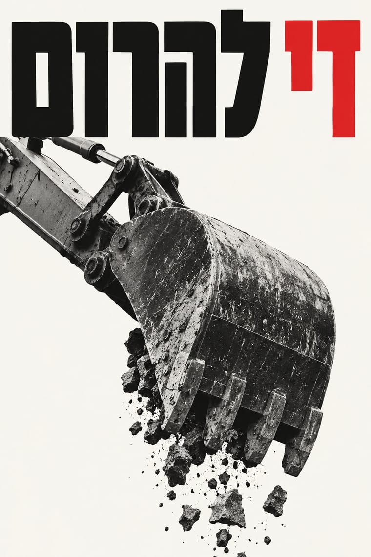
Use it with care
These are situated arguments by individual designers, not a neutral national look or a statement of what all Israelis believe. Identify the maker, occasion and position when discussing a work, and distinguish Israeli dissent from official state communication and from Palestinian poster traditions. Photographs of suffering people require context and care; do not fabricate documentary scenes or recycle victims as decorative stock. The historical posters and contemporary responses examined here have no verified open file licences, so this entry supplies no specimen images or reuse permission. Borrow a compositional method without copying a movement's logo, an artist's work or an identifiable person's likeness.
01
How it works
- Reduce the argument to one encounter: two sharply contrasted words, a photograph crossed by a slogan, or one familiar object transformed into a metaphor; remove decoration that does not advance that encounter.
- Make the wording do visual work: contrast traditional-looking and blunt block Hebrew letters, enlarge the demand, or set a brief label beside the photograph instead of adding a long explanatory paragraph.
- Reframe the familiar rather than painting a heroic national scene: put a public phrase against an uncomfortable photograph, or change a recognised image until its new meaning challenges the first reading.
- Let each image determine its colour strategy: black and white with one forceful red or green accent for a slogan or caption, natural photographic colour when the object itself supplies the shock.
- Keep photographic specificity when bearing witness, and make alteration legible as metaphor when constructing an impossible image; do not pass a composite off as documentary evidence.
- Carry the argument across a poster, sticker or screen without adding a decorative identity system; preserve the concentrated headline or image even when the sheet becomes a small circulating graphic.
Tel Aviv, Israel: a critical poster practice anchored here at David Tartakover's Peace Now (1978), followed through his photographic political posters and Yossi Lemel's conceptual social graphics. This is a comparative grouping of practices, not the name of a formally constituted school.
02
Its design choices
From Stylogeny’s vocabulary of design choices: defining choices make the style, characteristic ones are usual, occasional ones turn up now and then.
- Layout & composition
- Space & hierarchy
- Typography
- Colour
- Surface & texture
- Ornament
- Imagery
- Medium & production
- Tone & intent
- Avoids
- Abundant decoration, Floral & vegetal, Geometric tessellation, All-over field, Flat hierarchy, Ornamented display, Luxurious & glamorous, Calm & contemplative
Palette
-
#111111 -
#f5f4ef -
#d71920 -
#297c4b -
#ee7b28
Typefaces
-
Traditional-looking, stroke-modulated Hebrew display lettering contrasted with heavy monoline Hebrew block lettering, as visible in Peace Now (1978); exact font identifications are not asserted here
-
Heavy condensed Hebrew display letters arranged as short, tightly set word blocks, as in Mi yimalel gevurot Yisrael
1982
-
Plain bold Latin sans-serif titles and short functional captions, including ARTIST on the vest in I'm Here and the white exhibition title on Anatomy of a Conflict
Known for
-
David Tartakover, Peace Now (1978)
two stacked Hebrew words, the upper black word in traditional-looking letters and the lower demand in heavy red block letters, surrounded by white space. Original reproduced, separately from Teddy Cohen's later homage, in Madaf's 2024 project with the Shenkar College Archives
-
David Tartakover, Mi yimalel gevurot Yisrael (1982)
a distressed woman's black-and-white photograph interrupted by large Hebrew words on white rectangular strips. Attribution and date from the original-work caption in Madaf's Shenkar archive collaboration; the adjacent homage is not the historical exemplar
-
David Tartakover, I'm Here (2004)
a photographic view of the artist's back in an orange high-visibility vest marked ARTIST, with a green caption strip. Original identified and dated in Madaf's 2024 archive collaboration; the portraits and green typographic homage beside it are later responses
-
Yossi Lemel, Anatomy of a Conflict, Beckmans designhögskola exhibition poster, Stockholm (2009, printed on the sheet)
surgical instruments pull open a photographed fruit beneath a large white sans-serif title, with event information attached by thin diagram-like leaders. An exhibition application of his critical conceptual imagery, not a poster printed for an Israeli street campaign; Philip Williams Posters identifies the artist and supplies the object photograph
-
Yossi Lemel, Corona Case series (2020), exhibited as A Journey to Pandemia at Poznań Art Week
the Atlas image substitutes a huge virus silhouette for the burden on the figure's shoulders, on a red ground. A later social-commentary extension beyond the Israeli-Palestinian subject; the organiser documents the series as internet-oriented designs retaining traditional poster proportions
03
Make something in this style
Say what you need, and Stylogeny’s image studio draws it from Israeli Political Poster (Tartakover to Lemel)’s design choices and checks it against them. It takes about a minute, and you get a link to share.
04
Where it comes from, and what it’s close to
Before it
The style it grew out of, and the styles it borrowed from.
Nothing earlier is recorded: in the atlas it is a starting point.
After it
The styles that grew out of it.
No later style in the atlas grew out of it yet.
Alike in its design choices
Styles that make many of the same choices, related or not, besides those above.
-
-
-
-
- Post-Punk Record Sleeve (Stiff, Factory, 4AD) 64% alike
- Seoul Independent Graphic Design (Small-Studio Scene) 63% alike
05
Often taken for
Israeli Political Poster has no real works recorded yet, so these are its nearest styles by its choices alone, with the choices that tell them apart.
-
West German Conceptual Film & Culture Poster (Hillmann and Rambow)
West German Conceptual Film & Culture Poster is one of Israeli Political Poster’s nearest styles by choices; no real work of either fits the other better.
Choices that tell Israeli Political Poster and West German Conceptual Film apart Choice Israeli Political Poster West German Conceptual Film Found & vernacular imagery characteristic — Dark ground — characteristic Typography only characteristic — Distortion & exaggeration — characteristic Agitational & persuasive defining occasional No shared descent in the atlas: they reached these choices separately.
-
ACT UP & Gran Fury AIDS Activist Graphics
ACT UP & Gran Fury AIDS Activist Graphics is one of Israeli Political Poster’s nearest styles by choices; no real work of either fits the other better.
Choices that tell Israeli Political Poster and ACT UP apart Choice Israeli Political Poster ACT UP Visual tension characteristic — Layered information — defining All caps — defining Dark ground — characteristic Geometric primitives — characteristic No shared descent in the atlas: they reached these choices separately.
-
Blue Note Jazz Sleeve Modernism
Blue Note Jazz Sleeve Modernism is one of Israeli Political Poster’s nearest styles by choices; no real work of either fits the other better.
Choices that tell Israeli Political Poster and Blue Note Jazz Sleeve Modernism apart Choice Israeli Political Poster Blue Note Jazz Sleeve Modernism Central symmetry occasional avoids Dynamic asymmetry occasional defining Found & vernacular imagery characteristic — Rectilinear — characteristic Photomontage characteristic — No shared descent in the atlas: they reached these choices separately.
-
Stencil Street Art
Stencil Street Art is one of Israeli Political Poster’s nearest styles by choices; no real work of either fits the other better.
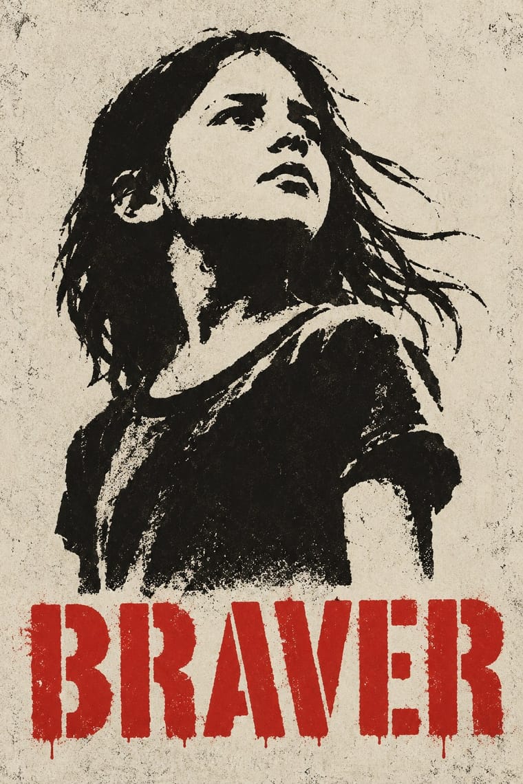
Choices that tell Israeli Political Poster and Stencil Street Art apart Choice Israeli Political Poster Stencil Street Art Straight photography characteristic — Photocopy & distress — characteristic Typography only characteristic — All caps — characteristic Full bleed characteristic — No shared descent in the atlas: they reached these choices separately.
— means the choice isn’t among the style’s recorded choices. Critics recorded each work’s choices with the styles’ descriptions in view, so this shows whether the descriptions hold together, not proof that they are right.
06
Combine it with
Styles Israeli Political Poster (Tartakover to Lemel) pairs well with or plays against, from the research. Each is worked out as a combination: which style gives the type, the colours and the forms.
- Polish Poster School Contrasts · Use the comparison to choose between a painted metaphor with the maker's handwritten title and a photograph or typographic confrontation; do not make painterly brushwork a defining trait of this grouping.
- West German Conceptual Film & Culture Poster (Hillmann and Rambow) Contrasts · Both can concentrate a poster into a photographed paradox and a set sans-serif title; choose the Israeli dissenting core when Hebrew slogans, national visual memory and the artist as critical witness must carry the argument, rather than a sign extracted from a film or play. Lemel's exhibition and pandemic images remain points of overlap, not a uniquely Israeli photographic technique.
- AIZ Political Photomontage (Heartfield) Pairs well · Compare how a recognisable photographed object becomes an accusation, but keep the Hebrew slogan and local reference specific; resemblance in the montage method is not evidence of direct historical influence.
- Hebrew Poster Lettering & Early Israeli State Design Contrasts · Compare the earlier entry's hand-drawn Hebrew, painted heroes and official emblems with this strand's set slogans and photographic contradictions; use the contrast to move from affirmative national address to situated criticism without implying a documented line of descent.
07
Sources
- Haifa Museum of Art, Solo exhibition - David Tartakover, curated by Svetlana Reingold, 12 December 2015–25 June 2016: primary museum account of the poster as a critical activist instrument and Tartakover's research and revival of Israel's pictorial index. https://www.hma.org.il/eng/Exhibitions/2767/Solo_exhibition_-_David_Tartakover
- Michal Shapira, A Tribute to David Tartakover on His 80th Birthday, Madaf, 6 February 2024, a project made with the Shenkar College Archives: original-work captions and visually inspected images for Peace Now (1978), Mi yimalel gevurot Yisrael (1982), and I'm Here (2004), carefully separated from the adjacent 2024 responses. https://madaf.art/en/magazine/tartakover-80-bday
- Poznań Art Week, Yossi Lemel: A Journey to Pandemia, 20 November 2020: organiser's primary exhibition text, artist biography, and gallery of Corona Case posters; Atlas image visually inspected. Documents internet viewing with 70 × 100 cm poster proportions and work with Amnesty International and other civic organisations. https://poznanartweek.com/en/events-exhibitions/yossi-lemel-a-journey-to-pandemia/ ; verified text via https://poznanartweek.com/wp-json/wp/v2/posts/9824?_fields=link,date,title,content
- Philip Williams Posters (commercial collection, not an institutional museum), Anatomy of a Conflict, object PFPJ207-018: artist attribution to Yossi Lemel and photograph of the exhibition sheet; the image itself reads Beckmans designhögskola, Stockholm, 11–20 September, 2009. The shop's web publication date is not the work's date. https://postermuseum.com/products/anatomy-of-a-conflict-207
- Research limits: the scout's exact Peace Now rally day, claims about a first bumper sticker, the Auschwitz anniversary/1995 combination, and specific Koren/Haim font identifications were not independently confirmed and are not adopted. No direct influence from Heartfield, Constructivism or Pop Art is asserted. Genome weights, representative palette and the local historical comparison are comparative atlas interpretations of the examined work, not claims of a uniform manifesto. The offset weight is a general print-practice interpretation; the 2020 organiser documents Internet distribution, not HTML/CSS or early desktop-publishing production. The occasional image.vector-illustration trait describes the clean flat silhouette imagery visible in the Atlas extension, not a verified software or file format.
How Stylogeny researches and checks a style: where the facts come from.