Style combination · Contrasts
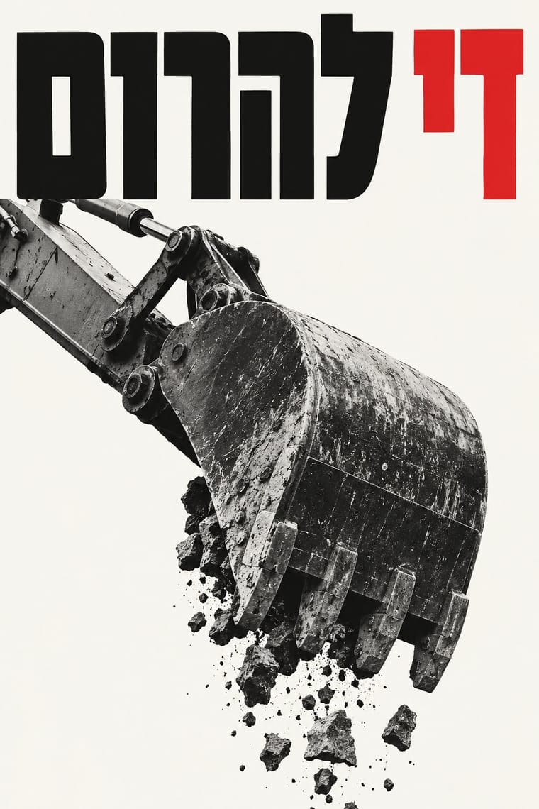
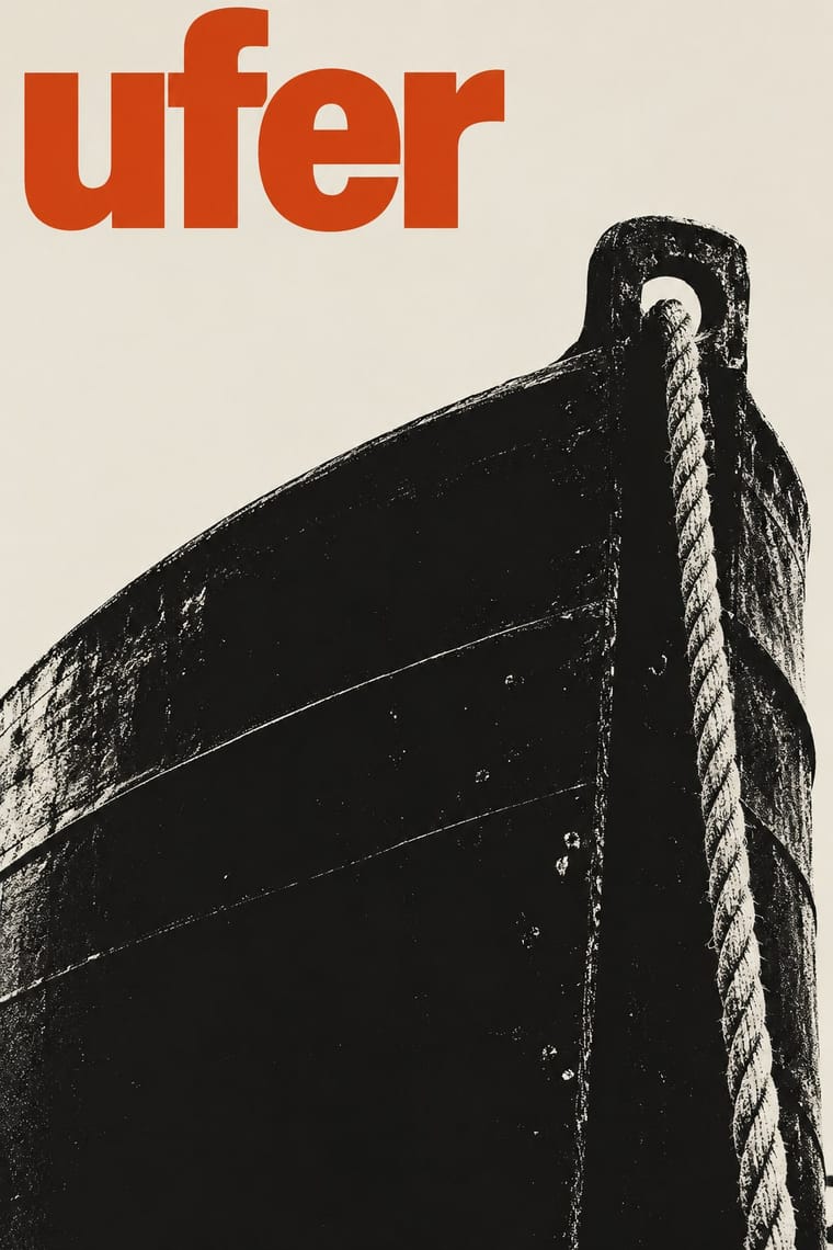
Israeli Political Poster × West German Conceptual Film
Both can concentrate a poster into a photographed paradox and a set sans-serif title; choose the Israeli dissenting core when Hebrew slogans, national visual memory and the artist as critical witness must carry the argument, rather than a sign extracted from a film or play. Lemel's exhibition and pandemic images remain points of overlap, not a uniquely Israeli photographic technique.
Mix them and make something Israeli Political Poster West German Conceptual Film
01
What each style brings
Each part of the design comes from the style with the stronger say in it, and each style gives at least two.
Israeli Political Poster (Tartakover to Lemel) West German Conceptual Film & Culture Poster (Hillmann and Rambow)
- Type from West German Conceptual Film
- Colour from West German Conceptual Film
- Form from Israeli Political Poster
- Composition from Israeli Political Poster
- Surface from West German Conceptual Film
02
The type
Open fonts standing in for each style’s own type, which is often hand-drawn or commercial.
Display · West German Conceptual Film
Noise
Inter Tight, standing in for Condensed bold grotesque for titles, set tight and often stacked (Panzerkreuzer Potemkin, 1967; Sturm über Asien; Der Malteser Falke, 1972; Rambow's Die Hamletmaschine, 1980)
Text · Israeli Political Poster
A dissenting strand of Israeli poster design that makes a short slogan, a charged photograph or an altered familiar image carry a public argument. Tartakover sets forceful Hebrew words against the national visual memory; Lemel turns photographed objects and familiar icons into disturbing metaphors. Unlike early state graphics, its authority is that of the critical witness rather than the official emblem. The shared method accommodates both type-only demands and nearly wordless images.
Archivo; Israeli Political Poster used Traditional-looking, stroke-modulated Hebrew display lettering contrasted with heavy monoline Hebrew block lettering, as visible in Peace Now (1978); exact font identifications are not asserted here and Heavy condensed Hebrew display letters arranged as short, tightly set word blocks, as in Mi yimalel gevurot Yisrael
03
The colours
The ground and leading colours come from West German Conceptual Film, with a counter-accent from Israeli Political Poster. The ink reads on the ground at 4.5:1 or more.
Israeli Political Poster (Tartakover to Lemel) West German Conceptual Film & Culture Poster (Hillmann and Rambow)
-
#ece7dcground · 36% -
#1b1b1bink · 14% -
#d4441daccent · 18% -
#ee7b28accent · 14% -
#2f3f8faccent · 10% -
#908a82accent · 8%
As CSS
:root {
  --ground: #ece7dc;
  --ink: #1b1b1b;
  --accent-1: #d4441d;
  --accent-2: #ee7b28;
  --accent-3: #2f3f8f;
  --accent-4: #908a82;
  --font-display: "Inter Tight", sans-serif;
  --font-text: "Archivo", sans-serif;
}
Use it with care
Israeli Political Poster (Tartakover to Lemel): These are situated arguments by individual designers, not a neutral national look or a statement of what all Israelis believe. Identify the maker, occasion and position when discussing a work, and distinguish Israeli dissent from official state communication and from Palestinian poster traditions. Photographs of suffering people require context and care; do not fabricate documentary scenes or recycle victims as decorative stock. The historical posters and contemporary responses examined here have no verified open file licences, so this entry supplies no specimen images or reuse permission. Borrow a compositional method without copying a movement's logo, an artist's work or an identifiable person's likeness.
West German Conceptual Film & Culture Poster (Hillmann and Rambow): Some posters turn Nazi imagery against itself: a swastika of broken pencils over the 1938 member list of the exiled German PEN (P.E.N. im Exil, 1983) and an egg given Hitler's forelock and moustache (Sein oder Nichtsein, 1964). Displaying Nazi symbols is restricted by law in Germany and several other countries outside contexts such as art, satire, education and history, so keep any such sign unmistakably critical and check the rules where the work will be shown. Rambow's Othello poster (1978) appears to show a face in dark stage make-up, the blackface convention for the role that is now widely rejected: do not borrow it. The posters and their photographs (Hillmann, Rambow, Lienemeyer, van de Sand, Abisag Tüllmann) are in copyright: stage and photograph your own object or cut your own silhouette instead of recreating a poster.
04
The two styles
05
More combinations
With Israeli Political Poster
- Polish Poster School Contrasts · Use the comparison to choose between a painted metaphor with the maker's handwritten title and a photograph or typographic confrontation; do not make painterly brushwork a defining trait of this grouping.
- AIZ Political Photomontage (Heartfield) Pairs well · Compare how a recognisable photographed object becomes an accusation, but keep the Hebrew slogan and local reference specific; resemblance in the montage method is not evidence of direct historical influence.
- Hebrew Poster Lettering & Early Israeli State Design Contrasts · Compare the earlier entry's hand-drawn Hebrew, painted heroes and official emblems with this strand's set slogans and photographic contradictions; use the contrast to move from affirmative national address to situated criticism without implying a documented line of descent.
With West German Conceptual Film
- Basel Object Poster (Swiss Sachplakat) Contrasts · Both isolate one object on a plain ground, but Basel paints a product in glossy lithographic realism to sell it; here the object stands for a film's theme, is cut to a flat silhouette or a grainy photograph, and rarely flatters.
- AIZ Political Photomontage (Heartfield) Pairs well · Heartfield tied four bloody axes into a swastika in 1934; Rambow's broken pencils laid into a swastika over a 1938 PEN list (1983) make the same move of an object turned into an emblem. Borrow the AIZ caption when the poster must accuse, and Rambow's wordless object when it should commemorate.
- Polish Poster School Contrasts · Its contemporary in art-film posters: the Polish school paints the metaphor and letters the title by hand in loose brushwork; take the Kassel route when the same single idea should come from a cropped photograph or a hard silhouette with set grotesque type.
- Hipgnosis Photographic Concept Sleeve Pairs well · Hipgnosis also builds impossible scenes for the camera and lets the photograph vouch for them; add Rambow's plain ground and one line of set grotesque when such a staged photo has to work as a street poster rather than a record sleeve.
- Cuban Revolutionary Poster (OSPAAAL & ICAIC) Contrasts · The ICAIC film posters of revolutionary Cuba also read a film metaphorically and reduce it to one silhouette or visual pun in screenprint, but they let flat, saturated, Pop and psychedelic colour carry the energy and draw or hand-cut the title letters; the Kassel poster mostly keeps to black and one or two inks, a photograph or a hard silhouette and set grotesque type.
- International Typographic Style Contrasts · Shares the set grotesque, flat inks and ornament-free ground, but rejects Swiss objectivity: each poster carries one visual metaphor and a new typographic choice per film instead of a grid and a neutral system.
- French Post-War Visual-Gag Poster (Savignac, Villemot, Morvan) Contrasts · Savignac's visual gag is drawn and painted to make people smile at a product; the Kassel poster finds its pun in photographs and silhouettes, and its humour is darker and aimed at a film's or play's subject.
- Saul and Elaine Bass Conceptual Film Graphics Contrasts · Hillmann's posters also refuse star portraits and reduce a film to one sign, but they are static sheets set in grotesque type that often find the sign in a grainy photograph; Bass draws and cuts the sign by hand and builds it as a moving title before it becomes a poster.