Digital native · 1963–1980 · Central Europe, Western Europe, North America, Southern Europe
Early Computer Art & Plotter Graphics
Also known as Early algorithmic graphics, Computergraphik, Early pen-plotter art
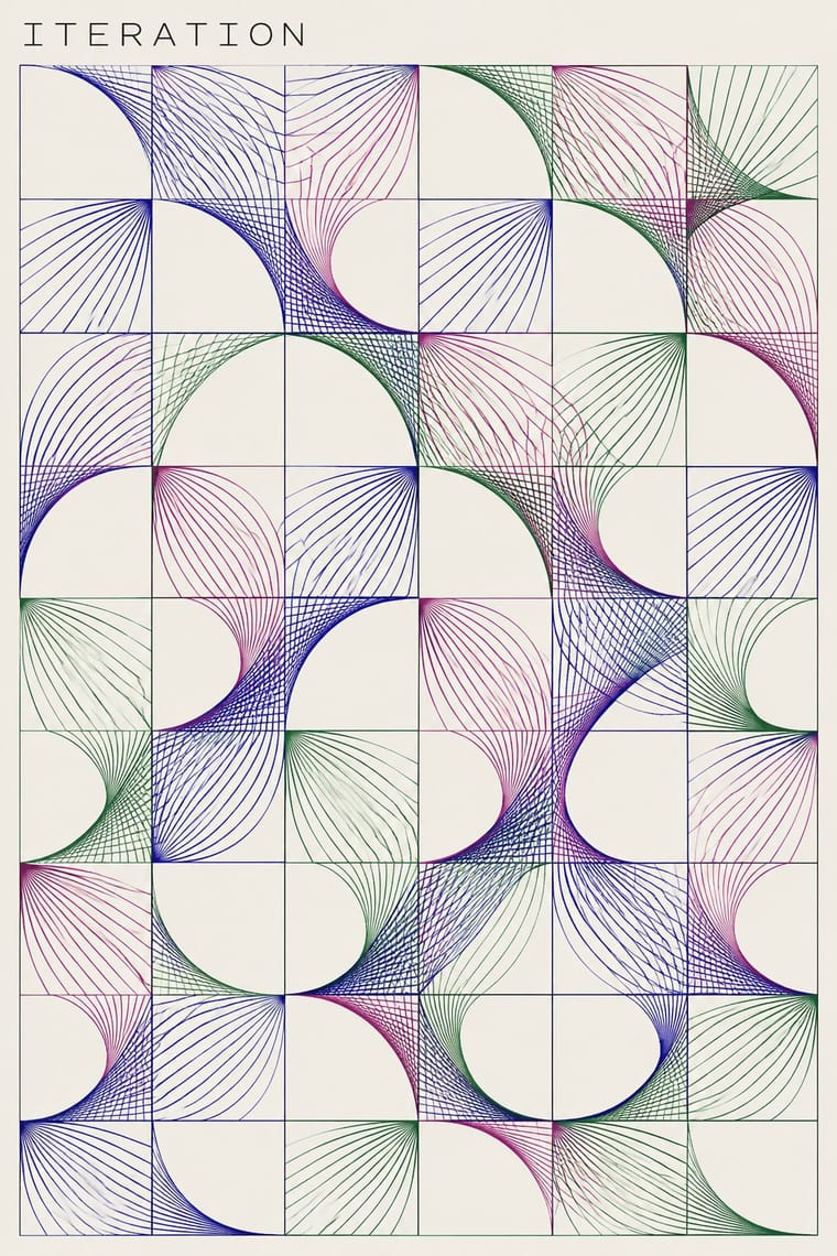
An early computational print idiom that turns explicit procedures and bounded chance into visible marks on paper. Fine paths or coloured modules, repeated units, omissions and changes of density make the rule and its variations readable. Plotter drawings circulated alongside screenprinted and offset versions; this entry centres that paper-based abstraction, not all computer art, pixel imagery or later variable branding.
Make something in this style Get advice in this style Mix it with another style
01
How it works
- Define a small repertoire of lines, circles or other geometric units, then generate their positions and relations through an explicit procedure.
- Make controlled variation visible through displacement, rotation, omission, overlap or changing density rather than hand-painted expression.
- Use fine, relatively even strokes on a light paper ground; let accumulations and intersections of paths produce darker areas.
- Keep a repeated field or coordinate structure legible while allowing local irregularities; do not require optical vibration or simulated depth.
- Give the drawing room within the sheet and keep any work identifiers, signatures and edition annotations subordinate to the generated image.
- Distinguish the generated drawing from its printed edition, and treat colour-module prints as a secondary register rather than forcing every work into monochrome linework.
University and industrial computing laboratories and their artist collaborators, including Stuttgart, Bell Labs in the United States and Paris; Zagreb's New Tendencies exhibitions and bit international connected computational graphics with visual research from 1968. The period bounds the early laboratory-and-paper idiom, not the invention or disappearance of computer art; 1980 is a curatorial boundary rather than a documented collective endpoint.
02
Its design choices
From Stylogeny’s vocabulary of design choices: defining choices make the style, characteristic ones are usual, occasional ones turn up now and then.
- Layout & composition
- Space & hierarchy
- Colour
- Form & shape
- Surface & texture
- Ornament
- Imagery
- Medium & production
- Tone & intent
- Avoids
- Painterly brushwork, Skeuomorphic material, Chrome & 3D render, Gloss & highlights, Floral & vegetal, Emblems & badges, Ornamented display, Type as image
Palette
-
#f5f2e9 -
#171717 -
#28249a -
#b24b88 -
#438446
Typefaces
-
Small technical work identifiers and captions subordinate to the image
visible in the lower margins of Mohr's P-62 and Nake's Hommage; exact face and typographic classification unconfirmed
-
Handwritten artist signatures and edition numerals in the sheet margin
visible in the Nees, Molnár and Knowlton examples; not headline lettering
Known for
-
Georg Nees, Achsenparalleler Irrweg (1964), ZKM
ink-on-paper plotter drawing generated with ALGOL on a Siemens 2002 and output on a Zuse Graphomat Z64; overlapping orthogonal paths rather than a pixel mosaic
-
Frieder Nake, Hommage à Paul Klee Nr. 2 (1965), ZKM
the collection object is a screenprint after a plotter drawing; irregular horizontal divisions, precise circles and fields of crossing or parallel lines
-
Vera Molnár, Interruptions (1969), Paris, V&A E.269-2011
a plotter drawing whose short, differently oriented strokes form a field broken by empty patches; the museum describes an iterative series of algorithmic modifications
-
Manfred Mohr, P-62 (floating points) (1970), Paris, V&A E.186-2008
an offset lithograph after a plotter drawing, with clusters of curved parallel paths and large areas of unmarked paper
-
Ken Knowlton, Untitled, from Art Ex Machina (1972), V&A E.236:12-2008
a computer-generated colour screenprint published by Gilles Gheerbrant in Montréal; a secondary modular-colour strand within a portfolio also containing Barbadillo, Kawano, Mohr, Nake and Nees
03
Make something in this style
Say what you need, and Stylogeny’s image studio draws it from Early Computer Art & Plotter Graphics’s design choices and checks it against them. It takes about a minute, and you get a link to share.
04
Where it comes from, and what it’s close to
After it
The styles that grew out of it.
No later style in the atlas grew out of it yet.
Alike in its design choices
Styles that make many of the same choices, related or not, besides those above.
05
Often taken for
Early Computer Art & Plotter Graphics has no real works recorded yet, so these are its nearest styles by its choices alone, with the choices that tell them apart.
-
Generative & Dynamic Identities
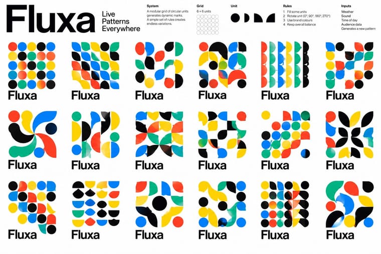
Generative & Dynamic Identities is one of Early Computer Art & Plotter Graphics’s nearest styles by choices; no real work of either fits the other better.
Choices that tell Early Computer Art and Generative apart Choice Early Computer Art Generative Monochrome characteristic — Motion & broadcast — characteristic Line illustration characteristic — Web & CSS — characteristic Flat hierarchy characteristic — No shared descent in the atlas: they reached these choices separately.
-
Brazilian Concrete Design
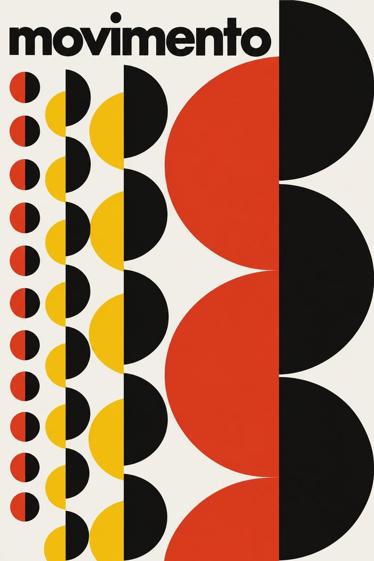
Brazilian Concrete Design is one of Early Computer Art & Plotter Graphics’s nearest styles by choices; no real work of either fits the other better.
Choices that tell Early Computer Art and Brazilian Concrete Design apart Choice Early Computer Art Brazilian Concrete Design Generative imagery defining — Limited spot colours — defining Monochrome characteristic — Flat fields occasional defining Line illustration characteristic — No shared descent in the atlas: they reached these choices separately.
-
Zagreb Modernist Graphics (EXAT 51 to Teatar &TD)
Zagreb Modernist Graphics is one of Early Computer Art & Plotter Graphics’s nearest styles by choices; no real work of either fits the other better.
Choices that tell Early Computer Art and Zagreb Modernist Graphics apart Choice Early Computer Art Zagreb Modernist Graphics Generative imagery defining — Type as image avoids characteristic Line illustration characteristic — Limited spot colours — defining Generous white space characteristic — No shared descent in the atlas: they reached these choices separately.
-
Total Design & Dutch Functionalism
Total Design & Dutch Functionalism is one of Early Computer Art & Plotter Graphics’s nearest styles by choices; no real work of either fits the other better.
Choices that tell Early Computer Art and Total Design apart Choice Early Computer Art Total Design Generative imagery defining — Type as image avoids characteristic Monochrome characteristic — Limited spot colours — defining Line illustration characteristic — No shared descent in the atlas: they reached these choices separately.
— means the choice isn’t among the style’s recorded choices. Critics recorded each work’s choices with the styles’ descriptions in view, so this shows whether the descriptions hold together, not proof that they are right.
06
Combine it with
Styles Early Computer Art & Plotter Graphics pairs well with or plays against, from the research. Each is worked out as a combination: which style gives the type, the colours and the forms.
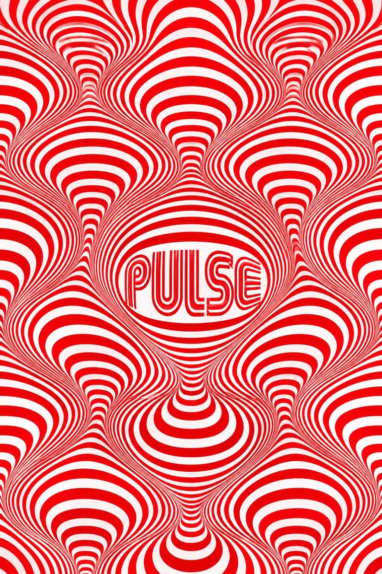
- Op Art Graphics Pairs well · Borrow progressive line spacing for a local optical effect, but retain omissions and irregularities so the computational drawing is not reduced to an illusion.
- Generative & Dynamic Identities Pairs well · Adapt a bounded drawing procedure into an identity's variable image layer while keeping its wordmark fixed; the historical paper print is not itself a responsive logo.
- Bitmap & Pixel Graphics Contrasts · Choose continuous, fine plotted paths for an open paper drawing or coarse pixel cells for a screen pictogram; do not simulate the former by merely adding an 8-bit font.
- Demoscene Graphics (Cracktros, Demos & Text-Mode Art) Contrasts · Use a quiet, light-ground sheet with restrained annotations instead of a dark animated stage dominated by a shaded group logo.
07
Sources
- https://zkm.de/en/artworks/achsenparalleler-irrweg — ZKM object record: Nees, 1964, ink on paper, ALGOL, Siemens 2002 and Zuse Graphomat Z64. Museum image examined: thin orthogonal overlapping paths on a pale sheet, wide margins and a handwritten signature. Copyright is retained; no image reuse licence claimed.
- https://zkm.de/en/artworks/hommage-a-paul-klee-nr-2 — ZKM object record and Anna-Maria Drago Jekal's interpretation: Nake's Stuttgart experiments began in 1963; 1965 work inspired by Klee; screenprint after plotter drawing, not an original pen drawing. Museum image examined: irregular bands, circles, variable-density straight paths and small technical lettering.
- https://api.vam.ac.uk/v2/museumobject/O1193775 — V&A Interruptions, E.269-2011: Molnár, Paris, 1969, plotter drawing; 2018 gallery label explains iterative algorithm modification. Museum image 2011EY6963 examined: short black strokes, omissions, a light ground and marginal handwritten annotation.
- https://api.vam.ac.uk/v2/museumobject/O201403 — V&A P-62 (floating points), E.186-2008: Mohr, Paris, 1970, offset lithograph after a plotter drawing; program includes random variables within given options. Museum image 2008BT5090 examined: curved parallel lines, clustered forms, overlap, generous empty areas, fine border and small work identifiers. This supports occasional curvature and depth effects, not an exclusively orthogonal genome.
- https://api.vam.ac.uk/v2/museumobject/O152641 — V&A Art Ex Machina contribution, E.236:12-2008: Knowlton, screenprint, 1972, published in Montréal by Gilles Gheerbrant; portfolio contributors verified. Museum image 2008BT5064 examined: purple-blue, pink and green modules, checker-like fields and stepped contours, with marginal signature and edition number. This is an exception to the dominant monochrome fine-line register, not evidence that all early computational prints were plotter drawings.
- https://www.vam.ac.uk/articles/digital-art — V&A, Digital art, updated 17 April 2024: laboratory access in France, plotters' contribution to complex geometric linework and Molnár's encounters with Op art. Used for technological and historical context, not as support for every claim in the much broader category of digital art.
- https://zkm.de/en/publications/a-little-known-story-about-a-movement-a-magazine-and-the-computers-arrival-in-art — Margit Rosen, ed., A Little-Known Story About a Movement, a Magazine, and the Computer's Arrival in Art: New Tendencies and Bit International, 1961–1973 (MIT Press, 2011). ZKM's publication description verifies Zagreb's visual-research network, the 1968 magazine and links from Op and Constructivist art to computer graphics. The atlas's specifically Russian Constructivism entry is not asserted as a direct parent of these diverse practitioners.
- Scope and calibration: the genome describes the early paper-based abstract register, not all computer art or all output by the named makers. No plotter-medium trait exists in the vocabulary; medium.generative-code records the procedure, while medium.hand-drawn is deliberately omitted. Typography is occasional marginal lettering, not a defining house face; type.grotesque at 0.3 is a provisional mapping of the marginal technical lettering, not a verified typographic classification or house face. Light grounds and fine linework are characteristic, not defining: Knowlton's retained colour-module exemplar has a blue-purple picture field and filled stepped modules; its white sheet margins do not make the image ground light. The palette is representative, not an ink specification. Compared with op-art, optical vibration and depth are optional; compared with generative-identity, variable branding and web or motion delivery are absent; compared with demoscene-graphics and bitmap-pixel, neither screen pixels nor display lettering defines the form. The 1980 endpoint is a catalogue scope choice, not a verified end date for plotter practice.
How Stylogeny researches and checks a style: where the facts come from.