Style combination · Pairs well
Early Computer Art × Op Art Graphics
Borrow progressive line spacing for a local optical effect, but retain omissions and irregularities so the computational drawing is not reduced to an illusion.
Mix them and make something Early Computer Art Op Art Graphics
01
What each style brings
Each part of the design comes from the style with the stronger say in it, and each style gives at least two.
Early Computer Art & Plotter Graphics Op Art Graphics
- Type from Op Art Graphics
-
Early Computer Art avoids ornamented display: this is where the two pull against each other.
- Colour from Op Art Graphics
- Form from Early Computer Art
- Composition from Op Art Graphics
- Surface from Early Computer Art
02
The type
Open fonts standing in for each style’s own type, which is often hand-drawn or commercial.
Display · Op Art Graphics
Future
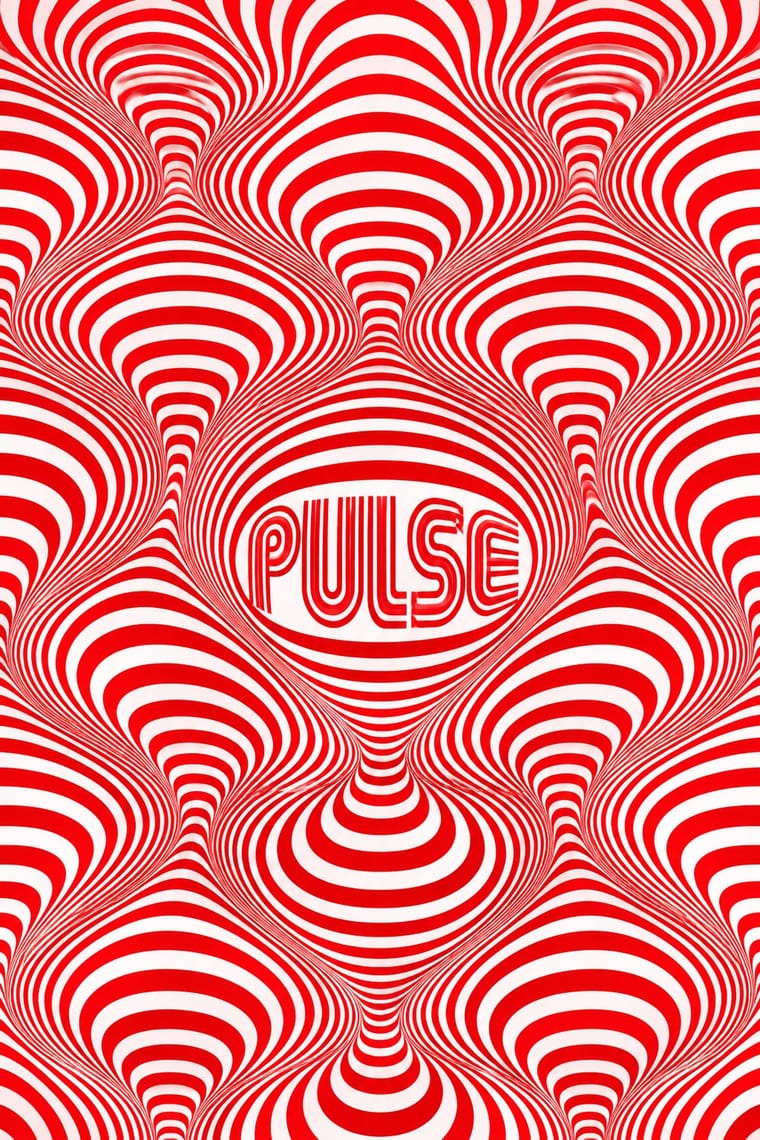
Monoton, standing in for Mexico 68 multiline lettering (Lance Wyman)
Text · Early Computer Art
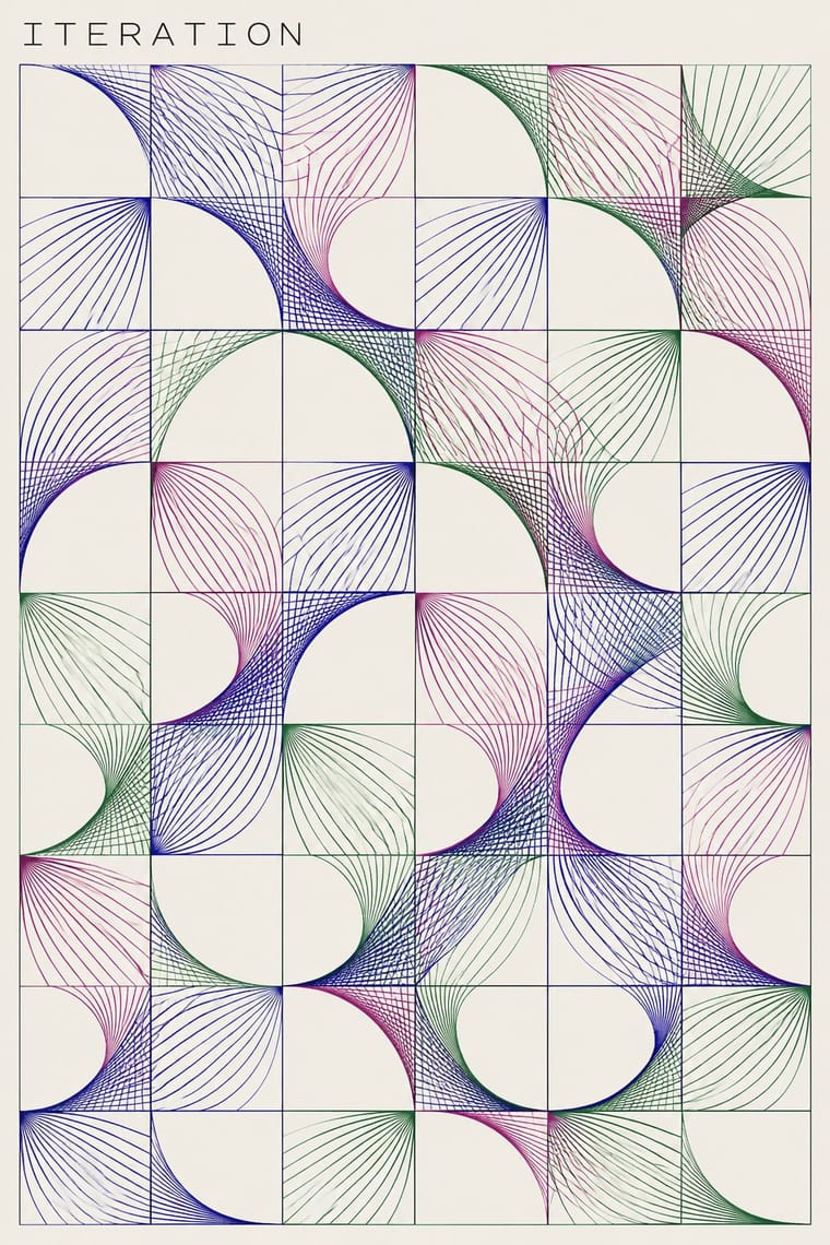
An early computational print idiom that turns explicit procedures and bounded chance into visible marks on paper. Fine paths or coloured modules, repeated units, omissions and changes of density make the rule and its variations readable. Plotter drawings circulated alongside screenprinted and offset versions; this entry centres that paper-based abstraction, not all computer art, pixel imagery or later variable branding.
Inter; Early Computer Art used Small technical work identifiers and captions subordinate to the image and Handwritten artist signatures and edition numerals in the sheet margin
03
The colours
The ground and leading colours come from Op Art Graphics, with a counter-accent from Early Computer Art. The ink reads on the ground at 4.5:1 or more.
Early Computer Art & Plotter Graphics Op Art Graphics
-
#ffffffground · 36% -
#0a0a0aink · 14% -
#e3001baccent · 18% -
#28249aaccent · 14% -
#0050b5accent · 10% -
#b24b88accent · 8%
As CSS
:root {
  --ground: #ffffff;
  --ink: #0a0a0a;
  --accent-1: #e3001b;
  --accent-2: #28249a;
  --accent-3: #0050b5;
  --accent-4: #b24b88;
  --font-display: "Monoton", sans-serif;
  --font-text: "Inter", sans-serif;
}
04
The two styles
05
More combinations
With Early Computer Art
- Generative & Dynamic Identities Pairs well · Adapt a bounded drawing procedure into an identity's variable image layer while keeping its wordmark fixed; the historical paper print is not itself a responsive logo.
- Bitmap & Pixel Graphics Contrasts · Choose continuous, fine plotted paths for an open paper drawing or coarse pixel cells for a screen pictogram; do not simulate the former by merely adding an 8-bit font.
- Demoscene Graphics (Cracktros, Demos & Text-Mode Art) Contrasts · Use a quiet, light-ground sheet with restrained annotations instead of a dark animated stage dominated by a shaded group logo.
With Op Art Graphics
- Brazilian Concrete Design Pairs well · Start from concrete design's calm serial module, then introduce op distortions in one zone for controlled movement.
- Generative & Dynamic Identities Pairs well · Code op's progressive line modulation so an identity can animate and vary while staying perceptually striking.
- Ma & Wabi-sabi Aesthetics Contrasts · Wabi-sabi's quiet irregular textures are the antithesis of mechanical vibration; give one op element plenty of calm space to avoid visual fatigue.
- Psychedelic Poster Pairs well · Psychedelic posters borrowed op's vibrating colour edges; combine precise line fields with melting lettering for kinetic music graphics.
- Zagreb Modernist Graphics (EXAT 51 to Teatar &TD) Pairs well · The New Tendencies shows in Zagreb were one of op art's sources; take op's vibrating line fields and hold them inside Picelj's square module and small lowercase credit line for a gallery poster that stays systematic.
- Finnish Bold Print (Marimekko Modernism) Contrasts · Both fill a field edge to edge with one repeated module in the 1960s, but op art's ruled precision makes the eye vibrate while Finnish bold print keeps hand-cut edges and calm flat shapes; choose between perceptual shock and relaxed joy.
- Di Tella Graphic Design (Instituto Torcuato Di Tella) Pairs well · The CLAEM programmes and the Premio Di Tella 64 poster already speak Op; run one heavy grotesque title through an optical field, as Distéfano did, for an event that should vibrate.
- 2 Tone Graphics Pairs well · Let the checkerboard carry optical energy as border and ground around a flat figure.