Style combination · Pairs well
Early Computer Art × Generative
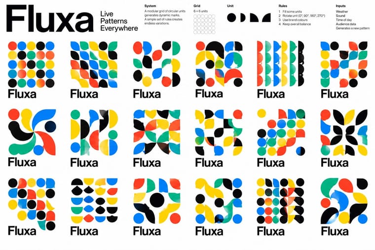
Adapt a bounded drawing procedure into an identity's variable image layer while keeping its wordmark fixed; the historical paper print is not itself a responsive logo.
01
What each style brings
Each part of the design comes from the style with the stronger say in it, and each style gives at least two.
Early Computer Art & Plotter Graphics Generative & Dynamic Identities
- Type from Generative
- Colour from Generative
- Form from Early Computer Art
- Composition from Early Computer Art
- Surface from Early Computer Art
02
The type
Open fonts standing in for each style’s own type, which is often hand-drawn or commercial.
Display · Generative
Order
Inter Tight, standing in for Neue Haas Grotesk (Whitney Museum, Experimental Jetset)
Text · Early Computer Art
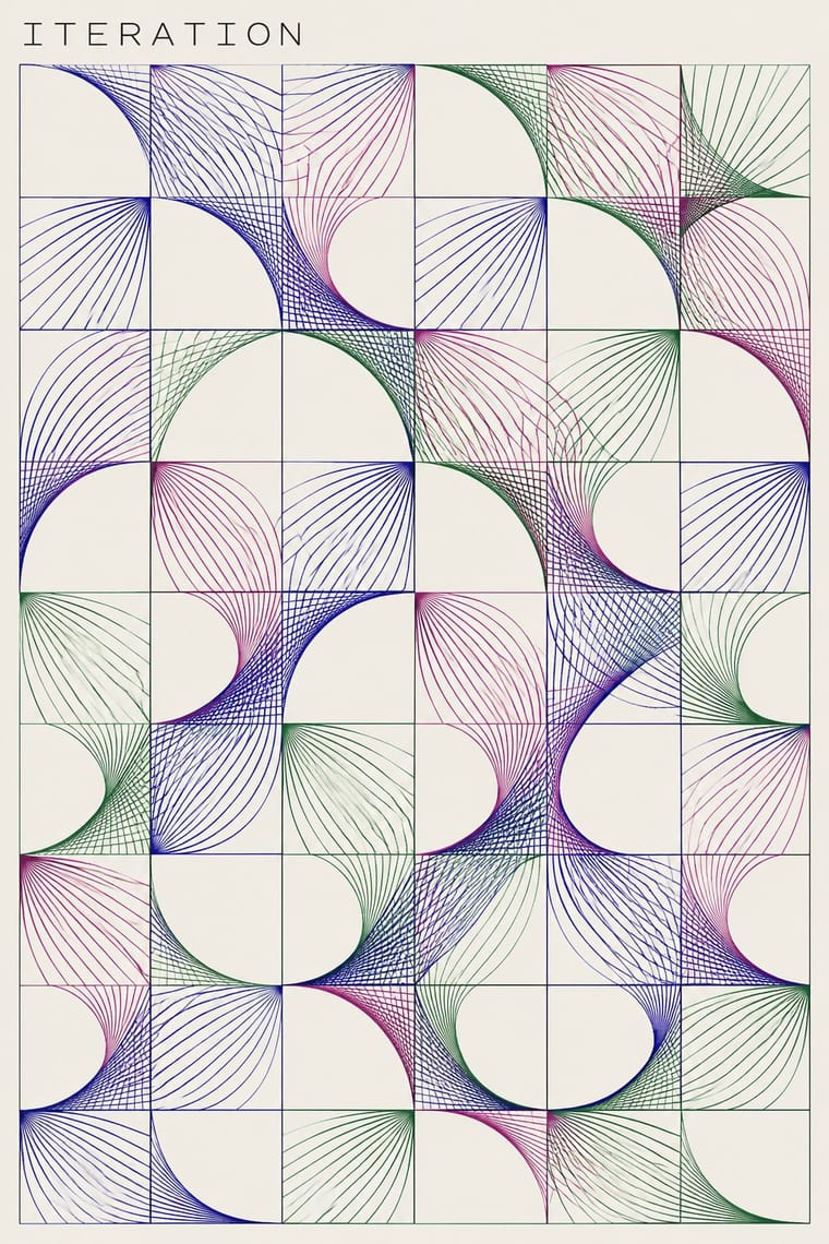
An early computational print idiom that turns explicit procedures and bounded chance into visible marks on paper. Fine paths or coloured modules, repeated units, omissions and changes of density make the rule and its variations readable. Plotter drawings circulated alongside screenprinted and offset versions; this entry centres that paper-based abstraction, not all computer art, pixel imagery or later variable branding.
Inter; Early Computer Art used Small technical work identifiers and captions subordinate to the image and Handwritten artist signatures and edition numerals in the sheet margin
03
The colours
The ground and leading colours come from Generative, with a counter-accent from Early Computer Art. The ink reads on the ground at 4.5:1 or more.
Early Computer Art & Plotter Graphics Generative & Dynamic Identities
-
#ffffffground · 36% -
#111111ink · 14% -
#0091ffaccent · 18% -
#28249aaccent · 14% -
#ffd400accent · 10% -
#b24b88accent · 8%
As CSS
:root {
  --ground: #ffffff;
  --ink: #111111;
  --accent-1: #0091ff;
  --accent-2: #28249a;
  --accent-3: #ffd400;
  --accent-4: #b24b88;
  --font-display: "Inter Tight", sans-serif;
  --font-text: "Inter", sans-serif;
}
04
The two styles
05
More combinations
With Early Computer Art
- Op Art Graphics Pairs well · Borrow progressive line spacing for a local optical effect, but retain omissions and irregularities so the computational drawing is not reduced to an illusion.
- Bitmap & Pixel Graphics Contrasts · Choose continuous, fine plotted paths for an open paper drawing or coarse pixel cells for a screen pictogram; do not simulate the former by merely adding an 8-bit font.
- Demoscene Graphics (Cracktros, Demos & Text-Mode Art) Contrasts · Use a quiet, light-ground sheet with restrained annotations instead of a dark animated stage dominated by a shaded group logo.
With Generative
- Hand-Painted Signage & Vernacular Lettering Contrasts · Hand-painted lettering's one-off irregularity is the human counterpart to algorithmic variation; mix the two only with clear intent.
- Op Art Graphics Pairs well · Op Art's line modulation and moiré are ready-made rules for patterns that respond to data or motion.
- Corporate Identity Modernism Pairs well · Keep one invariant element from corporate modernism, such as a fixed wordmark or colour, so the variable identity stays recognisable.
- International Typographic Style Pairs well · Use a Swiss modular grid as the fixed frame so generated variants stay coherent across the whole system.
- Dark Tech Minimalism Pairs well · Run a generative shader or particle field behind the hero to replace stock imagery with live, on-brand texture.
- Kinetic Typography & Variable Type Pairs well · Drive the variable axes with data or sound so the type responds to input rather than merely looping.
- Generative-AI Image Aesthetic Contrasts · Rule-based generative identity designs the system and accepts abstract variation; AI imagery averages toward realism, so decide which kind of 'generative' a brief needs.
- Milanese Industrial Modernism (Olivetti, Pirelli, Studio Boggeri) Pairs well · Pintori's cascades of numerals and dots are proto-generative; code them as rules to drive a contemporary variable identity.