Digital native · 1979–present · Global / networked, North America
Cassette Futurism
Also known as Cassettefuturism, Lo-fi sci-fi interface look
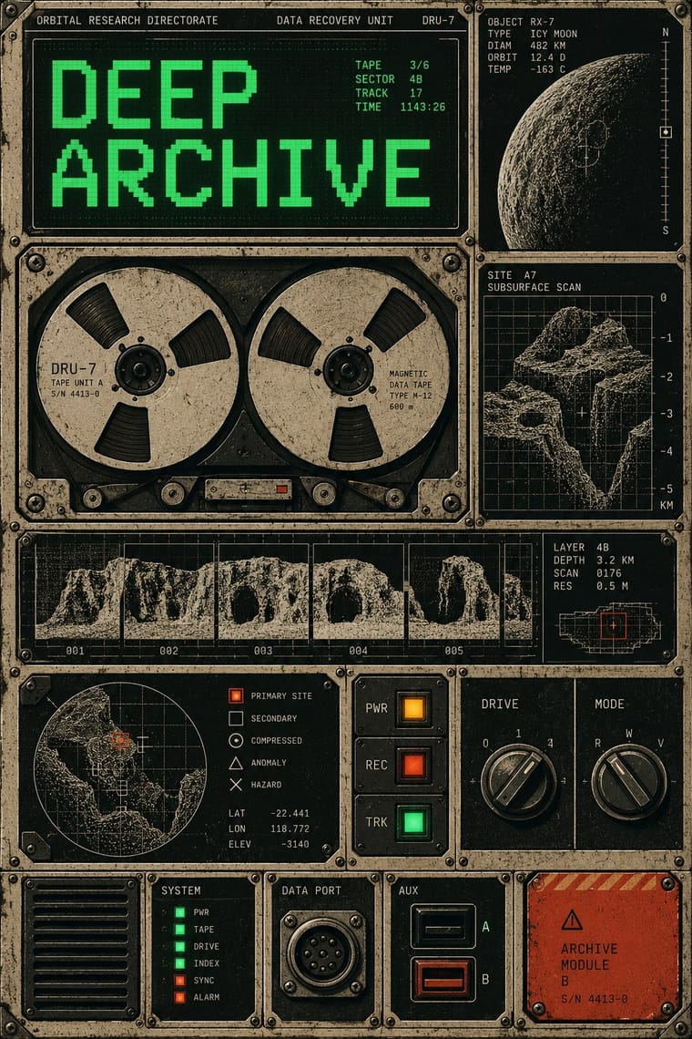
A retro-futurist look that treats the future as tactile, used machinery: amber or green phosphor text (one phosphor per screen) on dark CRT screens, chunky buttons, dials and switch panels, cryptic abbreviated labels and standardised industrial symbols. Named after the fact, it revives the lo-fi, analogue computing imagery of late-1970s and 1980s science fiction films and games. It has no parent here: the glowing HUDs of fantasy-ui came later and are what it contrasts with.
Make something in this style Get advice in this style Mix it with another style
01
How it works
- Show the interface as physical hardware: bolted panels, rocker switches, dials and sockets, with cassette, tape-reel and floppy-disk motifs that make it tactile and analogue.
- Set screen text in a single phosphor colour on a near-black ground.
- Use terse capitalised monospace labels and codes instead of friendly wording.
- Mark functions with a standardised system of blunt industrial symbols and colour-coded signs.
- Degrade every screen with scanlines, grain, curvature and flicker so it looks old and used.
- Limit yourself to what a prop maker or low-resolution display of the era could actually build.
A retrospective label for the clunky, hardware-bound vision of the future in late-1970s science fiction, with Alien (1979) as touchstone; the name is documented online only from 2018 (earliest citation in Wiktionary), and who coined it is not established. Alien: Isolation (2014) revived the look
02
Its design choices
From Stylogeny’s vocabulary of design choices: defining choices make the style, characteristic ones are usual, occasional ones turn up now and then.
- Layout & composition
- Space & hierarchy
- Typography
- Colour
- Surface & texture
- Imagery
- Medium & production
- Tone & intent
- Avoids
- Pastel, Gradients, Fluorescent & neon, Rounded & pill, Gloss & highlights, Frosted glass, Floral & vegetal, Script, Warm & approachable, Luxurious & glamorous
Palette
-
#0b0f0c -
#33ff66 -
#ffb000 -
#b8b09a -
#c8422b
Typefaces
-
OCR-A
period-typical
-
Eurostile
period-typical
-
Generic terminal monospace
-
Generic bitmap CRT terminal fonts
Known for
-
Alien (1979), Nostromo interiors and Ron Cobb's 'Semiotic Standard' signage
-
Alien
Isolation (2014, Creative Assembly), built under a rule to create nothing a 1979 prop crew could not have made
-
Blade Runner (1982), a retrofitted, decayed-and-gleaming future
concept artist Syd Mead, production designer Lawrence G. Paull
03
Make something in this style
Say what you need, and Stylogeny’s image studio draws it from Cassette Futurism’s design choices and checks it against them. It takes about a minute, and you get a link to share.
04
Where it comes from, and what it’s close to
Before it
The style it grew out of, and the styles it borrowed from.
Nothing earlier is recorded: in the atlas it is a starting point.
After it
The styles that grew out of it.
No later style in the atlas grew out of it yet.
Alike in its design choices
Styles that make many of the same choices, related or not, besides those above.

05
Often taken for
Cassette Futurism has no real works recorded yet, so these are its nearest styles by its choices alone, with the choices that tell them apart.
-
Fantasy User Interface (FUI) & Sci-Fi HUD
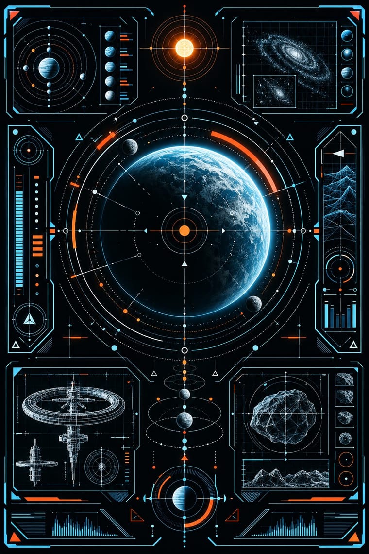
Fantasy User Interface & Sci-Fi HUD is one of Cassette Futurism’s nearest styles by choices; no real work of either fits the other better.
Choices that tell Cassette Futurism and Fantasy User Interface apart Choice Cassette Futurism Fantasy User Interface Grain & noise defining — Fluorescent & neon avoids characteristic Skeuomorphic material characteristic — Radial & concentric — defining Nostalgic & retro defining — No shared descent in the atlas: they reached these choices separately.
-
Bitmap & Pixel Graphics
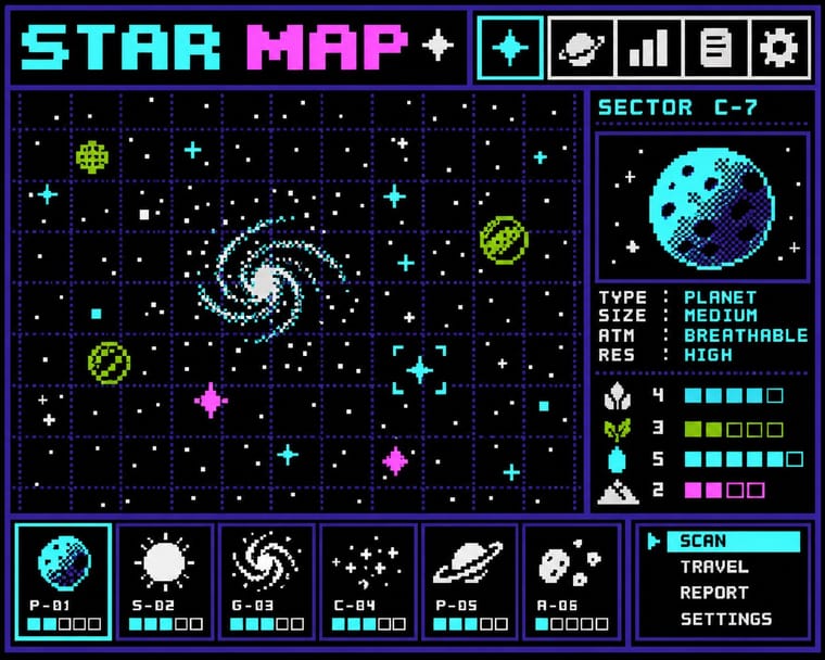
Bitmap & Pixel Graphics is one of Cassette Futurism’s nearest styles by choices; no real work of either fits the other better.
Choices that tell Cassette Futurism and Bitmap apart Choice Cassette Futurism Bitmap Skeuomorphic material characteristic avoids Pictogram occasional defining Diagram & data defining — Bitmap & pixel occasional defining All caps defining occasional No shared descent in the atlas: they reached these choices separately.
-
Analog Horror Graphics
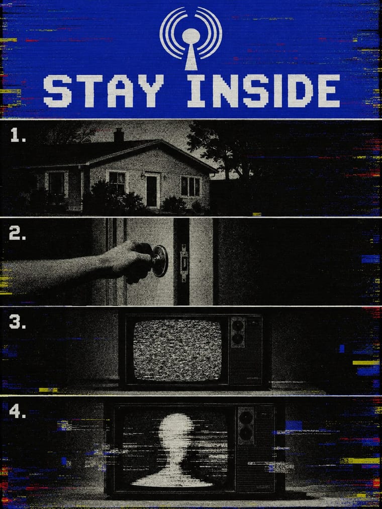
Analog Horror Graphics is one of Cassette Futurism’s nearest styles by choices; no real work of either fits the other better.
Choices that tell Cassette Futurism and Analog Horror Graphics apart Choice Cassette Futurism Analog Horror Graphics Horror vacui characteristic avoids Sequential narrative — defining Rectilinear defining occasional Flat fields occasional defining Diagram & data defining occasional No shared descent in the atlas: they reached these choices separately.
-
HfG Ulm Systematic Design
HfG Ulm Systematic Design is one of Cassette Futurism’s nearest styles by choices; no real work of either fits the other better.
Choices that tell Cassette Futurism and HfG Ulm Systematic Design apart Choice Cassette Futurism HfG Ulm Systematic Design Dark ground defining — Flat — defining Framed panels defining — Flush left, ragged right — defining Grain & noise defining — No shared descent in the atlas: they reached these choices separately.
— means the choice isn’t among the style’s recorded choices. Critics recorded each work’s choices with the styles’ descriptions in view, so this shows whether the descriptions hold together, not proof that they are right.
06
Combine it with
Styles Cassette Futurism pairs well with or plays against, from the research. Each is worked out as a combination: which style gives the type, the colours and the forms.
- Fantasy User Interface (FUI) & Sci-Fi HUD Contrasts · Its clean, glowing, layered HUDs came later; cassette futurism answers with worn hardware and one phosphor colour.
- Synthwave / Outrun Contrasts · Neon grids and chrome sunsets show a glamorous 1980s; cassette futurism shows its workaday machinery.
- Claymorphism & Soft 3D Contrasts · Soft, glossy, friendly 3D is the opposite of blunt, scuffed hardware.
07
Sources
- Wikipedia, Alien (film): production design, Ron Cobb's Semiotic Standard, retrofitted-technology sets
- Wikipedia, Alien: Isolation: 2014 release, 1970s lo-fi art direction, CRT and VHS treatment of screens
- Wikipedia, Blade Runner: 1982 release, Syd Mead concept art, Lawrence G. Paull production design, retrofitted future
- Wiktionary, Cassette Futurism: definition and earliest citation (John Hannimation blog, 14 Oct 2018)
- Design by Curio, What is Cassette Futurism? (designbycurio.com/learn/cassette-futurism-1979): Cobb's used future, DEC VT100 phosphor screens; does not say who coined the term
How Stylogeny researches and checks a style: where the facts come from.