Digital native · 2015–present · Global / networked, Northern Europe
Spotify Duotone Identity
Also known as Streaming duotone, Duotone brand photography, Collins Spotify rebrand look
A corporate music-streaming identity from the 2015 Collins rebrand in which photographs are recoloured into two-colour images in saturated, clashing palettes, cropped at angles and set in geometric sans. Its duotone is an homage to 1960s band posters, applied by a fixed recolour filter (the Colorizer tool) to photographs rather than by a data-driven rule system, which separates it from generative identity. Palette note: green, black and white date from the 2015 identity; the other hues are from Spotify's later brand guidelines.
Make something in this style Get advice in this style Mix it with another style
01
How it works
- Recolour every photograph into two vivid, contrasting hues instead of showing natural colour.
- Crop images at bold, tilted angles and let them run to the edge.
- Set short names in a friendly geometric sans at large scale over the image.
- Automate the duotone recolouring with a software tool (Collins's Colorizer) so photographs can be styled consistently.
- Pair a saturated duotone field with flat colour blocks and a small set of simple shapes.
Spotify (Stockholm) and the agency Collins, 2015 rebrand
02
Its design choices
From Stylogeny’s vocabulary of design choices: defining choices make the style, characteristic ones are usual, occasional ones turn up now and then.
- Layout & composition
- Space & hierarchy
- Colour
- Form & shape
- Surface & texture
- Ornament
- Medium & production
- Avoids
- Abundant decoration, Floral & vegetal, Ornamented display, Script, Skeuomorphic material, Naturalistic depiction, Pastel, Horror vacui
Palette
-
#1ed760 -
#191414 -
#ff4632 -
#450af5 -
#f573a0 -
#ffffff
Typefaces
-
Circular
Laurenz Brunner, Lineto
-
Geometric sans-serifs
Known for
-
Spotify rebrand by Collins
2015
-
Spotify playlist cover art, duotone treatment
-
Circular typeface (LL Circular, Laurenz Brunner / Lineto), adopted on the 2015 Spotify site
03
Make something in this style
Say what you need, and Stylogeny’s image studio draws it from Spotify Duotone Identity’s design choices and checks it against them. It takes about a minute, and you get a link to share.
04
Where it comes from, and what it’s close to
Before it
The style it grew out of, and the styles it borrowed from.
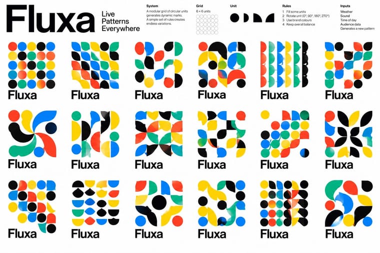

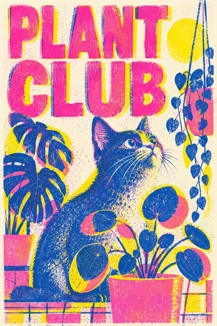
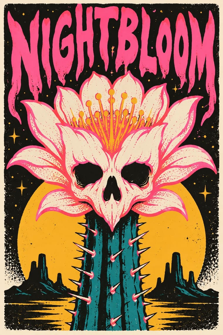
After it
The styles that grew out of it.
No later style in the atlas grew out of it yet.
Alike in its design choices
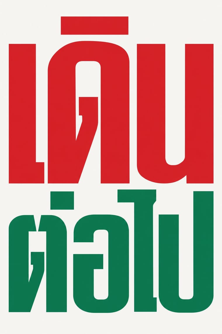
Styles that make many of the same choices, related or not, besides those above.
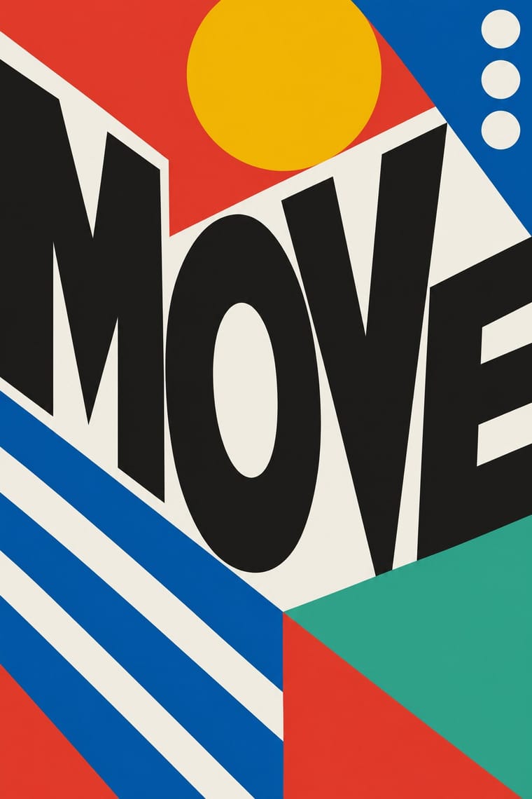
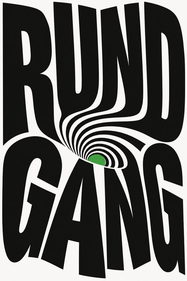
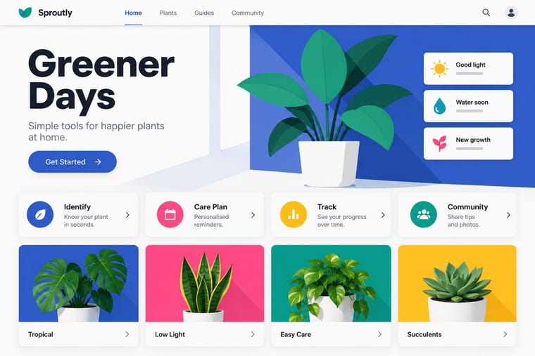
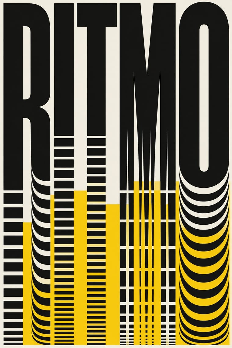
05
Often taken for
Spotify Duotone Identity has no real works recorded yet, so these are its nearest styles by its choices alone, with the choices that tell them apart.
-
Roman-like Thai Typography (modern loopless Thai)
Roman-like Thai Typography is one of Spotify Duotone Identity’s nearest styles by choices; no real work of either fits the other better.
Choices that tell Spotify Duotone Identity and Roman-like Thai Typography apart Choice Spotify Duotone Identity Roman-like Thai Typography Complementary clash defining — Grotesque & neo-grotesque — defining Treated photography defining — Light ground — characteristic Full bleed defining occasional Both descend from Corporate Identity Modernism in the family tree.
-
Supergraphics
Supergraphics is one of Spotify Duotone Identity’s nearest styles by choices; no real work of either fits the other better.
Choices that tell Spotify Duotone Identity and Supergraphics apart Choice Spotify Duotone Identity Supergraphics Treated photography defining — Rules & bars — defining Complementary clash defining occasional Full polychrome — characteristic Limited spot colours characteristic — Both descend from International Typographic Style in the family tree.
-
Lucerne Poster Scene (Neubad & Südpol Posters)
Lucerne Poster Scene is one of Spotify Duotone Identity’s nearest styles by choices; no real work of either fits the other better.
Choices that tell Spotify Duotone Identity and Lucerne Poster Scene apart Choice Spotify Duotone Identity Lucerne Poster Scene Complementary clash defining — Illusion of depth — defining Geometric sans defining — Experimental & distorted — defining Treated photography defining occasional Both descend from International Typographic Style in the family tree.
-
Material Design
Material Design is one of Spotify Duotone Identity’s nearest styles by choices; no real work of either fits the other better.
Choices that tell Spotify Duotone Identity and Material Design apart Choice Spotify Duotone Identity Material Design Complementary clash defining — Icons & pictograms — defining Treated photography defining — Modular grid — defining Full bleed defining occasional Both descend from International Typographic Style in the family tree.
— means the choice isn’t among the style’s recorded choices. Critics recorded each work’s choices with the styles’ descriptions in view, so this shows whether the descriptions hold together, not proof that they are right.
06
Combine it with
Styles Spotify Duotone Identity pairs well with or plays against, from the research. Each is worked out as a combination: which style gives the type, the colours and the forms.
- Risograph & Indie Print Culture Pairs well · Borrow riso's overprinted two-ink grain to give the clean digital duotone a tactile, handmade edge.
- DTC 'Blanding' / Millennial Minimalism Contrasts · Pastel, quiet and symmetric against saturated, clashing and angled; a pointed tonal opposite.
- Screenprinted Gig & Alt-Movie Poster Pairs well · Add hand-lettered, flat-ink poster drawing to recall the gig-flier roots of the look.
07
Sources
- Logo Designer, Music Provider Spotify Unveils New Look (2015), logo-designer.co/spotify-unveils-new-branding-by-collins-new-york/
- Communication Arts, Spotify redesign, commarts.com/exhibit/spotify-redesign
- Brand New Magazine, How Spotify's brand became a future-forward phenomenon, brandknewmag.com/how-spotifys-brand-became-a-future-forward-phenomenon/
- Fonts In Use, Spotify website (2015), fontsinuse.com/uses/9175/spotify-website-2015
How Stylogeny researches and checks a style: where the facts come from.