Postmodern · 1966–2026 · North America
Supergraphics
Also known as Supergraphic, Environmental supergraphics, Sea Ranch supergraphics
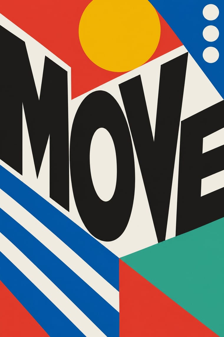
Oversized stripes, numerals, letters and abstract shapes painted directly onto walls, floors and ceilings, wrapping across architectural planes so that a room reads larger, deeper or differently shaped. It took Swiss-trained flat colour and sans-serif type off the page and made the graphic the surface of the building. It later became a standard tool of environmental graphic design for wayfinding and branding.
Make something in this style Get advice in this style Mix it with another style
01
How it works
- Paint the graphic at architectural scale directly on the wall, floor or ceiling, not on a panel hung there.
- Wrap the shape across corners, doors and planes so it redefines the room's apparent size and depth.
- Use flat, saturated colour fields and bold stripes with no shading; any sense of depth comes from wrapping the geometry across planes, not from modelling.
- Set letters, numerals and arrows in a plain sans-serif large enough to be read as architecture.
- Let the graphic ignore the architecture's joints where that makes the space feel different, and use it to guide movement through the building.
California and New York in the mid-1960s; Barbara Stauffacher Solomon's painted interiors at The Sea Ranch, California, brought the method to a wide American audience
02
Its design choices
From Stylogeny’s vocabulary of design choices: defining choices make the style, characteristic ones are usual, occasional ones turn up now and then.
- Layout & composition
- Space & hierarchy
- Typography
- Colour
- Form & shape
- Surface & texture
- Ornament
- Medium & production
- Avoids
- Floral & vegetal, Abundant decoration, Skeuomorphic material, Grain & noise, Script, Blackletter, Classical text block, Naturalistic depiction
Palette
-
#e63b2e -
#f6b800 -
#0b5cad -
#f2efe6 -
#1d1d1b -
#2fa58b
Typefaces
-
Helvetica
typical, not documented
-
Univers
typical, not documented
-
Futura
typical, not documented
Known for
-
Barbara Stauffacher Solomon, painted interiors at The Sea Ranch, California (mid-1960s), including the Moonraker Athletic Center bathhouse graphics with architect Charles Moore (published in Progressive Architecture, March 1967)
-
Barbara Stauffacher Solomon, week-long supergraphics studio for the Yale Art and Architecture building elevators (1968), to which Charles Moore invited her
-
C. Ray Smith, who named the work in 1967 in his writing on Supermannerism
-
Deborah Sussman (Sussman Prejza), environmental graphics in the same large-scale tradition, including the 1984 Los Angeles Olympics look
-
Lance Wyman, Mexico 68 environmental graphics and wayfinding
see mexico-68
-
Morag Myerscough, contemporary large-scale painted and applied interiors (UK), part of the 2000s resurgence
03
Make something in this style
Say what you need, and Stylogeny’s image studio draws it from Supergraphics’s design choices and checks it against them. It takes about a minute, and you get a link to share.
04
Where it comes from, and what it’s close to
Before it
The style it grew out of, and the styles it borrowed from.


After it
The styles that grew out of it.
No later style in the atlas grew out of it yet.
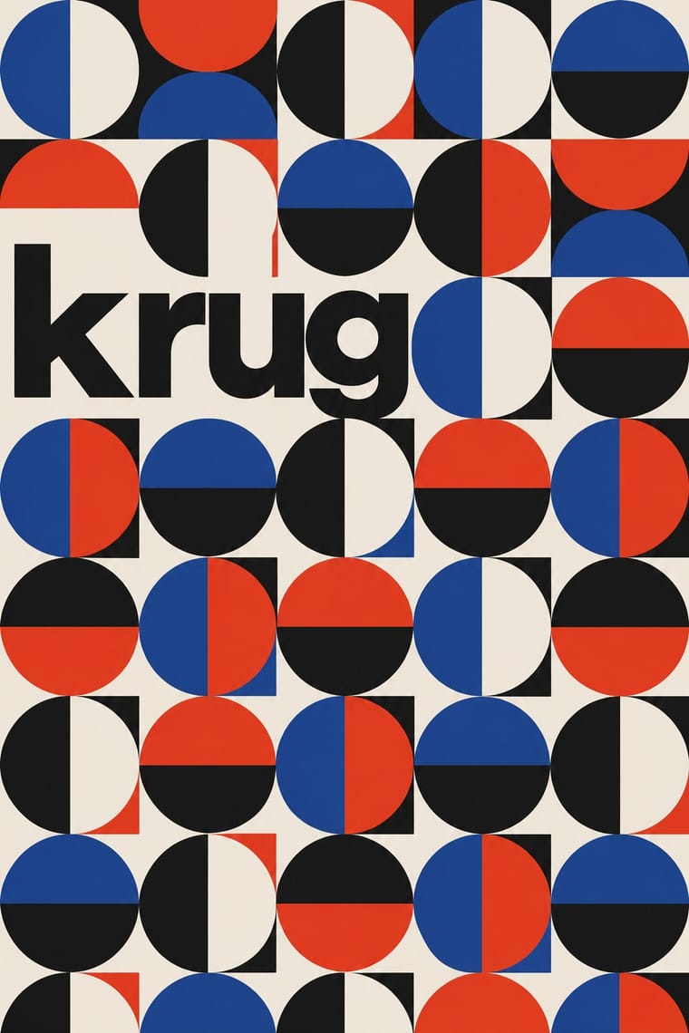
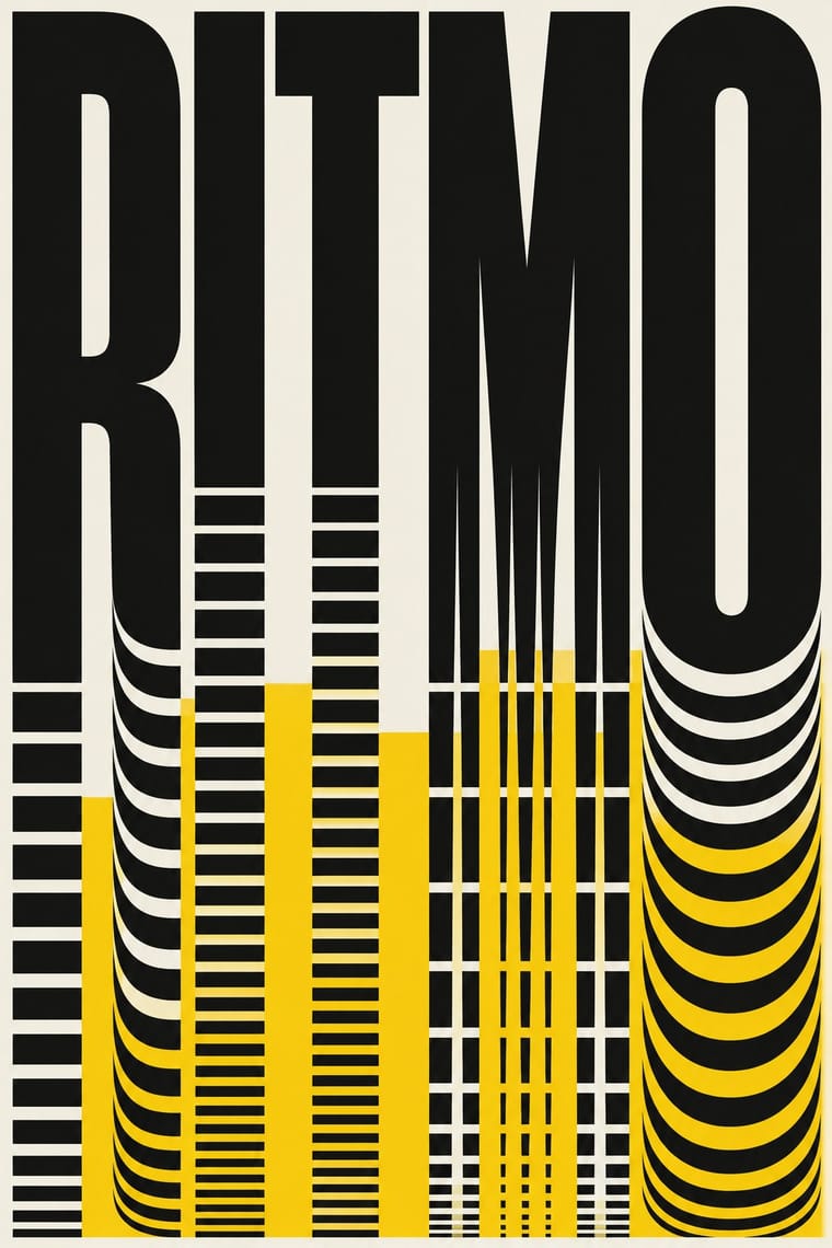
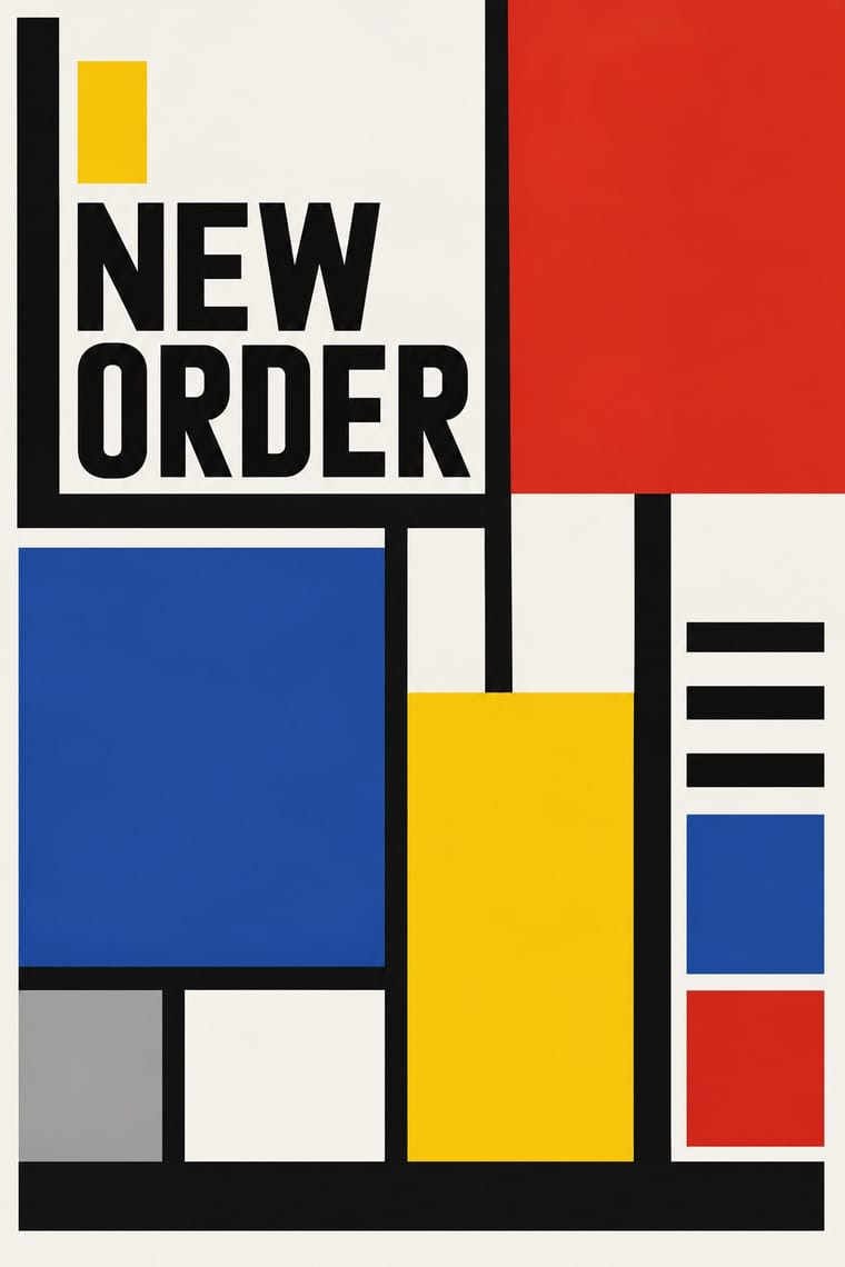
Alike in its design choices
Styles that make many of the same choices, related or not, besides those above.
05
Often taken for
Supergraphics has no real works recorded yet, so these are its nearest styles by its choices alone, with the choices that tell them apart.
-
Bauhaus
Bauhaus is one of Supergraphics’s nearest styles by choices; no real work of either fits the other better.
Choices that tell Supergraphics and Bauhaus apart Choice Supergraphics Bauhaus Full bleed defining — Primary triad occasional defining Type as image defining — Light ground — characteristic Full polychrome characteristic — Supergraphics descends from Bauhaus: a shared line, so the likeness is inherited.
-
Zagreb Modernist Graphics (EXAT 51 to Teatar &TD)
Zagreb Modernist Graphics is one of Supergraphics’s nearest styles by choices; no real work of either fits the other better.
Choices that tell Supergraphics and Zagreb Modernist Graphics apart Choice Supergraphics Zagreb Modernist Graphics Rules & bars defining — Limited spot colours — defining Full polychrome characteristic — Modular grid — defining Diagonal axis characteristic — Both descend from Russian Constructivism in the family tree.
-
Di Tella Graphic Design (Instituto Torcuato Di Tella)
Di Tella Graphic Design is one of Supergraphics’s nearest styles by choices; no real work of either fits the other better.
Choices that tell Supergraphics and Di Tella Graphic Design apart Choice Supergraphics Di Tella Graphic Design Full polychrome characteristic avoids Limited spot colours — defining Rules & bars defining occasional Optical pattern — defining Geometric sans characteristic — Both descend from International Typographic Style in the family tree.
-
Spotify Duotone Identity
Spotify Duotone Identity is one of Supergraphics’s nearest styles by choices; no real work of either fits the other better.
Choices that tell Supergraphics and Spotify Duotone Identity apart Choice Supergraphics Spotify Duotone Identity Rules & bars defining — Treated photography — defining Full polychrome characteristic — Complementary clash occasional defining Non-representational characteristic — Both descend from International Typographic Style in the family tree.
— means the choice isn’t among the style’s recorded choices. Critics recorded each work’s choices with the styles’ descriptions in view, so this shows whether the descriptions hold together, not proof that they are right.
06
Combine it with
Styles Supergraphics pairs well with or plays against, from the research. Each is worked out as a combination: which style gives the type, the colours and the forms.
- Ma & Wabi-sabi Aesthetics Contrasts · Quiet, unfinished interiors against loud, total colour make a deliberate counterweight in a mixed scheme.
- Memphis Design Pairs well · Its clashing colour and pattern can energise a painted wall, though it adds ornament that supergraphics usually leaves out. Memphis dates from 1981, so it is a later pairing, not an influence.
- Corporate Identity Modernism Pairs well · Use its disciplined identity colours and sans type to make an architectural graphic read as a brand.
07
Sources
- Wikipedia, Supergraphics (https://en.wikipedia.org/wiki/Supergraphics)
- Wikipedia, Barbara Stauffacher Solomon (https://en.wikipedia.org/wiki/Barbara_Stauffacher_Solomon)
- Wikipedia, Deborah Sussman (https://en.wikipedia.org/wiki/Deborah_Sussman)
- Wikipedia, Lance Wyman (https://en.wikipedia.org/wiki/Lance_Wyman)
How Stylogeny researches and checks a style: where the facts come from.