Rational modernism · 1980–present · East Asia, Global / networked
Muji No-Brand Design (Mujirushi Ryohin)
Also known as Muji packaging, Mujirushi Ryohin, No-brand minimalism
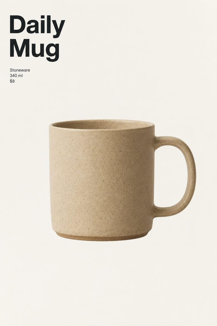
A house style that sells goods by withholding branding: clear cellophane and plain brown paper, plain labels stating the item and its price, and products centred in wide margins. Begun in Tokyo in 1980 under Ikko Tanaka, it makes calm a design method rather than a mood; Kenya Hara, art director since 2001, later articulated this through his idea of emptiness in his writing.
Make something in this style Get advice in this style Mix it with another style
01
How it works
- Strip the pack to the object, one plain label and a plain wrapper; let the product be the only picture.
- State only the name, function and price in small, quiet type, and drop slogans and logo statements.
- Centre the object in generous margins and treat the empty space as the message.
- Limit colour to the natural tones of paper, cellophane and material, with one small red or black text accent.
- Give every item the same neutral layout so that no product or label shouts over another.
Tokyo, where Muji began in December 1980 as a line of about 40 products from the supermarket chain Seiyu; Ikko Tanaka was first art director, developing the concept with Kazuko Koike and Takashi Sugimoto, and Kenya Hara has been art director since 2001 (some sources give 2002)
02
Its design choices
From Stylogeny’s vocabulary of design choices: defining choices make the style, characteristic ones are usual, occasional ones turn up now and then.
- Layout & composition
- Space & hierarchy
- Typography
- Colour
- Form & shape
- Surface & texture
- Ornament
- Medium & production
- Tone & intent
- Avoids
- Abundant decoration, Emblems & badges, Horror vacui, Ornamented display, Script, Fluorescent & neon, Pastel, Gloss & highlights, Playful & witty, Luxurious & glamorous, Agitational & persuasive, Gradients, Type as image
Palette
-
#f4f1ea -
#c9a97c -
#8a6a47 -
#d7261e -
#222222 -
#e6e4df
Typefaces
-
Japanese gothic (kaku gothic) sans-serif, the plain Japanese text tradition for labels and signage
-
Neutral neo-grotesque Latin sans-serif for English-language labels and signage, in the Helvetica tradition
Known for
-
Muji's first range of about 40 products (December 1980), wrapped in clear cellophane with plain brown paper labels and red writing under the slogan 'Lower priced for a reason'
-
The first directly operated Muji store in Aoyama, Tokyo
1983
-
Kenya Hara's 'Horizon' poster for Muji
2003
-
Muji's paper products such as notebooks, within its stationery line
03
Make something in this style
Say what you need, and Stylogeny’s image studio draws it from Muji No-Brand Design (Mujirushi Ryohin)’s design choices and checks it against them. It takes about a minute, and you get a link to share.
04
Where it comes from, and what it’s close to
Before it
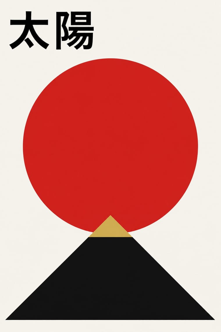
The style it grew out of, and the styles it borrowed from.
After it
The styles that grew out of it.
No later style in the atlas grew out of it yet.
Alike in its design choices
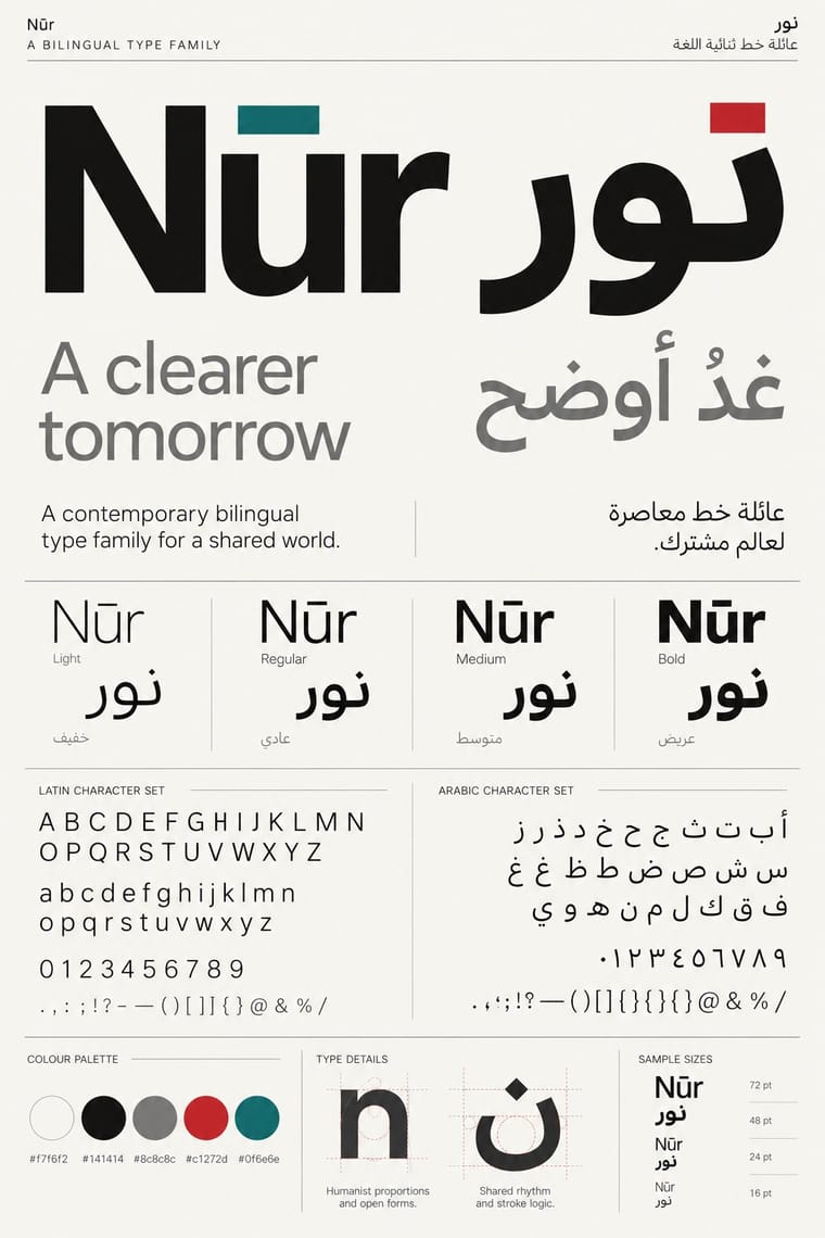
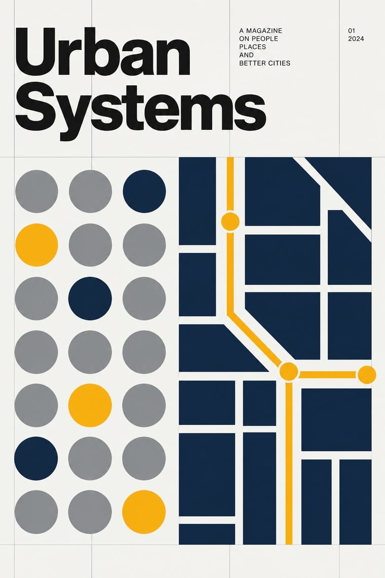
Styles that make many of the same choices, related or not, besides those above.

05
Often taken for
Muji No-Brand Design has no real works recorded yet, so these are its nearest styles by its choices alone, with the choices that tell them apart.
-
Total Design & Dutch Functionalism
1 of Total Design & Dutch Functionalism’s 5 real works fits Muji No-Brand Design’s choices slightly better than its own: Klankteksten.
Choices that tell Muji No-Brand Design and Total Design apart Choice Muji No-Brand Design Total Design Isolated object defining — Type as image avoids characteristic Single focal point defining — Modular grid — defining Earth & mineral characteristic — Both descend from Die Neue Typographie in the family tree.
-
Minimalist Graphic Design
1 of Minimalist Graphic Design’s 4 real works fits Muji No-Brand Design’s choices slightly better than its own: Carl Andre – Galerie Heiner Friedrich München.
Choices that tell Muji No-Brand Design and Minimalist Graphic Design apart Choice Muji No-Brand Design Minimalist Graphic Design Limited spot colours defining — Pastel avoids occasional Earth & mineral characteristic — Monochrome occasional defining Flat hierarchy characteristic — Both descend from Die Neue Typographie in the family tree.
-
Corporate Identity Modernism
1 of Corporate Identity Modernism’s 4 real works fits Muji No-Brand Design’s choices slightly better than its own: NASA Graphics Standards Manual, page 1.3: The NASA Color.
Choices that tell Muji No-Brand Design and Corporate Identity Modernism apart Choice Muji No-Brand Design Corporate Identity Modernism Earth & mineral characteristic — Emblems & badges avoids characteristic Flat hierarchy characteristic — Geometric primitives — defining Paper & letterpress bite characteristic — Both descend from Die Neue Typographie in the family tree.
-
Contemporary Arabic & Dual-Script Type Design
Contemporary Arabic & Dual-Script Type Design is one of Muji No-Brand Design’s nearest styles by choices; no real work of either fits the other better.
Choices that tell Muji No-Brand Design and Contemporary Arabic apart Choice Muji No-Brand Design Contemporary Arabic Single focal point defining — Measured density — defining Isolated object defining occasional Humanist sans occasional defining Earth & mineral characteristic — Both descend from Die Neue Typographie in the family tree.
— means the choice isn’t among the style’s recorded choices. Critics recorded each work’s choices with the styles’ descriptions in view, so this shows whether the descriptions hold together, not proof that they are right.
06
Combine it with
Styles Muji No-Brand Design (Mujirushi Ryohin) pairs well with or plays against, from the research. Each is worked out as a combination: which style gives the type, the colours and the forms.
- DTC 'Blanding' / Millennial Minimalism Contrasts · Shares the plain sans and isolated product but replaces its friendly pastel persona and funded brand voice with anonymity.
- International Typographic Style Contrasts · Where the Swiss style builds hierarchy on a grid and scale, this one flattens it and lets the object sit alone.
- Ma & Wabi-sabi Aesthetics Pairs well · Add ma, the charged interval, so the empty space reads as intention instead of a missing design.
- Japanese Postwar Modernism Pairs well · Take its single focal point and flat colour, then remove the emblem and the poster drama for a quieter consumer object.
- Plain Tobacco Packaging Contrasts · Both strip branding, but one is a regulatory sanction in drab brown and the other a voluntary, serene choice.
- minä perhonen (Hand-Drawn Textile Graphics, Akira Minagawa) Pairs well · Plain everyday goods give the quiet ground that lets small hand-drawn pattern read.
07
Sources
- https://en.wikipedia.org/wiki/Muji
- https://en.wikipedia.org/wiki/Kenya_Hara
- https://www.lars-mueller-publishers.com/designing-design
How Stylogeny researches and checks a style: where the facts come from.