Style combination · Contrasts
Muji No-Brand Design × International Typographic Style
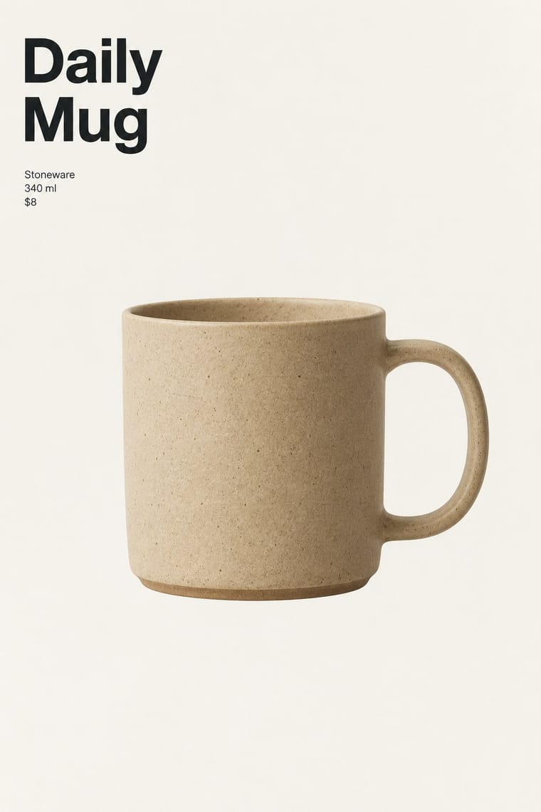
Where the Swiss style builds hierarchy on a grid and scale, this one flattens it and lets the object sit alone.
Mix them and make something Muji No-Brand Design International Typographic Style
01
What each style brings
Each part of the design comes from the style with the stronger say in it, and each style gives at least two.
Muji No-Brand Design (Mujirushi Ryohin) International Typographic Style
- Type from International Typographic Style
-
Muji No-Brand Design avoids type as image: this is where the two pull against each other, which is the point of the contrast.
- Colour from International Typographic Style
- Form from International Typographic Style
- Composition from Muji No-Brand Design
- Surface from Muji No-Brand Design
02
The type
Open fonts standing in for each style’s own type, which is often hand-drawn or commercial.
Text · Muji No-Brand Design
A house style that sells goods by withholding branding: clear cellophane and plain brown paper, plain labels stating the item and its price, and products centred in wide margins. Begun in Tokyo in 1980 under Ikko Tanaka, it makes calm a design method rather than a mood; Kenya Hara, art director since 2001, later articulated this through his idea of emptiness in his writing.
Zen Kaku Gothic New; Muji No-Brand Design used Japanese gothic (kaku gothic) sans-serif, the plain Japanese text tradition for labels and signage and Neutral neo-grotesque Latin sans-serif for English-language labels and signage, in the Helvetica tradition
03
The colours
The ground and leading colours come from International Typographic Style, with a counter-accent from Muji No-Brand Design. The ink reads on the ground at 4.5:1 or more.
Muji No-Brand Design (Mujirushi Ryohin) International Typographic Style
-
#f2f0e9ground · 36% -
#111111ink · 14% -
#e1251baccent · 18% -
#1f4e9caccent · 14% -
#c9a97caccent · 10% -
#7a7a7aaccent · 8%
As CSS
:root {
  --ground: #f2f0e9;
  --ink: #111111;
  --accent-1: #e1251b;
  --accent-2: #1f4e9c;
  --accent-3: #c9a97c;
  --accent-4: #7a7a7a;
  --font-display: "Inter Tight", sans-serif;
  --font-text: "Zen Kaku Gothic New", sans-serif;
}
04
The two styles

05
More combinations
With Muji No-Brand Design
- DTC 'Blanding' / Millennial Minimalism Contrasts · Shares the plain sans and isolated product but replaces its friendly pastel persona and funded brand voice with anonymity.
- Ma & Wabi-sabi Aesthetics Pairs well · Add ma, the charged interval, so the empty space reads as intention instead of a missing design.
- Japanese Postwar Modernism Pairs well · Take its single focal point and flat colour, then remove the emblem and the poster drama for a quieter consumer object.
- Plain Tobacco Packaging Contrasts · Both strip branding, but one is a regulatory sanction in drab brown and the other a voluntary, serene choice.
- minä perhonen (Hand-Drawn Textile Graphics, Akira Minagawa) Pairs well · Plain everyday goods give the quiet ground that lets small hand-drawn pattern read.
With International Typographic Style
- Art Nouveau Contrasts · Ornamental curves against an orthogonal grid make a strong deliberate tension.
- Brutalist Web Design Pairs well · Strip the grid to raw HTML defaults to get a rawer, contemporary take on Swiss honesty.
- Psychedelic Poster Contrasts · Its exact opposite on legibility; borrow one swirling element to break a too-cold Swiss layout.
- Japanese Postwar Modernism Pairs well · Add Japanese restraint and emblematic colour fields to the grid for warmth without losing order.
- American Traditional Tattoo Flash Contrasts · Rational grid and sans-serif against sentimental, hand-lettered emblems: one flash motif on a Swiss layout makes a sharp contrast.
- Graffiti & Hip-Hop Graphics Contrasts · Put a single tag or throw-up over a strict Swiss grid to stage the clash between institutional order and a street voice.
- Pop Art Graphics Contrasts · Set one loud appropriated Pop image inside a strict grid with a neutral grotesque so the irony reads as deliberate rather than chaotic.
- Italian Painted Film Poster (Rome Studios) Contrasts · Grid, restraint and photographic objectivity are the opposite of a crowded painted montage.