Style combination · Pairs well
minä perhonen × Muji No-Brand Design
Plain everyday goods give the quiet ground that lets small hand-drawn pattern read.
Mix them and make something minä perhonen Muji No-Brand Design
01
What each style brings
Each part of the design comes from the style with the stronger say in it, and each style gives at least two.
minä perhonen (Hand-Drawn Textile Graphics, Akira Minagawa) Muji No-Brand Design (Mujirushi Ryohin)
- Type from Muji No-Brand Design
- Colour from minä perhonen
- Form from minä perhonen
- Composition from minä perhonen
- Surface from Muji No-Brand Design
02
The type
Open fonts standing in for each style’s own type, which is often hand-drawn or commercial.
Display · Muji No-Brand Design
Calm
Zen Kaku Gothic New, standing in for Japanese gothic (kaku gothic) sans-serif, the plain Japanese text tradition for labels and signage
Text · minä perhonen
A Tokyo label's textile graphics in which small hand-drawn birds, butterflies, forests and rings are repeated in loose, quiet rows, often embroidered so the stitching stays visible. It takes up the Nordic everyday ideal of Finnish bold print but reverses its scale: small embroidered hand marks, delicate and densely repeated, against one huge flat screen-printed motif in strong colour. The lineage from Finnish bold print is loose; the craft is Japanese and hand-made.
Zen Maru Gothic; minä perhonen used Lowercase sans-serif wordmark and No signature typeface; the pattern, not the type, carries the style
03
The colours
The ground and leading colours come from minä perhonen, with a counter-accent from Muji No-Brand Design. The ink reads on the ground at 4.5:1 or more.
minä perhonen (Hand-Drawn Textile Graphics, Akira Minagawa) Muji No-Brand Design (Mujirushi Ryohin)
-
#f1ece2ground · 36% -
#3f4a5aink · 14% -
#c98f86accent · 18% -
#d7261eaccent · 14% -
#d9cfc0accent · 10% -
#9aa7a0accent · 8%
As CSS
:root {
  --ground: #f1ece2;
  --ink: #3f4a5a;
  --accent-1: #c98f86;
  --accent-2: #d7261e;
  --accent-3: #d9cfc0;
  --accent-4: #9aa7a0;
  --font-display: "Zen Kaku Gothic New", sans-serif;
  --font-text: "Zen Maru Gothic", sans-serif;
}
04
The two styles
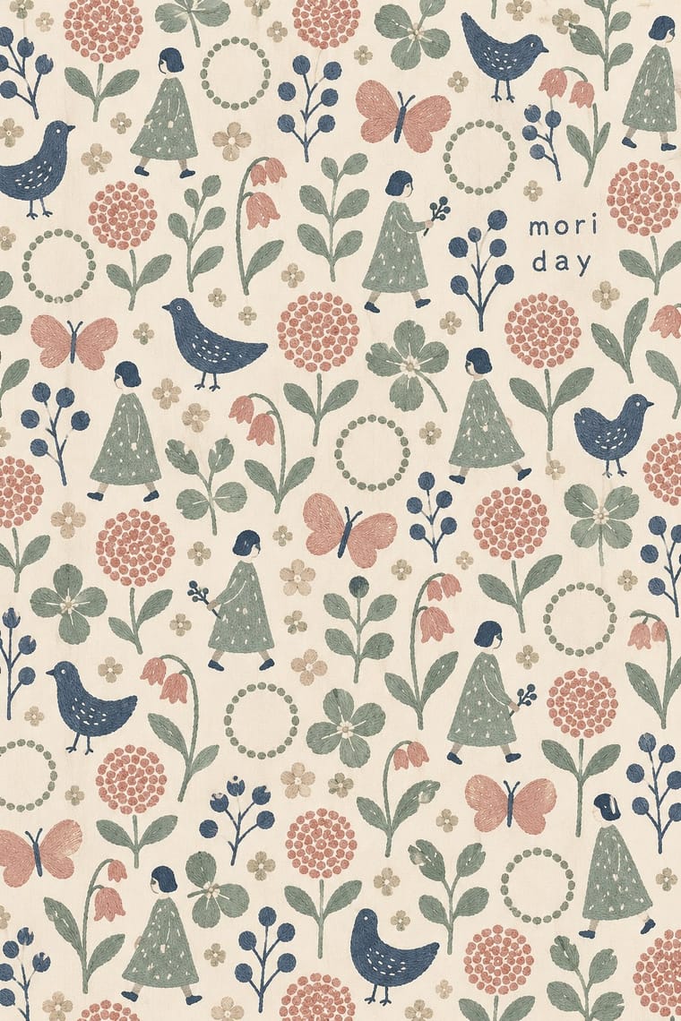
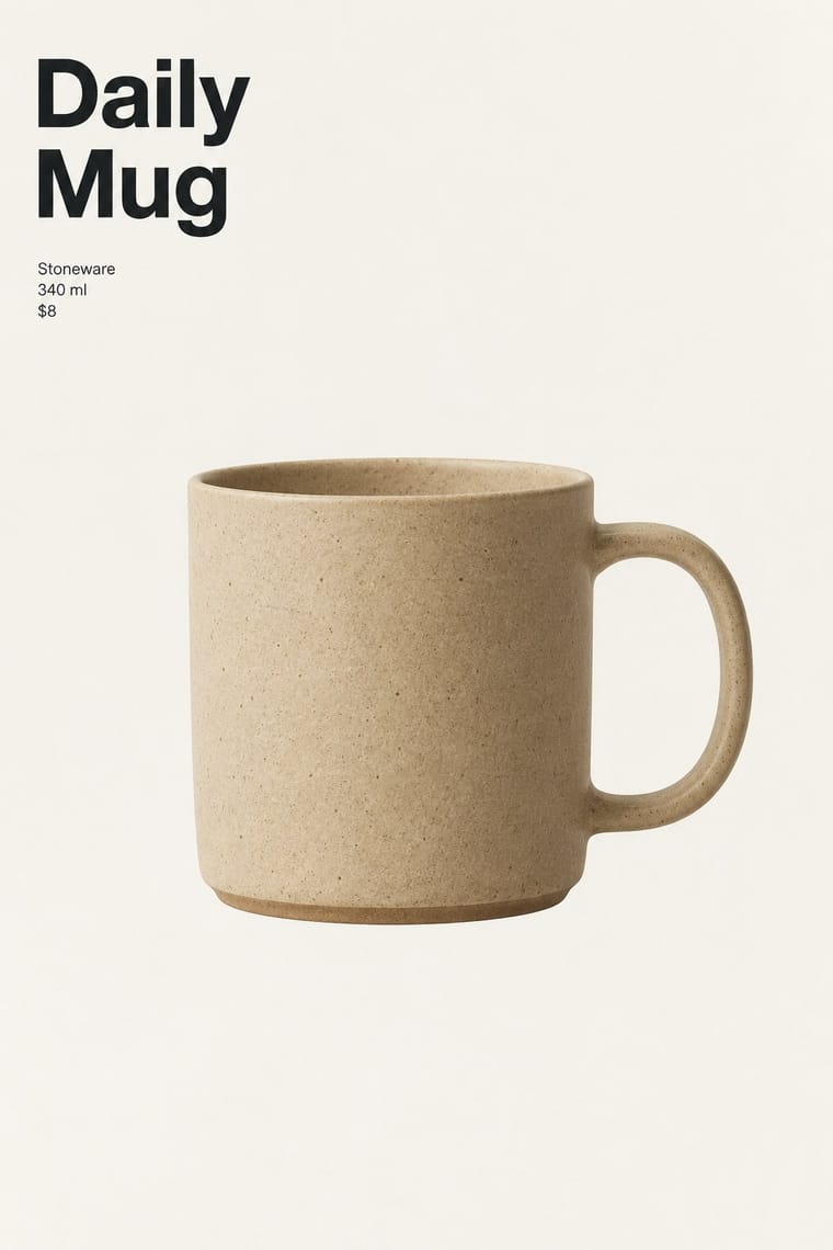
05
More combinations
With minä perhonen
- Japanese Postwar Modernism Pairs well · Both come from Japan and favour restrained, craft-minded everyday design, though the soft wobbling hand is minä perhonen's own.
- Scandinavian Functionalism Pairs well · Calm upholstery and interiors carry embroidered pattern without noise.
- DTC 'Blanding' / Millennial Minimalism Contrasts · Generic anonymous softness against a distinct, personally drawn and densely repeated mark.
With Muji No-Brand Design
- DTC 'Blanding' / Millennial Minimalism Contrasts · Shares the plain sans and isolated product but replaces its friendly pastel persona and funded brand voice with anonymity.
- International Typographic Style Contrasts · Where the Swiss style builds hierarchy on a grid and scale, this one flattens it and lets the object sit alone.
- Ma & Wabi-sabi Aesthetics Pairs well · Add ma, the charged interval, so the empty space reads as intention instead of a missing design.
- Japanese Postwar Modernism Pairs well · Take its single focal point and flat colour, then remove the emblem and the poster drama for a quieter consumer object.
- Plain Tobacco Packaging Contrasts · Both strip branding, but one is a regulatory sanction in drab brown and the other a voluntary, serene choice.