Traditions & vernacular · c. 1250–1550 · Western Europe
Gothic Book of Hours (Illuminated Devotional Book)
Also known as Illuminated Gothic book of hours, Livre d'heures, Horae, Illuminated horae
A devotional page system for private Christian prayer: compact Gothic writing, graded painted initials, framed miniatures and ornamented margins organise a reader's progress through the hours. Developed from medieval prayer-book practice, it ranges from delicate grisaille to jewel-coloured illumination. Unlike blackletter as a script tradition, its identity lies in the coordinated sequence of text, pictures, initials and borders, not broken letterforms alone.
Make something in this style Get advice in this style Mix it with another style
Use it with care
These are Christian devotional books, not a generic fantasy or occult aesthetic. Their prayers, images of Christ, the Virgin and saints, and commemorations of the dead belong to religious practices that remain meaningful to living communities. Explain an object's devotional function and local context; do not invent sacred text, detach a Passion scene for decorative shock, or imply that a newly made page is an authentic liturgical or medieval object. For historical study, use complete objects or pages openly published by their holding museums and libraries and retain their attribution and shelfmark; public availability is not an image licence, so check the rights of each exact file before display. For contemporary religious work, consult the commissioning community and credit the calligrapher or illuminator. Learn from page hierarchy and framing for secular work without copying prayers or sacred figures. This entry describes a selected Gothic manuscript tradition, not all Catholic prayer books or all medieval illumination; its approximate dates are not the invention and extinction dates of the book-of-hours genre.
01
How it works
- Rule a compact, usually single-column text block and write its prayers in a consistent Gothic book hand; preserve margins as a separate zone for decoration and commentary.
- Mark divisions with a graded system of coloured or gilded initials, rubricated text and line fillers rather than giving every line equal visual emphasis.
- Open major devotional sections with a miniature or historiated initial, and coordinate the picture, its frame and the adjoining text as one page or facing-page composition.
- Anchor marginal ornament to the text frame, growing fine foliage, flowers and occasional figures around it; vary the border's density without losing the distinction between the reading block and its margins.
- Use black or brown writing on pale parchment with red and blue accents; enrich luxury openings with gold and other colours, but allow grisaille and selective colouring rather than requiring full polychrome throughout.
- Organise the book as a navigable sequence of prayers and images for repeated devotion; distinguish the calendar, Hours of the Virgin and other sections rather than imposing one uniform treatment on every leaf.
Gothic manuscript workshops in France, England and the Low Countries; Paris was a major centre, followed by flourishing Dutch and Flemish production. This entry centres on the illuminated Gothic page and its continuation into the sixteenth century, not every regional or Renaissance form of the book-of-hours genre.
02
Its design choices
From Stylogeny’s vocabulary of design choices: defining choices make the style, characteristic ones are usual, occasional ones turn up now and then.
- Layout & composition
- Space & hierarchy
- Typography
- Form & shape
- Surface & texture
- Ornament
- Medium & production
- Tone & intent
- Avoids
- All caps, Flush left, ragged right, Wide letterspacing, Full bleed, Flat hierarchy, Ornament-free
Palette
-
#EFE3C9 -
#29211D -
#AF342D -
#284B92 -
#B99A49 -
#54744A
Typefaces
-
Gothic textualis / textura book hands
broad-pen, angular manuscript lettering, as visible on the Belles Heures and Entwistle openings; not modern Fraktur display fonts
-
Painted and gilded decorated initials, including historiated initials containing figures or scenes; a hierarchy of initial sizes articulates the devotional text
Known for
-
Book of Hours, England, ca. 1300; The Walters Art Museum, W.102
an early Gothic example with historiated initials and marginal imagery
-
Jean Pucelle, Hours of Jeanne d'Evreux, Paris, ca. 1324–28; The Metropolitan Museum of Art, 54.1.2
grisaille, tempera and ink on vellum, with narrative pictures, historiated initials and lively marginal figures
-
The Limbourg Brothers, Belles Heures of Jean de France, duc de Berry, probably Paris, 1405–1408/1409; The Metropolitan Museum of Art, 54.1.1
coordinated painted narratives, Gothic writing and fine foliate framing
-
Spitz Master, St. Christopher Carrying the Christ Child, from a Book of Hours, about 1420; J. Paul Getty Museum, Ms. 57 (94.ML.26), fol. 42v
a framed miniature above Gothic writing and a decorated initial, surrounded by foliate and figural margins
-
Entwistle Hours, England and northern France, ca. 1440; British Library, Sloane MS 2321, ff. 63v–64r
the Flight into Egypt opening combines a framed miniature, graded initials and abundant floral margins
03
Make something in this style
Say what you need, and Stylogeny’s image studio draws it from Gothic Book of Hours (Illuminated Devotional Book)’s design choices and checks it against them. It takes about a minute, and you get a link to share.
04
Where it comes from, and what it’s close to
Before it
The style it grew out of, and the styles it borrowed from.
After it
The styles that grew out of it.
No later style in the atlas grew out of it yet.
Alike in its design choices
Styles that make many of the same choices, related or not, besides those above.
-
-
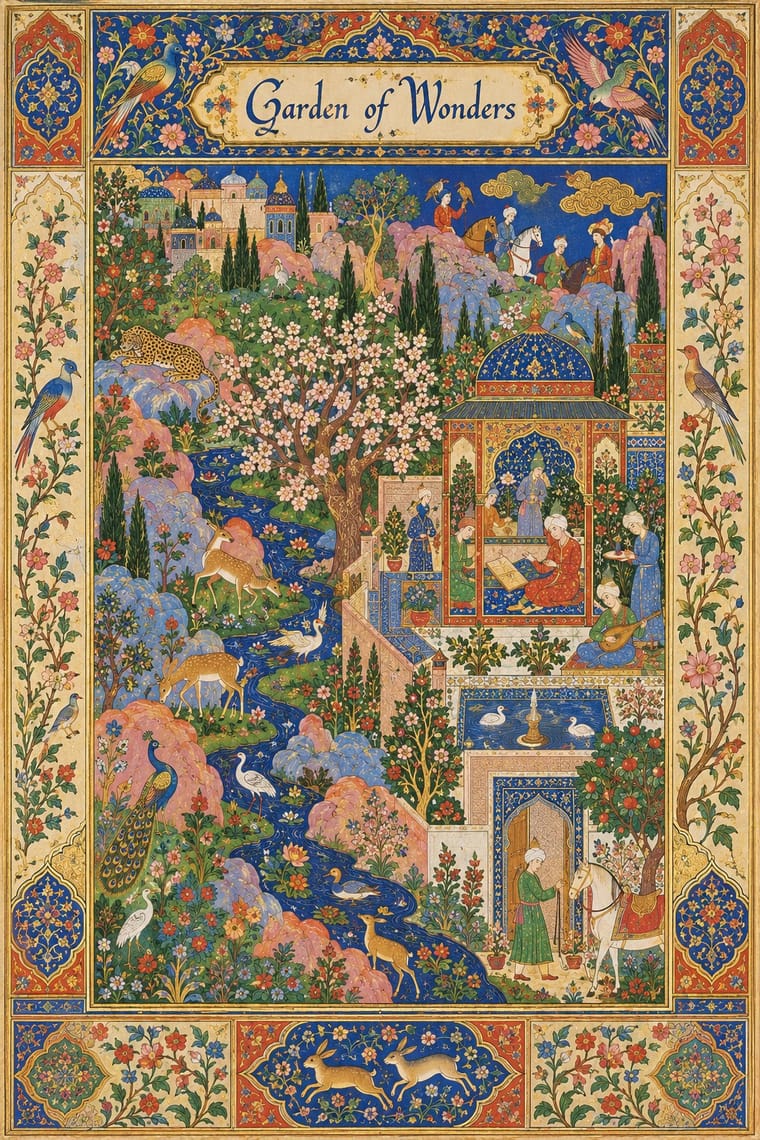
- Persian Popular Narrative (Lithographs & Coffeehouse Painting) 68% alike
-
- Swedish Painted Wall Hangings (Dalmålning, Bonadsmålning and Kurbits) 63% alike
-
05
Often taken for
Gothic Book of Hours has no real works recorded yet, so these are its nearest styles by its choices alone, with the choices that tell them apart.
-
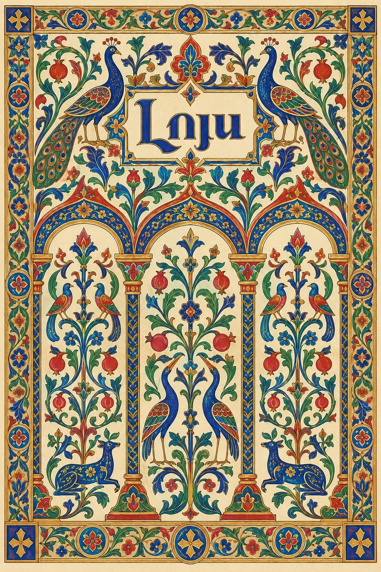
Armenian Manuscript Illumination
Armenian Manuscript Illumination is one of Gothic Book of Hours’s nearest styles by choices; no real work of either fits the other better.
Choices that tell Gothic Book of Hours and Armenian Manuscript Illumination apart Choice Gothic Book of Hours Armenian Manuscript Illumination Classical text block defining — Central symmetry — defining Blackletter defining — Flat fields — characteristic Measured density characteristic — No shared descent in the atlas: they reached these choices separately.
-
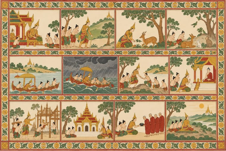
Burmese Parabaik Painting (Konbaung Folding Books)
Burmese Parabaik Painting is one of Gothic Book of Hours’s nearest styles by choices; no real work of either fits the other better.
Choices that tell Gothic Book of Hours and Burmese Parabaik Painting apart Choice Gothic Book of Hours Burmese Parabaik Painting Classical text block defining — Flat hierarchy avoids occasional Blackletter defining — Flat fields — characteristic Horror vacui occasional avoids No shared descent in the atlas: they reached these choices separately.
-
Persian Popular Narrative (Lithographs & Coffeehouse Painting)
Persian Popular Narrative is one of Gothic Book of Hours’s nearest styles by choices; no real work of either fits the other better.
Choices that tell Gothic Book of Hours and Persian Popular Narrative apart Choice Gothic Book of Hours Persian Popular Narrative Classical text block defining — Horror vacui occasional defining Blackletter defining — Monochrome — characteristic Jewel & metallic characteristic — No shared descent in the atlas: they reached these choices separately.
-
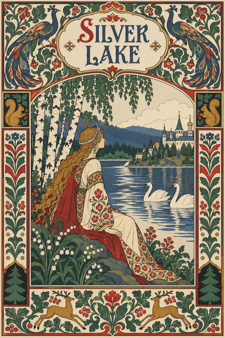
Mir iskusstva Book Art
Mir iskusstva Book Art is one of Gothic Book of Hours’s nearest styles by choices; no real work of either fits the other better.
Choices that tell Gothic Book of Hours and Mir iskusstva Book Art apart Choice Gothic Book of Hours Mir iskusstva Book Art Blackletter defining — All caps avoids occasional Layered information characteristic — Earth & mineral — characteristic Brush & pen calligraphy characteristic — No shared descent in the atlas: they reached these choices separately.
— means the choice isn’t among the style’s recorded choices. Critics recorded each work’s choices with the styles’ descriptions in view, so this shows whether the descriptions hold together, not proof that they are right.
06
Combine it with
Styles Gothic Book of Hours (Illuminated Devotional Book) pairs well with or plays against, from the research. Each is worked out as a combination: which style gives the type, the colours and the forms.
- Renaissance Book Typography Contrasts · Compare a hand-painted devotional opening with a printed humanist text page: the former gives pictures and illuminated margins a larger organising role, while the latter centres roman type and measured margins.
- Gothic Blackletter & Fraktur Tradition Pairs well · Compare the shared Gothic text block, then distinguish the book-of-hours page by its coordinated miniatures, graded initials and marginal programme; a blackletter wordmark alone does not reproduce this system.
- Armenian Manuscript Illumination Contrasts · Compare how distinct Christian book traditions organise sacred reading: this entry centres the lay prayer cycle and Gothic text block, rather than Armenian Gospel incipits and canon-table arcades; retain each tradition's own scripts and context.
07
Sources
- J. Paul Getty Museum, The Medieval Bestseller: Illuminated Books of Hours, exhibition essay: private lay devotion, the Hours of the Virgin, calendars, personalised commissions and heraldic borders. https://www.getty.edu/art/exhibitions/books/
- The Digital Walters, W.102, Book of Hours: England, end of the thirteenth century; illuminated initials and marginal imagery, including the funeral of Reynard the Fox. The exact English production centre and patron are uncertain. https://www.thedigitalwalters.org/Data/WaltersManuscripts/html/W102/
- The Metropolitan Museum of Art, Jean Pucelle, The Hours of Jeanne d'Evreux, 54.1.2: Paris, ca. 1324–28; grisaille, tempera and ink on vellum. The openly published opening was visually inspected for selective colour, Gothic writing, historiated initials and marginal figures. https://www.metmuseum.org/art/collection/search/470309
- The Metropolitan Museum of Art, The Limbourg Brothers, The Belles Heures of Jean de France, duc de Berry, 54.1.1: 1405–1408/1409, tempera, gold and ink on vellum. The openly published page was visually inspected for framed narrative painting, coloured Gothic writing and foliate borders. https://www.metmuseum.org/art/collection/search/470306
- J. Paul Getty Museum, Going Places: Travel in the Middle Ages, selected works: St. Christopher Carrying the Christ Child, about 1420, Spitz Master, tempera colours, gold and ink, Ms. 57 (94.ML.26), fol. 42v. Rechecked the holding institution's attribution, date and shelfmark and visually inspected its linked image: a framed miniature above Gothic writing, a decorated initial and foliate/figural margins. The same exhibition identifies Villagers on Their Way to Church, about 1550, Simon Bening, tempera colours and gold paint, Ms. 50 (93.MS.19), recto. Its linked image shows a landscape and narrow painted frame, without a visible text block, initial hierarchy or ornamented margins: it is an adjacent late devotional painting, not a diagnostic exemplar of this Gothic page system or evidence that its defining choices persisted unchanged to 1550. The unverified three-illuminator collaboration claim for the Spitz Hours is not retained; the directly verified St. Christopher leaf is used instead. https://www.getty.edu/exhibitions/going-places/
- Elena Lichmanova, The Nature of Gothic, British Library, 25 September 2025: Entwistle Hours, England and northern France, ca. 1440, Sloane MS 2321, ff. 63v–64r; the published Flight into Egypt opening was visually inspected for miniature/text pairing, graded initials and floral framing. The later Blackburn Hart 20884 Pentecost page in the same article is a different manuscript, not the Entwistle opening. https://www.bl.uk/stories/blogs/posts/the-nature-of-gothic
- J. Paul Getty Museum, Transcending Time: The Medieval Book of Hours: private Christian devotion and the late medieval book market. The openly published Annunciation detail, Paris or Bourges, about 1390, was visually inspected for painted figures and patterned gold-and-colour grounds; the crop was not used as evidence for whole-page layout. https://www.getty.edu/art/exhibitions/transcending_time/
- Editorial scope and weighting: the period is approximate, not an assertion of stylistic uniformity across three centuries or a claim that the listed exemplars establish both endpoints. Regional coverage is restricted to western Europe, not extended from patrons' nationalities. Jewel colour and abundant decoration are characteristic rather than mandatory because the Jeanne d'Evreux opening uses restrained grisaille. The palette is an illustrative selection, not sampled pigment measurements. Fraktur, the later German type family, is not asserted as the ancestor: the blackletter-fraktur influence id denotes its earlier Gothic manuscript-hand component. Printed horae and fully Renaissance page systems are adjacent developments, not defining media for this genome. The Morgan catalogue and Met essay were blocked during the original drafting run; unconfirmed details from those pages were omitted.
How Stylogeny researches and checks a style: where the facts come from.