Style combination · Contrasts
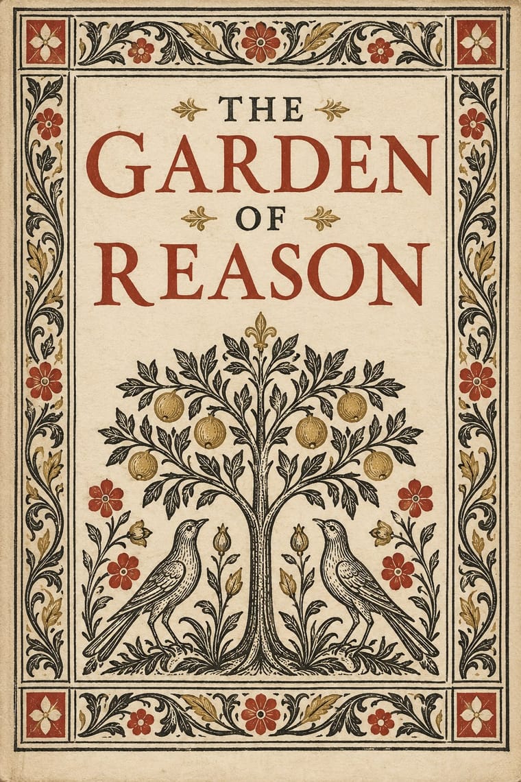
Gothic Book of Hours × Renaissance Book Typography
Compare a hand-painted devotional opening with a printed humanist text page: the former gives pictures and illuminated margins a larger organising role, while the latter centres roman type and measured margins.
Mix them and make something Gothic Book of Hours Renaissance Book Typography
01
What each style brings
Each part of the design comes from the style with the stronger say in it, and each style gives at least two.
Gothic Book of Hours (Illuminated Devotional Book) Renaissance Book Typography
- Type from Renaissance Book Typography
-
Gothic Book of Hours avoids all caps: this is where the two pull against each other, which is the point of the contrast.
- Colour from Gothic Book of Hours
-
Renaissance Book Typography avoids full polychrome: this is where the two pull against each other, which is the point of the contrast.
- Form from Gothic Book of Hours
- Composition from Gothic Book of Hours
- Surface from Renaissance Book Typography
02
The type
Open fonts standing in for each style’s own type, which is often hand-drawn or commercial.
Display · Renaissance Book Typography
Quiet
EB Garamond; Renaissance Book Typography used Jenson's roman and Griffo's roman
Text · Renaissance Book Typography
The printed book as shaped by humanist Italy and France: roman and italic types modelled on humanist handwriting, a single justified text block set in harmonious proportions within generous margins, and woodcut initials, borders and printer's devices as the only ornament. Its page became the default model of the Western book for the next five centuries.
EB Garamond; Renaissance Book Typography used Jenson's roman and Griffo's roman
03
The colours
The ground and leading colours come from Gothic Book of Hours, with a counter-accent from Renaissance Book Typography. The ink reads on the ground at 4.5:1 or more.
Gothic Book of Hours (Illuminated Devotional Book) Renaissance Book Typography
-
#efe3c9ground · 36% -
#29211dink · 14% -
#af342daccent · 18% -
#b99a49accent · 14% -
#284b92accent · 10% -
#54744aaccent · 8%
As CSS
:root {
  --ground: #efe3c9;
  --ink: #29211d;
  --accent-1: #af342d;
  --accent-2: #b99a49;
  --accent-3: #284b92;
  --accent-4: #54744a;
  --font-display: "EB Garamond", serif;
  --font-text: "EB Garamond", serif;
}
Use it with care
Gothic Book of Hours (Illuminated Devotional Book): These are Christian devotional books, not a generic fantasy or occult aesthetic. Their prayers, images of Christ, the Virgin and saints, and commemorations of the dead belong to religious practices that remain meaningful to living communities. Explain an object's devotional function and local context; do not invent sacred text, detach a Passion scene for decorative shock, or imply that a newly made page is an authentic liturgical or medieval object. For historical study, use complete objects or pages openly published by their holding museums and libraries and retain their attribution and shelfmark; public availability is not an image licence, so check the rights of each exact file before display. For contemporary religious work, consult the commissioning community and credit the calligrapher or illuminator. Learn from page hierarchy and framing for secular work without copying prayers or sacred figures. This entry describes a selected Gothic manuscript tradition, not all Catholic prayer books or all medieval illumination; its approximate dates are not the invention and extinction dates of the book-of-hours genre.
04
The two styles
05
More combinations
With Gothic Book of Hours
- Gothic Blackletter & Fraktur Tradition Pairs well · Compare the shared Gothic text block, then distinguish the book-of-hours page by its coordinated miniatures, graded initials and marginal programme; a blackletter wordmark alone does not reproduce this system.
- Armenian Manuscript Illumination Contrasts · Compare how distinct Christian book traditions organise sacred reading: this entry centres the lay prayer cycle and Gothic text block, rather than Armenian Gospel incipits and canon-table arcades; retain each tradition's own scripts and context.
With Renaissance Book Typography
- Minimalist Graphic Design Pairs well · Keep classical page proportions and a humanist serif but strip the ornament to give minimal layouts warmth and authority.
- Arts & Crafts Movement Pairs well · Morris's Kelmscott Press revived Jenson's roman; pair a Renaissance text block with dense Arts & Crafts borders for a private-press feel.
- Gothic Blackletter & Fraktur Tradition Contrasts · The humanist roman was drawn against the gothic textura it replaced in Italy: open, round and light where blackletter is dense, broken and dark.
- Islamic Geometric & Calligraphic Tradition Pairs well · Use arabesque or moresque fleurons, as Venetian and Lyon printers did, to frame a classical text block.
- International Typographic Style Contrasts · Centred, justified and serifed versus asymmetric, ragged and sans: the clearest foil for deciding which order a page should follow.
- Ethiopian Ge'ez Manuscript & Haräg Illumination Pairs well · Ge'ez manuscripts share the logic of black text with red rubrics; borrow the principle of red for names and headings, not the sacred imagery.
- Emblem Book (Motto, Picture & Epigram) Contrasts · Its parent shares the humanist roman and italic, the paper and the woodcut, but lets text carry the page with ornament at its edges; the emblem book puts a framed picture at the centre of every page and makes it part of the argument.
- Cranbrook & Deconstructivist Typography Contrasts · The single justified book block is what deconstruction questions; quoting it inside a layered layout makes the critique explicit.