Style combination · Contrasts
Vaporwave × Witch House Graphics
Both can rework found media in conspicuous digital colour; keep the symbol-name and unsettling scene if the brief wants witch house rather than a collage of consumer nostalgia.
01
What each style brings
Each part of the design comes from the style with the stronger say in it, and each style gives at least two.
Vaporwave Witch House Graphics (Symbol Names and Haunted Web Imagery)
- Type from Witch House Graphics
- Form from Witch House Graphics
- Composition from Vaporwave
- Surface from Vaporwave
-
Witch House Graphics avoids chrome & 3d render: this is where the two pull against each other, which is the point of the contrast.
02
The type
Open fonts standing in for each style’s own type, which is often hand-drawn or commercial.
Display · Witch House Graphics
Memory
Climate Crisis; Witch House Graphics used Typed symbol-name lettering and Widely tracked, plain sans-serif capitals, as on the inspected White Ring Black Earth That Made Me cover; this is a lettering treatment, not a verified typeface identification
Text · Vaporwave
An internet-born microgenre and visual aesthetic that remixes the debris of late-20th-century consumer culture (Windows 95 dialogs, classical busts, palm trees, mall interiors, Japanese text, early 3D renders) in pastel pinks and cyans. Emerging around 2011 from records by James Ferraro, Daniel Lopatin and Vektroid, it is at once nostalgic homage and deadpan critique of corporate optimism.
Shippori Mincho; Vaporwave used Full-width Latin text and Japanese katakana in MS Gothic / MS Mincho
03
The colours
The ground and leading colours come from Vaporwave, with a counter-accent from Witch House Graphics. The ink reads on the ground at 4.5:1 or more.
Vaporwave Witch House Graphics (Symbol Names and Haunted Web Imagery)
-
#1a1040ground · 36% -
#fffb96ink · 14% -
#01cdfeaccent · 18% -
#d7388aaccent · 14% -
#05ffa1accent · 10% -
#9ed33baccent · 8%
As CSS
:root {
  --ground: #1a1040;
  --ink: #fffb96;
  --accent-1: #01cdfe;
  --accent-2: #d7388a;
  --accent-3: #05ffa1;
  --accent-4: #9ed33b;
  --font-display: "Climate Crisis", sans-serif;
  --font-text: "Shippori Mincho", serif;
}
Use it with care
Witch House Graphics (Symbol Names and Haunted Web Imagery): These are musicians' authored identities, not a reusable alphabet of anonymous occult decoration. Credit the artists and obtain permission for their marks, photographs and footage; online circulation does not make those works openly licensed. The folk-symbols trait records coded and sometimes religious-looking signs, not evidence of the makers' beliefs or a licence to copy a community's sacred designs. Research any specific sign before using it. Symbol-only names can obstruct search, pronunciation and assistive access: supply a readable equivalent rather than reproducing that obstruction in navigation or essential information. The available evidence is strongest for the early-2010s visual cluster; later witch-house releases must be judged visually, not admitted by genre alone.
04
The two styles
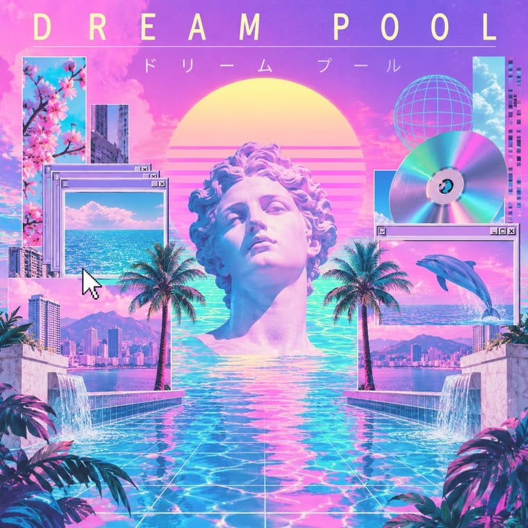
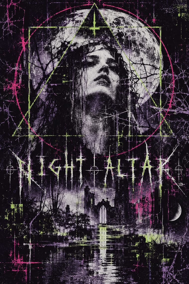
05
More combinations
With Vaporwave
- International Typographic Style Contrasts · Swiss objectivity is vaporwave's antithesis; a strict grid can frame its chaos for editorial or music-packaging use.
- Bitmap & Pixel Graphics Pairs well · Use pixel fonts, dithered gradients and Windows-style dialog boxes as framing devices for vaporwave collages.
- Memphis Design Pairs well · Memphis terrazzo, squiggles and pastel laminates ground vaporwave's busts and grids in genuine 1980s decorative language.
- Ma & Wabi-sabi Aesthetics Contrasts · Wabi-sabi's natural imperfection and quiet earth tones are the analogue counterpoint to vaporwave's synthetic, plastic nostalgia.
- Generative-AI Image Aesthetic Pairs well · Vaporwave's ironic distance is the antidote to AI's earnest polish; frame generated images as found kitsch to make the artificiality the point.
- Frutiger Aero Pairs well · Both trade on mid-2000s tech nostalgia; mix Aero bubbles and skies with vaporwave's pastel 3D for retro-internet campaigns.
- Weirdcore & Dreamcore Contrasts · Tanni's genealogy starts with vaporwave's spectral reuse of web imagery; vaporwave collages pastel consumer debris, busts and Japanese text with ironic luxury, while weirdcore empties the frame and drops the joke. Keep the found picture but swap the bust for a vacant playground to move from irony to unease.
- Early Web Vernacular Pairs well · Vaporwave already mines this archive; combine tiled backgrounds and default fonts with its pastel 3D for nostalgic net art.
With Witch House Graphics
- Glitch Art & Datamosh Graphics Pairs well · Use channel displacement or compression damage to estrange a recognisable scene, but retain the symbol-name as the identity; the image need not become an abstract demonstration of file failure.
- Hauntology & Ghost Box Design Contrasts · Choose between Ghost Box's fictitious institutional series and this scene's coded artist identity: trade the ruled paperback title band for a glyph-name and a distressed photographic field.
- Weirdcore & Dreamcore Contrasts · Both can estrange a low-quality photograph; use a coded artist name and geometric sign for witch-house identity, rather than weirdcore's anonymous place and short viewer-addressing caption. A haunted photograph alone is not enough.
- Black Metal Graphics Contrasts · Both can place an obscure mark over a bleak picture; distinguish typed, substituted glyphs and treated web imagery from a hand-drawn mirrored thorn alphabet. A thorn-logo cover does not become this style merely because its music is witch house.