Style combination · Contrasts
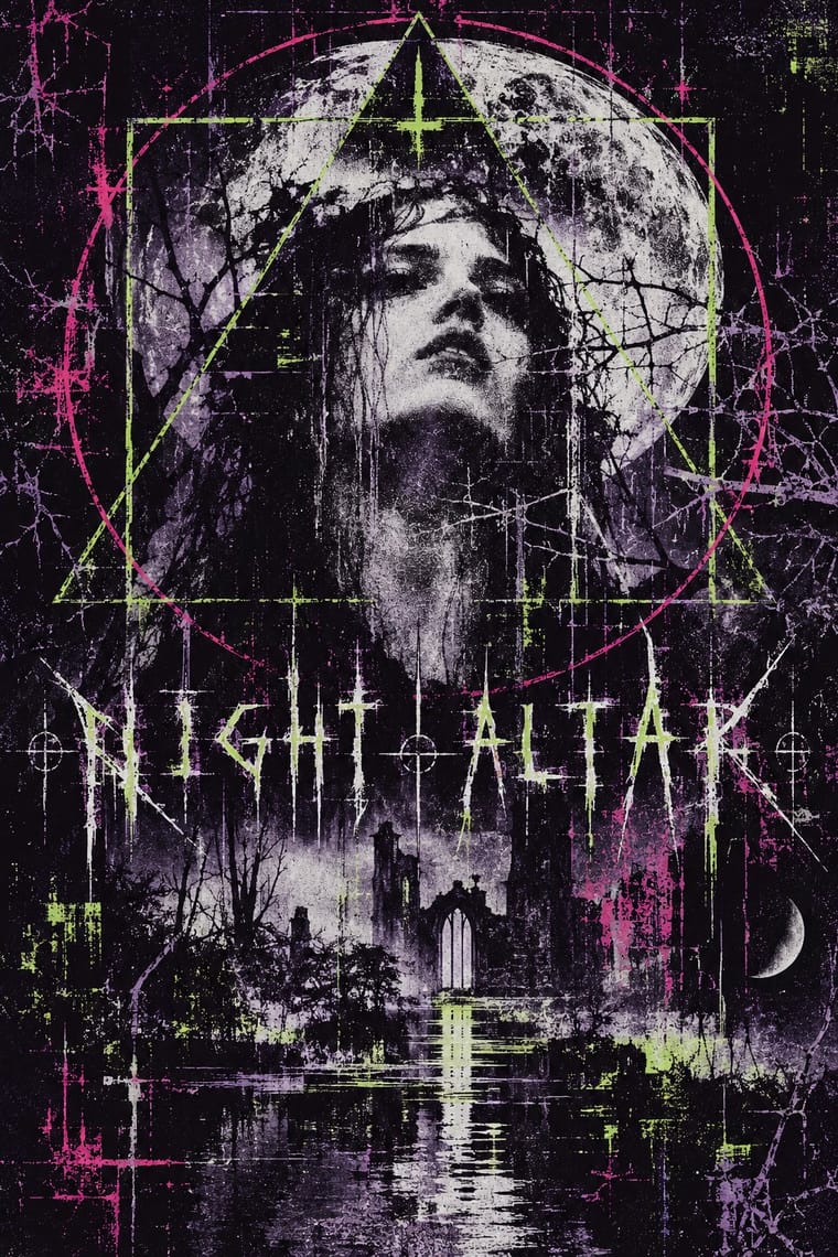
Black Metal Graphics × Witch House Graphics
Both can place an obscure mark over a bleak picture; distinguish typed, substituted glyphs and treated web imagery from a hand-drawn mirrored thorn alphabet. A thorn-logo cover does not become this style merely because its music is witch house.
Mix them and make something Black Metal Graphics Witch House Graphics
01
What each style brings
Each part of the design comes from the style with the stronger say in it, and each style gives at least two.
Black Metal Graphics Witch House Graphics (Symbol Names and Haunted Web Imagery)
- Type from Witch House Graphics
- Colour from Black Metal Graphics
- Form from Witch House Graphics
- Composition from Black Metal Graphics
- Surface from Black Metal Graphics
02
The type
Open fonts standing in for each style’s own type, which is often hand-drawn or commercial.
Display · Witch House Graphics
No!
Climate Crisis; Witch House Graphics used Typed symbol-name lettering and Widely tracked, plain sans-serif capitals, as on the inspected White Ring Black Earth That Made Me cover; this is a lettering treatment, not a verified typeface identification
Text · Black Metal Graphics
The visual language of black metal, fixed by Norway's second wave in the early 1990s, now worldwide, since the 2010s borrowed by mainstream acts (Szpajdel's Rihanna and Metallica logos, 2016). A hand-drawn band logo, barely legible, its letters grown into thorns and branches and balanced on a central axis, sits white on black over one bleak picture: a grainy black-and-white photograph of a corpse-painted musician, a church, a forest or a Romantic painting. Early covers, xeroxed like punk's, rejected death metal's bright painted art; the tone is misanthropic, pagan or occult, never ironic.
Special Elite; Black Metal Graphics used Hand-inked thorned, mirrored logotype and Old English Text and Fraktur capitals
03
The colours
The ground and leading colours come from Black Metal Graphics, with a counter-accent from Witch House Graphics. The ink reads on the ground at 4.5:1 or more.
Black Metal Graphics Witch House Graphics (Symbol Names and Haunted Web Imagery)
-
#0a0a0aground · 36% -
#e6e2d8ink · 14% -
#6f6f6faccent · 18% -
#d7388aaccent · 14% -
#2a2a2aaccent · 10% -
#9ed33baccent · 8%
As CSS
:root {
  --ground: #0a0a0a;
  --ink: #e6e2d8;
  --accent-1: #6f6f6f;
  --accent-2: #d7388a;
  --accent-3: #2a2a2a;
  --accent-4: #9ed33b;
  --font-display: "Climate Crisis", sans-serif;
  --font-text: "Special Elite", monospace;
}
Use it with care
Black Metal Graphics: The Norwegian scene's early-1990s fame rests partly on real crimes: church arsons from 1992 and two murders. Varg Vikernes of Burzum, sentenced in 1994 for the murder of Euronymous and four church arsons, is credited with bringing neo-Nazi views into the scene, and a small National Socialist black metal minority still spreads them through lyrics and imagery; even Darkthrone had to remove a slogan about race from a 1994 back cover after distributors objected. Cite Burzum sleeves only as history, and take mood from the public-domain Kittelsen and Doré pictures instead. Borrow the mirrored logo, the black field and the bleak photograph, but never a burnt or burning church, a photograph of a real death, or far-right symbols: no Black Sun (Sonnenrad), winged or serifed odal rune, wolfsangel, SS runes or Totenkopf, and no slogan about race or nation in blackletter. Inverted crosses and pentagrams signal hostility to Christianity; weigh them before using them for a general audience. Logos are the commissioned, living work of named letterers such as Szpajdel: commission or credit one rather than copying a band's name or mark.
Witch House Graphics (Symbol Names and Haunted Web Imagery): These are musicians' authored identities, not a reusable alphabet of anonymous occult decoration. Credit the artists and obtain permission for their marks, photographs and footage; online circulation does not make those works openly licensed. The folk-symbols trait records coded and sometimes religious-looking signs, not evidence of the makers' beliefs or a licence to copy a community's sacred designs. Research any specific sign before using it. Symbol-only names can obstruct search, pronunciation and assistive access: supply a readable equivalent rather than reproducing that obstruction in navigation or essential information. The available evidence is strongest for the early-2010s visual cluster; later witch-house releases must be judged visually, not admitted by genre alone.
04
The two styles
05
More combinations
With Black Metal Graphics
- Expressionist Woodcut Graphics Pairs well · Both work in black and white with jagged, angular marks and dread; cut a forest or a church as a black woodcut for a cover that needs a picture but not a photograph.
- Punk & DIY Zine Contrasts · Punk fed black metal's birth (Hellhammer's Tom G. Warrior heard Discharge as 'a revolution, much like Venom'), and both run off a photocopier for a scene that refuses polish; but punk crowds the sheet with ransom-note collage and irony while black metal leaves one dark photograph and one mirrored logo on an empty black field; choose between noise and silence.
- Gothic Blackletter & Fraktur Tradition Pairs well · Take one broken-script title from the gothic tradition and set it small under a hand-drawn thorned logo, in white on black, so the old letter reads as menace instead of a page of text.
- Post-Punk Record Sleeve (Stiff, Factory, 4AD) Contrasts · Both put one image on a quiet, often black field, but post-punk shrinks, codes or omits the band's name, prints offset on special stock and hides riddles for the art-literate, while black metal makes a hand-drawn, near-illegible logo the centre of a xeroxed, earnest sleeve; choose between a coded name and a sigil.
- Screenprinted Gig & Alt-Movie Poster Contrasts · The gig poster sells a show with fluorescent inks, cartoons and a knowing wink; strip it to black, bone white and a mirrored logo to see how much the wink was doing.
- Art Nouveau Pairs well · Szpajdel's cited source: borrow Art Nouveau's vegetal, space-filling lettering and mirror it, then sharpen every curve into a thorn and drop the colour.
- Grunge Typography Contrasts · Both made legibility negotiable in the 1990s, but grunge layered and eroded digital type across a broken grid, while black metal draws one logo by hand and centres it in emptiness; pick analogue symmetry or digital disorder.
- Gabber and Hardcore Graphics (Rotterdam and Thunderdome) Contrasts · Both use menace and emblems, but one is neon and rendered, the other monochrome and hand-inked.
With Witch House Graphics
- Glitch Art & Datamosh Graphics Pairs well · Use channel displacement or compression damage to estrange a recognisable scene, but retain the symbol-name as the identity; the image need not become an abstract demonstration of file failure.
- Hauntology & Ghost Box Design Contrasts · Choose between Ghost Box's fictitious institutional series and this scene's coded artist identity: trade the ruled paperback title band for a glyph-name and a distressed photographic field.
- Weirdcore & Dreamcore Contrasts · Both can estrange a low-quality photograph; use a coded artist name and geometric sign for witch-house identity, rather than weirdcore's anonymous place and short viewer-addressing caption. A haunted photograph alone is not enough.
- Vaporwave Contrasts · Both can rework found media in conspicuous digital colour; keep the symbol-name and unsettling scene if the brief wants witch house rather than a collage of consumer nostalgia.