Style combination · Contrasts
Hauntology × Witch House Graphics
Choose between Ghost Box's fictitious institutional series and this scene's coded artist identity: trade the ruled paperback title band for a glyph-name and a distressed photographic field.
01
What each style brings
Each part of the design comes from the style with the stronger say in it, and each style gives at least two.
Hauntology & Ghost Box Design Witch House Graphics (Symbol Names and Haunted Web Imagery)
- Type from Witch House Graphics
- Colour from Hauntology
- Form from Witch House Graphics
- Composition from Hauntology
-
Witch House Graphics avoids modular grid: this is where the two pull against each other, which is the point of the contrast.
- Surface from Hauntology
02
The type
Open fonts standing in for each style’s own type, which is often hand-drawn or commercial.
Display · Witch House Graphics
Daydream
Climate Crisis; Witch House Graphics used Typed symbol-name lettering and Widely tracked, plain sans-serif capitals, as on the inspected White Ring Black Earth That Made Me cover; this is a lettering treatment, not a verified typeface identification
Text · Hauntology
Sleeves and print that rebuild a misremembered British past from the public graphics of roughly 1958–1978. At Ghost Box, founded in London in 2004, Julian House gave every release one template after the Penguin paperback grid and library-music LPs: bold grotesque type in a ruled Penguin-style band over a single saturated colour field and an eerie collage of textbook, science and occult imagery. Reynolds and Fisher called it hauntology; Richard Littler's Scarfolk turned it into sinister public-information posters.
Archivo; Hauntology used Monotype Grotesque (MT Grotesque), the main face of the Ghost Box front covers, chosen over Helvetica and Clarendon (Bitstream's cut) on Ghost Box back covers and booklets
03
The colours
The ground and leading colours come from Hauntology, with a counter-accent from Witch House Graphics. The ink reads on the ground at 4.5:1 or more.
Hauntology & Ghost Box Design Witch House Graphics (Symbol Names and Haunted Web Imagery)
-
#efe9d8ground · 36% -
#1e1b18ink · 14% -
#f9a61aaccent · 18% -
#d7388aaccent · 14% -
#01b2deaccent · 10% -
#9ed33baccent · 8%
As CSS
:root {
  --ground: #efe9d8;
  --ink: #1e1b18;
  --accent-1: #f9a61a;
  --accent-2: #d7388a;
  --accent-3: #01b2de;
  --accent-4: #9ed33b;
  --font-display: "Climate Crisis", sans-serif;
  --font-text: "Archivo", sans-serif;
}
Use it with care
Hauntology & Ghost Box Design: The Ghost Box sleeves and logo, Littler's Scarfolk images and Frances Castle's Clay Pipe sleeves are in copyright, and much of what they imitate (Penguin covers, government public information posters, textbook illustrations, archive photographs) has its own rights holders: build a new fictional institution from public-domain or licensed material rather than copying a Ghost Box sleeve or Penguin's trade dress.
Witch House Graphics (Symbol Names and Haunted Web Imagery): These are musicians' authored identities, not a reusable alphabet of anonymous occult decoration. Credit the artists and obtain permission for their marks, photographs and footage; online circulation does not make those works openly licensed. The folk-symbols trait records coded and sometimes religious-looking signs, not evidence of the makers' beliefs or a licence to copy a community's sacred designs. Research any specific sign before using it. Symbol-only names can obstruct search, pronunciation and assistive access: supply a readable equivalent rather than reproducing that obstruction in navigation or essential information. The available evidence is strongest for the early-2010s visual cluster; later witch-house releases must be judged visually, not admitted by genre alone.
04
The two styles
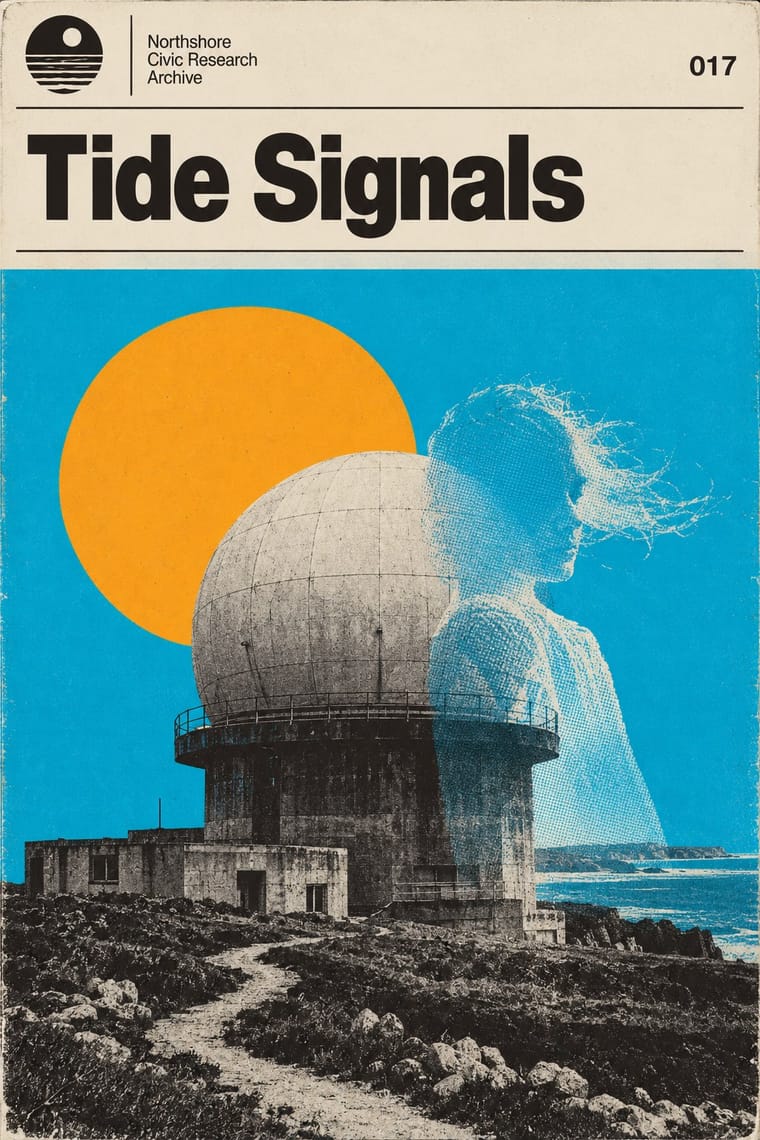
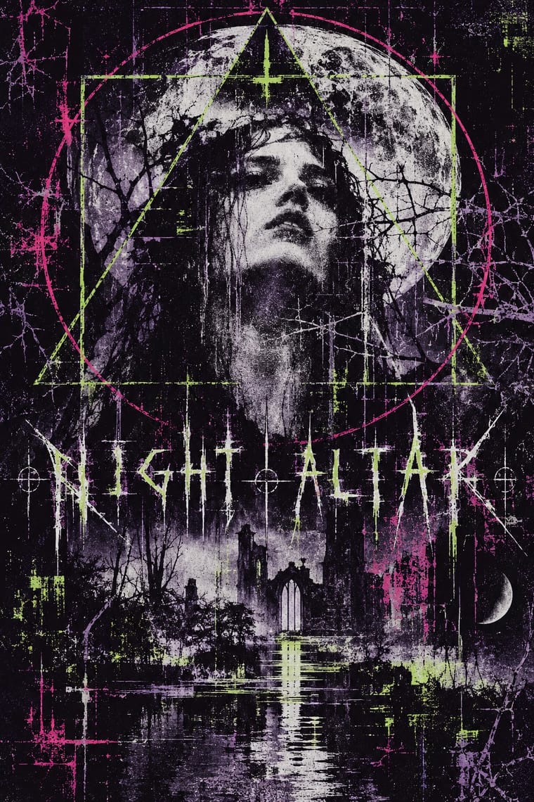
05
More combinations
With Hauntology
- Surrealist Graphics Pairs well · House named Max Ernst among his influences: add an Ernst-like collage juxtaposition to a textbook photograph to make an educational image turn eerie.
- London Transport Design Pairs well · Borrow the logic of a public-service programme (fixed elements, a roundel, varied pictures within one system) to give an invented hauntological institution a believable house style.
- Vaporwave Contrasts · Both build nostalgia from found media, but vaporwave mourns consumer electronics in neon pastels on screens while hauntology misremembers public, educational print in flat offset colour on paper; choose which lost future a design should haunt.
- Post-Punk Record Sleeve (Stiff, Factory, 4AD) Contrasts · House names Peter Saville among his influences, but Saville's Factory sleeves quote one modernist or classical source per record, while Ghost Box invents a whole institution and dresses every release in its one template; choose a single quotation or a fictional series.
- Neo-Swiss Revival Contrasts · Swiss revival uses the modernist grid straight, crisp and current; hauntology keeps a grid but ages its pictures with grain and halftone and lets something uncanny into them.
- Hipster Artisanal Revival Contrasts · Both fake an old firm, but the hipster badge revives Victorian craft for warmth and trust, while hauntology revives a post-war public institution so that it feels slightly wrong.
- Risograph & Indie Print Culture Pairs well · Print the template on a risograph to get real grain, two or three inks and genuine misregistration instead of simulated wear.
- Dark Academia Contrasts · Both turn institutional nostalgia uncanny, but Ghost Box uses grotesque type, halftone and flat fields where this is serif, photographic and dense.
With Witch House Graphics
- Glitch Art & Datamosh Graphics Pairs well · Use channel displacement or compression damage to estrange a recognisable scene, but retain the symbol-name as the identity; the image need not become an abstract demonstration of file failure.
- Weirdcore & Dreamcore Contrasts · Both can estrange a low-quality photograph; use a coded artist name and geometric sign for witch-house identity, rather than weirdcore's anonymous place and short viewer-addressing caption. A haunted photograph alone is not enough.
- Black Metal Graphics Contrasts · Both can place an obscure mark over a bleak picture; distinguish typed, substituted glyphs and treated web imagery from a hand-drawn mirrored thorn alphabet. A thorn-logo cover does not become this style merely because its music is witch house.
- Vaporwave Contrasts · Both can rework found media in conspicuous digital colour; keep the symbol-name and unsettling scene if the brief wants witch house rather than a collage of consumer nostalgia.