Rational modernism · 1999–present · Western Europe, North America, Global / networked
Legible City Wayfinding (Heads-Up Pedestrian Maps)
Also known as Legible London, Bristol Legible City, Heads-up mapping, Pedestrian wayfinding monoliths, WalkNYC
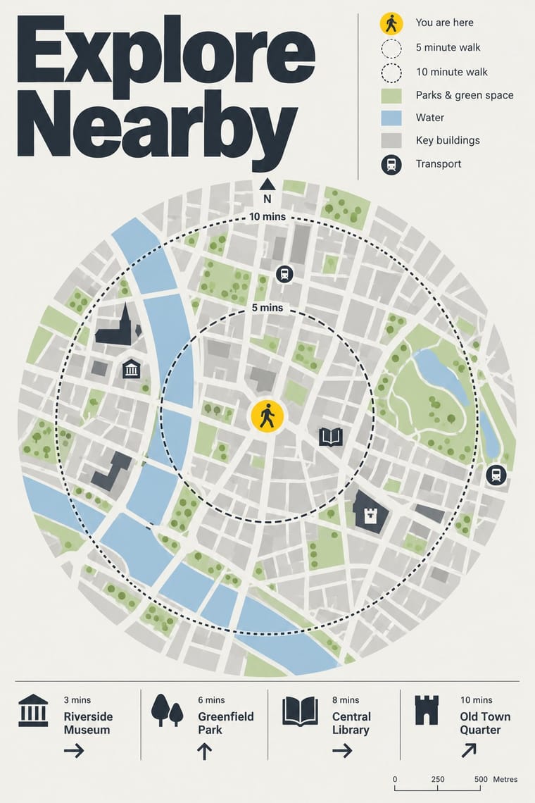
City-wide pedestrian wayfinding in which the sign is a map. Free-standing totems such as Legible London's Monolith, Midilith and Minilith carry 'heads-up' maps turned to the way the reader faces, a 'you are here' point ringed by a five-minute walking circle (fifteen minutes on the larger planner maps), and key landmarks drawn as small buildings on a flat street plan (in three dimensions in Bristol and London). A calm sans, high-contrast panels and one identifying accent, such as London's yellow top strip, make a single system of streets, stations, bus shelters and printed maps.
Make something in this style Get advice in this style Mix it with another style
01
How it works
- Make the map the sign: give every totem a walking-scale street plan, not only arrows and destination names.
- Turn the map heads-up, so that the direction the reader faces is at the top, and print the reverse side turned to its own view.
- Centre the plan on a 'you are here' point and ring it with walking-time circles (five minutes on the finder map, fifteen on the planner) at an average pace.
- Draw chosen landmark buildings as small illustrations among flat streets (in three dimensions in Bristol and London), so people can match the map to what they see.
- Disclose information progressively: a large local map, a wider planner map and short directions on one family of totems, repeated identically from street to station to printed map.
- Mark every sign with one identifying accent and the same calm sans, in high-contrast colours on a light map ground.
Bristol, England: Bristol City Council's Legible City initiative, conceived in 1996 during the city's regeneration under the Bristol 2000 plan. In 1998 the council appointed MetaDesign London, with its director Tim Fendley as lead designer, for the 'visual concept and information design' and PSD Associates for the street components, while Urban Initiatives handled the signing and information plan; MetaDesign created the signage system in 1999. City ID, the Bristol practice founded by Mike Rawlinson, developed the unified mapping system and later led Bristol Legible City 2.0, and Lacock Gullam, working with AIG, took the 2005 phase for the city's arrival points. The initiative won the Royal Town Planning Institute's 2002 Innovation Award for urban design. Fendley founded Applied Information Group (AIG) in 2002. In London the Central London Partnership commissioned AIG and Lacock Gullam to study walking; their January 2006 report proposed Legible London, counting 32 separate pedestrian sign systems in central London and finding that over 40% of people used the Tube map to walk. A prototype of 19 signs around Oxford Street and Bond Street, set in TfL's New Johnston with its walker symbol, led Transport for London to adopt the system, now over 1,500 signs. In 2013 New York City's Department of Transportation launched WalkNYC, designed by PentaCityGroup (Pentagram, CityID, Billings Jackson Design, RBA Group, T-Kartor)
02
Its design choices
From Stylogeny’s vocabulary of design choices: defining choices make the style, characteristic ones are usual, occasional ones turn up now and then.
- Layout & composition
- Space & hierarchy
- Typography
- Colour
- Form & shape
- Surface & texture
- Imagery
- Medium & production
- Tone & intent
- Avoids
- Ornamented display, Script, Experimental & distorted, Abundant decoration, Fluorescent & neon, Gradients, Straight photography, Grain & noise, Agitational & persuasive
Palette
-
#f2f1ec -
#2b3640 -
#ffd100 -
#c9c9c4 -
#b9d3a0 -
#a9c8de
Typefaces
-
New Johnston, Transport for London's corporate humanist sans, used by AIG as Legible London's identifying font on its vitreous enamel and steel signs
-
Bristol Transit, the 'simple font specially designed for the city' on Bristol Legible City's signs
the signage system MetaDesign London created in 1999
-
Helvetica DOT, Monotype's customised Helvetica for New York City's Department of Transportation, whose square dots are made round; WalkNYC's icons were drawn to match it at 18 pt
Known for
-
Bristol Legible City (Bristol City Council with MetaDesign London, PSD Associates and City ID; concept 1996, signs from 1999)
pedestrian signs, on-street maps drawn to the viewer's position with 150 landmarks drawn in three dimensions, directional panels and printed walking guides; RTPI Innovation Award 2002
-
Bristol Legible City 2.0 (City ID)
maps backlit for night use, with activity hotspots and cycling and transport networks
-
Legible London (Transport for London; Applied Information Group and Lacock Gullam)
Monolith, Midilith, Minilith and Interlith totems in vitreous enamel and vinyl-printed glass in stainless-steel frames, with planner and finder maps and a yellow top strip; DBA Design Effectiveness Gold Medal 2008, British Cartographic Society award 2009, SEGD Honor Award 2010
-
Legible London maps in Tube and DLR stations, bus shelters and Santander Cycles docking stations
-
WalkNYC (New York City Department of Transportation, 2013; PentaCityGroup with Pentagram as graphic designer)
8½-foot kiosks with heads-up five-minute walking maps on removable vinyl behind glass, icons and drawings of landmark buildings and Helvetica DOT, also on over 300 Citi Bike kiosks
-
Legible London-style monoliths and fingerposts on the streets and canals of Stoke-on-Trent
03
Make something in this style
Say what you need, and Stylogeny’s image studio draws it from Legible City Wayfinding (Heads-Up Pedestrian Maps)’s design choices and checks it against them. It takes about a minute, and you get a link to share.
04
Where it comes from, and what it’s close to
Before it
The style it grew out of, and the styles it borrowed from.
After it
The styles that grew out of it.
No later style in the atlas grew out of it yet.
Alike in its design choices
Styles that make many of the same choices, related or not, besides those above.


05
Sources
- Wikipedia, 'Legible London', https://en.wikipedia.org/wiki/Legible_London (Central London Partnership study by AIG London and Lacock Gullam, January 2006; 32 wayfinding systems; over 40% used the Tube map on foot; prototype of 19 signs around Oxford Street and Bond Street; Monolith, Midilith and Minilith in vitreous enamel and vinyl-printed glass in stainless-steel frames; yellow stripe with walking person; planner map 15-minute circle of 1.125 km, finder map 5-minute circle of 375 m at 4.5 km/h; maps face the reader's direction; landmarks in 3D; Stoke-on-Trent; awards 2008, 2009, 2010)
- Wikipedia, 'Bristol Legible City', https://en.wikipedia.org/wiki/Bristol_Legible_City (Bristol City Council with City ID, founded by Mike Rawlinson; concept 1996; signs, on-street maps, directional panels, printed walking guides; Bristol Legible City 2.0 with illuminated maps)
- Transport for London, 'Maps and signs', https://tfl.gov.uk/info-for/boroughs-and-communities/maps-and-signs (heads-up maps; five-minute and 15-minute walking circles; illustrations of key buildings for people who struggle to read maps; high-contrast colours; yellow strip and walking person icon; monoliths, miniliths, midiliths, interlith totems, finger posts, wall-mounted and digital signs)
- Applied Information Group, 'Legible London', https://appliedinformation.group/projects/legible-london (over 1,500 signs; most of London's 32 boroughs; 16% journey time saving; related city projects Walk Rio, Leer Madrid, Seamless Cleveland)
- Society for Experiential Graphic Design, 'Legible London', https://segd.org/?p=762 (Applied Information Group and Lacock Gullam; Tim Fendley creative director; heads-up maps at junctions, transport arrival points and on printed maps)
- Pentagram, 'WalkNYC', https://www.pentagram.com/work/walknyc (NYC DOT, 2013; PentaCityGroup members; heads-up orientation; five-minute walking map; Helvetica DOT by Monotype with round dots; maps on over 300 Citi Bike kiosks; 8½-foot kiosks; vinyl on the second surface of the glass, removable for updates; palette 'inspired by the colors of the city')
- Korea JoongAng Daily, 'Teaching cities how to read, Bristol-style' (21 November 2005), https://www.koreajoongangdaily.com/lifestyle/teaching-cities-how-to-read-bristolstyle/11127474 (begun 1996; Bristol Transit font; maps drawn to the viewer's position; 150 landmarks drawn in three dimensions on two-dimensional maps; RTPI 2002 Innovation Award)
- IAUD, speaker biography of Tim Fendley (2006), https://iaud.net/ud2006/en/schedule/speaker/fendley.html (lead designer of the Bristol Legible City Initiative; co-founder of MetaDesign London; founded AIG in 2002)
- Design Week, 'London groups win Bristol job' (25 June 1998), https://www.designweek.co.uk/issues/25-june-1998/london-groups-win-bristol-job/ (read via web.archive.org; PSD Associates and MetaDesign appointed for Bristol City Council's Legible City initiative, part of the Bristol 2000 plan; Urban Initiatives handles the signing and information plan; PSD the 'movement and information component manual'; MetaDesign the 'visual concept and information design'; MetaDesign director Tim Fendley)
- Design Week, 'Bristol finds its way with help from Placemarque' (27 February 2003), https://www.designweek.co.uk/issues/27-february-2003/bristol-finds-its-way-with-help-from-placemarque/ (read via web.archive.org; Legible City Programme originally created by MetaDesign and PSD Associates; MetaDesign created Bristol's signage system in 1999; physical components by PSD Associates)
- Design Week, 'Bristol signs up Lacock Gullam' (24 February 2005), https://www.designweek.co.uk/issues/24-february-2005/bristol-signs-up-lacock-gullam/ (read via web.archive.org; Lacock Gullam with AIG for the next phase at the airport, train and bus station 'welcome points'; Fendley contributed to the city centre system while at MetaDesign London)
- Design Week, 'AIG in Legible London launch' (November 2007), https://www.designweek.co.uk/issues/november-2007-online/aig-in-legible-london-launch/ (read via web.archive.org; 19 signs around Bond Street; heads-up maps with landmarks, also on bus stops and in leaflets; AIG used TfL's typeface New Johnston as the identifying font and its 'walker' symbol on vitreous enamel and steel signs)
- City ID, 'Bristol Legible City 2.0', https://www.cityid.com/bristol-legible-city-2-0 (City ID credited with concept, strategy, cartography and design lead; base maps redrawn; backlit materials for evening use; activity hotspots and transport information)
How Stylogeny researches and checks a style: where the facts come from.