Digital native · 1994–present · East Asia
Korean Variety-Show Captions (Yeneung Jamak)
Also known as 예능 자막, Yeneung jamak, Korean entertainment telops, Korean variety-show impact captions
An editor-authored caption voice layered over South Korean variety-show footage: outlined Hangul, selective colour, changing type styles and occasional illustrated containers turn speech and situations into comic commentary. Usually placed low in the frame or beside a performer, the words emphasise a reaction or interpret an event rather than merely transcribe it. Unlike danmaku, this is part of the edited programme, not a removable chorus of viewers' messages.
Make something in this style Get advice in this style Mix it with another style
Use it with care
Interpretive captions are editorial statements, not necessarily words spoken by the person on screen. Keep quotations distinct from commentary, avoid turning gender stereotypes or ridicule into a default visual code, and provide separate accurate accessibility captions where needed. Programme footage, logos and commercial fonts remain subject to their own rights; this entry grants no permission to reproduce them.
01
How it works
- Write the caption as an editorial voice: select a telling utterance, explain a situation or supply a comic interpretation instead of treating every line as a verbatim transcript.
- Give each beat a clear reading hierarchy: enlarge or recolour the important phrase, and change lettering style to match the delivery rather than give every contribution equal visual weight.
- Separate Hangul from changing live-action backgrounds with visible outlines, offset shadows and, where useful, illustrated bars or containers; keep white as a working base and add colour selectively within a phrase.
- Place most captions in the lower screen and use spare areas elsewhere when needed; preserve performers' visibility instead of spreading an all-over curtain of text across their faces.
- Cut captions in and out with the edit, reserving zooms, lateral or vertical movement and fades for selected emphases; do not make constant letter animation the default.
- Build a programme-specific repertoire of gothic, serif and brush-like Hangul, colour and small graphic accents; let the repertoire carry humour without imposing one universal brush face or cast-colour code.
South Korean television post-production, adapting Japanese entertainment telops in the mid-1990s; subsequently also Korean online entertainment video. The 1994 start is approximate, not a verified first-broadcast date. Bai and Lin (2022) associate early adoption with Kim Yeong-hee in 1994, following training at Fuji TV; Kim and Bang (2013), citing a 2011 study, instead give 1996 and MBC's Sunday Sunday Night. Busan Ilbo's 16 October 2012 report of Kim's televised recollection confirms the 1994 training but does not independently establish the first broadcast. These accounts do not establish one uncontested inaugural programme or date. The Japanese broadcast antecedent is not represented by an equivalent atlas entry, so parent is null; danmaku, webtoon and the atlas's 2016-on kinetic identity style are comparisons, not claimed ancestors.
02
Its design choices
From Stylogeny’s vocabulary of design choices: defining choices make the style, characteristic ones are usual, occasional ones turn up now and then.
- Layout & composition
- Space & hierarchy
- Typography
- Form & shape
- Surface & texture
- Ornament
- Imagery
- Medium & production
- Tone & intent
- Avoids
- Flat hierarchy, All-over field, Horror vacui, Typography only, Ornament-free, Photocopy & distress
Palette
-
#ffffff -
#111111 -
#f6d72e -
#e94732 -
#3b83d5 -
#8c58ad
Typefaces
-
Hangul gothic (고딕체) sans-serif lettering
the dominant category in the Running Man and Infinite Challenge broadcasts analysed by Kim and Bang; particular commercial font families are not established here
-
Brush-like Hangul calligraphy (캘리그래피체)
expressive, handwriting-like lettering used alongside typeset faces, especially prominent in the sampled 2 Days & 1 Night broadcast; not a universal lettering rule
-
Myeongjo and Gungseo lettering (명조체, 궁서체)
included in Kim and Bang's serif category and used selectively alongside sans-serif and calligraphic captions
Known for
-
MBC, Infinite Challenge (무한도전), episode 283, 7 January 2012, third part of the 나름 가수다 special; one of the three broadcasts analysed by Kim and Bang (2013)
-
KBS, 2 Days & 1 Night (1박2일), episode 234, 11 March 2012, second Baegado story with the new members; the broadcast identified in Kim and Bang (2013), table 2
-
SBS, Running Man (런닝맨), episode 77, 15 January 2012, second Yeosu special with IU; the broadcast identified in Kim and Bang (2013), table 2
-
Knowing Bros, Korean talk-show caption examples in Bai and Lin's Superimposed Agenda (2022 preprint), including figures 1 and 5b; evidence of editorial text and expressive treatment, not a claim about the programme's first use of captions
03
Make something in this style
Say what you need, and Stylogeny’s image studio draws it from Korean Variety-Show Captions (Yeneung Jamak)’s design choices and checks it against them. It takes about a minute, and you get a link to share.
04
Where it comes from, and what it’s close to
Before it
The style it grew out of, and the styles it borrowed from.
Nothing earlier is recorded: in the atlas it is a starting point.
After it
The styles that grew out of it.
No later style in the atlas grew out of it yet.
Alike in its design choices
Styles that make many of the same choices, related or not, besides those above.
- Cel-Shaded Game Graphics (Toon-Shaded Real-Time 3D) 48% alike
-
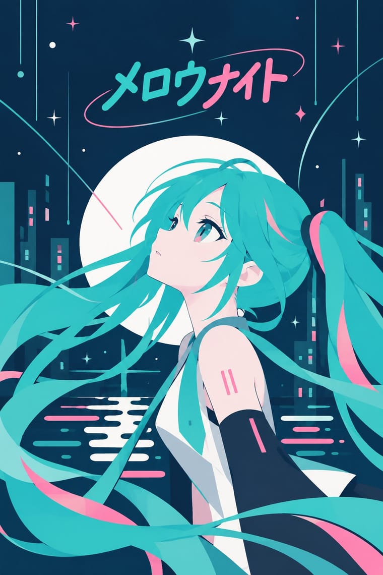
- YouTube Thumbnail Style (the 'YouTube Face') 45% alike
- VTuber Avatar and Stream Graphics 44% alike
- Neo-Brutalism 44% alike
-
05
Often taken for
Korean Variety-Show Captions has no real works recorded yet, so these are its nearest styles by its choices alone, with the choices that tell them apart.
-
Cel-Shaded Game Graphics (Toon-Shaded Real-Time 3D)
Cel-Shaded Game Graphics is one of Korean Variety-Show Captions’s nearest styles by choices; no real work of either fits the other better.
Choices that tell Korean Variety-Show Captions and Cel-Shaded Game Graphics apart Choice Korean Variety-Show Captions Cel-Shaded Game Graphics Straight photography defining avoids Stylised figuration — defining Gradients characteristic avoids 3D render — defining Layered information defining occasional No shared descent in the atlas: they reached these choices separately.
-
Vocaloid Fan Illustration (Hatsune Miku Culture)
Vocaloid Fan Illustration is one of Korean Variety-Show Captions’s nearest styles by choices; no real work of either fits the other better.
Choices that tell Korean Variety-Show Captions and Vocaloid Fan Illustration apart Choice Korean Variety-Show Captions Vocaloid Fan Illustration Straight photography defining — Stylised figuration — defining Hard offset shadow defining — Analogous harmony — characteristic Layered information defining occasional No shared descent in the atlas: they reached these choices separately.
-
YouTube Thumbnail Style (the 'YouTube Face')
YouTube Thumbnail Style is one of Korean Variety-Show Captions’s nearest styles by choices; no real work of either fits the other better.
Choices that tell Korean Variety-Show Captions and YouTube Thumbnail Style apart Choice Korean Variety-Show Captions YouTube Thumbnail Style Eclectic mixing characteristic avoids Naturalistic depiction — defining Layered information defining — Photomontage — defining Flat fields characteristic — No shared descent in the atlas: they reached these choices separately.
-
VTuber Avatar and Stream Graphics
VTuber Avatar and Stream Graphics is one of Korean Variety-Show Captions’s nearest styles by choices; no real work of either fits the other better.
Choices that tell Korean Variety-Show Captions and VTuber Avatar and Stream Graphics apart Choice Korean Variety-Show Captions VTuber Avatar and Stream Graphics Straight photography defining avoids Stylised figuration — defining Flat fields characteristic — Horror vacui avoids occasional Rectilinear characteristic — No shared descent in the atlas: they reached these choices separately.
— means the choice isn’t among the style’s recorded choices. Critics recorded each work’s choices with the styles’ descriptions in view, so this shows whether the descriptions hold together, not proof that they are right.
06
Combine it with
Styles Korean Variety-Show Captions (Yeneung Jamak) pairs well with or plays against, from the research. Each is worked out as a combination: which style gives the type, the colours and the forms.
- Kinetic Typography & Variable Type Contrasts · Borrow a brief scale change for one emphatic caption, but keep live-action performers as the subject: the atlas's kinetic identity style makes moving letters the picture, whereas variety captions comment on footage and often simply cut in and out.
- Danmaku Bullet-Comment Overlay Contrasts · Choose editorial hierarchy, changing faces and illustrated containers for a producer's comic voice; choose equal-weight, separately rendered lanes and repetition for a viewer chorus. Outlined text over video alone does not make the two interchangeable.
- Korean Webtoon Graphics Pairs well · Borrow a comic container or a drawn reaction accent, but preserve the editor's video timing rather than transferring the webtoon's reader-controlled scrolling and long gutters.
- Internet Ugly & Meme Vernacular Contrasts · Use a short outlined phrase for an immediate joke, but retain the programme's controlled lettering repertoire and clean compositing rather than adopting amateur damage or a fixed Impact image-macro template.
07
Sources
- Kim, Hyun-Ki and Bang, Yoon-Kyeong (2013), 'Kinetic Typography study on TV Entertainment Programs — Focused on <2 Days & 1 Night>, <Running Man>, <Infinite Challenge>', Cartoon and Animation Studies 33, 363–382, DOI: 10.7230/KOSCAS.2013.33.363. Full text independently retrieved and read: https://ocean.kisti.re.kr/downfile/crosscheck/koscas/JAKO201302757909589.pdf . Table 2 identifies the three dated broadcasts; table 4 and pp.376–378 establish lower-screen placement, prevalent strokes, illustrated containers, variable faces and selective colour. Most caption transitions are cuts, not continuous motion. Genome weights are a taxonomic interpretation, not the paper's measurements.
- Bai, Yaying and Lin, Chenyang (2022), 'Superimposed Agenda: A Multimodal Comparison of Telops in Japanese, Korean, and Chinese Television Shows', SocArXiv preprint, DOI: 10.31235/osf.io/5p3qt. Full text independently retrieved: https://osf.io/download/u3d6x/ . Introduction and section 2.1 discuss producer-added open captions and Japanese antecedents; comparative analysis distinguishes interpretive third-person commentary and discusses colours, fonts, affect and persona construction. A preprint, not treated as a settled first-broadcast chronology or experimental proof of audience effects.
- Lee Su-yeon, Busan Ilbo, 16 October 2012, '예능 최초 자막, 우리나라 최초는 쌀집 아저씨 김영희 PD?', https://www.busan.com/view/busan/view.php?code=20121016000161 . Independently checked report of Kim Yeong-hee's recollections on MBC's 15 October broadcast: six months at Fuji TV in 1994 and a wish to give the screen liveliness through captions. Confirms the reported training, not an exact inaugural caption date.
- Ko, Taeyoung and Lee, Kyungho (2026), 'Toward a Multi-modal Understanding of Visual-Linguistic Design of Telop: A Computational Analysis of Telop Used in Korean YouTube Videos', DOI: 10.1145/3817018. Author-institution account independently read: https://hcdt.unist.ac.kr/2026/09/09/toward-a-multi-modal-understanding-of-visual-linguistic-design-of-telop-a-computational-analysis-of-telop-used-in-korean-youtube-videos-cscw-2026/ . Supports continuing online practice and genre-specific size, colour, font and position; not a claim that all Korean YouTube captions share one style. Its genre-comparison cover image was visually inspected: the entertainment example combines live-action imagery with a compact lower caption, while the research labels identify decorative type and high saturation. Red OCR rectangles are annotations, not graphic ornament. No image is included in this draft and no reuse licence is assumed.
- Scope and limits: representative palette swatches are design guidance, not sampled or official programme colours. The selected genome describes the caption-plus-footage composition; image.photography refers to live-action frames, not a separate still-photography practice. No universal cast-colour code, ubiquitous emoji system, particular named commercial font or constant animation was established. The three 2012 broadcasts anchor the visual repertoire; later research supports continued use, not uniformity across programmes or decades. The font-category counts describe a programme-wide repertoire, not a measured rate of simultaneous mixed-face compositions. Enlarged captions are not necessarily type-as-image; that treatment is coded as occasional pending broader visual evidence. The dated broadcast exemplars and their programme-specific visual descriptions are attributed to Kim and Bang's aggregate analysis, not independently checked against complete broadcasts or frame by frame across all four exemplar programmes.
How Stylogeny researches and checks a style: where the facts come from.