Style combination · Contrasts
Kinetic Typography × Korean Variety-Show Captions
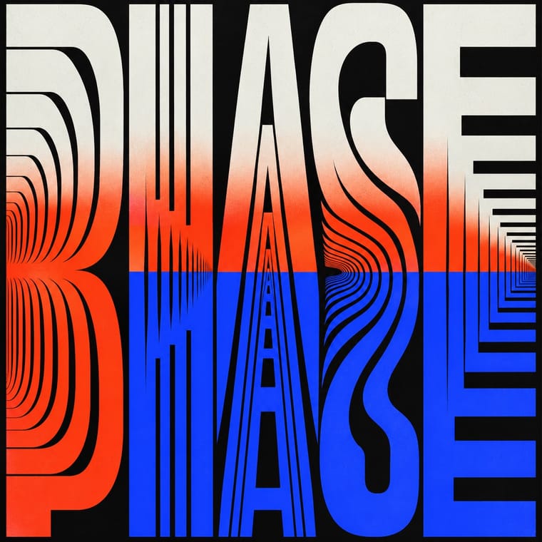
Borrow a brief scale change for one emphatic caption, but keep live-action performers as the subject: the atlas's kinetic identity style makes moving letters the picture, whereas variety captions comment on footage and often simply cut in and out.
Mix them and make something Kinetic Typography Korean Variety-Show Captions
01
What each style brings
Each part of the design comes from the style with the stronger say in it, and each style gives at least two.
Kinetic Typography & Variable Type Korean Variety-Show Captions (Yeneung Jamak)
- Type from Kinetic Typography
- Colour from Kinetic Typography
- Form from Korean Variety-Show Captions
- Composition from Kinetic Typography
- Surface from Korean Variety-Show Captions
02
The type
Open fonts standing in for each style’s own type, which is often hand-drawn or commercial.
Display · Kinetic Typography
Hello
Inter Tight, standing in for Variable grotesques with weight and width axes (e.g. Roboto Flex)
Text · Korean Variety-Show Captions
An editor-authored caption voice layered over South Korean variety-show footage: outlined Hangul, selective colour, changing type styles and occasional illustrated containers turn speech and situations into comic commentary. Usually placed low in the frame or beside a performer, the words emphasise a reaction or interpret an event rather than merely transcribe it. Unlike danmaku, this is part of the edited programme, not a removable chorus of viewers' messages.
Jost; Korean Variety-Show Captions used Hangul gothic (고딕체) sans-serif lettering and Brush-like Hangul calligraphy (캘리그래피체)
03
The colours
The ground and leading colours come from Kinetic Typography, with a counter-accent from Korean Variety-Show Captions. The ink reads on the ground at 4.5:1 or more.
Kinetic Typography & Variable Type Korean Variety-Show Captions (Yeneung Jamak)
-
#0b0b0bground · 36% -
#f3f3efink · 14% -
#ff3d1faccent · 18% -
#f6d72eaccent · 14% -
#2b3dffaccent · 10% -
#c8ff3aaccent · 8%
As CSS
:root {
  --ground: #0b0b0b;
  --ink: #f3f3ef;
  --accent-1: #ff3d1f;
  --accent-2: #f6d72e;
  --accent-3: #2b3dff;
  --accent-4: #c8ff3a;
  --font-display: "Inter Tight", sans-serif;
  --font-text: "Jost", sans-serif;
}
Use it with care
Korean Variety-Show Captions (Yeneung Jamak): Interpretive captions are editorial statements, not necessarily words spoken by the person on screen. Keep quotations distinct from commentary, avoid turning gender stereotypes or ridicule into a default visual code, and provide separate accurate accessibility captions where needed. Programme footage, logos and commercial fonts remain subject to their own rights; this entry grants no permission to reproduce them.
04
The two styles
05
More combinations
With Kinetic Typography
- Generative & Dynamic Identities Pairs well · Drive the variable axes with data or sound so the type responds to input rather than merely looping.
- Renaissance Book Typography Contrasts · The still, centuries-old reading page is the opposite pole; keep long text static and reserve motion for display.
- Neo-Swiss Revival Pairs well · Animate a Swiss-revival grid of tight grotesque headlines and you have most of a kinetic identity; the grid keeps the motion legible.
- Czech Poetist Book Design (Devětsil) Pairs well · Teige's Abeceda posed a dancer as each letter; borrow its body-as-glyph idea to give motion type a human performer.
- Demoscene Graphics (Cracktros, Demos & Text-Mode Art) Pairs well · The sine scroller is an early kinetic type system; set greetings or credits as a waving bitmap scroller over raster bars for event openers and title sequences.
- Danmaku Bullet-Comment Overlay Contrasts · Kinetic type is one designer's choreographed letters; danmaku is hundreds of identical-default lines from strangers. Decide whether motion type should feel authored or crowd-made before borrowing either.
- Lucerne Poster Scene (Neubad & Südpol Posters) Pairs well · Lucerne's twisted and warped letters are already halfway to motion (The Notwist also ran as an animated poster); animate the construction for screens while keeping the printed F4 as the still.
With Korean Variety-Show Captions
- Danmaku Bullet-Comment Overlay Contrasts · Choose editorial hierarchy, changing faces and illustrated containers for a producer's comic voice; choose equal-weight, separately rendered lanes and repetition for a viewer chorus. Outlined text over video alone does not make the two interchangeable.
- Korean Webtoon Graphics Pairs well · Borrow a comic container or a drawn reaction accent, but preserve the editor's video timing rather than transferring the webtoon's reader-controlled scrolling and long gutters.
- Internet Ugly & Meme Vernacular Contrasts · Use a short outlined phrase for an immediate joke, but retain the programme's controlled lettering repertoire and clean compositing rather than adopting amateur damage or a fixed Impact image-macro template.